
Summarize with AI:
Check out what’s new in some of our Kendo UI JavaScript products!
In the time since our R3 2022 release, the team has been hard at work updating our products, and today we’ll look at Kendo UI for Angular, KendoReact and Kendo UI for Vue updates.
Kendo UI for Angular
New Component: Angular ActionSheet
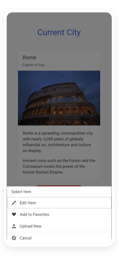
The Kendo UI for Angular ActionSheet component provides a list of options, or “actions,” that users can select from in a modal popup that appears at the bottom the users’ screen.
Traditionally this user experience has primarily targeted mobile applications, but there are also scenarios where applications that target desktop environments can take use of the ActionSheet component.
Each item in the list can be configured to have its own icon, text and event that triggers when the user interacts with the Angular ActionSheet.
See the Angular ActionSheet demo.
Angular Data Grid: Column Menu Auto-Size Option
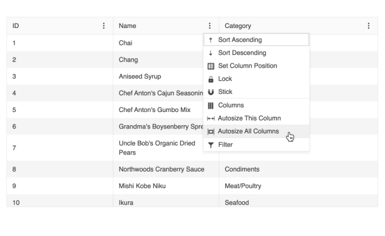
With this update, the Kendo UI for Angular Grid now has the option for end users to be able to auto-size a column through the built-in column menu, which is accessed from the column header of each column. This will let the column auto-adjust its width to ensure that it fits the content available within the column.
See the Angular Data Grid Column Menu Demo.
Angular Charts: Label Support in Bullet Charts
The Kendo UI for Angular Charts added the support for labels in the Kendo UI for Angular Bullet Charts. Previously, Bullet Charts did not support labels, but with this update developers can add labels to any of their Angular Bullet Charts through a simple configuration option.
See the Angular Bullet Chart Labels demo.

KendoReact
React TabStrip: Scrollable Tabs
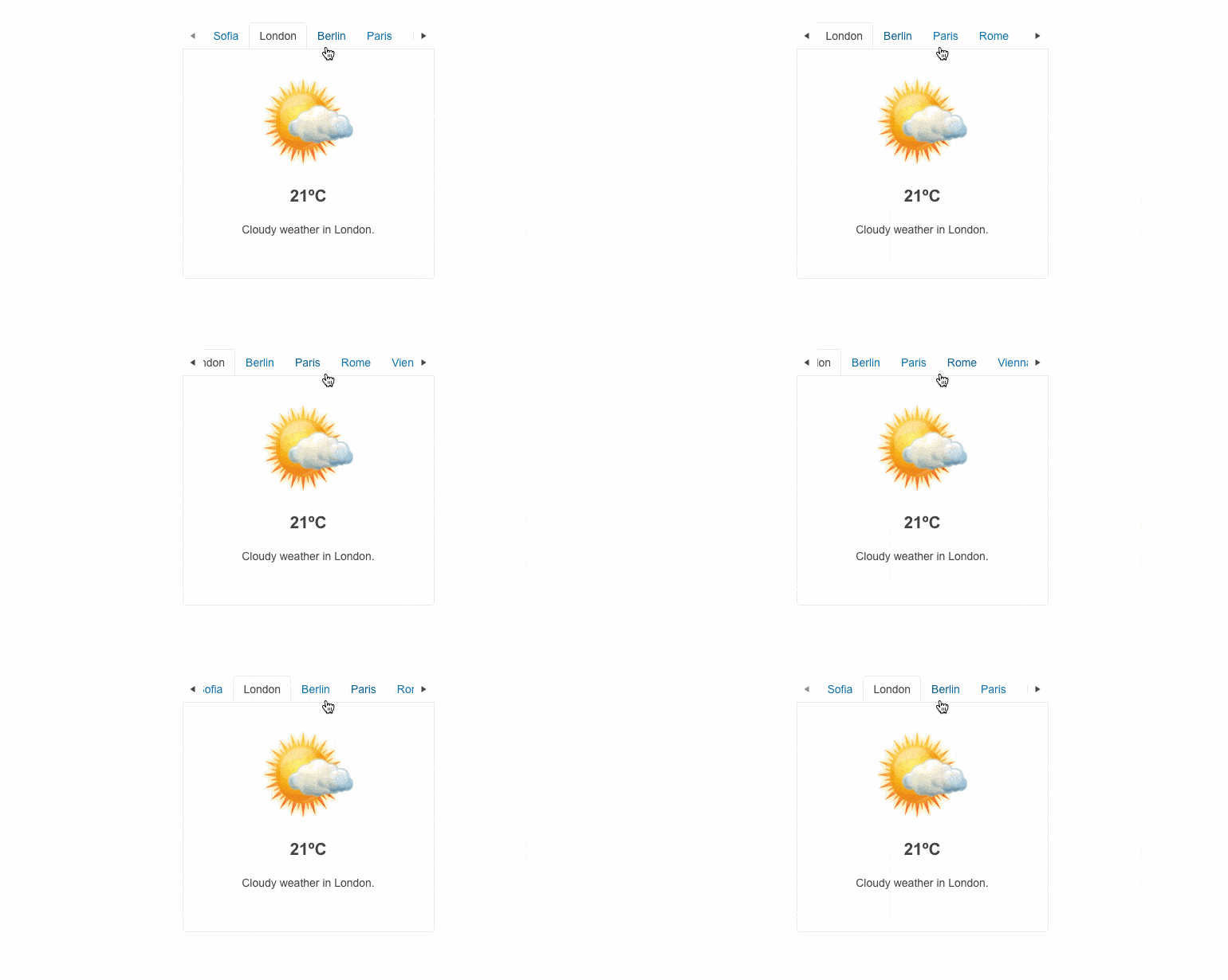
One of the most requested features for the KendoReact TabStrip component has been the ability to scroll through tabs. Well, the wait is over! With this update we can announce that with this update the React TabStrip component added the ability to scroll through available tabs.
Scrollable tabs are important in scenarios where the TabStrip needs to have a specific width and the number of tabs available require a larger width to display.
See the KendoReact Scrollable Tabs demo.
React Charts: New Subtitle Property
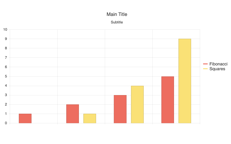
The React Charts added the subtitle feature, letting developers set a subtitle for any of the available chart types in KendoReact. The subtitle provides a uniquely styled element under the main title of the React Charts and can be set through a single configuration option.
See the React Charts Subtitle Property demo.
React Charts: Label Support in Bullet Charts
The React Bullet Charts also received an update with the new feature that adds support to display labels. Thanks to this feature, developers can easily add labels to any of their React Bullet Charts, giving users more contextual information for the visuals they are interacting with.
See the React Bullet Charts Displaying Labels demo.
Kendo UI for Vue
New Native Vue Component: AppBar
The new Kendo UI for Vue AppBar component is the perfect UI element to use as a navigation for any Vue application. Built with flexibility in mind, the Vue AppBar offers building blocks for designing menus and navigations that can contain text links, search bars, icons which contain dropdown menus and much, much more. Additionally, the Vue AppBar can be configured to be displayed at the top of the page and disappear upon scrolling down, or constantly remain at the top of the page while users scroll.

New Native Vue Component: BottomNavigation
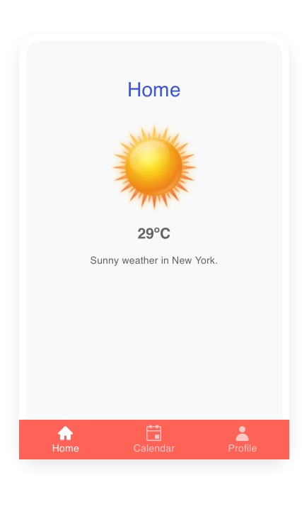
Going hand in hand with the Vue AppBar component, the new Kendo UI for Vue BottomNavigation component provides a quick way for developers to create a navigation element that will always be displayed at the bottom of any screen.
While very popular on mobile devices, the user experience covered by the Vue BottomNavigation component can also find its place on desktop-focused web applications.
Navigation items in the Vue BottomNavigation component can be icons, text or a mix of text and icons, and they can be fully customized using Vue templates.
See the Vue BottomNavigation demo.
New Native Vue Component: ExpansionPanel
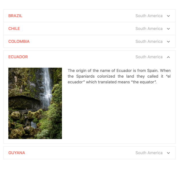
The new Kendo UI for Vue ExpansionPanel component provides an intuitive interface for expanding and collapsing a content area anywhere within a Vue Application. Each ExpansionPanel has a title area and a content area, with the title area always being displayed and represents the main element to control the expanding and collapsing functionality. The content area has no limitations, so developers can provide any custom Vue template to define the content.
See the Vue ExpansionPanel demo.
Vue TreeList: Editing
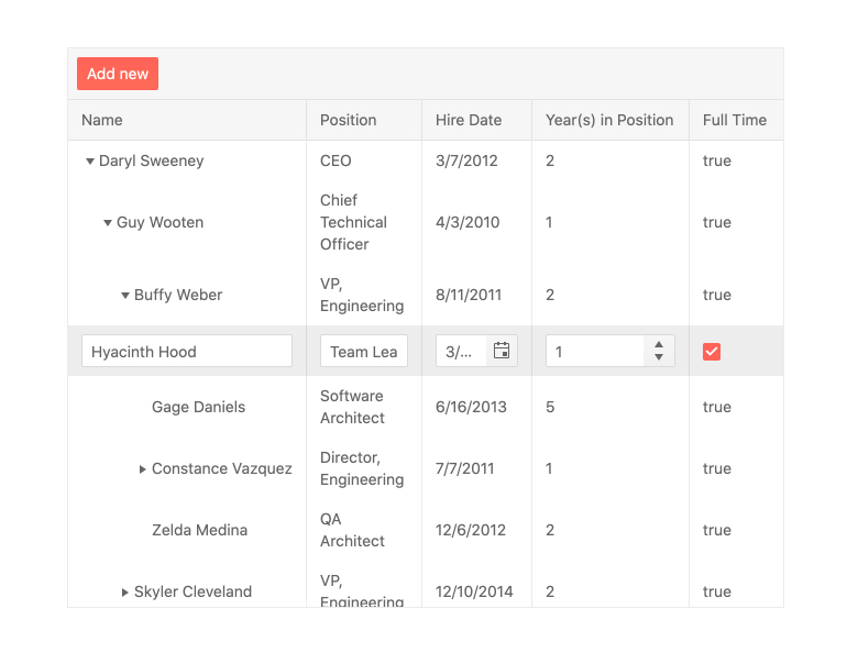
Kicking off a large set of features to the Kendo UI for Vue TreeList component, one of the biggest features added with this release is the TreeList editing functionality.
The built-in editing option allows for users to place an entire row in edit mode, edit individual cells one at a time, or showcase all fields that can be edited in a modal dialog.
See the Vue TreeList Editing demos.
Vue TreeList: Column Operations
The Kendo UI for Vue TreeList component also added several features relating to working with the columns of the Vue TreeList. These features include:
- Column Resizing – Lets users resize the width of a column using built-in resizing handlers
- Reordering – Lets users rearrange the order of the displayed columns
- Column Menu – Provides a menu with actions that can be taken for each column, including items like showing or hiding a column, filtering, sorting and much more
- Multi-Column Headers – Allows developers to define headers that span multiple columns which can be useful to group related columns and fields
- Locked Columns – Also known as frozen columns, this feature lets columns be locked to either side of the TreeList as users scroll through the list of available columns
- Column Virtualization – Improves performance for scenarios where a TreeList contains a large collection of columns and optimizes when and how to display columns to make a buttery smooth scroll experience
See the Vue TreeList Column Operation demos.
Vue TreeList: Row Drag & Drop
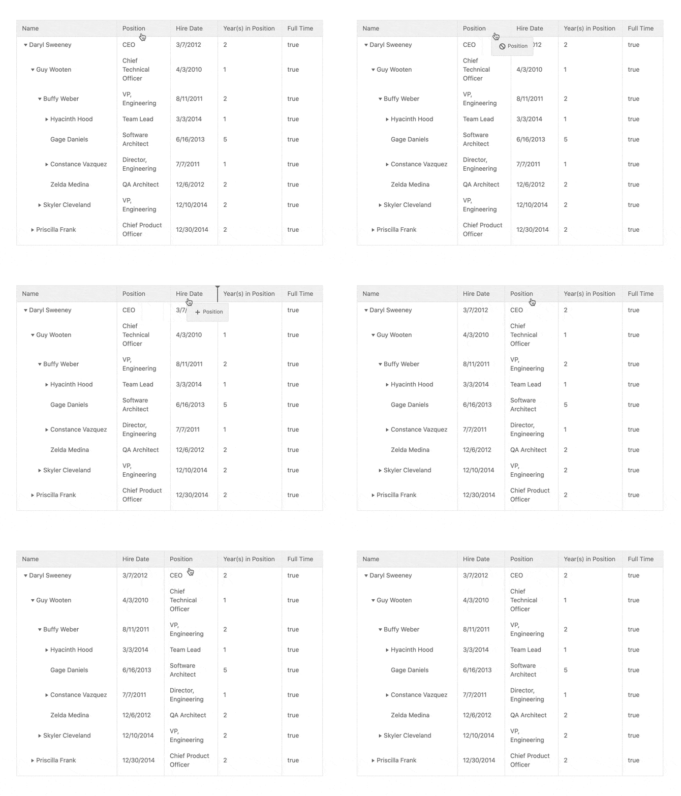
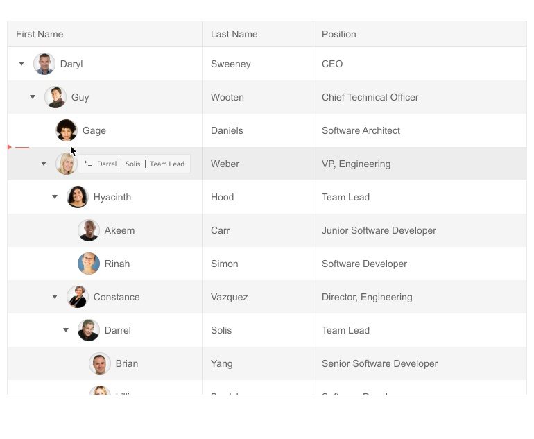
With this update, the Kendo UI for Vue TreeList also added a new drag-and-drop feature, allowing end users to rearrange any of the rows available in a TreeList.
The Vue TreeList drag and drop functionality can also be used to rearrange the hierarchy within the Vue TreeList, letting child rows be dragged to the parent level or even all the way to the root level if needed.
See the Vue TreeList Row Drag & Drop demo.
Vue TreeList: PDF Export
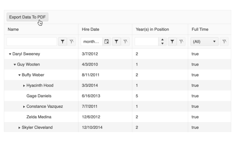
The final update for the Vue TreeList component that we can announce today is the new built-in PDF export feature. When enabled, the Vue TreeList PDF Export feature will display a toolbar with an “Export to PDF” button at the top of the TreeList component.
PDF generation can be configured to only export the currently displayed data or the entire data set available to the Vue TreeList component. Additionally, each PDF file can add additional PDF content as well as customized paper sizes (including margin and padding settings) to ensure the generated PDF can fulfill any requirements.
See the Vue TreeList PDF Export demo.
Vue Grid: Persist State Documentation Article
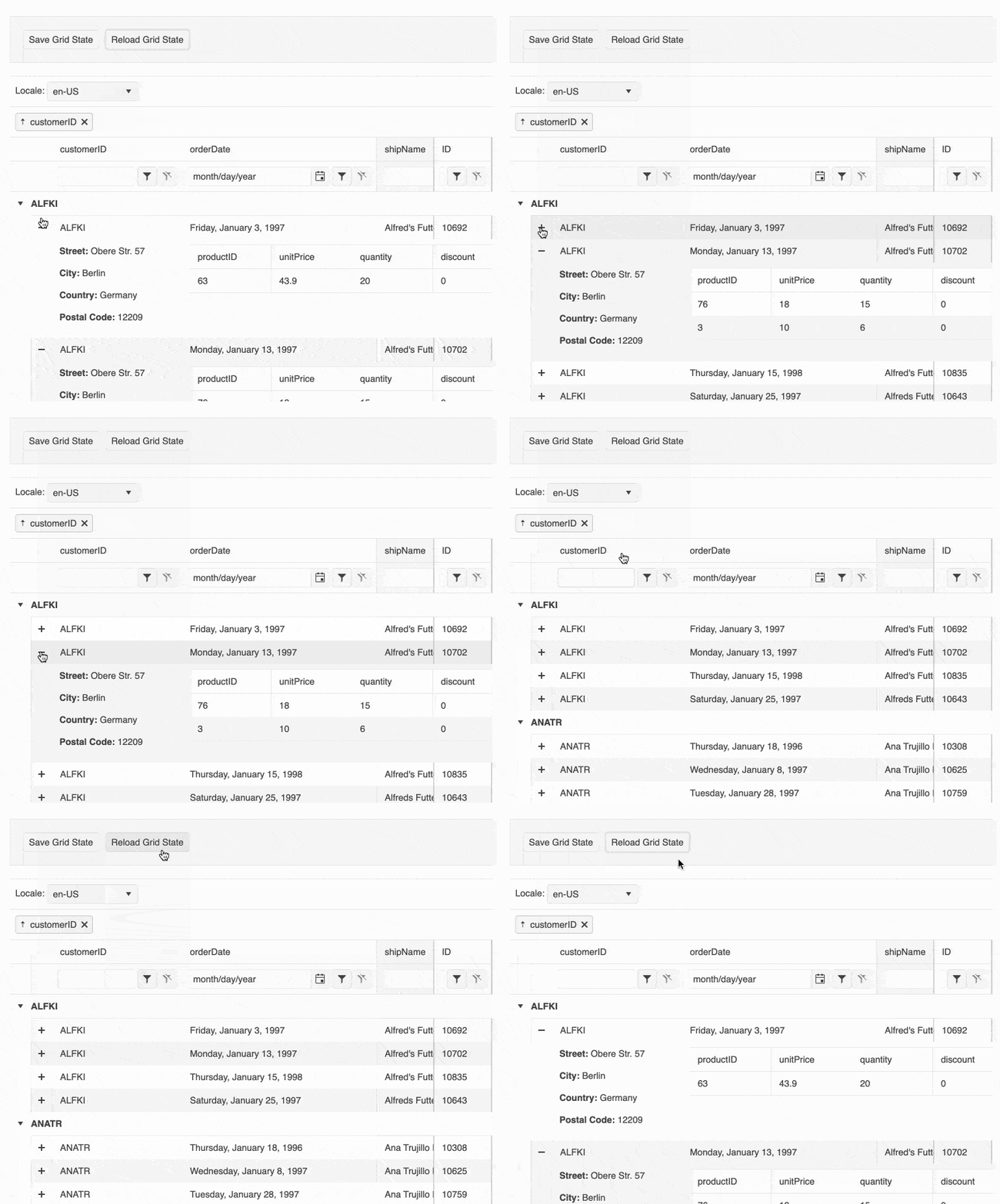
The last note to add to this update is the new Vue Data Grid Persist State documentation article, which shows off how to implement state persistence in the Kendo UI for Vue Data Grid.
The goal behind this documentation article is to showcase how aspects like column order, display preferences, current page, filter options, etc. can all be saved in a state that can be reverted to or saved for the next time the user views the page again.
See Vue Data Grid Persist State documentation article.
Stay Tuned for More
We’re always working to improve our products, as you know, so we’ll talk again soon. 😉

Dan Beall
Dan Beall joined the Kendo Team in 2020 and brought with him a background in product management, marketing, and UX. Dan has over 20 years’ experience in the developer tools community bringing new solutions to market and evolving established solutions to meet the challenges of an ever-changing technical landscape. In his free time, he enjoys brewing, hiking, boating, and disc golf.

