

Summarize with AI:
Our Kendo UI JavaScript component libraries have big announcements for R3 2022, including a new Fluent theme and new and improved ThemeBuilder.
Let’s take a look at the huge news affecting all our Kendo UI component libraries.
New Fluent Theme

The first big update arriving with R3 2022 is new Fluent theme for the jQuery, Angular, React, Vue, ASP.NET MVC, ASP.NET Core and Blazor UI component libraries! Just like the other Telerik and Kendo UI themes, applying the new Fluent theme to any of our UI components is as simple as adding the theme to your projects, which could be as simple as updating a single CSS reference.
The Telerik and Kendo UI Fluent theme follows the guidelines of the official Fluent Design System. This means if you are already using Fluent UI components in your web applications today, any of the Telerik and Kendo UI components will seamlessly fit in once you add the new Fluent theme to your project.
See Fluent theme demos for all Telerik and Kendo UI libraries.
New ThemeBuilder and ThemeBuilder Pro

For those unfamiliar, Progress ThemeBuilder is a web application aimed at letting developers quickly customize and style the web UI components found in our jQuery, Angular, React, Vue, ASP.NET MVC, ASP.NET Core and Blazor libraries. While the ThemeBuilder is a very popular tool among our users, it has not seen many improvements over the recent years.
This is all changing with the R3 2022 release, as we are officially announcing the revamped ThemeBuilder, built from the ground up to be faster (twice as fast!) and offer more features like working with multiple projects and saving them across sessions. This will initially target Angular, React, Vue and Blazor, with other products (jQuery, ASP.NET MVC, and ASP.NET Core) arriving in the future.
We are also excited to announce the new ThemeBuilder Pro for developers looking for atomic-level control of customization that goes beyond the regular ThemeBuilder.
For a full breakdown in what’s new with the ThemeBuilder and what ThemeBuilder Pro includes, feel free to jump over to the new ThemeBuilder announcement blog post.
Table of Contents
To learn what else is new in R3 2022 for Kendo UI, keep reading along, or jump ahead to your favorite technology:
Kendo UI for jQuery Updates
New Component: jQuery SplitButton

Kicking things off for R3 2022 with the Kendo UI for jQuery components, with this update we are expanding the total number of button types available by adding the new SplitButton component. The jQuery SplitButton combines the functionality of a button with a dropdown, letting users interact with the main button element to execute one action, or select from a list of other actions in the available dropdown element.
While this style of component has been available in the jQuery Toolbar for some time, as of R3 2022 developers can take advantage of this component in a standalone fashion. Expanding on the number of button types that Kendo UI for jQuery offers out of the box, with this update the new SplitButton component is officially available.
See the jQuery SplitButton demo.
New Component: DropDownButton

Another type of button added with R3 2022 is the new Kendo UI for jQuery DropDownButton component. The name of the component gives the functionality away, but the primary function of the jQuery DropDownButton is to show a dropdown with a list of actions that the user can select from whenever the main button has been clicked or interacted with in some way.
See the jQuery DropDownButton demo.
New Component: jQuery Signature

Another exciting jQuery UI component arriving with R3 2022 is the new Kendo UI for jQuery Signature component. This brand-new component allows end users to use their mouse, or some sort of touch interface, to record their signature. Developers can then save and reuse the signature if desired, and the jQuery Signature component can easily be exported to an image.
See Kendo UI for jQuery Signature Component demos.
jQuery CDN: Introduction of License Keys
This update only affects users already taking advantage of, or looking to use, the public Kendo UI for jQuery CDN for JavaScript and CSS references.
Specifically, R3 2022 using the public CDN will require users to provide a license key to their projects. While we believe that the public CDN is an important avenue for our users to consume and work with Kendo UI for jQuery, we also want to ensure that we can continue to offer this service to trial and licensed users alike, while still ensuring that the service is not used in some sort of nefarious way.
To ensure that this update will not cause issues with developers upgrading to the latest and greatest, we have taken steps to ensure that projects will still build. Without this license key, a warning will be displayed in the developer console of the browser letting anyone with access see that the project is using the CDN without a proper license key, but projects will still compile and run.
The license check is done completely within the project and does not reach out to any third-party service for verification, ensuring that no extra communication is done for the sake of licensing.
Older projects will not be affected by this change, and license keys will only be required with R3 2022 and beyond.
See Kendo UI for jQuery license key documentation for more information.
Kendo UI Dojo: Now Using Sass by Default

Many developers learning or actively using Kendo UI for jQuery are probably familiar with the Kendo UI Dojo. Any of the available examples can be edited, and the Kendo UI Dojo is the tool that opens whenever these links are clicked.
The Kendo UI Dojo is the perfect playground for Kendo UI for jQuery, as it allows developers to experiment with the Kendo UI components without adding code to any local project and is a great way to send examples to other developers or even the Kendo UI support team as each project creates a unique URL for people to share.
Before the R3 2022 update, the Kendo UI Dojo would default to using one of the LESS-based themes when new projects were created. However, with R3 2022, the Kendo UI Dojo is now aligned with the rest of Kendo UI to use the newer Sass-based themes as a default.
jQuery PivotGrid (v2): Local Data Binding

In January 2022, the Kendo UI for jQuery team released the new and revamped jQuery PivotGrid component. Called the PivotGridV2, this new component is a complete overhaul of the PivotGrid component. The goal of this revamp is to create a more modern jQuery PivotGrid component with a better user experience and design, overall improved performance and much more.
When navigating through our docs and demos, developers may notice that there are two PivotGrids available. Since jQuery PivotGrid v2 is being built from the ground up (and PivotGrids are quite complex), the Kendo UI for jQuery team wanted to offer both editions of the PivotGrid (old and new) while we build out features in the new jQuery PivotGrid v2.
That brings us to the update which arrived in R3 2022. Specifically, with this release the Kendo UI for jQuery PivotGrid v2 component officially added support for local data binding.
With local data binding added, developers can now choose which is the best way to bind data to the PivotGrid: Data located on a server somewhere (remote using OLAP) or through a JavaScript array or a collection of data available on the client (local).
See jQuery PivotGrid Local Data Binding demo.
Various jQuery Components: Improved Accessibility & Accessibility Demos

Accessibility and compliance with the latest standards continue to be a focus for all Kendo UI libraries, and Kendo UI for jQuery is certainly no exception. Over the past few months, we have worked hard at improving the compliance we offer for Section 508, WCAG 2.1, and WAI-ARIA standards across all our jQuery UI components.
If you are looking for specific details around what we updated, you can go through the release notes for R3 2022.
Beyond updating our UI components, with R3 2022 the Kendo UI team has created accessibility-specific demos that can be used to test any of our jQuery UI components with screen readers and other software used to test accessibility. Previously, whenever teams needed to run accessibility tests on any Kendo UI for jQuery component, they would have to do so locally which required dedicated developers to set up the perfect configuration. Now, any team member that needs to run tests can do so by visiting a public URL—no developer needed!
jQuery Grid: Disable Column Menu on a Per-Column Basis

The first in a series of updates to the jQuery Grid with R3 2022 is the ability to disable the column menu on a per-column basis. With this new configuration option, developers have full control over which columns should display a column menu.
See jQuery Grid Disable Column Menu demo.
jQuery Grid: Hide Currently Grouped Column
Another feature added to the jQuery Grid with R3 2022 is the ability to hide the column or field that is currently being grouped. Previously, anytime a column was grouped, either as a part of the initial configuration of the component or when a user dynamically selected a field to group by, the column would still be displayed. This may not be ideal for certain scenarios, so with this latest update developers can choose if they want to display or hide the field when it has been used to group the Data Grid.
See hide grouped column in jQuery Grid demo.
jQuery Grid: Fire onChange Event Only When Row Select and Deselect Are Performed

A quality-of-life improvement for anyone dealing with the onChange event when using the select functionality of the Kendo UI for jQuery Grid is that the onChange event will only fire when a row is selected and deselected.
Previously this event could be triggered when interacting with rows even when selection or deselection did not occur.
See updated jQuery Data Grid onChange event API.
Kendo UI for Angular Updates
New Component: Angular PivotGrid (RTM)
While the Kendo UI for Angular PivotGrid component was technically introduced in the previous release, it was offered in a beta version as a way for the team to collect feedback from users that have been actively looking for a PivotGrid for their Angular applications.
Well, the wait is finally over, as with R3 2022 we have officially introduced the RTM version of the Angular PivotGrid! With this update, developers who may be a bit cautious around anything labeled with beta can feel free to start using the Angular PivotGrid in all their applications.
For those curious, here is a list of features that we added as a part of the evolution from beta to RTM:
- A configurator area
- Filtering
- Sorting
- Localization
- Keyboard navigation
- Accessibility compliance
See Kendo UI for Angular PivotGrid component demos.
New Component: Angular Drag and Drop (Beta)

A brand-new component arriving with R3 2022 is the new Angular Drag and Drop component. The goal of this new component is to give Angular developers a framework to build generic draggable elements which can be dragged around freely or dropped in certain specific elements. This gives devs ultimate flexibility to create any type of drag-and-drop scenarios across their Angular applications, even if the elements and components being dragged are not Kendo UI for Angular components.
This has been a highly requested component and we are beyond excited to be able to empower any Angular developer to enable more interactivity in their Angular applications.
See Kendo UI for Angular Drag and Drop demos.
New Component: Angular Signature
Another brand-new component arriving with R3 2022 for Kendo UI for Angular is the new Angular Signature component. The Kendo UI for Angular Signature component can be used to capture the signature of end users anywhere within an Angular application. These signatures can then be saved and reused in other areas of an application.
See Kendo UI for Angular Signature Component demos.
New Component: Angular CircularProgressBar

The last new component arriving in Kendo UI for Angular with R3 2022 is the new Angular CircularProgressBar. Giving users a new and fresh way to show progress, the Angular CircularProgressBar component shows progress in a circular shape rather than the traditional linear bar.
The Angular CircularProgressBar component comes with all of the configuration options that Angular developers have come to expect from Kendo UI for Angular. This includes ability to have the Angular CircularProgressBar automatically change colors as the progress updates, as well as controlling the formatting and the content of the label showcased within the circular area.
See the Angular CircularProgressBar demo.
Angular PivotGrid: PivotGrid and Chart Integration

A common scenario that we see for both the Kendo UI for Angular Data Grid as well as PivotGrid is the requirement to connect the grids with some sort of chart. With this in mind, as a part of the R3 2022 release the Kendo UI for Angular team put together a demo showcasing just how you can generate charts based on the Angular PivotGrid. This can even update the chart when users sort and filter the data within the PivotGrid component!
See Angular PivotGrid and Chart Integration demo.
Angular Grid: Separate Navigable Sections

To ensure that the Kendo UI for Angular Data Grid can comply with accessibility requirements, with R3 2022 the new “navigable sections” feature was added to the Angular Grid. This new feature allows developers to define whether keyboard navigation should apply to the main table, the pager section or both the main table and pager sections. The navigable sections feature should help any developer who may have more specific requirements around accessibility and keyboard navigation behavior.
Just so it is mentioned, the default behavior (when no additional configuration options are set) will enable all elements to be navigable with keyboard navigation out of the box.
See the Angular Data Grid Navigable Sections demo.
Angular Grid: Save and Restore Column State

Within the Kendo UI for Angular Data Grid there are so many ways that users can interact with columns. This can include reordering columns, resizing columns, showing or hiding columns and more. Based on this, there may be requirements that call for allowing users to save and restore the various configurations of the data table columns.
R3 2022 comes with good news for any developers with this requirement, as with this release we have officially added the ability to easily save and restore columns states to the Angular Data Grid columns.
See Angular Grid Save and Restore Column State demo.
Angular Grid: Max Resizable Width Property for Columns

An additional column-based feature added to the Angular Grid with R3 2022 is a new property to help control the maximum size that a column can be resized to. This can be set on a column-by-column basis to help ensure that end users will not create odd layouts whenever they resize columns.
See Angular Grid Max Resizable Width Property for Columns docs.
Angular Drawer: Hierarchical Items Support

With R3 2022 the Kendo UI for Angular Drawer component added support for hierarchical items. The hierarchical item support lets any level of the Angular Drawer have child items and can expand and collapse items through interacting with the parent item. Creating the hierarchy can be done by data binding to hierarchical or flat data a field representing the parent and child relationship.
See the Angular Drawer Hierarchical Item demo.
Angular Dialog: Configurable Animations

The Kendo UI for Angular Dialog component also received an update with R3 2022 by allowing developers to configure the type of animations used when interacting with the dialog. Through a new property added to the Angular Dialog component, developers can control the type of animation (translate, slide, expand, zoom and fade), the direction of the animation (down, up, left, right), as well as the duration of the animation (in seconds).
See the Angular Dialog animations demo.
Angular TreeView: Disable Only Parent Nodes and Expand Disabled Nodes

The Angular TreeView added two highly requested features with R3 2022. These features relate specifically to the handling of disabled nodes.
Disable Only Parent Nodes
With R3 2022, the Angular TreeView can now let parent nodes be disabled without having to disable all the children of said parent node. This is an optional feature that lets developers separate the disabled
status from the child and parent nodes.
Expand Disabled Nodes
Tying together with the disabling of parent nodes only, the Angular TreeView also received the ability to expand and collapse nodes that have been disabled.
See the Angular TreeView Disable Parent Nodes demo.
Angular Editor Enhancement: Allow Users to Set Their Own Font Sizes

Another highly requested feature that the Kendo UI for Angular team managed to add with R3 2022 is letting end users manually input the font size they want to use within the Angular Editor component. Previously, users could only select from a predefined list of font sizes set by the developer who configured the Editor component.
See the Angular Editor Toolbar Tools demo.
Angular Filter: Expression Value Templates
The Kendo UI for Angular Filter component received a few updates with R3 2022. Kicking things off, the new Expression Value Templates feature for the Angular Filter component lets developers define a custom template for any of the editors within the
Filter component. As with all Kendo UI for Angular components using templates, this is done through setting a ng-template and applying a simple directive to the ng-template element. The result is that developers get full
control over the look and feel of each field.
See the Angular Filter Expression Value Templates demo
Angular Filter: Support for Declarative Initialization

Another feature added to the Kendo UI for Angular Filter component is the ability to create the Angular Filter completely through a declarative way.
Previously, Angular developers had to add a <kendo-filter> component their page and then define the available filters through a JavaScript object to customize the fields and filters available. With R3 2022, the Angular Filter component
can be initialized declaratively by using the new <kendo-filter-field> component for each field and editor that needs to be displayed within the Filter component.
See the Angular FilterFieldComponent API documentation.
Angular Filter: Set Default Filter Formats

The last feature the Kendo UI for Angular Filter component is adding with R3 2022 is the ability to set a default format when using dates and numbers.
Formatting dates and numbers to fit requirements can be a struggle when creating forms or dealing with data. To ensure that the Angular Filter component can display the appropriate format, developers can either define a template with the desired formatting or pass an object representing the desired formatting to the Angular Filter component.
See the Angular Filter Editor Formats demo.
Angular Charts: New Subtitle Property
A smaller feature with a big impact arriving with R3 2022 is the new subtitle property for all Kendo UI for Angular Charts. The subtitle, as the term gives away, is displayed under the main title of the Chart, and has its own unique style.
See the Angular Charts Subtitle Property demo.
Kendo UI Productivity Tools: Additional Code Snippets
The Kendo UI for Angular team is so excited to see that so many Kendo UI for Angular developers have downloaded and used the new Kendo UI Productivity Tools for Visual Studio Code over the last couple of months.
Thanks to feedback provided by developers using Kendo UI for Angular, the team has spent time expanding the available Angular code snippets in the Kendo UI Productivity Tools.
These code snippets are designed to boost developer productivity when working with our Angular UI components, saving keystrokes and time with every snippet used.
See the Angular Code Snippets documentation.
All Angular Components: Updated Design for API Pages

With R3 2022, all API pages found in the Kendo UI for Angular documentation have been updated and revamped, taking advantage of a new design to make it easier to navigate through and understand the API of each Angular UI component. This effort has been ongoing throughout all of 2022, but with R3 2022 all API pages take advantage of this new design.
See the Angular Data Grid API documentation for an example.
Various Angular Components: Improved Accessibility Compliance
Accessibility is an important part of developing Kendo UI for Angular UI components. In fact, accessibility compliance is one of the criteria to officially release a new component as RTM!
As a part of our efforts to ensure that the Kendo UI for Angular components are as accessible as possible, the team has spent a ton of time over the last few months addressing accessibility issues that have been submitted to the team through our support ticketing system, as well as improving compliance based on additional research and specifications that the Kendo UI accessibility team has put in place.
While there are too many improvements to list in this blog post, the goal of the improvements are to enhance the components’ Section 508, WCAG 2.1 and WAI-ARIA compliance across the board.
See the Kendo UI for Angular Accessibility documentation.
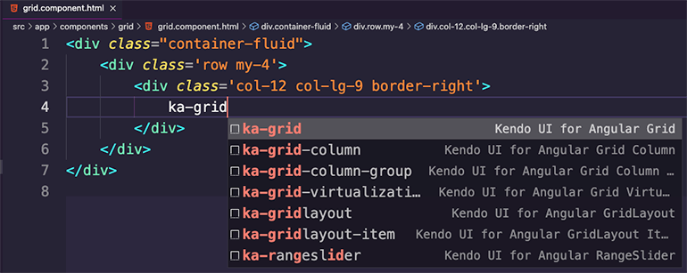
Visual Studio Code Kendo UI Productivity Tools: More Angular Scaffolders

The Kendo UI Productivity Tools is the ultimate productivity booster for any Angular developer working with the Kendo UI for Angular components in Visual Studio Code. Over the last few releases, we have introduced features like code snippets to help with writing code for specific Angular components, as well as scaffolders which help generate full pages with multiple Kendo UI for Angular components or scenarios like data binding to the Angular Grid.
With R3 2022, we have added even more scaffolders to help developers quickly create pages and generate code with a few clicks, saving hundreds of keystrokes per scaffolder!
If you have not had a chance to try tour the Kendo UI Productivity Tools, I highly recommend you take it for a spin!
See the Kendo UI Productivity Tools for Visual Studio Code.
Kendo UI for jQuery to Kendo UI for Angular Migration Guide

A few folks out there are actively planning on, or maybe even working on, migrating from one application architecture over to Angular as a part of ongoing modernization efforts. While Kendo UI for jQuery continues to get updates and is a big part of the future of the Kendo UI bundle, there are folks who are eager to migrate applications and toolsets to Angular.
To ensure that we can help existing Kendo UI for jQuery users with tips and tricks for how to migrate to Kendo UI for Angular, we have put together the official Kendo UI for jQuery to Angular Migration Guide!
This is an initial version of the guide, and it will be a living and breathing part of our documentation, so if some aspects may be missing do not fret! We will continue to add information in here based on feedback and questions we get from developers that are looking to do this migration.
See the Kendo UI for jQuery to Kendo UI for Angular Migration Guide.
KendoReact Updates
New Component: React Signature
With R3 2022, the KendoReact library officially adds the new React Signature component. The purpose of the React Signature component is to capture and reuse signatures from users. The way users can input their signature can be through a mouse or touch interface.
See React Signature Component demos.
All React Components: Support for the Latest Version of TypeScript

With R3 2022, KendoReact officially supports the latest stable version of TypeScript (4.7.4) and internally uses the latest @types/react version (18.0.17). While these updates are welcomed by any developer looking to take advantage of
the latest and greatest, it should also be noted that KendoReact components still support any React version above, and including, 16.8.2.
See the KendoReact TypeScript support in any of our online demos.
All React Components: Updated Design for API Docs

Like the feature mentioned in the Angular section, with R3 2022 all available API documentation pages have been updated to follow a brand-new design. This new design was created based on feedback from active users of the KendoReact documentation, and the goal is to make it easier to understand and use the available API for all React UI components available in KendoReact.
See the KendoReact Grid API section for an example.
New React Visual Studio Productivity Tools
To boost the productivity of any developer using KendoReact, with R3 2022 there have been tons of React-specific features added to the Kendo UI Productivity Tools for Visual Studio Code.
Specifically, over the last few months the KendoReact team put together several React snippets to help save keystrokes whenever using any of the KendoReact UI components.
After the Kendo UI Productivity Tools have been installed in VS Code, the KendoReact code snippets will display whenever a developer types kr- in their VS Code instance. This will then show a popup with all available KendoReact components,
and the list will be filtered down when the developer continues to type the component name.
Once a developer has filtered down the list or navigated through the available options in the popup using the arrow keys, hitting the tab key will automatically type out the entire component declaration. It should also be noted that this popup will also display for sub-components in any KendoReact component. The code snippets are smart enough to only display the appropriate options depending on the UI component that is currently being added.
See the Visual Studio Productivity Tool Code Snippets.
React PivotGrid: Export to Excel

While the React PivotGrid allows users to slice and dice data without the need for opening up a standalone application, there may be requirements for users to be able to export the React PivotGrid content to an Excel file.
To help with these requirements, with R3 2022 the KendoReact PivotGrid now comes with built-in Export to Excel functionality. When enabled, end users will be able to export the content of the React PivotGrid with a single button click.
See React PivotGrid Export from Excel demo.
React PivotGrid: Export to PDF

Another exciting announcement for the React PivotGrid is the new Export to PDF functionality added with R3 2022 as well. This feature lets end users export the content of the KendoReact PivotGrid to a PDF file using a single button click. The Export to PDF feature also comes with several configuration options, letting developers customize only the current page or all content will be exported when a user attempts to export to PDF.
See the React PivotGrid Export to PDF demo.
React PivotGrid: Built-in Loading Indicator

With R3 2022, the KendoReact PivotGrid component added a built-in loading indicator which will be displayed whenever data operations occur within the React PivotGrid. These kinds of data operations include sorting, filtering, changing the fields displayed within the PivotGrid and more.
Initially this loading indicator is available only in local data binding scenarios, which will cover scenarios where the PivotGrid is used without binding to an OLAP cube directly.
The built-in loading indicator relies on the standalone React Loader component, which means React developers have plenty of built-in options for changing the look and feel of the loading indicator. Of course, a custom renderer can always be provided to take full control over what displays to show users that something is loading in the React PivotGrid.
See React PivotGrid Loading Indicator demos.
React PivotGrid: Globalization Documentation Article

The KendoReact UI components get used in applications across the globe, which requires that parts of the React components need to be able to display strings in different languages and formats.
This is why, with R3 2022, the React PivotGrid component added a documentation article showcasing how to follow various culture formats when using the PivotGrid. This article also covers which available built-in strings exist within the KendoReact PivotGrid component and highlights how developers can set their own strings to help localize any built-in message.
See the React PivotGrid Globalization demo.
React PivotGrid: PivotGrid and Chart Integration
The last feature the KendoReact team managed to add to the React PivotGrid is the new PivotGrid and Chart integration examples.
Displaying data both in the “raw” form (columns and rows) as well as in a more visual form (charts and data visualizations) can be very powerful for end users to understand more about the data they are seeing.
With this in mind, with R3 2022 the KendoReact team worked on building functionality to make it as easy as possible to connect the React PivotGrid to a React Chart, allowing for the Chart to automatically update whenever data operations like sorting or filtering, etc., may occur.
See React PivotGrid and Chart integration demos.
Various React Components: Accessibility Improvements and WCAG 2.1 Compliance
The KendoReact UI components offer some of the best accessibility compliance of any advanced React UI library with over 100+ UI components. However, this does not mean that there is no room for improvement. This is why, with R3 2022, the KendoReact team focused on addressing accessibility-related issues and update the target WCAG version for compliance to WCAG 2.1 (compared to 2.0 previously).
The end result of this effort is a version of the KendoReact UI components that is the most accessible to date.
See KendoReact Accessibility Overview.
Various React Components: Bug Fixes and Enhancements
KendoReact is one of the fastest growing React UI libraries out there. With this rapid expansion of UI components, now well over 100, the KendoReact team wants to ensure that each UI component is as reliable and stable as possible.
To make each component as reliable and stable as possible, over the last couple of months the KendoReact team has been busy implementing enhancements (big and small) and tackling a whole slew of bugs.
There are too many features to list in a single blog post, especially when we have so many other features to highlight, but a full view of the changes can be seen by reviewing the KendoReact changelog.
Kendo UI for Vue Updates
New Component: Vue TreeList

With R3 2022, the Vue TreeList component officially arrives in the Kendo UI for Vue UI library. Perfect for scenarios where data tables use the same data model for all rows, but still require a parent-child relationship, the Kendo UI for Vue TreeList offers the same functionality of the Vue Data Grid but keeps columns aligned as users expand or collapse rows within the hierarchical structure of the component.
See the Vue TreeList component demos.
New Component: Vue Badge
Another brand-new native UI component for Vue arriving with R3 2022 is the Kendo UI for Vue Badge component. The Vue Badge component is a versatile component which can provide a visual indicator, like unread messages or online statuses, and attach it to any existing HTML element or Vue component.
See the Kendo UI for Vue Badge demos.
New Component: Vue ColorPicker

With R3 2022, Kendo UI for Vue also focused on color picking UI components. To start things off, with this update the new Vue ColorPicker component was added to Kendo UI for Vue. The Vue ColorPicker component provides an easy and intuitive way to select and extract a color picked by any user. These colors can be picked by providing Hex or RGB values, using a built-in gradient UX, or selecting from a list of predefined colors set by the developer.
The ColorPicker is great for scenarios where real estate of any page is limited, as the overall user experience is displayed within a popup and will only display when the user interacts with the Vue ColorPicker component.
See the Vue ColorPicker component demo.
New Component: Vue FlatColorPicker

The next color picking component added to Kendo UI for Vue with R3 2022 is the new Vue FlatColorPicker component. The Vue FlatColorPicker provides the same functionality as the Vue ColorPicker component mentioned above, with the key difference that the UX is not hidden within a popup. Instead, the entire Vue FlatColorPicker component is displayed fully when added to a page.
See the Vue FlatColorPicker component demo.
New Component: Vue ColorGradient

Another color picking component available with R3 2022 is the new Kendo UI for Vue ColorGradient component. The Vue ColorGradient component extracts the gradient UX available in the Vue ColorPicker and FlatColorPicker into a standalone component. When added to a page, the Vue ColorGradient component lets users select a color from a full gradient of colors, with crosshairs helping narrow down exactly which color has been picked. Additionally, the Vue ColorGradient also includes a hue slider, opacity slider, and the ability to input RGB or HEX values to select a color.
See the Vue ColorGradient component demo.
New Component: Vue ColorPalette

The last new color picking Vue UI component for this release is the Vue ColorPalette component. Like the Vue ColorGradient component, the Kendo UI for Vue ColorPalette component extracts the user experience letting users select from a predefined list of colors. Each color option is displayed as a box representing and showcasing each available color.
See the Vue ColorPalette component demo.
New Visual Studio Code Productivity Tools
Expanding on the list of useful tools offered to Kendo UI for Vue developers, with R3 2022 the Kendo UI Productivity Tools for Visual Studio Code added code snippets for Kendo UI for Vue.
Once the Kendo UI Productivity Tools have been installed into Visual Studio Code, Kendo UI for Vue Code snippets will appear when developers type kv- into their IDE. From there, a list of all available Kendo UI for Vue components will
be displayed. The list will automatically filter down as users type the name of the Vue UI component they are interested in. Additionally, the snippets are smart enough to also display sub-components when configuring Kendo UI for Vue components,
so only the most appropriate options will be shown.
See the Visual Studio Productivity Tool Code Snippets.
All Vue Components: Vue 2.7.x Compatibility
Kendo UI for Vue is one of the few Vue UI libraries that supports both Vue 3.x and Vue 2.x simultaneously. While Vue 3.x support gets the most attention since it is the newer version of the Vue library, Vue 2.7.x was released on July 1, 2022. With this update, the Kendo UI for Vue components have updated their compatibility with Vue 2.x to officially support 2.7.x.
Of course, the latest version of Vue 3.x is fully supported by Kendo UI for Vue as well.
See Vue UI Components and Vue 2.7 compatibility.
All Vue Components: Updated Design for API Pages

Just like with the React and Angular documentation, with R3 2022 the Kendo UI for Vue team has gone through all the available API documentation sections and given them a new and fresh design. This improved design was based on feedback from Kendo UI for Vue developers and the goal is to make it easier and more intuitive to explore and learn the API of each Kendo UI for Vue UI component.
See the Vue Data Grid API documentation as an example.
Vue Grid: Live and Updating Data Demo

One of the most-requested demos that the Kendo UI for Vue team received is a showcase of the Vue Data Grid bound to live and frequently updating data.
To help developers see just how the Kendo UI for Vue Data Grid component can be bound to data that is constantly updating, we have created the new Data Grid Live Update demo. This not only provides a sample application that can easily be copied and pasted, but also shows the rendering performance of the Vue Data Grid with rapidly updating data. The demo provides options for setting the frequency of updates, including down to every millisecond.
See the Vue Data Grid Live Update demo.
New Vue Data Grid Demo: Performance

Performance is one of the most important aspects of any data grid, and the Kendo UI for Vue team often gets questions about how to get the most performance out of the Vue Data Grid. To prove that the Kendo UI for Vue Grid component is one of the fastest Vue data grids on the market, the Kendo UI for Vue team created a new documentation article focused on the topic of performance. Within the documentation article, developers can see how they can configure the Vue Data Grid to be as performant as possible, and the accompanying example gives code which can easily be copied and pasted into existing projects.
See the Vue Data Grid Performance demo.
Vue Grid: Sticky Rows Example

With R3 2022, the Kendo UI for Vue Data Grid added an example highlighting how to add “sticky” rows to the Vue Grid. “Sticky rows” automatically add themselves to the top of the data grid as users scroll through the content. The difference between a frozen row and a sticky row is that the sticky row only adds itself to the top of the Grid when users scroll past its position, and it can “un-stick” when users scroll the opposite way and scroll past the original position of the row.
See the Vue Data Grid Sticky Rows demo.
Vue Grid: Loading Indicator Support

Another feature added to the Kendo UI for Vue Data Grid with R3 2022 is a built-in loading indicator. Loading indicators are displayed whenever data operations occur or an action which require some time before the user can interact with the Vue Data Grid. Common examples include initial loading of data, filtering, sorting and grouping data, and so on.
The Vue Data Grid’s loading indicator uses the Kendo UI for Vue Loader component, which means all configuration and customization options of the Vue Loader are available to developers using the Kendo UI for Vue Data Grid.
See the Vue Data Grid Loading Indicator demo.
Vue Data Grid: Added All Pager Option

This feature is a quality-of-life improvement for any developer using the Kendo UI for Vue Data Grid with paging enabled. Specifically, with R3 2022 the Kendo UI for Vue team added the ability to have an “All” (or a custom string) as an option for the page size dropdown, previously limited to pre-defined page sizes like 10, 20, 50, etc.
See the Vue Data Grid All Pager Option demo.
Vue Data Grid: Updated Filtering Examples

Filtering is a critical feature within the Kendo UI for Vue Data Grid component. Because of this, with this latest update, the Kendo UI for Vue team has been busy adding demos showcasing additional options for filtering data within the Vue data table. This includes demos that show how to use the column menu to filter data, as well as using an external interface for filtering data in the Vue Data Grid.
See Kendo UI for Vue Data Grid Filtering demos.
Vue Data Grid: Dynamic Column Display

Another feature added to the Vue Data Grid component with R3 2022 is the ability to dynamically update the columns within the Vue Data Grid. This feature lets developers update the available columns bound to the Vue data table and is not just about showing or hiding the columns. This feature is perfect when the underlying data model needs to change, or if there are more fields available that were not originally a part of the Vue data table’s definition.
See Kendo UI for Vue Data Grid Dynamic Column Display.
Vue Inputs: Suffix and Prefix Support

Textboxes and inputs are often the backbone of many applications, coming in different forms and sizes throughout even a single application. Input components can be responsible for many of the business-critical features of an application including filling out forms, searching, date selection and many more.
To help developers fulfill any design requirements they may be given, the Kendo UI for Vue Input components have added the prefix and suffix features. The prefix allows developers to add custom elements before the input element while the suffix adds custom elements after the input element (suffix). This feature is also called “adornments.”
With these two features added to the Vue Inputs, developers can customize all Kendo UI for Vue input elements without needing to deeply modify the components through source code, making these input components extremely flexible.
See Vue Inputs Adornments demo.
Vue DropDownList, ComboBox and MultiSelect: Added valuePrimitive Property

While this feature may initially seem a bit niche, it was a feature that was highly requested from Kendo UI for Vue users. With R3 2022, all the dropdown components added the valuePrimitive property.
The valuePrimitive property controls the value-binding behavior of the component. When set to true the value of the component use whatever field was bound to the valueField property. When set to false,
the value of the component will be extracted as an object representing the data item of the selected item.
This update affects the Vue DropDownList, Vue ComboBox and Vue MultiSelect UI components.
See the Vue DropDown API documentation.
Various Vue Components: Accessibility Improvements and WCAG 2.1 Compliance
Accessibility is a very important aspect of all Kendo UI for Vue components. While the Kendo UI for Vue team addresses accessibility with most of our releases, with the R3 2022 release there has been an extra focus on ensuring WCAG 2.1 compliance (compared to previous 2.0 compliance) and addressing reported accessibility issues from Kendo UI for Vue users.
The end result is a version of Kendo UI for Vue that is more accessible out of the box, and should help any teams looking for WCAG 2.1 compliance in their Vue applications.
See Kendo UI for Vue Accessibility.
Kendo UI for Vue Dashboard Sample App: Now With 100% Native UI Components

Last but not least, we are excited to announce that the Kendo UI for Vue Dashboard application has now officially been rewritten to use the 100% native Kendo UI for Vue UI components. The previous version showcased the original jQuery-based UI components, but with the rapid expansion of the fully native UI components for Vue it is time to rewrite any old samples to use the native Vue components.
See the Kendo UI for Vue Dashboard Sample Application.
Webinar & Twitch Session
Kendo UI Webinar
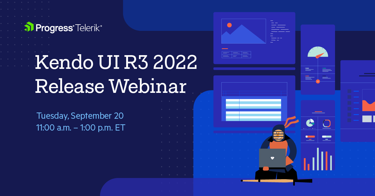
Tuesday, September 20, 2022 | 11:00 a.m. – 1:00 p.m. ET
Discover all updates across KendoReact and Kendo UI for Angular, Vue and jQuery.
Join Us on Twitch Today

Live from Devreach’22 @ Progress360: Join the live community session from the Progress360 Streaming Studio on September 14 from 10 a.m. – 11:30 a.m. ET to hear the release highlights and celebrate the DevReach spirit with us at our Livestream Release Party.
And the Best Part About the Release Webinars?
The live webinars and Twitch sessions are a great opportunity for you to ask questions before and during the webinars. We’ll be waiting to hear from you on Twitter—just use the #heyTelerik and #heyKendoUI hashtags. Another great option is the live chat during our release session on CodeItLive, our Twitch channel.

Carl Bergenhem
Carl Bergenhem was the Product Manager for Kendo UI.
Related Posts
Comments
All articles
Topics
Web MobileMobile
Desktop
Design
Productivity
People
