
What’s New in R3 2022 With Telerik UI Web Components

Summarize with AI:
R3 2022 brings exciting updates to your favorite Telerik web components, including a new Fluent theme, support for the latest .NET 7 preview and accessibility enhancements.
- Common Telerik Web R2 2022 Release Items
- Telerik UI for Blazor
- Telerik UI for ASP.NET Core and Telerik UI for ASP.NET MVC
- Telerik UI for ASP.NET AJAX
Common Telerik Web R3 2022 Release Items
New Fluent Theme Across Telerik and Kendo UI
With R3 2022 we are excited to announce that the new Fluent theme is officially available for Telerik and Kendo UI libraries and their web UI components! Just like our other themes, the new Fluent theme follows the guidelines of the official Fluent Design System to let all ASP.NET MVC, ASP.NET Core, Blazor, jQuery, Angular, React and Vue UI components immediately be styled with the Fluent Design System just by including the new theme.
If you are already using Fluent-themed components in your web applications today, with the Fluent theme added, any of the Telerik and Kendo UI components will seamlessly fit in.

Compatibility With .NET 7 Latest Preview Release
For those of you eager to try out the latest and greatest by Microsoft, we are happy to announce that the Telerik UI for Blazor and Telerik UI for ASP.NET Core libraries are compatible with the latest .NET 7 Preview 7. Our goal is to provide full support for .NET 7 as soon as Microsoft releases it this November.

Accessibility Enhancements
A major focus in R3 2022 for all Telerik Web UI components was further improving the accessibility compliance level and available documentation and demos that can be used for reference points or direct A11Y testing. For each of the Telerik UI products, we have added a dedicated section below which outlines the specific items in the release.

New Telerik Document Processing Features
With R3 2022, we’ve released new features across all Telerik Document Processing libraries to help you better navigate your document formats. The new features include:
Updates in WordProcessing Library
- Page Numbering fields: In addition to the filed codes support, we have now added a functionality that allows you to update the PAGE, PAGEREF, NUMPAGES and SECTIONPAGES fields and easily calculate their result.
- Shapes support: The shapes feature allows you to easily insert, style and interact with existing shapes like circles, boxes, arrows and many others directly in your documents.
Updates in SpreadProcessing Library
- Repeat specific rows or columns on every printed page: You can easily specify a row or a column that will be repeated on every printed page.
Updates in SpreadStreamProcessing Library
- SpreadStreamProcessing import: You can now read large XLSX or CSV files without loading the entire document in memory.
Updates in PdfProcessing Library:
- PdfProcessing Signature flags support: With this new functionality, you can specify that there is a signature, even if the signature itself does not have a visual representation.
- Export PDF pages to images: We have added the ability to convert the pages of a .pdf document to images. This feature will work with the .NET Standard version and does not depend on any Windows libraries.

Telerik UI for Blazor
Telerik UI for Blazor continues to grow and improve, and we are happy to share that we now offer 100 native Blazor components! The new additions in R3 2022 include PDFViewer, MultuColumnComboBox and Skeleton components; accessibility improvements; new scaffolding and code snippets and Visual Studio—plus dozens of advanced features across all UI for Blazor components.
New Blazor PDFViewer Component
The new UI for Blazor PDFViewer component is certainly one of the highlights of R3 2022 release. It allows users to view and interact with PDF files directly in the browser without the need to download the file or use third-party tools or browser extensions.
The PDF Viewer for Blazor comes with a toolbar with built-in features to open, view, and download PDF files, paging, PDF search options, zoom in/out, printing and more. You can further customize the built-in toolbar commands and add your own, such as including a watermark or sending via email.
See the UI for Blazor PDFViewer component demo.

New Blazor MultiColumnComboBox Component
The new UI for Blazor MultiColumnComboBox component comes with a rich set of built-in features and options to customize its look and feel, including data binding, filtering, grouping, rendering of custom content through templates, appearance configuration, input of custom values, validation, built-in localization of messages, accessibility and keyboard navigation. With the help of the MultiColumn ComboBox, users can easily choose values from a predefined list in a table-like structure and type input in it.
See the UI for Blazor MultiColumnComboBox component demo or try out the component in the Telerik Blazor REPL browser-based code runner.

New Blazor Skeleton Component
Skeletons are widely used as hints to the users that the page content is being loaded. With the Telerik UI for Blazor Skeleton component you can easily achieve such behavior and render a placeholder for each of the underlying HTML elements in a component or page. It includes customization options for its shape (text, circle or rectangle), height, width, animation type (pulse or wave), visibility and CSS class.
The UI for Blazor Skeleton allows seamless integration with other Blazor UI components, such as Data Grid. This allows you to easily mimic grid with rows while data loading takes place.
See a demo of the UI for Blazor Skeleton component or try it out in Telerik REPL for Blazor.

Accessibility Improvements in Telerik UI for Blazor
In Telerik UI for Blazor, we specifically addressed the WAI-ARIA best practices for implementing keyboard navigation for multiple components, tested against the popular screen readers, implemented the recommended rendering related to various WAI-ARIA attributes, and worked toward aligning with WCAG 2.1 AAA and Section 508 compliance standards.
The UI for Blazor components that received accessibility boost in R3 2022 include Blazor Data Grid, TreeList, TreeView, PanelBar, Stepper, Wizard, Pager, DateInput, Calendar, DateRangePicker, DatePicker, TimePicker, DateTimePicker, Drawer and Breadcrumb.
Accessibility-Focused Demos & Docs
In addition to updating our UI for Blazor components, with R3 2022 the Telerik Blazor team has created accessibility-specific demos that can be used to test any of our Blazor UI components with screen readers and other software used to test accessibility.
Previously, whenever teams needed to run accessibility tests on Telerik UI for Blazor components, they would have to do so locally, which required dedicated developers to set up the perfect configuration. Now, any team member who needs to run tests with screen readers or other software for accessibility testing can do so by visiting the respective online demo. Additionally, we have added a WAI-ARIA Support article for each of the components that lists the respective attributes and usage.
Enhancements to Blazor DataGrid and TreeList Components
The Blazor Grid and TreeList UI components come with the following new features:
Drag & drop between Data Grid, TreeList and TreeView
This allows users to drag items from any of these components to any other of them plus Gantt and Scheduler. That is—in addition to the option drag and drop of items between
instances of the same component, which has been available for quite some time.
The existing Drop event will be triggered as the current one but with two additional event parameters (DestinationIndex(string) and DestinationComponentId(string)) and a new method called GetTimeSlotFromDropIndex. These updates will allow users to determine the drop destination inside any of the receiving components and ensure the corresponding item in the destination component can be returned.
HeaderClass parameter
This allows you to define custom CSS classes for the column header cells and easily bold their text,
change their alignment or style them to make them stand out.

FilterOperators parameter
This parameter can be applied on a per column basis and lets you customize the list of filter operators within the filter row and menus.
FilterEditorFormat parameter
This one allows control over the format of the default filter and align the formatting of values in the column display and filter editor.
Enhancements to Blazor Gantt Component
Based on your feedback, we expanded the UI for Blazor Gantt component to give you greater flexibility and more customization options.
Blazor Gantt State Management
The Telerik UI for Blazor Gantt component now allows persisting its state between browsing sessions. You can save and load the Gantt layout so your users can continue where they left off. That includes all types of changes in the TreeList part of the Gantt component: extended items, edited items, column size and order, TreeList size (controlling the splitter position between the tree list and timeline parts), sorting and filtering. You can also control these elements programmatically by setting the desired state of the Gantt in your own code.
See how to save and load Blazor Gantt UI component state.

Blazor Gantt Rebind Method
The new Rebind method in the Telerik Blazor Gantt component allows you to easily trigger data processing logic in the TreeList and Timeline parts so that the UI reflects changes made in the data collection.
Blazor Gantt ToolTip Template Customization
The Blazor Gantt component tooltip template now includes StartDate and EndDate fields that include all relevant parts of a task’s date (year, month, day, hours, minutes, etc.). The new date parameters are formatted according to the ISO 8601 standard and can be easily parsed as C# DateTime objects. This will help you transform and format the task dates to any format that is required in your Blazor applications
Blazor Gantt New Parameters
The FilterEditorFormat parameter of the Blazor Gantt component allows control over the format of the default filter. That way you can align the formatting of values in the column display and filter editor.
With the FilterOperators parameter you can customize the list of filter operators within the filter row and menus of the TreeList part in the Gantt component.
Header Template in Multiple Blazor Components
Using the new header templating feature, you can customize the content rendered in the Blazor Calendar, DatePicker and DateRangePicker component’s header. Within the <HeaderTemplate> tag, you add render buttons, images or apply custom styling.

Customization of the Filter Default Operator
The new DefaultOperator parameter of the Blazor Filter component allows you to customize the default filter operator on a per-field basis (the filter that is preselected each time you add a new field). If it is left unassigned, the default operator will be set based on the data type.
Visual Studio Productivity Tools
R3 2022 brings a large set of developer productivity features for working within Visual Studio. You can now speed development, configuration and upgrades in applications built with UI for Blazor components. The latest release of Visual Studio Productivity Tools for Telerik UI for Blazor includes the following list of enhancements:
- UI for Blazor Visual Studio Scaffolder – brings quick scaffolding and data mocking for the most used data-bound components: the Data Grid, TreeList, Scheduler, Chart, ListView, Gantt, Form, Drawer, Menu, DropDownList, Upload, ComboBox and more.

UI for Blazor Code Snippets Pack – boosts coding speed by allowing fast reference to UI components. You can type a shortcut (e.g., “tb” for Telerik Blazor) or directly the name of the component you need to plug. For example, typing “grid” or just “gr” will conveniently show a dropdown with the available snippet templates you can insert into your code.
Visual Studio Upgrade Wizard – simplifies Telerik UI for Blazor version upgrades, includes updates to theme versions, and smooths transition from a trial to a license version of the product.

- Visual Studio Configuration of Projects – helps with the configuration of already existing Telerik UI for Blazor applications via a wizard, and includes settings like visual theme, use of CDN and localization.
New ThemeBuilder and ThemeBuilder Pro
Progress ThemeBuilder has long been a popular tool for developers using Telerik and Kendo UI to customize the style of their components without having to write CSS. It has now been rebuilt for better performance and other productivity features such as the ability to save work and reuse it for multiple projects. For those who want to take customization of the Telerik UI for Blazor components to the next level, we are also introducing ThemeBuilder Pro!
For a full breakdown in what’s new with the ThemeBuilder and what ThemeBuilder Pro includes, read the ThemeBuilder announcement blog post.

Native Blazor Report Viewer
We are happy to announce that those of you who use Telerik UI for Blazor and need to implement reporting in your Blazor applications, our friends from the Telerik Reporting team have just shipped a brand-new native Blazor Report Viewer control.
The native version of the report viewer component brings a fluent user experience that blends with the rest of your Blazor application by using the same input controls and styling mechanism.
The first version of the Telerik Blazor Report Viewer component includes all the core functionalities for previewing interactive reports which will be further developed to include features such as Search and navigating back from a drill-through action.

Telerik REPL for Blazor Updates
The Telerik REPL for Blazor received multiple updates and improvements—it now includes a new playful loading animation, adaptive layout and support for different version of Telerik UI for Blazor.

We ensured the REPL is responsive—you can now adapt, run and share code snippets seamlessly from smaller screen devices.

Users are now able to change the underlying version of Telerik UI for Blazor when using the REPL and compile and render code using the selected version. Each Telerik UI for Blazor version comes with its package and static asset dependencies, allowing the user to use currently available swatches for each of the versions.

Check out the latest updates in the Telerik REPL for Blazor now!
Multiple New Parameters in FileSelect and Upload Components
We exposed multiple parameters to enable further flexibility when working with the FileSelect and Upload components in Blazor applications. The new parameters include:
- Id – allows you to associate the component with
<label>tags and perform further references and checks - Accept – easily configure which files should be visible in the browser’s file select dialog
- Capture – renders as a capture HTML attribute of the
<input type="file" />and enables direct usage of the device camera instead of the file system
OnOpen and OnClose Events in Multiple Blazor Components
The following list of UI for Blazor components are expanded with OnOpen and OnClose events: AutoComplete, ColorPicker, ComboBox, DatePicker, DateRangePicker, DateTimePicker, DropDownList, MultiSelect and TimePicker.
The OnOpen/OnClose events are triggered right before the underlying popup component is shown or hidden regardless of how the open/close is initiated—keyboard, mouse click or value change.
Responsiveness and Adaptive Blazor Layout
Throughout 2022 we have added multiple responsive features to the components (responsive Pager, Toolbar and scrollable TabStrip) and added some additional resources to demonstrate how you can easily make Blazor components and apps responsive to different screen sizes using the UI for Blazor MediaQuery component:
- How to make responsive Menu components in Blazor Applications
- How to make responsive Forms in Blazor Applications
- How to make responsive Grid Layout in Blazor Applications
You can also review a dedicated blog post on the topic of Responsive Blazor Layouts, and in R1 2023 we further plan to develop more adaptiveness and updated design for UI for Blazor DatePicker and select UI components.

Updated Blazor Coffee Demo App
If you are in the beginning of your journey with Blazor and Telerik UI for Blazor, check out for ideas and inspiration the updated demo app Blazor Coffee Warehouse. We updated the already existing application and have included examples of some of the most popular UI for Blazor components such as the Data Grid, Drawer, Charts, Inputs, Form and more. The app also demonstrates how users can easily change the theming and apply localization in Blazor apps.

Telerik UI for ASP.NET Core and Telerik UI for ASP.NET MVC
CDN Licensing
The way Telerik UI for ASP.NET Core and UI for ASP.NET MVC are licensed undergoes an important change in this release. R3 2022 introduces the requirement to add a license key whenever using the CDN to reference any Kendo UI for jQuery JavaScript and CSS files. Although the license key mechanism will not break any builds, it serves as a verification step, acknowledging that you are a licensed user. Applying a license key will be as simple as adding a single line of code to your project(s) and you can reference the dedicated resources on how to quickly set it up in your code:
Adding license code in UI for ASP.NET Core
Adding license code in UI for ASP.NET MVC
Signature UI Component

The new Signature component in Telerik UI for ASP.NET Core and MVC enables end users to draw a signature using a mouse or touch device. The key features that users can take advantage of to customize their signatures and adapt them to their needs include different canvas options, stroke width, size, color, background configuration, read-only state and more.
As an alternative to drawing, the Signature component also allows uploading of existing image format. For completeness of the use case of placing a signature in web applications, we have also included handy “Save As” and “Clear” buttons.
See UI for ASP.NET Core Signature component demo.
See UI for ASP.NET MVC Signature component demo.
DropDownButton UI Component
The new DropDownButton component in Telerik UI for ASP.NET Core and MVC renders as a button that opens a popup list of action items. The DropDownButton component supports icons, images, data binding, keyboard navigation, accessibility and multiple appearance customization options.

See the UI for ASP.NET Core DropDownButton component demo.
See the UI for ASP.NET MVC DropDownButton UI component demo.
SplitButton UI Component
The new SplitButton in Telerik UI for ASP.NET Core and MVC gives users a choice to execute the default button action or choose a secondary command from a related dropdown list. The SplitButton eliminates the need for multiple adjacent buttons, simplifies the application UI and saves screen real estate. It comes with built-in support for icons, multiple sizes, fill mode, theme color, disabling items, RTL support, keyboard navigation, accessibility and multiple UI customization options.

See the UI for ASP.NET Core SplitButton component demo.
See the UI for ASP.NET MVC SplitButton UI component demo.
Accessibility Improvements
The list of the UI components that we enhanced in Telerik UI for ASP.NET Core and MVC is long so here we will mention just the highlights: Drawer, Breadcrumb, TabStrip, TreeView, Pager, Editor, Toolbar, DateTimePickers and more.
Beyond updating our UI components to comply with Section 508, WCAG 2.1, and WAI-ARIA standards, R3 2022 introduces accessibility-specific demos that can be used to test any of our ASP.NET Core & MVC components with screen readers and other software used to test accessibility. Anyone who needs to run accessibility tests on Telerik UI for ASP.NET Core components can do so by visiting a public URL. The same option is also available for MVC flavor of Telerik UI components.
DataGrid Features and Enhancements
R3 2022 includes several Data Grid UX improvements such as adding a configuration option for enabling/disabling column menu as well as grouping and sorting enhancements.
Enable/Disable Column Menu on a Per-Column Basis
Enabling and disabling the Data Grid’s column menu is now available out of the box on a per-column basis. With this new configuration option, developers have full control
over which columns should display a column menu.
See how to configure the UI for ASP.NET Core Grid column menu.
See how to configure the UI for ASP.NET MVC Grid column menu.
Hide Currently Grouped Column
Another Data Grid feature added in R3 2022 is the option to hide the column or field which is currently being grouped. Previously, every time a column was grouped, the column would always be displayed,
which was not ideal for all the Grid use cases. The new option to hide columns/fields that are being used for grouping ensures flexibility for the .NET developers and smoother experience for the end user.
See how to hide the currently grouped column in UI for ASP.NET Core Grid.
See how to hide the currently grouped column in UI for ASP.NET MVC Grid.
Fire Change Event Only When Row Select and Deselect Are Performed Within Multiple ASP.NET Core Components
In this release, we ship another improvement to anyone dealing with the onChange event when using the select functionality of the Telerik UI components. Previously, this event could be triggered when interacting with rows even when selecting
or deselection did not occur. Now onChange event will only fire when a row is selected and deselected
The new behavior and change apply to following ASP.NET Core and MVC UI components—Grid, Calendar, MultiViewCalendar, Listbox, ListView, TreeList, FileManager, Gantt.
PivotGrid v2 Local Data Binding
The local binding feature allows you to populate the Telerik PivotGrid v2 for ASP.NET Core and MVC with local flat data. When the component is configured for local binding, it will serialize the data as part of its data source and perform all data operations on the client. Now you can choose the preferred way to bind data to the PivotGrid: data located on a server somewhere (remote using OLAP) or through local binding.
For those unfamiliar, earlier this year the Telerik UI team released the new and revamped PivotGrid v2 component with a better user experience and design, overall improved performance, and more. Since the new PivotGrid component is being built from the ground up and PivotGrids are quite complex, we wanted to offer both editions of the PivotGrid (old and new) while we build out features in the new PivotGrid v2.
See how to use local binding in the ASP.NET Core PivotGrid UI component.
See how to use local binding in the ASP.NET MVC PivotGrid UI component.

Telerik UI for ASP.NET MVC & Core API Improvements
We are undertaking the effort to make improvements to the product’s API in the next several releases. The goal is to address feedback we received regarding the level of details, descriptions and examples included in the API. With the current release, we have implemented improvements to several of the most used components—DataGrid, DropDownList, DatePicker, DateRangePicker, Data Source and Window. We will continue with the UI for ASP.NET Core and MVC API improvements throughout 2023.

UI for ASP.NET Core Visual Studio Productivity Tools

The latest release of Visual Studio Productivity Tools for Telerik UI for ASP.NET Core includes the following list of new productivity features:
- UI for ASP.NET Core Visual Studio Scaffolder – allows quick scaffolding and mocking of data for some the most used data-bound components, such as the ASP.NET Core Data Grid, TreeList, Scheduler, ListView, Gantt, Chart, Form and Editor.
- UI for ASP.NET Core Code Snippets Pack – boosts coding speed by allowing fast reference to UI components. By typing a shortcut (e.g., “tc” for Telerik ASP.NET Core) or directly the name of the component you need to plug. For example, typing “grid” or just “gr” will conveniently show a dropdown with the available snippet templates for both HTML and TagHelpers which you can insert into your code.

UI for ASP.NET Core TagHelper Snippets
Telerik UI for ASP.NET Core offers HTML and TAG helpers options for initializing and configuring the UI components. Based on your feedback regarding the need for more TAG Helper demos and documentation, we made sure that there is a complete parity between all examples of the HTML and TAG Helpers, and you can now easily switch the component demos and documentation between HTML and TAG Helper View.

Telerik UI for ASP.NET AJAX
Floating Action Button
UI for ASP.NET AJAX continues to grow, and in this release we included a brand-new Floating Action Button component (FAB). The FAB appears on top of all page content and presents the user with the primary action. When clicked, it either executes that action or shows additional action items. The UI for ASP.NET AJAX FloatingActionButton includes multiple configuration options for alignment, color, size and shape, plus the option to customize its content via templates.
See the UI for ASP.NET AJAX Floating Action Button Component.

Accessibility Improvements
With R3 2022, we’ve focused on further improving the components accessibility compliance. The release includes more than 30 accessibility fixes and improvements in multiple components— Calendar, Scheduler, ComboBox, DropDownList, Editor, FileExplorer, Input, DatePicker, DateRangePicker, Prompt, SearchBox, Spell, TabStrip, Window, Wizard, RadGrid, Filter, Splitter and more.
See the UI for ASP.NET AJAX Accessibility Compliance page for more details.
Updated VPAT Document
Along with the accessibility fixes and improvements, we have updated the existing Voluntary Product Accessibility Template (VPAT) for Telerik UI for ASP.NET AJAX. Now the document follows the latest version and include the latest accessibility improvements that have been made to our UI components. The latest version of the VPAT document is available here.

Release Webinar & Twitch Session
Telerik .NET Web, Desktop & Mobile Products Webinar
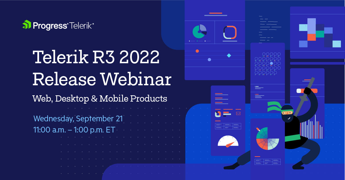
Wednesday, September 21, 2022 | 11:00 a.m. – 1:00 p.m. ET
Discover all updates across Telerik UI for Blazor, UI for ASP.NET Core, UI for ASP.NET MVC, UI for ASP.NET AJAX, UI for WPF, UI for WinForms, UI for WinUI, UI for
Xamarin and UI for .NET MAUI.
Join Us on Twitch Today
Live from Devreach’22 @ Progress360: Join the live community session from the Progress360 Streaming Studio on September 14 from 10 a.m. – 11:30 a.m. ET to hear the release highlights and celebrate the DevReach spirit with us at our Livestream Release Party.
And the Best Part About the Release Webinars?
The live webinars and Twitch sessions are a great opportunity for you to ask questions before and during the webinars. We’ll be waiting to hear from you on Twitter—just use the #heyTelerik and #heyKendoUI hashtags. Another great option is the live chat during our release session on CodeItLive, our Twitch channel.

Maria Ivanova
Maria Ivanova is a Manager of Product Management at Progress, for Telerik and Kendo UI components and developer tooling. She joined the company in 2019 as a Product Manager for Telerik UI web components and is passionate about developing impactful and innovative software products. Maria believes that to create great products, it's important to challenge the status quo, closely collaborate with customers, and embrace a spirit of experimentation.
Related Posts
Comments
All articles
Topics
Web MobileMobile
Desktop
Design
Productivity
People
