Telerik UI for Blazor Is Heading on a Responsive Journey

Summarize with AI:
Telerik UI for Blazor has built-in responsive and adaptive capabilities on many components, with even more to come. Let’s take a look!
Responsive and adaptive capabilities have become the de facto standard when designing and building web applications. People no longer use their mobile phones and devices to just browse, but to get their personal and professional job done anytime and anywhere. Whether it’s ordering food, shopping, checking and updating the status of work items, submitting requests or performing transactions, web apps need to look equally good and function just as well regardless of the device and screen size.
What Are Responsive Web Applications?
Responsive web designs are the ones that can accommodate different screen sizes, so the visualized content and user experience are great everywhere—from the smaller screens on mobile to the larger ones on tablets, desktops and even big TV screens. On a foundational level, responsive web design uses fluid grid systems, fluid images and media queries. These ensure that the layout and the content of the website or app alter and adapt when certain conditions are met.
Do We Need Responsiveness & Adaptability in Blazor Applications?
With the growing popularity of the Blazor framework for building web applications for various scenarios and verticals, the respective design and behavior need to comply with the demands of modern times and users. In this blog post, we will dive into the capabilities of the Telerik UI for Blazor library and how it enables and supports your development efforts for designing and building responsive and adaptive Blazor projects.
How To Build Responsive Web Applications With Telerik UI for Blazor
There are many components, properties and options in the Telerik UI for Blazor library that will enable you to build responsive apps—the Blazor MediaQuery component, adaptive parameters in Pager and Toolbar, scrollable tabs in the TabStrip component, responsive GridLayout and more. Let’s review the different options and the use cases when they can be applied.
The Telerik Blazor MediaQuery Component—Our Magic Wand
The Blazor MediaQuery component is a powerful tool for creating a responsive and adaptive design. It allows you to define media queries and change the layout of your page based on the screen resolution.
MediaQuery lets you change component settings, render different components or prevent components from rendering at all depending on the browser viewport size. This allows you to make your Blazor application rendering much more adaptive. Still, in cases where you don’t need to affect the components and their settings, you can still use responsive CSS and HTML rendering for the overall page layout.
Compact Data Grid Layout in Blazor Apps
Let’s have a quick peek at how the MediaQuery component integrates with the Blazor Data Grid component to help you achieve a compact grid layout on smaller resolutions.
In the Telerik Blazor demo site, we have illustrated how you can toggle the visibility of the columns when a media query is matched. The only thing you need to do is to define the media parameters and take advantage of the reactivity of the Visible parameter of the GridColumns … and the magic is done!
<TelerikGrid Data="@GridData"
             Width="100%"
             Height="400px"
             Sortable="true"
             Pageable="true">
    <GridColumns>
        <GridColumn Field=@nameof(ProductDto.ProductId) Width="60px" Title="ID" />
        <GridColumn Field=@nameof(ProductDto.ProductName) Title="Product Name" />
        <GridColumn Field=@nameof(ProductDto.UnitPrice) DisplayFormat="{0:C2}" Title="Price" />
        <GridColumn Field=@nameof(ProductDto.UnitsInStock) Visible="@(!XSmall)" Title="In stock" />
        <GridColumn Field=@nameof(ProductDto.QuantityPerUnit) Visible="@(!XSmall)" Title="Quantity per unit" />
        <GridColumn Field=@nameof(ProductDto.Discontinued) Visible="@(!XSmall)" Title="Discontinued" />
        <GridColumn Field=@nameof(ProductDto.CategoryName) Visible="@(Medium || Large)" Title="Category Name" />
        <GridColumn Field=@nameof(ProductDto.CategoryDescription) Width="230px" Visible="@Large" Title="Category Description" />
    </GridColumns>
</TelerikGrid>

<TelerikMediaQuery Media="(max-width: 600px)" OnChange="((changed) => XSmall = changed)"></TelerikMediaQuery>
<TelerikMediaQuery Media="(max-width: 960px)" OnChange="((changed) => Small = changed)"></TelerikMediaQuery>
<TelerikMediaQuery Media="(min-width: 961px)" OnChange="((changed) => Medium = changed)"></TelerikMediaQuery>
<TelerikMediaQuery Media="(min-width: 1200px)" OnChange="((changed) => Large = changed)"></TelerikMediaQuery>

@code {
    public IEnumerable<ProductDto> GridData { get; set; }

    private bool XSmall { get; set; }
    private bool Small { get; set; }
    private bool Medium { get; set; }
    private bool Large { get; set; }

protected override void OnInitialized()
    {
        GridData = productService.GetProducts();
    }
}
You can play with the example in our browser-based Blazor code runner Telerik REPL.
More information about the UI for Blazor MediaQuery component can be found on the demo and documentation sites.
Responsive Form in Blazor Apps
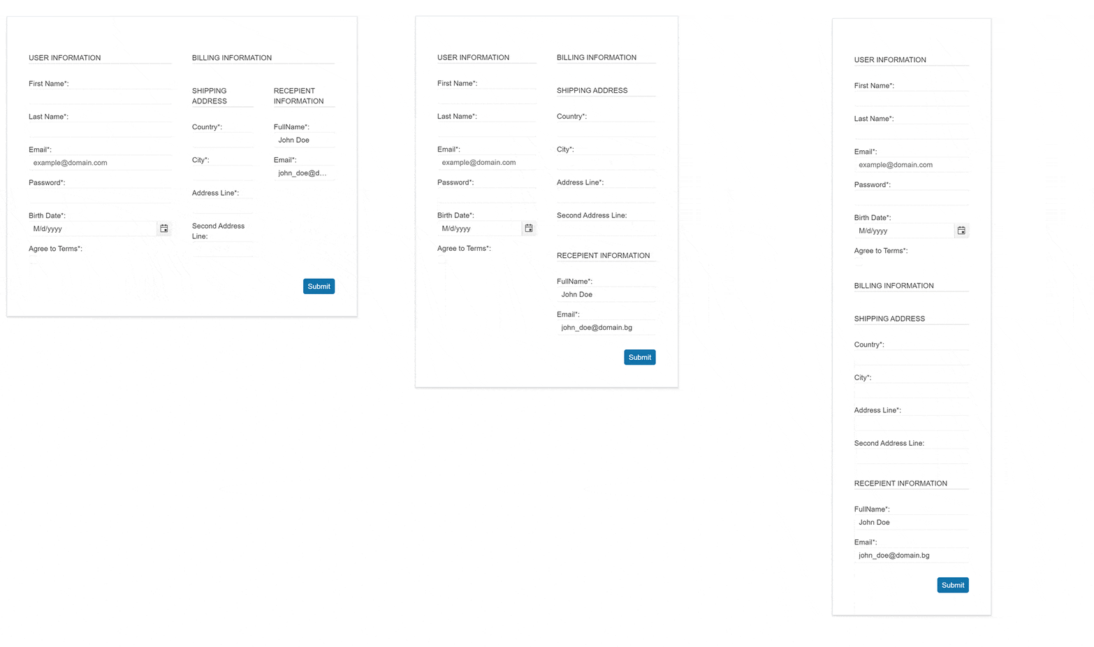
Another commonly used responsive scenario by our customers is the combination of the Blazor Form and MediaQuery UI components. The Form provides flexible configuration parameters that allow to be toggled when the resolution change. Let’s see the behavior of the responsive form below, and you can always jump into adaptive Blazor Form example in our demo site to explore it further.

Change Menu to a Drawer Component in Smaller Resolutions
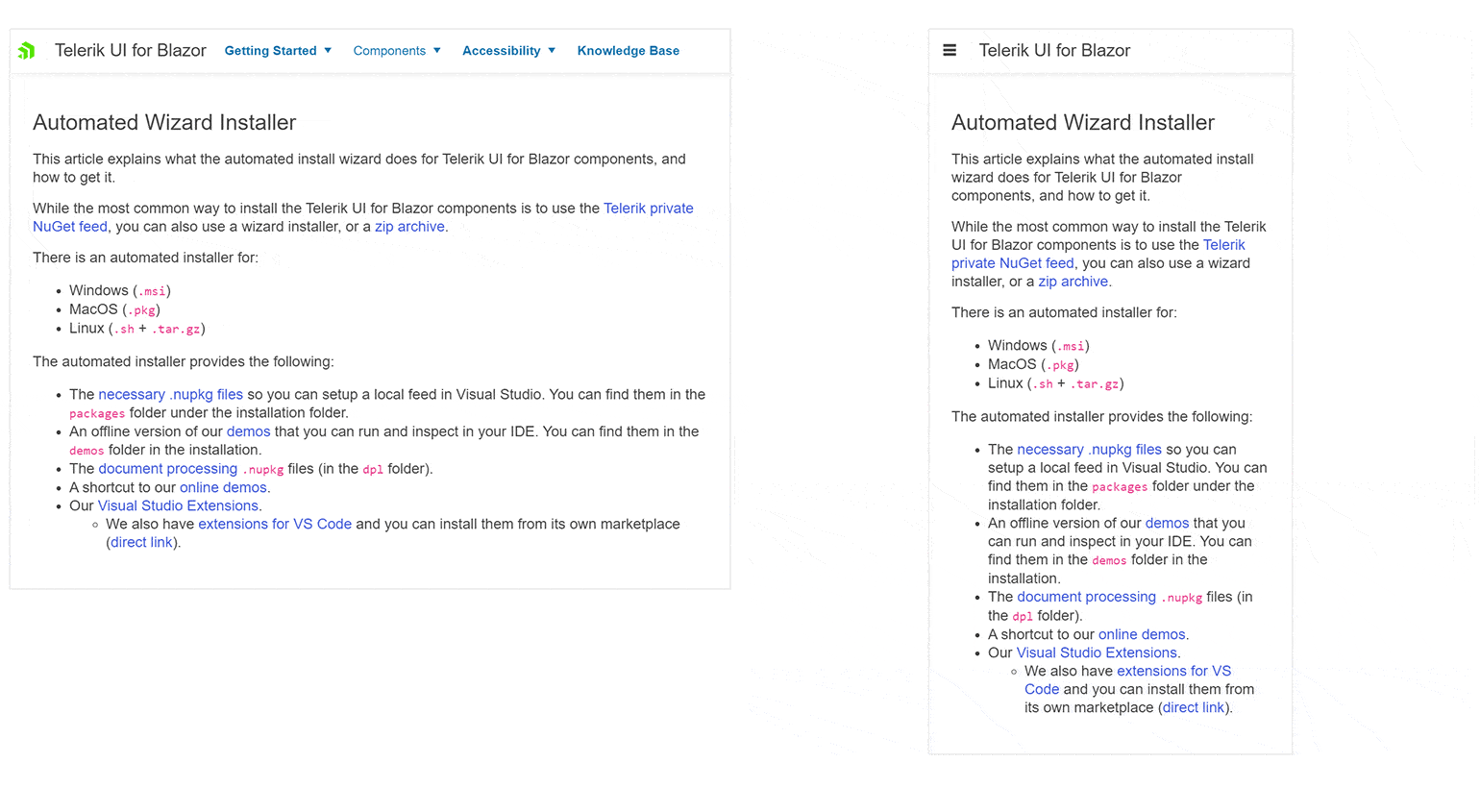
In the next GIF, we are demonstrating our new example combining the superpowers of the Menu, Drawer and MediaQuery components. It shows how the horizontal layout of the Blazor Menu UI component smoothly transitions into a vertical hamburger menu implemented with the help of the Blazor Drawer component.

If you are curious to learn more about how we combined the Blazor Drawer and Menu components, visit adaptive Blazor Menu demo sample.
Responsive GridLayout in Blazor Apps
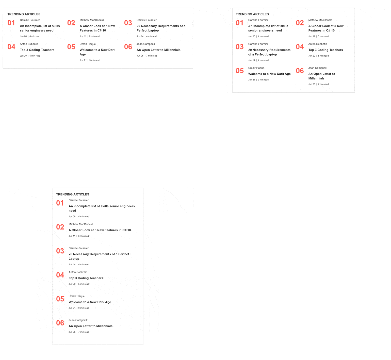
One more curious integration example is the one of GridLayout and MediaQuery components. Below you can see how the GridLayout updates its columns and rows definitions to provides a nice layout for listing articles in any resolutions.

The GIF captures our adaptive Blazor GridLayout demo in action.
Built-in Adaptiveness in Telerik UI for Blazor
We can write tons of pages about all the opportunities that the MediaQuery component brought to the Telerik UI for Blazor suite! But let’s move on to the adaptive capabilities that our components provide out of the box.
Adaptive Blazor Pager
After we looked into compact data grid capabilities, I would like to bring to your attention the adaptive capabilities of an important inner part of the component—the Pager. Our 3.2.0 release is shipped with an adaptive parameter for the UI for Blazor Pager that controls whether to make the component resizable in smaller resolutions.
Look at the capabilities of the pager in the embedded snippet below or edit it directly in the Blazor REPL tool. The built-in Blazor Pager capabilities allow the component to hide and optimize the rendered elements when its width is decreased. In the smallest resolution, the buttons of the pager are rendered as a select element.
Adaptive Blazor ToolBar
The adaptive feature of the BlazorToolbar UI component is another huge piece of the “responsive puzzle.” When resized, the toolbar
brings a user-friendly overflow popup menu that renders the tools that cannot fit in the width of the toolbar container. Additionally, the Overflow parameter of the ToolBar items allows you to control which items should move to
the overflow popup and which should remain permanently visible.
Try it out in the embedded playground below or edit in our REPL.
Scrollable TabStrip
The Blazor TabStrip UI component is one of the most popular components of our library. The Scrollable feature of the tab component renders right and left navigation buttons on demand based on the width of the TabStrip. It allows the tabs to be scrolled via mouse or keyboard interaction. The following snippet shows the beauty of the feature, and you can extend it further in the REPL link.
Where Do We Want To Go?
We are working on a whole new design for our Blazor DatePicker and select UI components on smaller resolutions that will be a huge chapter in the UI for Blazor responsive story.
Stay tuned and see what the next versions of Telerik UI for Blazor will bring!

Joana Ivanova
Joana Ivanova has been part of Progress for 10 years. She started her career in the company as a QA Engineer, then changed the track to Software Engineer, and today she is the Manager of the Telerik UI Blazor Team. She is passionate about workflow optimizations, improving productivity and programming. In her spare time, Joana loves playing pool, dancing, driving anything on wheels, hiking and traveling.

