
What’s New in R2 2022 With Telerik UI Web Components

Summarize with AI:
The Telerik Teams at Progress are excited to announce that the R2 2022 release is available for download! We have worked hard in the last few months to bring you new UI components, features, productivity tools and extensions, dark mode in demos and docs, a new accessibility swatch and so much more!
Let’s dive in and review what’s new across the board, plus product-specific release items for:
- Common Telerik Web R2 2022 Release Items
- Telerik UI for Blazor
- Telerik UI for ASP.NET Core and Telerik UI for ASP.NET MVC
- Telerik UI for ASP.NET AJAX
Common R2 2022 Items in Telerik UI for Web
Dark Mode for All Docs & Demos
Today we can announce an exciting update across several products that the Telerik and Kendo UI teams have worked hard on over the last couple of months—the ability to toggle between light and dark modes within our documentation and demos!

When navigating through any of our web-based UI component library resources, you will see a toggle switch in the top-right corner of your screen. Interacting with this element will let you switch between dark mode and light mode.
New Ocean Blue Swatch
With the latest update, the Telerik and Kendo UI teams researched how we could improve the accessibility of all our components out of the box by making changes to the look and feel of the components. Specifically, we looked at the Telerik and Kendo UI Default theme to see how we could improve accessibility levels by focusing on aspects like contrast, which are very important in accessibility scenarios.
This research effort led to the new Telerik and Kendo UI Default Ocean Blue swatch. Rather than the traditional orange color of the Default theme, the Ocean Blue swatch offers blue as the primary color.
 The goal of this swatch is to let Telerik UI users immediately see a boost in accessibility compliance by using this swatch. While the Telerik and Kendo UI components already adhere to a high level of compliance, using this
swatch will help improve accessibility compliance even further.
The goal of this swatch is to let Telerik UI users immediately see a boost in accessibility compliance by using this swatch. While the Telerik and Kendo UI components already adhere to a high level of compliance, using this
swatch will help improve accessibility compliance even further.
This update is available in all our Telerik and Kendo UI web components except ASP.NET AJAX. To see the new accessibility swatch in action, visit any of the online demos for the web-based UI component libraries.
Productivity Tools in Visual Studio Code
With the growing interest and usage of Visual Studio Code, we introduced the Telerik Visual Studio Code Extensions for Blazor and ASP.NET Core about a year ago, and we have continuously added new features and templates to it with the goal of helping web developers set up and build apps faster.
That led us to the natural next step to transform the initially simple project wizard into Progress® Telerik® UI for Blazor and Telerik® UI for ASP.NET Core Productivity Tools. For each of the Telerik products, there is a dedicated extension within VS Code that will include handy developer features for fast UI component reference, configuration and usage. At the time of the R2 2022 release, the productivity tools include: project templates with Telerik UI components, scaffolding, code snippets, convert command and a “share to REPL” feature.
Check out the Visual Studio Productivity Tools for Telerik UI for Blazor and UI for ASP.NET Core.

Compatibility With .NET 7 Preview 4
For those of you eager to try out the latest and greatest by Microsoft, we are happy to announce that the Telerik UI for Blazor & Telerik UI for ASP.NET Core libraries are compatible with the latest .NET 7 Preview 4.

New Features in Telerik Document Processing
In the R2 2022 release, we have something new for those of you who are using Telerik Document Processing within their Blazor, ASP.NET Core, MVC and WebForms apps!
In the latest distribution package, you will find several of the most-wanted items from our Feedback Portal, such as:
- Insertion and deletion of comments (SpreadProcessing): Allows adding rules used during cells visualization and applies formatting depending on their values.
- Implementing cell reference to whole columns (SpreadProcessing)
- Support for Type 3 fonts in PDFProcessing

Telerik UI for Blazor
Telerik UI for Blazor continues to grow and improve and we are happy to share that we now offer nearly 100 native Blazor components! The new additions in R2 2022 include FileManager, Filter, FloatingLabel and SplitButton components, plus dozens of advanced features and brand-new functionality within Visual Studio Code.
New Blazor FileManager UI Component
One of the release highlights of R2 2022 is the Telerik UI for Blazor FileManager component. It eases the process of managing files and folders, and most common folder/file operations. The File Manager (also known as File Explorer) provides easy navigation for browsing and selecting folders and files from the file system and managing them in your Blazor apps. The FileManager comes with a toolbar with predefined commands, three panes for viewing and previewing content, a context menu for the file list, and built-in localization.

New Blazor Filter UI Component
The new Blazor Filter component allows users to build filter expressions with multiple logical operators which can be applied to any data-bound component such as Grid, ListView and TreeList. Like the rest of Telerik Blazor UI components, the Filter comes with built-in accessibility, keyboard navigation, localization and professionally styled themes.
See how the Blazor Filter component works in Blazor REPL.
New Blazor FloatingLabel UI Component
The Telerik Blazor Floating Label component lets you take advantage of floating labels in focusable Telerik input components such as NumericTextBox, TextBox, TextArea, DateTime Inputs & Pickers, DropDownList, ComboBox, AutoComplete, MultiSelect and MaskedTextBox.
The Floating Label adds features on top of the HTML <label> element such as animation, association with non-form elements, and combination with the input’s placeholder.
See the Telerik Blazor FloatingLabel in Blazor REPL code runner.

New Blazor SplitButton UI Component
The Telerik UI for Blazor SplitButton allows users to execute a default action or to choose a predefined action from a dropdown list. The SplitButton comes with multiple out-of-the box configuration options for its visual appearance such as icons, custom colors, borders, share and size which eliminates the need for custom CSS.

Scaffolder and Code Snippets in Visual Studio Code
You can take advantage immediately and start scaffolding the top used data-bound Telerik Blazor components: Data Grid, TreeList, Scheduler, Chart, ListView, Gantt, Form, Drawer, Menu, DropDownList, Upload, ComboBox and more. The Visual Studio Code scaffolder will prompt you for input of the service name, model name and will allow you to configure in the UI multiple component specific properties—for example, if you scaffold a new page with Telerik Blazor Data Grid, you will be able to set its sorting, filtering, grouping, column resizing and more.
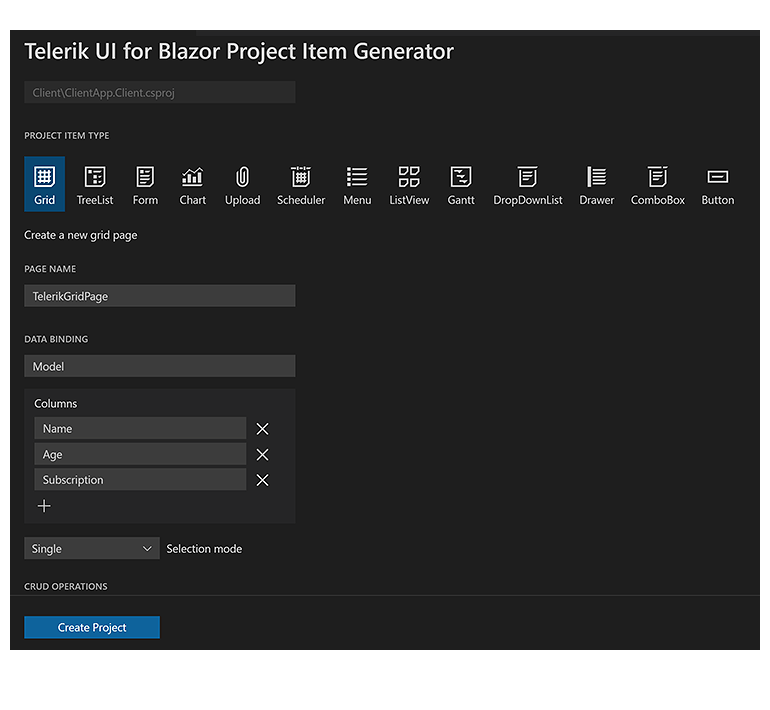
The productivity tools for Telerik Blazor within Visual Studio Code now include over 80 code snippets for speeding up your development with Telerik UI components. You can take advantage of the dozens of code snippets that can be easily invoked in the IDE by typing shortcut “tb” (short for Telerik Blazor) or directly the name of the component you need to plug.

New Blazor Data Grid & TreeList Features
As with every release, we have given a lot of love and attention to the Telerik Blazor Data Grid and TreeList components. In R2 2022, we focused on various areas of Grid and TreeList customization—you can tailor the default filters, editors, popup editing window, search box and take advantage of a new Rebind method.
Customize the default filter – in addition to using the filter template, you can now configure the default filter operator and control whether the filter dropdown and clear buttons are visible.
DebounceDelay FilterRow property – the time in milliseconds between the last typed symbol and firing the OnFilter event in the Grid & TreeList components.
Custom filter editor – you can customize the filter editor rendered within the FilterRow, FilterMenu and ColumnMenu within Grid and TreeList components.
Custom editors via EditorType parameter – provides a simple way to change the default field editors without using templates. You have the flexibility to choose between DatePicker or DateTimePicker for the DateTime type, and TextBox or TextArea for the string fields.

Custom popup editing settings – we exposed multiple settings for the Grid and TreeList popup editors. You can set the (max) width, (max) height, CSS class and orientation of the window and customize the columns and column spacing layout parameters of the form, and the horizontal alignment of the Buttons in the form through ButtonsLayout.
SearchBox Width & Placeholder parameters – you can now customize the SearchBox within the Blazor Data Grid and TreeList components by taking advantage of the two newly exposed Width and Placeholder parameters.
Rebind method – you can invoke the processing of data and refreshed rendering with just one call. If you have manually defined the OnRead event, then the business logic defined in its event handler will be executed.
In addition to the listed common customization features, we added two new events specific to the Blazor TreeList: OnRowclick and OnRowDoubleClick, which enable you to handle logic when users click or double-click on the TreeList rows.
Multiple New Gantt Component Features
With R2 2022, we enhanced the Blazor Gantt component with multiple new features, including:
- PopUp and InLine Editing Modes – in the Gantt pop-up editing mode clicking a command button opens a popup with options to edit the starting task details, and in the in-line editing clicking a command button opens a popup with options to edit the starting task details.

Custom Content in the Gantt TreeList and DateHeader – the templating options in the Blazor Gantt grew, and the component now allows the rendering of custom content and formatting within the TreeList and Timeline parts.
Zoom to Fit – the feature provides greater control over the date range alignment in the Gantt timeline part.

EditorType Parameter – provides a simple way to change the task default field editors. You have the flexibility to choose between DatePicker or DateTimePicker for the DateTime type, and TextBox or TextArea for the string fields.
Custom Popup Editing Windows – exposes multiple settings for the Gantt popup editor. You can set the (max) width, (max) height, CSS class and orientation of the window and customize the built-in editing look of tasks.
Custom Date Format of Timeline Headers – for each of the Blazor Gantt views (Day, Week, Month and Year) you can customize the date format of major and minor slot headers in the timeline part of the component.
DebounceDelay FilterRow property – the time in milliseconds between the last typed symbol and the raising of the OnFilter event.
OnEdit, OnExpand and OnCollapse events – as their names suggest, the new events are raised when a Gantt item is about to be edited, expanded or collapsed, respectively.
Responsive and Adaptive Blazor Components
In 2022 we are aiming to further improve the responsiveness of Telerik Blazor components and add features that allow them to have built-in adaptability for various screen sizes. With the current release, you can take advantage of the responsive Blazor Pager, Toolbar and TabStrip components.
New Pager Feature: Responsiveness and Adaptability
The Blazor Pager component now includes built-in responsive
breakpoints and can be easily adapted to various screen sizes.

New Toolbar Feature: Responsiveness and Adaptability
The Blazor Toolbar is another UI component that received an Adaptive parameter.
By setting it to true, the Toolbar container becomes adaptive and hides the overflowing items in a popup. You can also define the items that need to move to the overflow popup and remain visible via the Overflow parameter of the ToolBar items.

New TabStrip Feature: Scrollable Tabs
Another item from the responsive components epic we addressed in the release is the scrollable tabs feature in the Blazor TabStrip component. Now end users can seamlessly navigate a larger number of tabs in the component header.
See how the TabStrip scrollable tabs feature works in Telerik Blazor REPL.

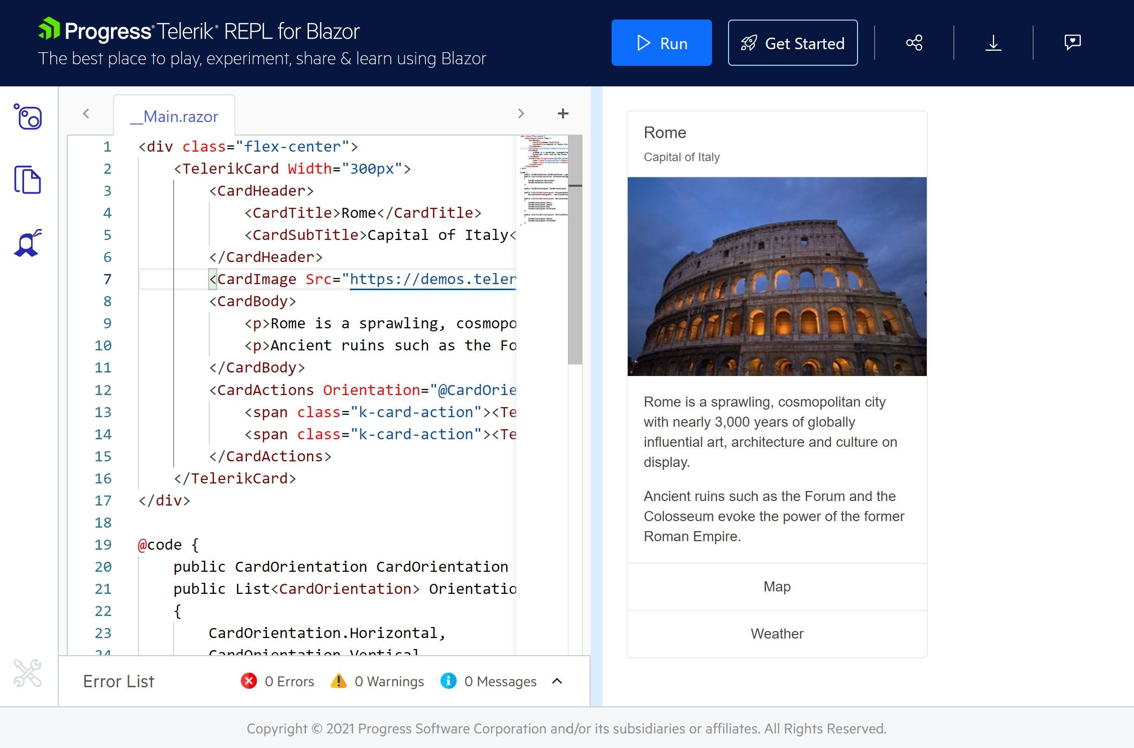
Telerik REPL for Blazor
We continue adding new features in our browser-based code runner Telerik REPL for Blazor. With R2 2022, we’ve added two new cool productivity features—scaffolding of data-bound Telerik UI for Blazor components and over 80 code snippets. You can now choose a component from the side menu and drag and drop it onto the REPL code editor. The tool will generate the code on your behalf and, the best part, for the components with enabled scaffolding, you will be able to set a service and model name as well as properties such as sorting, paging, grouping and more.
We also dedicated effort to improve the loading performance, the runner responsiveness and added a handy new feature that allows you to pin/unpin the side menu.
New Parameter EditorType in Multiple Components
We exposed an EditorType parameter in multiple Telerik Blazor components. The EditorType provides a simple way to change the default field editors in Grid, TreeList, Gantt and Form UI components. You have the flexibility to choose between DatePicker or DateTimePicker for the DateTime type and TextBox or TextArea for the string fields.
New Window Feature: Resizable
With the new resizable feature in the Telerik Blazor Window component, we are responding to popular requests in the Telerik UI for Blazor Feedback Portal. By setting the new Resizable property of the Window to true, you can enable users to drag the Window component’s corners and resize it as needed.

New Editor Features: Table & Image Resizing, Video Nested Tags
With the latest release, the allows video nested tags and table and image resizing. The table resizing feature in the component is enabled by default and includes handles which are rendered on hovering the column and row borders. Analogically, the image resizing feature is enabled by handles positioned in every corner of an image.
Debounce Delay Parameter in Multiple UI Components
The DebounceDelay parameter is available in the multiple Telerik UI for Blazor components that adopt an input: AutoComplete, ComboBox, DateInput, DatePicker, DateRangePicker, DateTimePicker, MultiSelect, NumericTextBox, TimePicker. You will have greater control over the response to change of values, specifically when you need to add a predefined time delay before making a request or responding to a user action.

New Chart & Stock Chart Enhancements
The new features include plot bands, plot area customization and series gradient settings in the Telerik Blazor Chart and StockChart components.
The plot bands feature allows you to highlight a specific range of either category or value axis. Each plot band can be configured with color and opacity. The chart components now allow further customization of the plot area borders, margin, padding and gradient settings for the chart series. You can set the border color by passing a valid CSS color string, including HEX and RGB, set the position to top, right or left, and more.

NumericTextBox: InputMode & АutoComplete Parameters
Based on your feedback, we expanded the Blazor NumericTextBox with an InputMode and AutoComplete parameters:
The InputMode param improves the user experience by showing numeric-only keypads on virtual keyboards.
The AutoComplete parameter allows developers to disable browser suggestions of previous values provided by the user.
Localization Support in VS Project Templates
We extended the existing Telerik Visual Studio Extension with an option to configure the culture and localization of your Blazor apps during project creation. The language configuration is added as a step in the Create Project Wizard and allows you to easily choose from one of the Telerik Blazor Resource files as a starter for your project. The current options include sample translated messages in English, German, Spanish and Bulgarian, which you can later edit or add your own.
New Form & Button Parameters: Id & Form
One of the many items from the Telerik Blazor user voice portal we addressed is the Form parameter in the Telerik Button UI component. The new parameter allows linking a form to a submit button, when the button is rendered outside the form and ensures the same behavior as if the submit button is inside the form. We have also added a new Id parameter to the Form Component so that it can be linked to submit buttons outside it and assure integration with the new button parameters.
New Scheduler Feature: Custom Popup Editing Window
The is another component exposes multiple settings for its popup editor. You can set the (max) width, (max) height and CSS class, configure the orientation of the form (either horizontal or vertical), the columns, and column spacing layout parameters of the form, and more.
Signed NuGet Packages
Starting with version 3.0.0 of Telerik UI for Blazor, we introduced signed NuGet packages, in addition to providing signed product DLL files for quite some time now. With this, we wanted to take security to the next level and give you the option to verify
the signed publisher (using _dotnet nuget verify_) and ensure that the package was not replaced through the network while being downloaded.
Telerik UI for ASP.NET Core & UI for ASP.NET MVC
New CircularProgressBar UI Component
In addition to the existing linear ProgressBar component available in UI for ASP.NET Core and MVC, in R2 2022 we added a new CircularProgressBar. The new component allows developers to visualize the progress for a particular process as a circle. The Circular Progress Bar comes with the following set of features:
- Support for finite and infinite modes
- Center template – allows you to display custom text or HTML in the circle’s center
- Colors feature – allows rendering of different colors depending on the indicator’s value
See the UI for ASP.NET Core CircularProgressBar demo.
See the UI for ASP.NET MVC CircularProgressBar demo.

Multiple New ColorPickers
As the features and complexity of the existing ColorPicker component grew over time, we needed to break down the complexity and provide granular functionality in several standalone color picker UI components. You can now take advantage of a specific color picker depending on your use case:
- ColorPalette – renders a predefined list of palettes and provides the flexibility to define your own set of colors (any valid CSS color).
See the UI for ASP.NET Core ColorPalette demo.
See the UI for ASP.NET MVC ColorPalette demo.

- ColorGradient – when you need to show just a gradient view. The ColorGradient includes a slider for hue and alpha, manual HEX and RGB inputs for pinpointing a desired color, and a contrast tool that analyzes the contrast ratio between two colors, visualizes it and outputs a pass/fail report for WCAG standards.
See the UI for ASP.NET Core ColorGradient demo.
See the UI for ASP.NET MVC ColorGradient demo.

- FlatColorPicker – while it resembles the ColorPicker component, it comes in a simpler form without the typical popup present in the color picker.
See the UI for ASP.NET Core FlatColorPicker demo.
See the UI for ASP.NET MVC FlatColorPicker demo.

New Spreadsheet Feature: Dynamic Change of Size
The Spreadsheet UI component now has the capability to change the number of its rows and columns, and increase its size after loading. The new Resize method allows automatic sheet resizing on pasting more data than the current sheet size, plus flexible behavior when adding and deleting columns and rows from the toolbar.
See a demo of how the Telerik UI ASP.NET Core Spreadsheet resizes.

New Event in TreeView Component
In R2 2022 we also added a LoadCompleted event to the TreeView component. It allows you to trigger certain operations or define custom logic only when the complete data is loaded.
Accessibility Improvements
In addition to the high-contrast Ocean Blue theme, in R2 2022 we focused on further improving the components’ accessibility compliance levels and documentation. The Telerik UI for ASP.NET Core and MVC libraries are undergoing an accessibility review using the industry standard testing process. In the latest release, we have addressed and improved multiple items and will continue this effort throughout the year.

Updated VPAT Document
We have updated our existing Voluntary Product Accessibility Template (VPAT) for Telerik UI for ASP.NET Core and UI for ASP.NET MVC to follow the latest version of this document and have updated it according to the latest accessibility improvements that have been made to our UI components. The VPAT document is available on a per-request basis. Feel free to reach out to our support team, or one of our sales reps, to get ahold of the latest version.
Specific to Telerik UI for ASP.NET Core
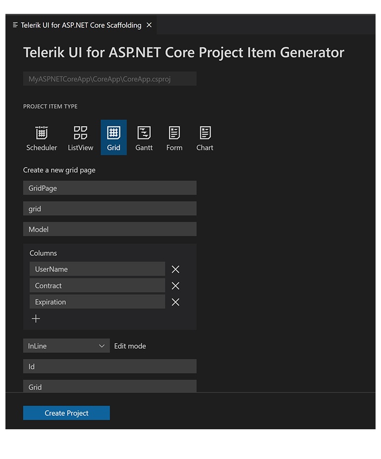
ASP.NET Core Scaffolder in Visual Studio Code
One of the R2 2022 most wanted features for UI for ASP.NET Core is the new scaffolder. You can take advantage immediately and start scaffolding the top used data-bound Telerik UI for ASP.NET Core components: Data Grid, Chart, Form, ListView and Scheduler. The Visual Studio Code scaffolder will prompt you for input of the controller and model name and will allow you to configure in the UI multiple component specific properties. For example, if you scaffold a new page with UI for ASP.NET Core Grid, you will be able to set its sorting, filtering, grouping, column resizing and more.
ASP.NET Core Code Snippets in Visual Studio Code
Another productivity feature in the extension is the addition of code snippets for fast UI component reference and configuration. You can now take advantage of the dozens of code snippets that can be easily invoked in the IDE by typing shortcut “tc” (short for Telerik ASP.NET Core) or directly the name of the component you need to plug. For example, typing “grid” or just “gr” will conveniently show a dropdown with the available snippet templates you can insert in code. Then, using a tab sequence, you can fill out component properties, options, model and controller actions.

With the first release, we shipped code snippets for the majority of Telerik UI for ASP.NET Core components—the Data Grid, Autocomplete, Date and Time Pickers, Form, Textbox, Upload, Window and more. The good news is that the snippets are available for both flavors of the UI components for ASP.NET Core HTML and Tag Helpers. Our goal is to continue this effort and, with the next couple of product releases, to deliver 100% coverage for the snippets.
Menu Security Trimming
The UI for ASP.NET Core Menu component was enhanced with a much-requested feature related to hiding menu items from unauthorized access. The feature can be enabled through a single property called SecurityTrimming, but also relies heavily on ASP.NET Core Authorization.
See how menu security trimming can be configured.
Tag Helper Improvements in Docs & Demos
Based on your feedback, we are significantly improving the TagHelper code examples and documentation, so that you can easily reference them in your work. The effort will continue throughout 2022, but you can already take advantage of the easy switch between HTML and Tag Helper View in the component demos.

Additionally, we are expanding the available TagHelper code snippets in both component demos and documentation. In the current release, we managed to improve the examples in over 30 ASP.NET Core components and multiple documentation articles—DropDownList, DateTimePicker, Editor, TreeView and more. As promised, this effort will continue for a few more releases until we have complete parity between the HTML and TagHelpers examples.
Telerik UI for ASP.NET AJAX
Telerik UI for ASP.NET AJAX is our most mature, but still actively used and developed product and we are excited to announce that R2 2022 marks the 110th release of the product! This is really a great milestone that proves that when you love what you do time flies. 😊
New Stepper UI Component
The Telerik UI for ASP.NET AJAX Stepper is the latest addition that helps you split complicated interactions into logical steps with visual progress. The Stepper includes horizontal and vertical modes, multiple customization options for each of the steps, validation, animations, built-in keyboard navigation and accessibility, and more.

DataViz Improvements
In the second major release of 2022, you we also implemented several of the most wanted chart features, enhancing the already robust DataViz library. These include:
- Enhanced appearance options for the tooltips in the RadHtmlChart
- Show chart shapes in legend
- New notes in RadHtmlChart
- Configuration options—highlight InactiveOpacity in RadHtmlChart
- Ability to modify the width of the range placeholder in radial RadGauge

PDF Export Enhancements
Again based on your feedback, we addressed several of the most voted features in our Feedback Portal related to PDF Export functionality:
- Ability to disable hyperlinks in the exported PDF via the RadClientExportManager
- Ability to scale the content when exporting PDF with the RadClientExportManager
Visual Indicator for Unsorted in RadGrid
With R2 2022, we’ve improved the sorting capabilities of the Grid and introduced the ability to show a NoSort icon, which indicates that an unsorted column can be sorted.
See how the RadGrid NoSort works.

Accessibility Improvements
Accessibility is a topic of ever-growing importance, and we are focusing on further improving the UI for ASP.NET AJAX components’ accessibility compliance levels. We’ve implemented several improvements in AsyncUpload, Dock, Window, Tooltip, Tile and Editor components, thus further enhancing the Section 508 support of the controls.
Download Telerik UI Components
Head over to the preferred Telerik UI library and download a free trial. Or, if you are an active license holder, you can grab the latest and greatest from the “Your Account” page, or update your NuGet package reference to the latest version.
Webinar & Dedicated Twitch Sessions
Be sure to sign up for the Telerik R2 2022 release webinar and live Twitch sessions to see the newly released components and features in action:
Twitch Session:
Mon, May 16 I 10:00 a.m. – 12 p.m. ET I Blazor & .NET MAUI
Add it to your calendar or save the link to our Twitch channel.
Webinar:
Tue, May 17 I 11:00 a.m. – 1:00 p.m. ET
Thank you for the continuous support!

Maria Ivanova
Maria Ivanova is a Manager of Product Management at Progress, for Telerik and Kendo UI components and developer tooling. She joined the company in 2019 as a Product Manager for Telerik UI web components and is passionate about developing impactful and innovative software products. Maria believes that to create great products, it's important to challenge the status quo, closely collaborate with customers, and embrace a spirit of experimentation.