
UI for ASP.NET Core
ASP.NET Core PromptBox
- Facilitate user‑AI interactions with Telerik UI for ASP.NET Core PromptBox that provides intuitive, feature‑rich interface for composing prompts.
- Part of the Telerik UI for ASP.NET Core library along with 120+ professionally designed UI components.
- Includes support, documentation, demos, virtual classrooms, Visual Studio Code Extensions and more!
-
Smarter Input Experience for AI or Chat Apps
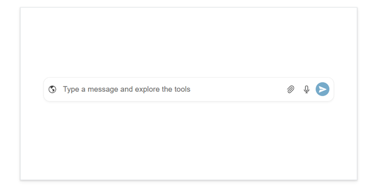
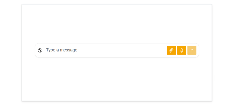
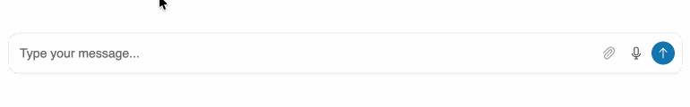
The Telerik UI for ASP.NET Core PromptBox delivers a modern, consolidated input area built for chat experiences and AI‑powered workflows. It adapts to different prompt lengths with flexible sizing options and supports file attachments, speech-to-text button and input adornments, making it easy to build rich, conversational AI experiences.
-
Modes
The PromptBox component supports three input modes that control how the text area behaves upon typing:
- Auto mode (default): Starts as a single‑line input and expands automatically into multiple lines as the user types more content. It grows until it reaches its maximum height, then adds scrolling.
- Single‑line mode: Keeps the input compact with a fixed height. When the text becomes longer than the available width, it scrolls horizontally instead of expanding.
- Multi‑line mode: Displays a multi‑line text area from the start, giving users more room to write longer prompts. It increases in height as needed until it reaches its limit, then switches to vertical scrolling
-
Tools
The Telerik UI for ASP.NET Core PromptBox includes several built‑in tools that enhance how users compose and submit prompts in conversational or AI‑driven interfaces:
- File attachment button: Lets users attach files directly to their prompts, making it easy to send documents, images, or other content as part of the conversation.
- Speech‑to‑text button: Allows users to dictate prompts using their voice. Audio input is converted to text and placed into the prompt area for quick, hands‑free interaction.
- Action button: A customizable send button that users click to submit their prompt. It supports different icons and visual states and can indicate when a prompt is actively being processed.
-
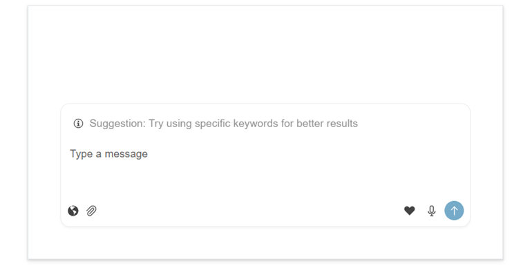
Adornments
The ASP.NET Core PromptBox supports input adornments that let you add custom content directly inside the prompt field. These can appear at the start, top or end of the input area, making it easy to display icons, indicators, helper text, or lightweight actions that enhance the prompt-composition experience.
See the Telerik UI for ASP.NET Core PromptBox adornments demo
-
Appearance
Style the Telerik UI for ASP.NET Core PromptBox built-in buttons with ease. You can adjust their fill mode, corner radius, size, and theme color to match your app’s design, whether you customize them individually or apply a unified look.
See the Telerik UI for ASP.NET Core PromptBox appearance documentation
-
Disabled State
The ASP.NET Core PromptBox supports a disabled state that prevents users from typing, attaching files, or interacting with any of its tools. When disabled, the entire input area and its actions become non‑interactive, helping you control when users can submit prompts, i.e., during loading, processing or restricted scenarios.
See the Telerik UI for ASP.NET Core PromptBox disabled state documentation
-
Events
The component offers several events that let you respond to user actions and manage the prompt‑submission workflow. You can detect when the user changes the input, track when a prompt is sent, and react to file attachments, speech‑to‑text results, or tool interactions.
-
Right-To-Left Support (RTL)
The PromptBox component supports right‑to‑left (RTL) layouts, ensuring a natural and intuitive experience for languages such as Arabic and Hebrew.
-
Keyboard Navigation
The ASP.NET Core PromptBox component supports full keyboard navigation, following the standard tab order. Users can focus the input and all affix buttons individually and use familiar keys to work efficiently. Keyboard navigation ensures fast, accessible interaction for all users.
See the Telerik UI for ASP.NET Core PromptBox keyboard navigation demo
