
UI for ASP.NET Core
ASP.NET Core GridLayout
- Build beautiful web layout in no time leveraging the built-in capabilities of Telerik UI for ASP.NET Core GridLayout.
- Part of the Telerik UI for ASP.NET Core library along with 110+ professionally designed UI components.
- Includes support, documentation, demos, virtual classrooms, Visual Studio Code Extensions and more!
-
Overview
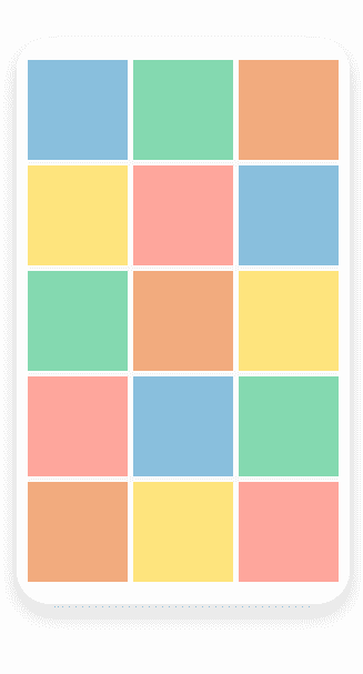
Speed up the delivery of a high-quality page layout in no time for your web applications thanks to the built-in features of the UI ASP.NET Core GridLayout . The component uses a grid-like system to arrange your content in columns and rows and applies the same rules across your entire application. It works with content from the most basic text to full components such as charts. Additionally, the GridLayout component comes with multiple customization options to satisfy any design request while keeping the project visually appealing and functional.
The GirdLayout simplifies the creation of layouts in web applications and helps developers migrate from desktop to the web since it mimics the GridPanel component used in Windows development.
-
Customization
The ASP.NET Core GridLayout can be tailored to match your needs. Play with the available customization options such as row and column spacing, horizontal and vertical align options, row height, column width and more.
-
Adaptive Rendering
The Telerik UI for ASP.Core GridLayout is a responsive component that can be used on mobile devices. Simply adjust the layout of the component to match the different screen sizes.
-
Layout
The Telerik UI for ASP.NET GridLayout gives you control over the three elements of its layout: Rows and Columns, Gap, and Alignment. Rows and Columns allow you to specify the number and size of each. Gap lets you define spacing between items. Finally, Alignment sets the position of the content within a cell.
-
Theming
With the ASP.NET Core GridLayout component you can apply multiple built-in themes such as Default (our own styling), Material (based on the Material Design guidelines), Bootstrap (which looks like the Bootstrap styling to integrate better) and Fluent (based on Microsoft Fluent UI) on the components within the layout.
You can further customize any of the out-of-the box themes, style a specific chart component or create new theme to match your colors and branding by using the Telerik SASS ThemeBuilder application.
