
KendoReact
Free React Button
- All you need in a React Button in one neat package: built-in styles, globalization and more.
- Part of the KendoReact library along with 120+ free and paid enterprise-grade UI components.
- This component is free to use, including in production—no sign-up or license required!
-
Customizable and user-friendly button component
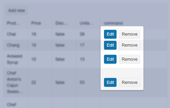
The React Button provides a clickable UI functionality and enables you to display only textual content, or show predefined icons, images and custom icons, and to render a combination of textual and image content.

-
Icon Button
The KendoReact Button can have a combination of Icon and Text, or just Icons, as its main content. Icons can be provided through the built-in KendoReact Icons, as custom icons that can be imported as images, or any font icon library like FontAwesome.

-
Primary Button
As a part of several built-in styles for the KendoReact Button, the Primary Button provides a highlighted and unique look and feel to the React Button component.

-
Toggleable Button
A KendoReact Button that can be toggled showcases a clear representation between the default rendering of the Button and when the Button has been pressed.

-
Appearance
The KendoReact Button component provides a set of predefined appearance options. Additionally, you can play around with different styling options enabling you to customize each individual aspect of the button appearance.
-
Events
The KendoReact Button component supports a variety of events enabling you to tailor the button's behaviour based on your needs.
-
Globalization
The KendoReact Button supports being rendered in a right-to-left mode, allowing for the Button to be used in any globalization or localization scenarios.
-
Accessibility
As a part of our commitment to accessibility, the KendoReact component is compliant with WAI-ARIA and Section 508 standards, and is rated AAA for WCAG 2.0.

-
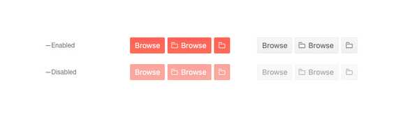
Disabled Button
By default, the KendoReact Button component is enabled, but for scenarios that require the Button to be disabled until certain requirements have been met, a single configuration option can disable the React Button and prevent user interactions.
-
Other supported frameworks
The Button component is also available for these web development frameworks:
