
UI for ASP.NET AJAX
ASP.NET AJAX Button
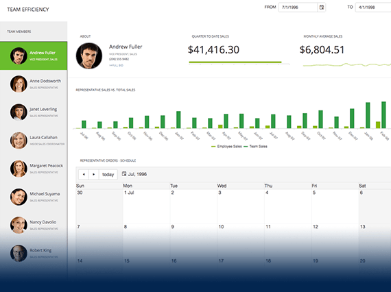
- Fully-customizable ASP.NET AJAX Button component enhanced with built-in text and images, toggle and split button modes, and more.
- Part of the Telerik UI for ASP.NET AJAX library along with 120+ professionally designed UI components.
- Includes support, documentation, demos, virtual classrooms and more!
-
Expanded Button Behavior
Use a single control for button, link-button, toggle-button and image-button interactions.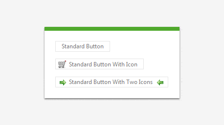
-
Image Buttons
Define an image to represent the button and get full customization of the look and feel.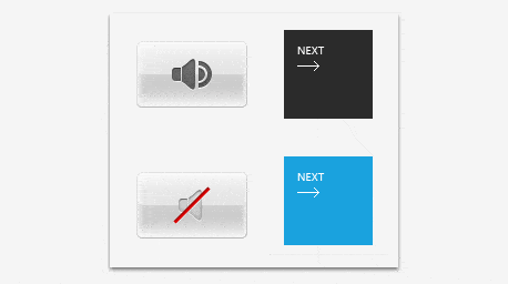
-
Toggle Buttons
Utilize a button with various toggle states, such as a check box, a radio button or even a custom toggle button.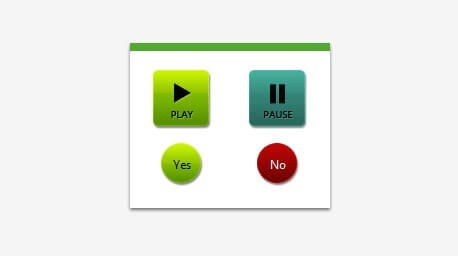
-
Content Templates
Create your own layout for button elements with the ability to define a content template.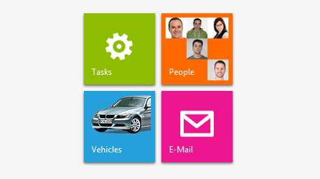
-
Accessibility
Rely on the compliance of the control with the WCAG and Section 508 standards to improve the accessibility of your application. -
Client-Side API
Interact with the control through JavaScript via its rich and flexible client-side API by subscribing to events and extracting information such as text and button type. -
Embedded Icons
Take advantage of the ability to include images and icons next to the text of the button control. These icons can be displayed either on the left or right side of the provided text.
All ASP.NET AJAX Components
Data Management
- Spreadsheet
- DataForm
- ClientDataSource
- TreeList
- PivotGrid
- OData DataSource
- ListView
- ListBox
- Filter
- Data Pager
- Grid
Scheduling
Layout
- Badge
- Avatar
- Card
- Wizard
- Device Detection Framework
- Page Layout
- Window
- ToolTip
- Splitter
- Notification
- MultiView
- Dock
Interactivity & UX
Theming
Media
Editors
Data Visualization
- Pyramid Chart
- Vertical Area Chart
- Vertical Line Chart
- ArcGauge
- CircularGauge
- Timeline
- Map
- Diagram
- Rotator
- Org Chart Updated
- Gauge
- BinaryImage
- Barcode
- Chart (HTML5)
File Upload & Management
Spell Checking
Navigation
- Speech-to-Text Button
- ChipList
- Chip
- Floating Action Button
- Stepper
- SplitButton
- Switch
- Breadcrumb
- Button
- PanelBar
- RibbonBar
- SearchBox Updated
- TabStrip
- ToolBar
- SiteMap Updated
- TreeView
- Menu
Performance
Ajax
Social
SharePoint Web Parts
Mobile Widgets
Document Processing
