
UI for ASP.NET AJAX
ASP.NET AJAX Card
- Easily organize content when building catalogues, dashboards, blogs, e-shops and guide your users to the options they are interested in with the ASP.NET AJAX Card component.
- Part of the Telerik UI for ASP.NET AJAX library along with 120+ professionally designed UI components.
- Includes support, documentation, demos, virtual classrooms and more!
-
Overview
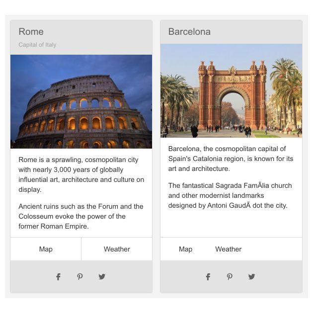
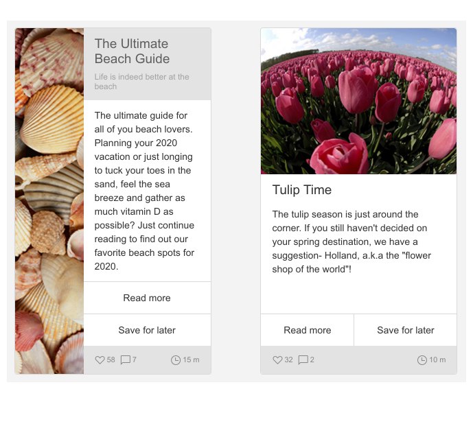
The Telerik UI for ASP.NET AJAX RadCard is a control designed to help users organize content when building catalogues, dashboards, blogs, e-shops, etc. It quickly grabs the user’s attention with its clean layout, consisting of a title, usually an image, some text as the body and perhaps a footer. Use Cards to create sleek UIs that effortlessly guide the user to the options they are interested in.
-
Card Subcomponents
The building blocks of the of RadCard component (its subcomponents) can be customized to the level of choosing which subcomponent you want to be displayed. This is the full list of subcomponents which you can opt to use:
- Header, Title and Subtitle
- Body
- Footer
- Actions, Media and Separators
-
Styles
Through the predefined states of the RadCard, you can change its visual appearance. Turn your card into a message box by applying one of the available styles: Primary, ‘Info, Success, Warning’or Error.
-
Content and Customization
Place any type of HTML content or other Telerik UI for AJAX control in the RadCard’s body: plain text, links, buttons, images, video, etc. You are able to fully customize the layout of the body and configure how the header and actions operate. Achieving the configuration that matches your requirements is a matter of minutes.
Arranging cards in groups is a frequently used pattern so we also provide you with several CSS classes that help you easily organize the cards in various patterns:
- Deck of Cards (.k-card-deck class) renders a single row of cards, detached from one another
- Group of Cards (.k-card-group class) renders a single row of cards, attached to one another
- List of Cards (.k-card-list class) renders a column of cards, detached from one another
- Custom Layout (.k-vbox, .k-hbox, .k-column) renders a flex layout

-
Orientation
The content of the card can be oriented vertically and horizontally and actions can be centered, stretched, aligned to the start or to the end or none.
-
Multiple Skins
The RadCard component comes with 20+ out-of-the-box skins that serve common scenarios like Material and Bootstrap. Further customization of the built-in themes with pure CSS3 helps you match the card’s style to the app’s.

-
Right-To-Left Support
As is common for most Telerik components, the RadCard has built-in support for RTL text.
