
KendoReact
React Scheduler
- The Scheduler brings the functionality of Outlook's Calendar to a single UI component that can be added to any React app.
- Part of the KendoReact library along with 120+ free and paid enterprise-grade UI components.
- Includes legendary technical support, design resources, comprehensive documentation, demos, and more!
-
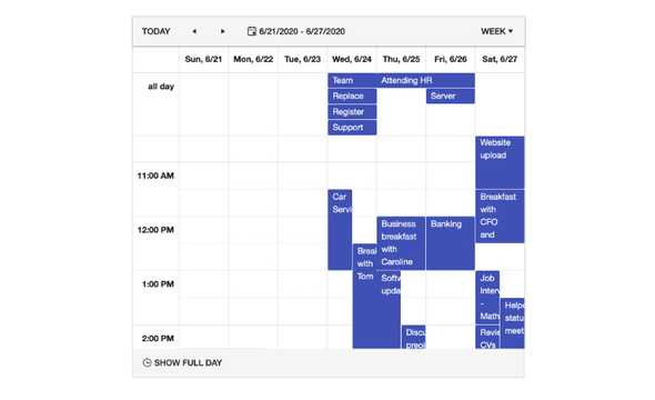
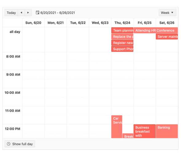
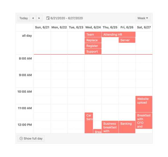
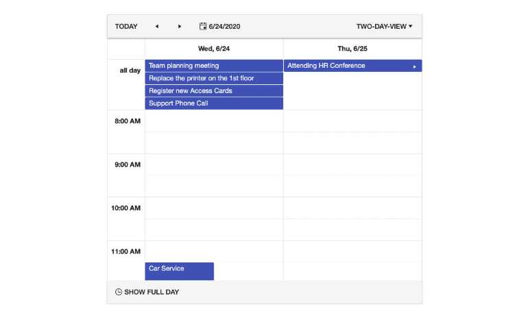
Week and Workweek Views
The Week View enables users to see all events available during their week. With the predefined Workweek View, only a limited set of days will be displayed. Which day starts and which day ends each week can be customized to fit any scheduling needs.
-
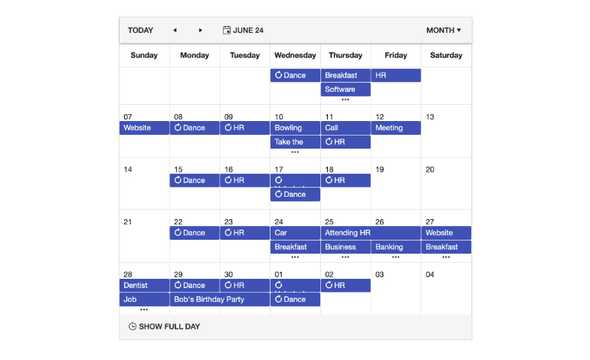
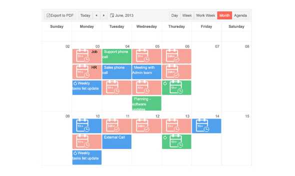
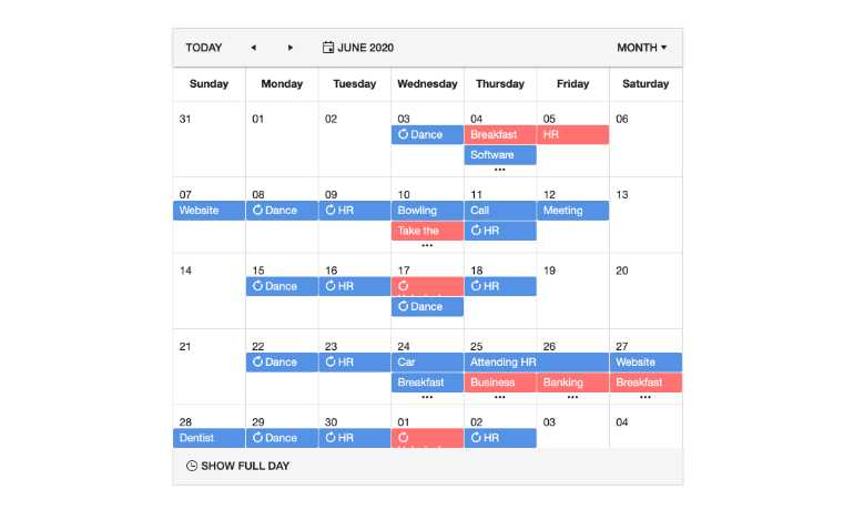
Month View
The Month View showcases an entire month worth of events, highlighting a few events for each day with a clear indication for when certain days have more events than are currently displayed.
-
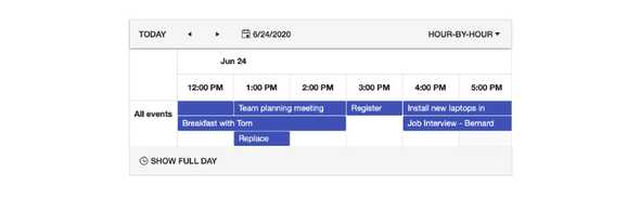
Timeline View
The Timeline View shifts the scheduler from showcasing time in a vertical fashion to showing events in a horizontal fashion.
-
Multiple Event Selection
The KendoReact Scheduler supports the ability to select multiple events. After events have been selected, they can be rearranged, deleted or edited as a group through the available API methods.
-
Data Binding
The KendoReact Scheduler contains built-in logic for handling all available functionality, which requires certain fields on the underlying data model to be available. Rather than enforce a strict data model, the component is flexible enough to let developers connect to any object and simply indicate what fields should be used to represent the needed information.
-
Recurrence
The component has a recurrence editor built-in, allowing any events to occur on a daily, weekly, monthly and annual basis. It also allows for exceptions from these recurrence rules, ensuring that any requirements around recurrence can be fulfilled.
-
Resources
Resources within the React Scheduler allows for the categorization of events to give them a unique appearance from other events on the calendar. These resources can be individuals, rooms or any type of group that should have a common look and feel.
-
Tasks
The tasks are responsible for displaying information in the Agenda View. The Scheduler component will automatically transform the provided data collection into Task components when the current active view is the Agenda View.
-
Slots
The Slots are responsible for showing each individual hour, day or month slot throughout the scheduler, giving developers granular control over how to display items within the calendar.
-
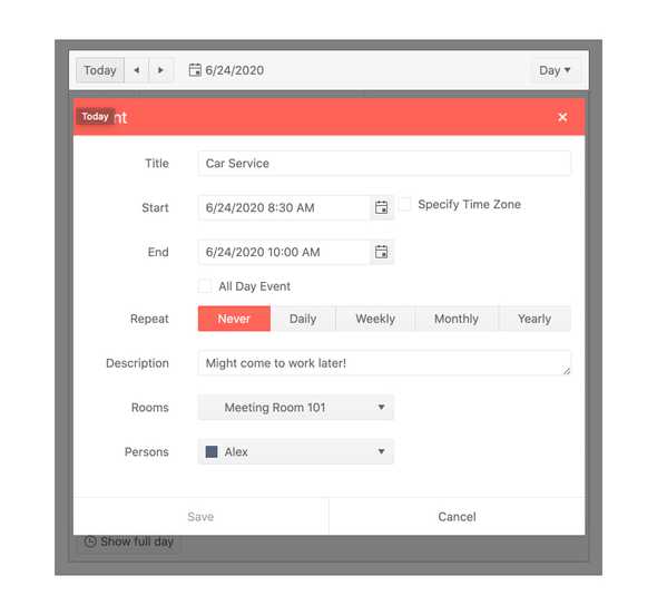
Editing
The component has the ability for users to edit singular events or recurring events by interacting with events either through double-clicking with a mouse or via keyboard navigation. The built-in editor provides applicable form components for any field that is tied to the selected event.
-
Custom Editor Form
Out of the box, the Scheduler provides a pre-built Editor Form for editing calendarevents. Use the Custom Editor Form feature to add more fields and options for customization, such as reminders and links to join events online. This allows React developers to utilize a custom renderer to represent the form that appears when an event is edited, giving you full control over the rendering of the event edit form.
-
Time Zones
The KendoReact Scheduler provides built-in support for displaying events in different time zones. By default, the Scheduler component will utilize the local time zone of the browser to display events as they are occurring in the user's time zone, but a fixed time zone across all users can also be set.
-
Date Selection
The component enables you to choose between a controlled and an uncontrolled mode of the selected date, enabling you to completely override the date selection from outside the Scheduler.
-
Custom Rendering
Many of the building blocks of the KendoReact Scheduler are built up by components, and many of these components accept custom renderers. This ensures that developers can take granular control over the look and feel of the React Scheduler. Customizations can vary from simply updating the appearance to inserting custom components, where applicable.
-
Adaptive Slot Height
By default, the KendoReact Scheduler component adapts to fit all items inside the view slot. However, sometimes your user may have more scheduled items than their current view can fit, or no items scheduled at all. This is where the React Scheduler's adaptive slot height feature comes in, enabling you to set the minimum height of a scheduler slot to prevent the slot from disappearing when there are no scheduled events - and also extend its height to accommodate all scheduled items for the day, if needed.
-
Auto Item Height
The Auto Item Height feature deals with the same ability to auto-adjust or have a defined event height when events are displayed horizontally. This includes the TimelineView and the MonthView, plus the allDay section of the Day, Week and WorkWeek views.
-
Current Time Marker
When enabled, the Current Time Marker feature of the KendoReact Scheduler shows a line across the Scheduler interface with the user's machine current time. This provides a point of reference for users as they navigate through the currently scheduled events.
-
Globalization
Being responsible for handling data relying on time, as well as containing several built-in strings for displaying information, localization, and globalization in the KendoReact Scheduler, are extremely important. With this in mind, any message in the Scheduler can be localized to any language and the component can also be rendered in Right-to-Left mode.
-
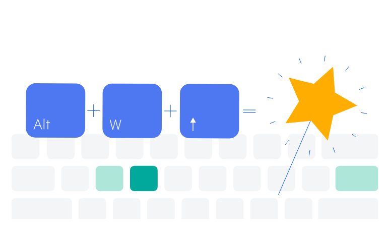
Keyboard Navigation
The component provides keyboard navigation out of the box. This helps users traverse and interact with any element of the React Scheduler by simply using their keyboard.
-
Easy Scheduling at Your Fingertips
The KendoReact Scheduler provides a calendar experience similar to Outlook or Google Calendar for any React application with minimal setup. With support for time zone conversions, resource visualization, grouping, editing and recurring events, the component can be responsible for complex requirements around scheduling with just a few lines of code.
-
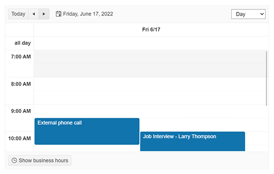
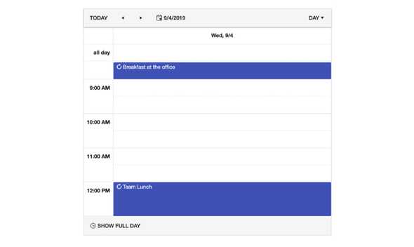
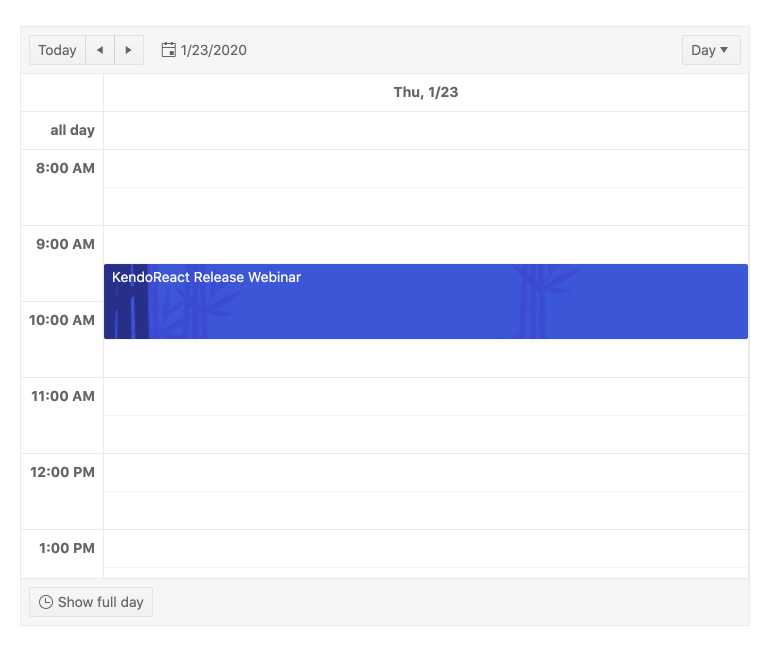
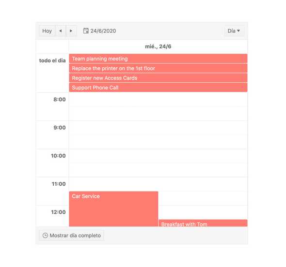
Day View in React Scheduler
The Day View showcases all available events in a single day. Developers have full control over the start and end of each day, so hours can be limited to just the work day, and an “all day” slot can be displayed at the top of the day to show events happening that block the entire day.
-
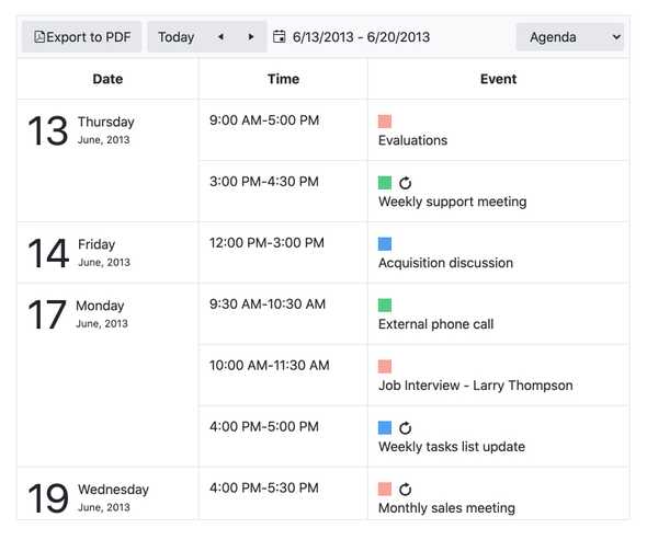
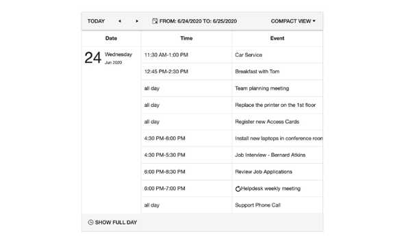
Agenda View in React Scheduler
With the Agenda View, the component can showcase all upcoming events in a more compact view, showing each event as an agenda item while scrolling horizontally. Popularized by calendar applications found on mobile devices, the Agenda View can be used to quickly grasp all upcoming events without needing to see all available time slots in a day.
-
React Scheduler Events
Events are at the core of the KendoReact Scheduler as they are responsible for displaying what has been added to the calendar. Events can be static, resized with a resize handler, dragged to change their location, as well as edited.
-
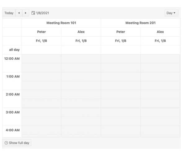
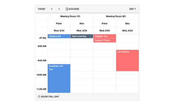
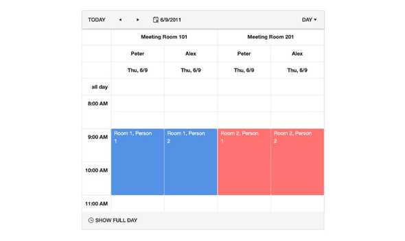
React Scheduler Grouping
The grouping feature enables grouping of multiple resources together within a view. This provides a quick comparison between two different resources and what each of their schedules look like for the day.
-
React Scheduler Accessibility
Accessibility is a core aspect of the KendoReact UI library. With this in mind, the KendoReact Scheduler is compliant with Section 508 and WAI-ARIA standards and is AA rated with WCAG 2.0.

-
Other Supported Frameworks
The Scheduler component is also available for these web development frameworks:
