
KendoReact
React Charts
- Powerful data visualization library of 16 different React chart types built from the ground-up (no 3rd-party dependencies).
- Part of the KendoReact library along with 120+ free and paid enterprise-grade UI components.
- Includes legendary technical support, design resources, comprehensive documentation, demos, and more!
-
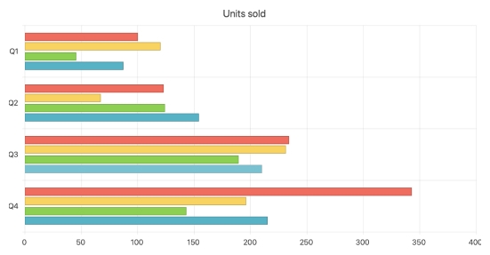
Powerful Data Visualization for Any Need
The React Chart component found in KendoReact is a powerful data visualization tool that can fit into any application. This one component includes over 16 different types of charts, all with built-in support for interactivity, tooltips, zooming and panning, and much more. This React chart library is built from the ground up, without any dependencies on third-party libraries. Each chart can be rendered either as an SVG or a Canvas element, defined by a single property and can be exported to various formats like an image or PDF.
-
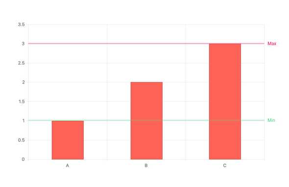
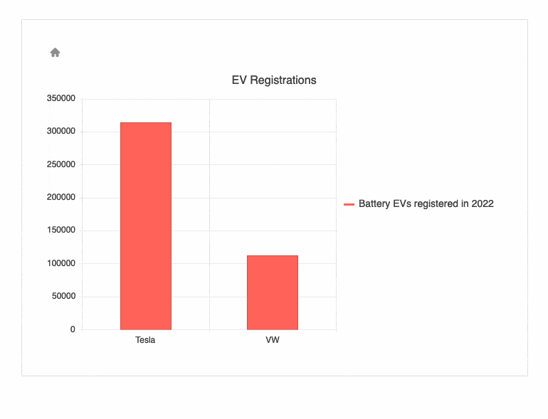
Plot Bands
Plot Bands enable highlighting of a specific range on any axis (both X and Y) to showcase additional information related to the displayed series. This can be very useful when trying to showcase a range of good or bad numbers, or just providing focus to a certain area of the React Chart. Within the KendoReact Chart component there is no limit to the number of different plot bands that can be defined in a single chart.
-
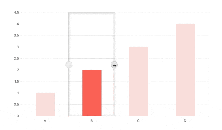
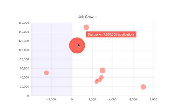
Selection
The KendoReact Chart comes with a built-in user experience for selecting a single data point or a range of data within the chart. Selection can be enabled with a single property and when enabled shows a visible area to indicate the current selection of the chart. This selection can then be modified by using the built-in drag handles, the scroll wheel, clicking elsewhere in the chart area or dragging the selection area around. Selected data points can then be extracted programmatically and used elsewhere in your React application.
-
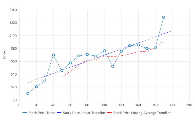
Trendlines
The KendoReact Charts’ Trendlines are automatically generated indicators that illustrate data trends over time. Choose between the following trendline types:
- Linear trendline
- Exponential trendline
- Logarithmic trendline
- Power trendline
- Polynomial trendline
- Moving average
-
Responsive Design Support
While the KendoReact Charts are often displayed in desktop browsers, they have full support for rendering on mobile devices. Beyond just rendering the charts like normal, the KendoReact Charts have built-in logic for handling resizing and responsive design. This includes features like rotating labels on the various axes, as well as making content displayed within the chart area smaller to fit the available size – all without writing any additional logic.
-
Canvas & SVG Rendering
Data Visualization within React applications often comes in two forms: SVG or Canvas rendering. With the KendoReact Charts, there is no need to settle for just one as our React Charts can render as both Canvas or SVG elements. Switching between the two is as simple as changing a single configuration option.
-
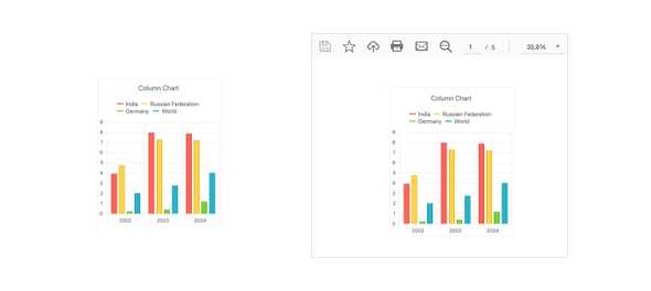
Export Options
Beyond displaying data visualizations on a web page, each KendoReact Chart can be exported as an image, PDF, or an SVG element with a single click of a button! Thanks to the integration with the KendoReact Drawing package, a single method can be called to export the entire React chart and let the end user save the file locally.
-
Custom Rendering
Every aspect of the KendoReact Charts component can be completely customized. The options for customization range from using custom renderers, providing custom CSS, or just defining a template that can be reused throughout the various elements of the charts.
-
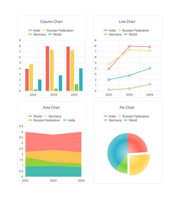
Extensive List of Chart Types
Out of the box, the KendoReact Chart component has a long list of available chart and series types. They work well as standalone series and many can be mix-and-matched and rendered in a single chart. Available chart types include:
- Area Chart
- Bar Chart
- Box Plot Chart
- Bubble Chart
- Bullet Chart
- Donut Chart
- Funnel Chart
- Line Chart
- Pie Chart
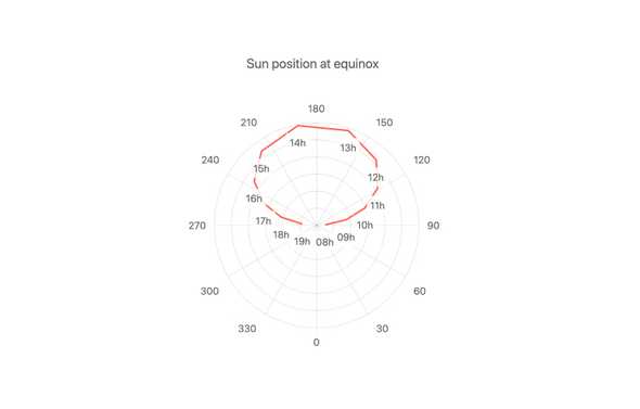
- Polar Chart
- Radar Chart
- Range Area Chart
- Range Bar Chart
- Scatter Chart
- Stock Chart
- Waterfall Chart
-
React Charts Video Tutorial
In less than 10min, learn how to implement React Charts into your app using the KendoReact Charting Library.
TJ VanToll created this easy-to-follow tutorial to demonstrate how with just a few lines of code, you can have a good-looking chart customized with animations, title, custom axes, chart legend and tooltips.
React Charts Tutorial with the KendoReact Chart Library (video)
-
Binding to Different Data Types
The KendoReact Chart can be bound to various forms of data, ranging from simple arrays with X and Y values, to more advanced data types and objects with fields representing the values that need to be displayed. Additionally, the React Chart component can easily be bound to dates and has built-in methods for handling which days or months should be displayed on the axis.
-
Multiple Axes and Chart Series on the Same Plot
A traditional chart contains a single series and has an X and Y axis starting at zero. For the scenarios that require multiple series in the same chart, including having multiple axes showing different values and scales, the KendoReact Chart has you covered. Defining multiple series or multiple axes can be done just as easily as defining your first.
-
Drill Down to More Detailed Data
The drill-down functionality in the KendoReact charts enables users to easily click on a specific chart element, such as bar or pie segment, and navigate to a different view containing more detailed data about the selected item (e.g. breakdown by product).
-
Chart Animations
Data Visualization goes beyond just displaying data. Animating a series as it renders from lowest value to highest, or letting bars animate-in one at a time, are all small tweaks that can be done to make any chart pop—and be visually pleasing to end users. The KendoReact Charts come with built-in animations that are enabled by default, but any animation can be fully controlled and can be turned on or off on a granular level.
-
Data Binding
The KendoReact Chart component enables the binding of its data series and category axis to arrays and Datasets of objects.
See the KendoReact Chart Data Binding demo
-
Events
The KendoReact Chart component supports a variety of events, enabling you to change the chart's behaviour based on your needs.
-
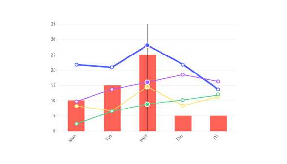
Panning & Zooming
With large sets of data, displaying everything within one chart area may not always be viable. This is where features like panning and zooming come in to play. Panning allows users to scroll horizontally over an axis, moving left and right and navigate through large sets of data with ease. Zooming can move in and out of an area of a chart with the scroll wheel of a mouse or through selecting an area on the KendoReact Chart.
-
Chart Elements
Building parts of the KendoReact Chart is broken down to various elements. These include the axes, the chart area, labels, legends, plot bands, title and other aspects of the chart. This breakdown enables developers to customize and interact with every aspect of the chart.
-
Tooltips
The KendoReact Charts have built-in support for tooltips throughout the various chart types. This React Tooltip can appear when hovered over individual points of the chart, or constantly displayed along a set of crosshairs as users move the mouse across the chart area. By default, these tooltips can be bound to a field from the underlying data model but they can also be customized to contain a completely unique layout through a custom renderer for the tooltip element.
-
Labels
Labels are scattered all throughout the KendoReact Chart, including displayed next to series data points within the chart area, as well as on each of the displayed axes. These labels can easily be customized by utilizing the built-in properties of each label, and each label is broken down in to a component within the React Chart to make it as easy as possible to modify the specific labels as needed.
-
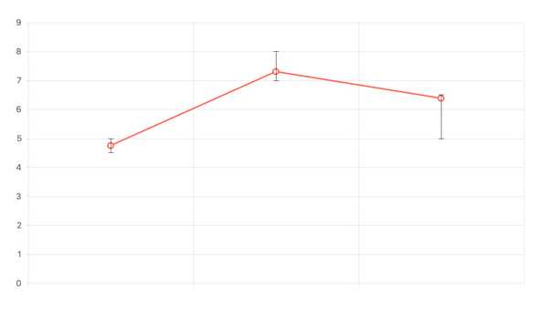
Error Bars
In certain scenarios a data point displayed within a chart may have some margin of error and actually may fall within a range of possible values. This is where React Error Bars come in to play. With the KendoReact Chart, values can have a defined high and low field associated with every value, allowing for an indicator to show where within a range of possible values the rendered data point falls.
-
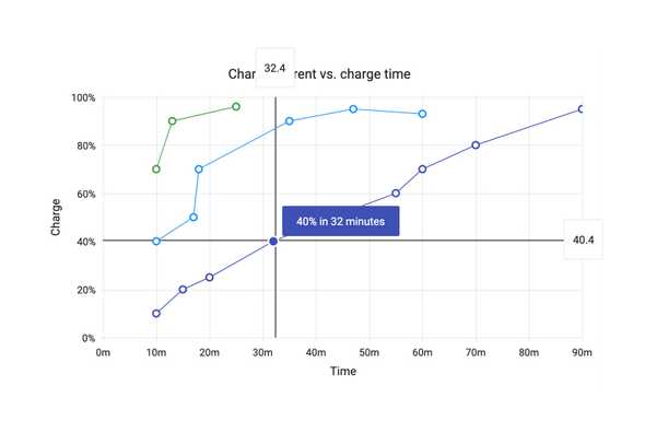
Crosshairs
For busy or large charts, it can be difficult to see a specific X and Y value of a particular data point. Thanks to the built-in Crosshairs feature of the React Chart component, lines going across the X and Y axis follow the mouse pointer and display the current X and Y values along the way. Enabling this functionality is as simple as setting a single property of the React Chart component.
-
Legend
The Legend Area of the KendoReact Charts can be autogenerated based on the series bound to the Chart, giving a simple representation of what series and data is tied to what color and type. Additionally, the React Chart Legend has interactivity built in, offering features like clicking on a series name to show or hide the series in the cart.
-
Other Supported Frameworks
The Chart component is also available for these web development frameworks:
