background

KendoReact

React Stepper

  • Visualize a process of multiple steps with the customizable React Stepper component.
  • Part of the KendoReact library along with 100+ professionally-designed components.
  • Includes support, documentation, demos, virtual classrooms, learning resources and more!
Stepper Header
  • Create a Sequence of Logical Steps and Visualize the Progress

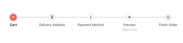
    The KendoReact Stepper component enables developers to create a set of logical steps in sequential order and visualizes the progress throughout the steps. The content of each step is completely customizable, and the React Stepper contains built- in logic to prevent navigation until certain requirements are met.
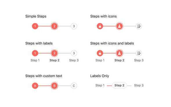
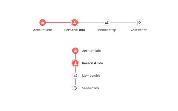
    See the React Stepper Overview demo

    React Stepper - Overview, KendoReact UI Library
  • Display Modes

    With the KendoReact Stepper component there are several ways to display each step. This includes simple steps numbered in sequential order, to using icons or custom text within each step, as well as providing labels underneath each step. These different styles can be configured across the entire React component, or on a step-by-step basis.
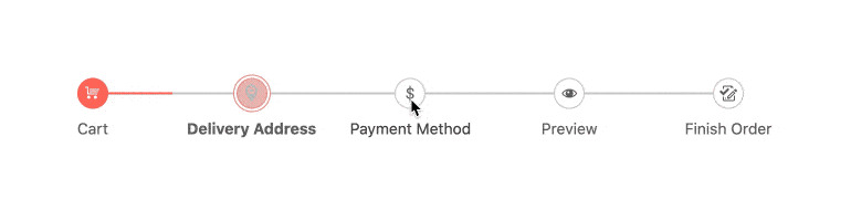
    See the React Stepper Display Modes demo

    React Stepper - Display Modes, KendoReact UI Library
  • Linear Mode

    Out of the box, the React Stepper allows for navigation between steps in any order and does not restrict steps being completed in order. There may be requirements that enforce a progression from the first to the last step in order, and this is where the linear mode of the KendoReact Stepper comes in to play. By enabling linear mode, steps must be completed in sequence, restricting users from random jumping between steps.

    See the React Stepper Linear Mode demo

    React Stepper - Linear Mode, KendoReact UI Library
  • Orientation

    The KendoReact Stepper supports both horizontal and vertical orientations and can dynamically switch between them with a single configuration option.
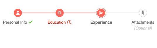
    See the React Stepper Orientation demo

    React Stepper - Orientation, KendoReact UI Library
  • Validation

    The KendoReact Stepper component allows you to setup a validation logic for each step. Depending on the result, a success or an error icon will be rendered. Additionally, you can customize the rendereded validation icons.

    See the React Stepper Validation demo

    Stepper validation
  • Custom Rendering

    By default, the KendoReact Stepper components utilizes a built-in layout and structure to display each step. For scenarios where this default layout is not enough, the steps can utilize a custom renderer to allow developers to take full control over the look and feel of each step.

    See the React Stepper Custom Rendering demo

    React Stepper - Custom Rendering, KendoReact UI Library
  • Globalization

    By default, the React Drawer component will be rendered on the left-hand side, but for applications that require right-to-left display, the Drawer can easily be rendered on the right-hand side.

    See the React Stepper Globalization demo

  • Keyboard Navigation

    Highlighting, focusing and navigating through the steps of the KendoReact Stepper component can be done completely via the keyboard.

    See the React Stepper Keyboard Navigation demo

  • Accessibility

    The KendoReact Stepper component is AAA rated with WCAG 2.0 and sports compliance with Section 508 and WAI-ARIA standards, ensuring that the component is fully compliant with modern accessibility guidelines.

    See the React Stepper Accessibility demo

    Accessibility
  • Other Supported Frameworks

    The Stepper component is also available for these web development frameworks:

Frequently Asked Questions

  • Why should you choose the KendoReact Stepper?
    • All KendoReact components are built from the ground up for React 
    • The component is highly customizable and can be easily modified to suit your needs. 
    • It is one of over 100 other components in our React components library that developers use to build modern, consistent UI.   
    • As a commercial product, it is frequently updated for React compatibility and user demand by a full-time team of experts.    
    • Our support team consistently wins accolades from industry organizations and users themselves.  
    • Each feature is meticulously documented. 


  • How can I try the KendoReact Stepper component?

    You can try all KendoReact Components by signing up for a 30-day trial. During your evaluation, you will have access to all the components, technical support, documentation and on-demand technical training.   

    See the KendoReact Layout Getting Started article for a quick tutorial.  Also, don’t forget to sign up for a trial of the KendoReact components library to get free support.

  • How can I buy the KendoReact Stepper?

    The KendoReact Stepper component is one of over 100 in the KendoReact components library which is part of the Kendo UI bundle. Kendo UI includes libraries for jQuery, Angular, React, and Vue. You can purchase Kendo UI online or by contacting sales.   

    You can also choose to purchase DevCraft, which bundles all our .NET and JavaScript components. 

  • Where can I find the KendoReact Stepper component demo?

    You can find the KendoReact Stepper demo here


  • How do I get started with the KendoReact Stepper?

    Getting started is easy. Visit the KendoReact Layout Getting Started tutorial for an easy step-by-step tutorial. All you need to do is install the NPM package, add the component to a page, and set the desired properties!  

    Don’t forget to sign up for a trial of the KendoReact components library. This gives you a 30-day license and access to support resources to help you during your learning and evaluation process. 


All KendoReact Components

Next Steps