
KendoReact
Free React DropDownList
- Enable users to choose a single item from a list of predefined options.
- Part of the KendoReact library along with 120+ free and paid enterprise-grade UI components.
- You can use this component’s free feature set in production—no sign-up or license required!
The KendoReact DropDownList has both free and premium features. The free features are sufficient to implement essential functionality in a production app.
-
Enable Users to Select a Single Item From a Predefined List
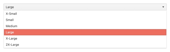
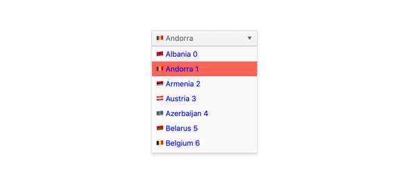
The KendoReact DropDownList component is a form component that enables end users to choose a single predefined value from a list, without support for typing in values, and is a richer form of the select element. Unlike other similar dropdown components, the React DropDownList does not include an input element that can be used for typing a value, and instead, can only be updated by selecting an option from the available list of data.
-
Data and Value Binding
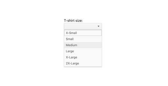
The KendoReact DropDownList can be bound to various forms of data, including datasets of objects, an array of primitive values or binding directly to a single value property. Additionally, the React DropDownList can bind separate fields to the displayed text and the underlying value.
-
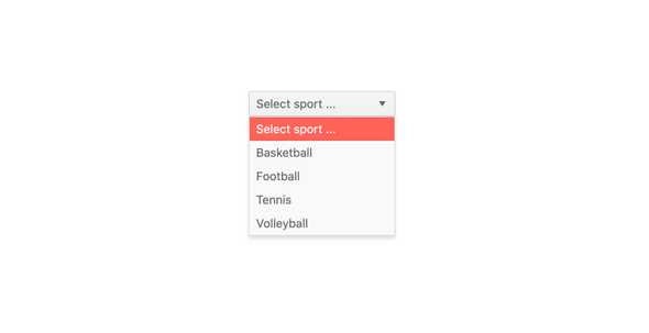
Default Item
By Default, the KendoReact DropDownList will render an empty area if no value has been displayed. Some requirements may call for some sort of placeholder string indicating what the DropDownList component is for, which is where the default item feature comes in. By setting this property, a custom string will be displayed in the React DropDownList when no item is selected.
-
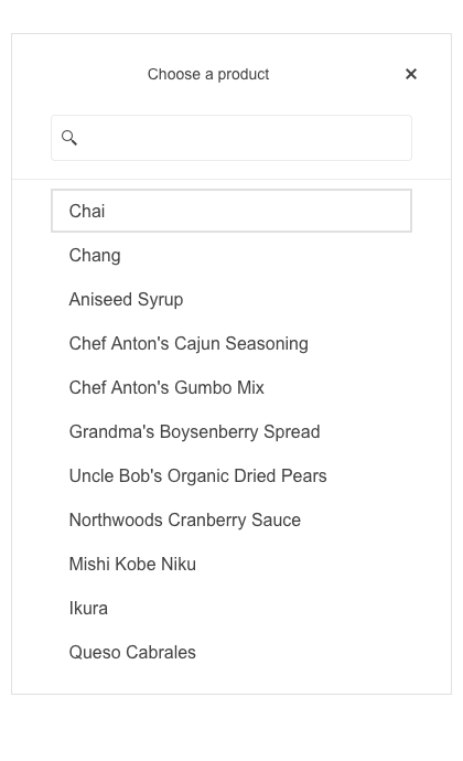
Filtering
The built-in filtering mechanism of the KendoReact DropDownList automatically reduces the number of available choices in the DropDownList data list. Rather than displaying in the input of the React component, the filter appears as a search box at the top of the drop down. Filtering can be configured in various ways, including "starts with" or "contains" to ensure the most intuitive filtering behavior for any scenario.

-
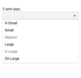
Disabled Items
You have the flexibility to disable certain items within the React DropDownList. Once an item is disabled, it cannot be selected as a value for the component, but it might still remain focusable or non-focusable when navigating through the items using the keyboard.
-
Custom Rendering
Out of the box, the KendoReact ComboBox renders items as plain text. For requirements that need more intricate items, the React DropDownList can take advantage of custom renderers to customize every aspect of the DropDownList. Areas like the list items, the list value, the header and footer areas, as well as the no data message area can be completely customized.
-
Appearance
The KendoReact DropDownList component offers a predefined set of styling options enabling you to customize each individiual aspect of the component appearance.
-
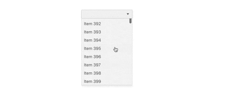
Virtualization
A DropDownList can sometimes be bound to thousands or hundreds of thousands of data items which can impact the performance of even the fastest browsers. With the virtualization feature of the KendoReact DropDownList, scrolling through large amounts of data can be done without impacting the performance of the page.
-
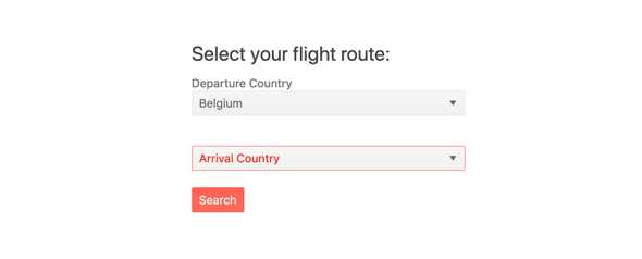
Forms Support
The KendoReact DropDownList is often used as a part of a form to assist with selecting data from a long list of available options. With this in mind, the React DropDownList supports being added to any plain form element or integrated in to an existing React Form library, including the KendoReact Form component.
-
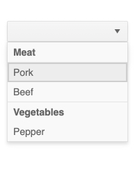
Grouping
Group similar data items in logical categories to help users quickly and easily navigate through the drop-down list. Specify the field responsible for each category while binding your dataset to the KendoReact DropDownList component.
-
Adaptive Rendering
The KendoReact DropDownList supports an adaptive mode, enabling a mobile-friendly rendering of the component popup. The component automatically adapts to the current screen size and alters its rendering accordingly.
-
Globalization
For applications that require support for multiple cultures, the DropDownList has built-in support for updating internal messages to a different language and also can be used in a right-to-left setup by setting a single attribute.

-
Keyboard Navigation
Keyboard navigation has become a crucial part of website navigation for several reasons ranging from speed of data input to accessibility concerns. Understanding this, the KendoReact DropDownList comes with keyboard navigation support out of the box to assist with navigating through and selecting an item by only using the keyboard.
-
Events
The KendoReact DropDownList component supports a variety of events enabling you to tailor the component behavior based on your specific needs.
-
Accessibility
Creating accessible React UI components is a core concept of KendoReact, and the DropDownList is no exception! The KendoReact DropDownList is complaint with Section 508 standards, is AA rated with WCAG 2.0 and follows WAI-ARIA standards.

-
Other Supported Frameworks
The DropDownList component is also available for these web development frameworks:
