
KendoReact
Free React DateTimePicker
- This highly customizable component makes picking the date and time as easy as a couple of clicks.
- Part of the KendoReact library along with 120+ free and paid enterprise-grade UI components.
- This component is free to use, including in production—no sign-up or license required!
-
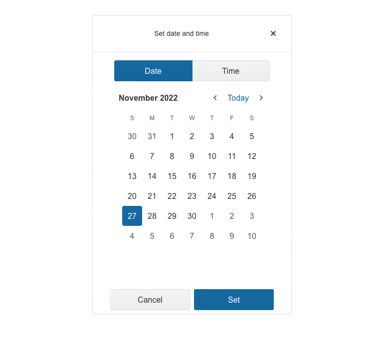
Enable Users to Easily Pick Date and Time in a Single UI Component
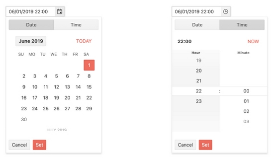
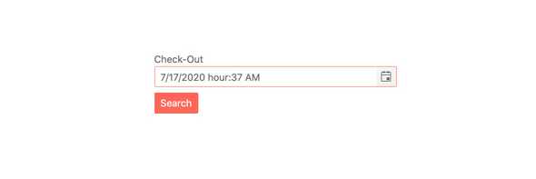
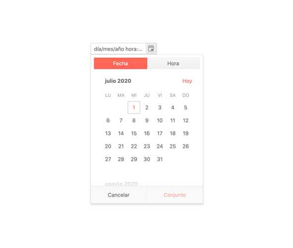
The React DateTimePicker component, part of KendoReact, combines the ability to select both a date and a specific time of day through a highly-customizable component. Users can quickly type in a date and time in the input of the component, or work with the calendar and time picker that appear in a popup to make picking the date and time as easy as a couple of clicks.
-
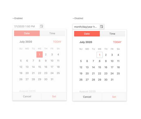
Disabled DateTimePicker
Certain requirements will call for the KendoReact DateTimePicker to be disabled and provide a visual indication that the component cannot be interacted with. Through a single property, which can be updated on the fly, the DateTimePicker can switch between enabled and disabled states.
-
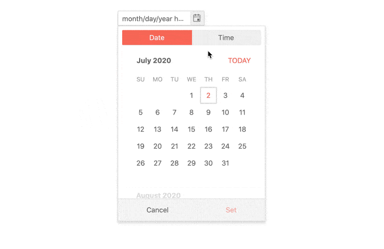
Default Value
By default, the value of the KendoReact DateTimePicker is empty and the popup containing the calendar and time picker only appears when the component is interacted with. Through a couple of configuration options, the React DateTimePicker can initially render with the popup already open, and the default value of both the date and time can already be defined.
-
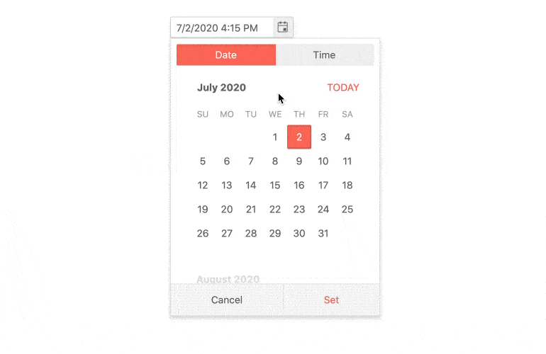
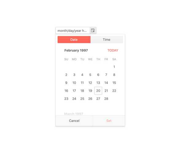
Focused Dates
The calendar featured in the KendoReact DateTimePicker always has a focused date, a date that is highlighted and rendered differently from other dates on the calendar. By default, this is todayâs date, but focus can be applied to any other date through a single property.
-
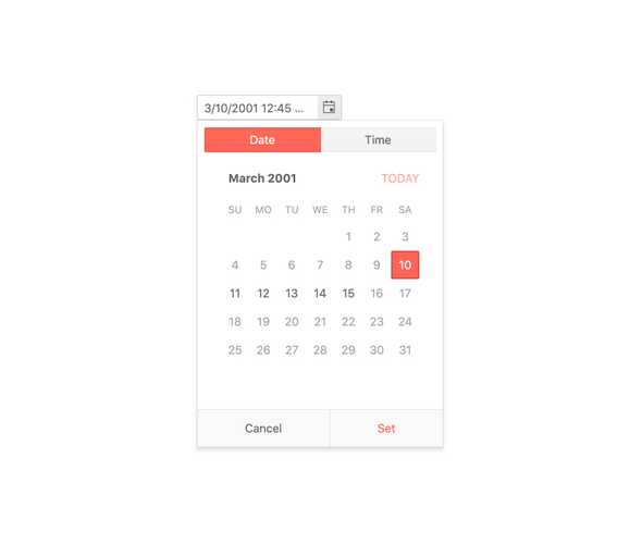
Date and Time Limits
The KendoReact DateTimePicker can handle the full 24-hour clock and can select from any day in the past or the future, which may be too broad of a range for your application. With the Date and Time Limit feature, the React DateTimePicker can limit the available dates and time slots that users can select from, and also prevent users from typing in values outside of these ranges.
-
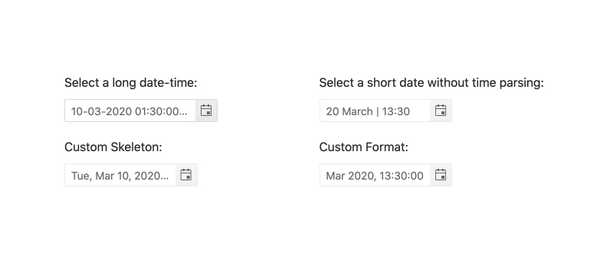
Formats
Date and time can be represented in various formats and the KendoReact DateTimePicker is ready to handle them all thanks to support for valid standard date and time format strings.
-
Appearance
The KendoReact DateTimePicker component provides a set of predefined styling options enabling you to configure each individual aspect of the component appearance.
-
Floating Label
The React DateTimePicker supports adding floating labels as part of its input. This feature displays an initial message within the component, which then floats outside the component when the user enters the input. The floating label is then replaced by the mask of the component, ensuring that users are aware of the content format they should adhere to.

-
Placeholders
When dealing with dates and time using a placeholder to indicate to the user exactly what kind of date of format the component is expecting can be extremely useful. The KendoReact DateTimePicker can use any valid format string to define the format of the displayed date and time values.

-
Adaptive Rendering
The KendoReact DateTimePicker supports an adaptive mode that provides a mobile-friendly rendering of its calendar popup. When enabled, the component will automatically adapt to the current screen size and will change its rendering accordingly.
-
Forms Support
The KendoReact DateTimePicker is a perfect component to be used with a form element when both a date and a time need to be selected without having two different components responsible for each portion. As a part of this, the DateTimePicker can integrate in to any form, whether it is a HTML form, a KendoReact Form or a form built by any React form library.
-
Globalization
The KendoReact DateInput component supports globalization out of the box, which means that the format of the date placeholder and date can change depending on the locale of the user without needing to manually reconfigure the React component.
-
Controlled and Uncontrolled Modes
React components in forms come in two flavors: control and uncontrolled. Uncontrolled components enable the form data to be controlled directly by the DOM. Controlled components enable the form data to be handled by a React component. By default, the KendoReact DateTimePicker is an uncontrolled component, but can easily transition to a controlled component by working with a few configuration options.
See React DateTimePicker Controlled and Uncontrolled Modes demo
-
Customization
The KendoReact DateTimePicker enables you to render custom components instead of default ones, thus allowing you to customize the child component based on your needs. You can customize the DateInput, Calendar and Popup DateTimePicker components.
-
Events
The KendoReact DateTimePicker component supports a variery of events enabling you to customize the component behaviour based on your needs.
-
Keyboard Navigation
The KendoReact DateTimePicker includes a few different ways to select a day and time using keyboard navigation. This includes typing in the date and time slot, incrementing the value of each value with the arrow keys, or opening the calendar and time picker in order to traverse through the displayed interface to select a date and time.
-
Accessibility
Continuing a tradition of putting accessibility at the forefront of building React UI components, the KendoReact DateTimePicker is AAA rated for WCAG 2.0, and compliant with both WAI-ARIA and Section 508 standards.

-
Other Supported Frameworks
The DateTimePicker component is also available for these web development frameworks:
