

Overview of the Meridian Theme
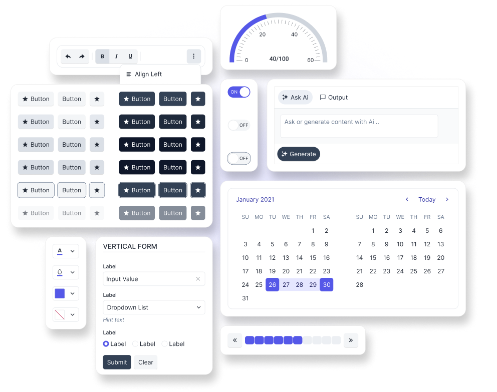
The Telerik and Kendo UI Meridian theme is a fully-customizable SCSS-based theme for the Telerik and Kendo UI components.
The theme provides a modern, accessible visual language and is the recommended starting point for new Telerik and Kendo UI applications. Starting with theme version v14.0.0, Meridian becomes the recommended default choice for new projects, while the Telerik and Kendo UI Default theme moves to maintenance mode. Existing applications that use the Default theme can continue doing so and migrate to Meridian when it fits their roadmap. For more information about this change, refer to the v14.0.0 breaking changes article.
The Meridian theme includes two built-in swatches: meridian-main and meridian-main-dark. To learn more, see the Meridian swatches article.
To get the Telerik and Kendo UI Meridian theme, you can use the available npm package, CDN link, or GitHub repository.
Getting Started
The fastest way to apply the out-of-the-box Telerik and Kendo UI Meridian theme is to reference the theme stylesheets that are located on a CDN. Alternatively, you can install the theme as an npm package. The npm package approach also gives you access to the theme source so you can customize the theme and inspect the available theme variables.
Using the CDN Link
To use the Telerik and Kendo UI Meridian theme without customizing it, reference the precompiled CSS file URL for the required theme version and swatch in the head section of your application, for example:
<link
  rel="stylesheet"
  href="https://www.unpkg.com/@progress/kendo-theme-meridian@14.3.0/dist/meridian-main.css"
/>
In the above URL, @x.x.x specifies the theme version and main is the swatch name. To preview the appearance of the built-in theme styles, visit the online demos for the Telerik or Kendo UI product that you are using.
To obtain the CDN URL for a specific theme version and swatch:
- Visit @progress/kendo-theme-meridian on UNPKG.
- Select a version at the top-right.
- Open the
distfolder. - Open the required CSS file, for example, meridian-main.css.
- Click the View Raw button, for example, here is the CDN URL for
meridian-main.css.
It is possible to reference a swatch URL without a version, which will load the latest one automatically. This is strictly not recommended in production applications.
While using the precompiled CSS file is faster than compiling the theme from the source code, the approach has two drawbacks:
- The precompiled CSS file contains the CSS code for all components, even for components that you do not use in your application.
- The precompiled CSS file does not support customizations through SCSS variables because they are no longer present in the theme. To customize the theme, you must rebuild it by using the provided source code.
Installing the NPM Package
To install the Telerik and Kendo UI Meridian theme in your project, use the provided npm package.
npm install --save @progress/kendo-theme-meridianTo use the theme in your application, import it into your project styles:
// Import the entire theme
@use "@progress/kendo-theme-meridian/scss/all.scss" as *;
Customizing the Theme
You can customize the Telerik and Kendo UI Meridian theme both in terms of what gets compiled and how the theme looks. In addition to importing the full theme bundle, you can import only the styles for the components you need and use SCSS variables to override colors, typography, sizing, and component-level settings.
Framework-Specific Documentation
For specific information about how to implement the Meridian theme in the context of the Telerik and Kendo UI libraries, refer to the official product documentation:


