Overview
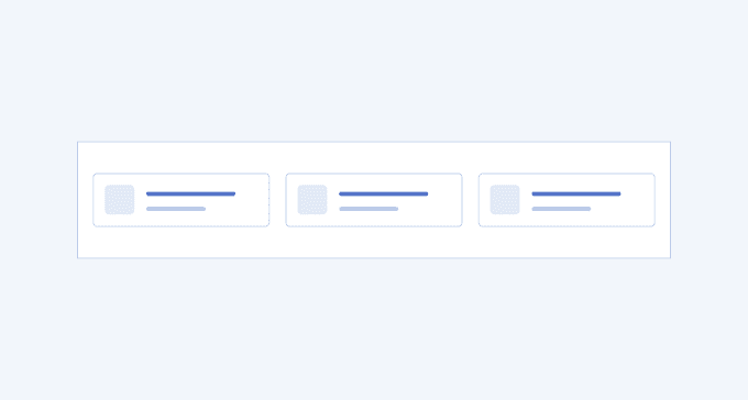
The Compact Card is mostly used within dashboards where the information is often represented in the form of cards and a lot of it should be displayed in a compact and understandable manner. The Compact Card is located above all other cards on the overview page. Depending on the information in it, the card could include a header, footer, icons, buttons, progress bars, gauges, or whatever the context requires.
Similarly to the Stats Card, the Compact Card always comes with other compact cards, grouped in rows or columns, providing equally important information, following the same layout and size.
A well-designed Compact Card is visually attractive, provides meaningful information in an accessible and understandable manner, and uses various typography styles, icons, or components.
Key Principles
- Consistency—all compact cards must contain information of equal importance and must have equal structure and size.
- Data-driven—the compact cards must include data, such as statistics or status.
- Clear messaging—the text within the compact card should be concise and informative, with emphasis on the numbers.
Compact Card Variants
The Telerik and Kendo UI Compact Card offers design variants showcased in our demos, each tailored to enhance your application development by covering different usage scenarios.
Compact Card 1

Compact Card 2

Compact Card 4

Compact Card 7

Compact Card 9

UI Components Documentation
For product-specific information, refer to the corresponding Telerik and Kendo UI documentation:


