Grid Overview
The Grid component is a powerful tool for displaying structured data in a table format within web or application interfaces. It organizes the data into rows and columns and allows users to easily view and edit the data. With features such as sorting, filtering, grouping, resizing, and pagination, Grids provide a flexible and intuitive way to interact with large data sets, making them essential for data-driven applications.
Live Demo
Appearance
The Grid component provides built-in styling options that grant visually appealing and flexible rendering experience.
Anatomy
The anatomy of the Grid summarizes the elements of the component:
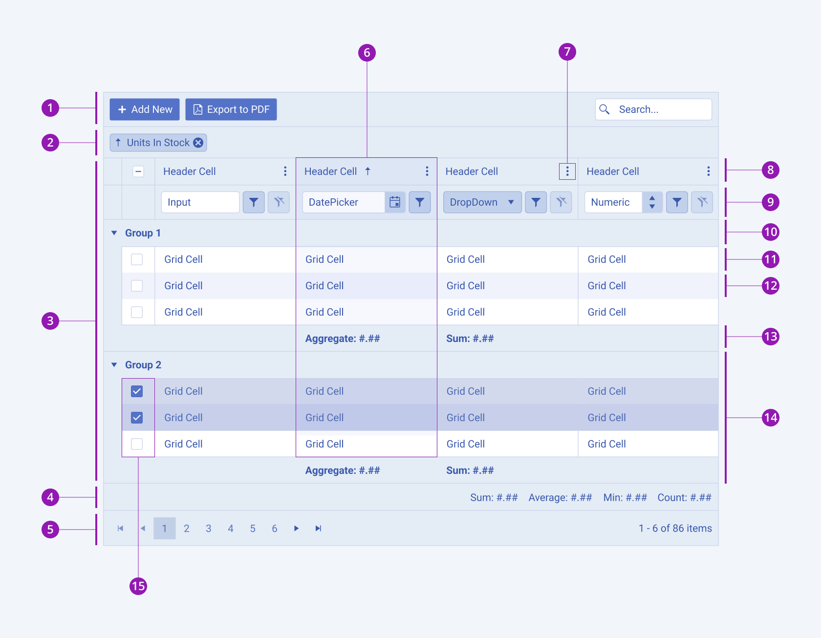
- Toolbar
- Grouping header
- Grid
- Status bar
- Pager
- Sorted column
- Column menu
- Grid header
- Filter row
- Group header
- Grid row
- Grid alternate row
- Group aggregate footer
- Group with selected rows
- Checkbox row selection
Size
The Grid provides the size configuration option that enables you to control how big or small the rendered Grid will be. Options for size customization are also at your disposal.
size provides the following available options:
small—Renders a small Grid which is optimized for compact UI designs. The small Grid, also called "high-density Grid", uses the same typographic style as the medium Grid. However, the vertical and horizontal paddings of the cells are decreased.medium(default)—Renders a medium Grid. The medium Telerik and Kendo UI Grid uses the same typographic style as the small Grid. However, the vertical and horizontal paddings of the cells are increased.
Basic Grid
In its basic form, the Grid displays data in rows and columns using only grid cells and a grid header, offering a fundamental structure for presenting information:

Sorting
The sorting feature in Grids enables users to arrange data in ascending or descending order based on the values in single or multiples columns. It facilitates quick organization and analysis of data, allowing users to easily locate specific information and identify patterns within the dataset. Users can initiate sorting by clicking the column headers or through options in the column menu.
The next image shows the different sorting scenarios:
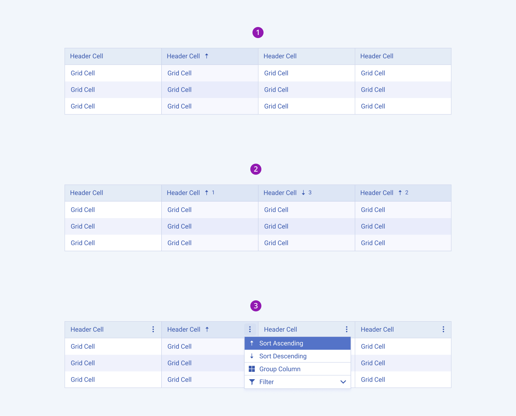
- Sorting a single column from the column header
- Sorting multiple columns from the column headers
- Sorting through the options in the column menu
Filtering
The filtering feature in Grids empowers users to refine data display based on specific criteria, enhancing data analysis capabilities. Users can set filters on single or multiple columns to display only rows that meet certain conditions. These conditions can include text search, numeric ranges, date ranges, or custom criteria defined by the user. Filtering options can be accessed through a dedicated filter row, a filter menu, or through options in the column menu.
The next image shows the different filtering scenarios:
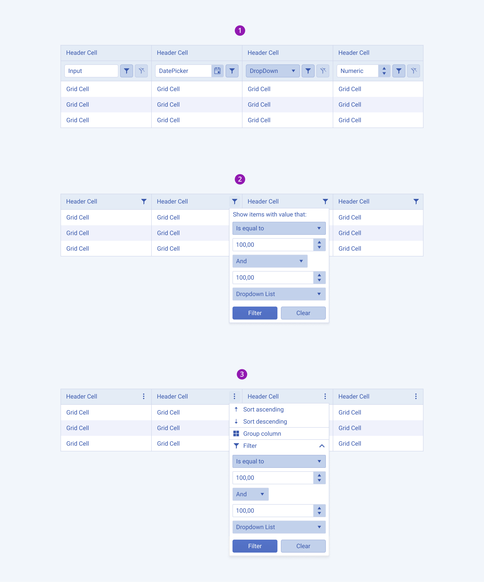
- Filtering from the column menu
- Filtering from the filter menu
- Filtering from a filter row
Grouping
The grouping feature in Grids empowers users to organize data into logical groups by dragging a single or multiple column headers to the grouping header. This action prompts the grid to create groups based on the available values within that column. By structuring data in this way, users can easily analyze relationships and hierarchies within the dataset, enhancing their understanding and decision-making capabilities.
The next image shows the grouping feature:
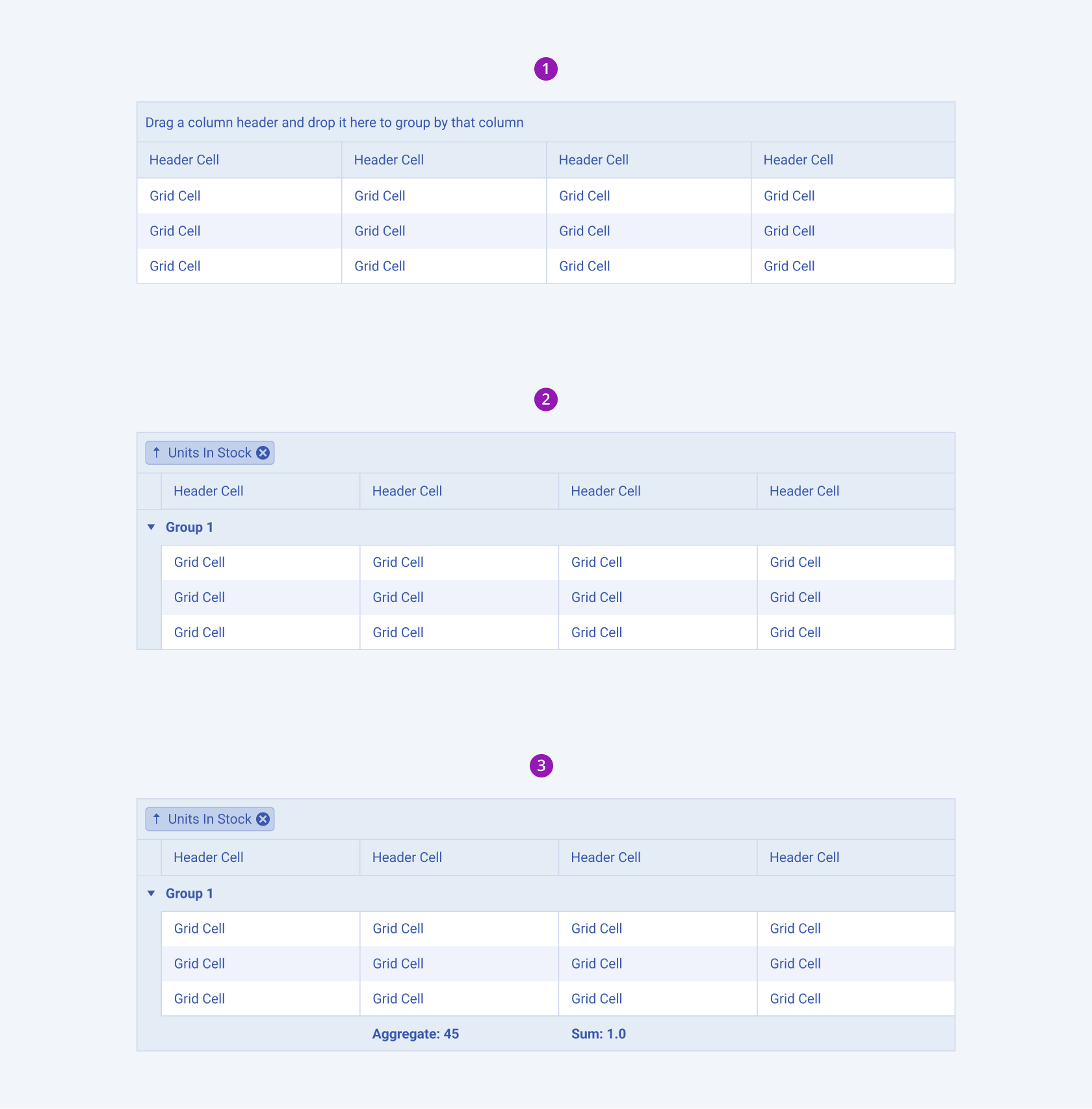
- Empty group header
- Grouping
- Grouping with an aggregate footer
Editing
The editing feature in Grids allows users to modify data directly within the grid interface, providing a seamless and efficient way to update information. Depending on configuration, Grids may support various editing modes such as inline editing, in-cell editing, or external form editing.
The next image shows the editing configurations:
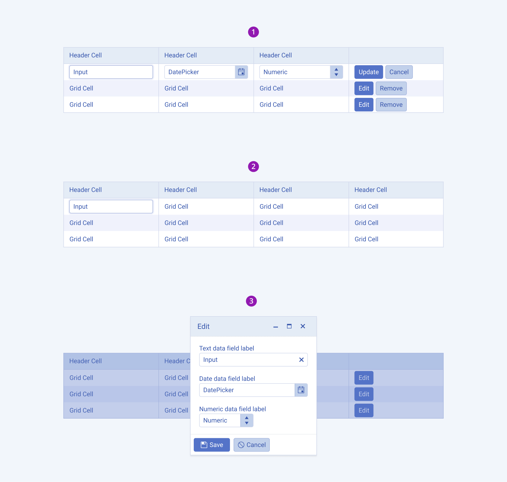
- Inline editing
- In-cell editing
- External form editing
Framework-Specific Documentation
For specific information about the component, refer to its official product documentation:


