

Button Overview
A Button is a user interface (UI) element, displaying textual or visual content to indicate an action which will be triggered when the user clicks on the button.
Buttons provide consistent styling. They can render arbitrary content such as text, icons, badges, or a combination of these. Depending on the requirements of the website or application, developers can either initialize a single Button or create multiple Buttons at once.
Live Demo
Appearance
Buttons provide built-in styling options that grant visually appealing and flexible rendering experience. To a great extent, the appearance of the Buttons on the page implies the logical flow of the page itself. For example, primary buttons have to be as visible as possible so, typically, they use solid colors.
Apart from the default vision of the Telerik and Kendo UI Button, the component supports alternative styling options which enable you to configure the individual aspects of its appearance.
States
Depending on the action you want to imply through its appearance, the Telerik and Kendo UI Button can acquire the following states which you can set by using the following classes:
- A Button in its normal state appears active, and is usable and clickable.
k-hover—Тhe hover state of a Button is applied after the user hovers over the component.k-focus—The focus state is triggered after the Button has been spotlighted with the mouse or the keyboard.k-active—The active state is applied when a Button is activated upon user interaction.k-selected—The selected state of a Button is activated after the user has selected the component.k-disabled—The disabled state indicates that a Button is temporarily unclickable because, for example, the page requires additional user input, or something important is missing before users continue to the next step. To indicate that they are unavailable, Buttons in their disabled state are usually faded, slightly out of focus, and show a subdued text label.
Anatomy
The anatomy of the Button summarizes the elements of the component.
Depending on the elements they display, the Telerik and Kendo UI Buttons can be any of the following types:
- Icon—Icon buttons display icons instead of text, and are useful for visual enhancement. Telerik and Kendo UI Buttons seamlessly accept Kendo UI Font icons, FontAwesome icons, and image icons which can be displayed as foreground or background images. Using background images is better because the icon represents a decoration and not structural content.
- Text—Text buttons render a chunk of text which directly identifies the action that will be triggered upon user interaction.
- Icon-and-text—Icon-and-text buttons display icons next to a chunk of text, and also come in handy when you want to visually enhance the button and its message.
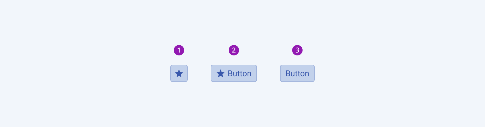
- An icon-only Button
- An icon-and-text Button
- A text-only Button
The next image shows the anatomy of an Icon button and includes the following elements:
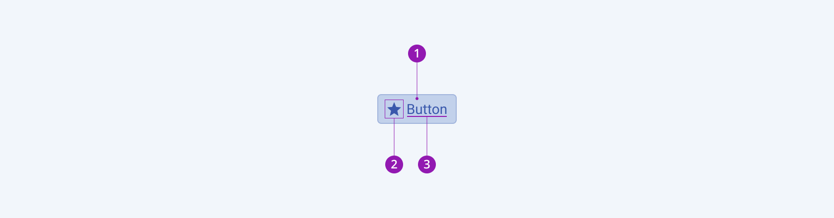
- Container
- Icon (optional)
- Text label
Size
The Button provides the size configuration option that enables you to control how big or small the rendered button will be. Buttons also provide options for size customization.
size provides the following available options:
-
small—Renders small buttons, which are suitable for compact components, such as the Pager and Toolbar, where the available space is limited.The small Telerik and Kendo UI Buttons use the same typographic style as the medium buttons. However, to achieve the desired height, the small buttons apply a
$kendo-spacing, 0.5spacing value for their vertical paddings. -
medium(default)—Renders medium buttons.The
mediumsize configuration is the base according to which thesmallandlargeoptions are specified. The medium Telerik and Kendo UI Buttons use the same typographic style as the small buttons. However, to achieve the desired height, the medium buttons apply a$kendo-spacing, 1spacing value for their vertical paddings. -
large—Renders large buttons, which are suitable for adaptive components and mobile devices.The large Telerik and Kendo UI Buttons achieve the recommended touch area dimensions both by doubling the value of their vertical paddings to
$kendo-spacing, 2and by using a different typographic style with a bigger font size and line height. -
none—Does not set asizeand allows you to add your own, custom value.
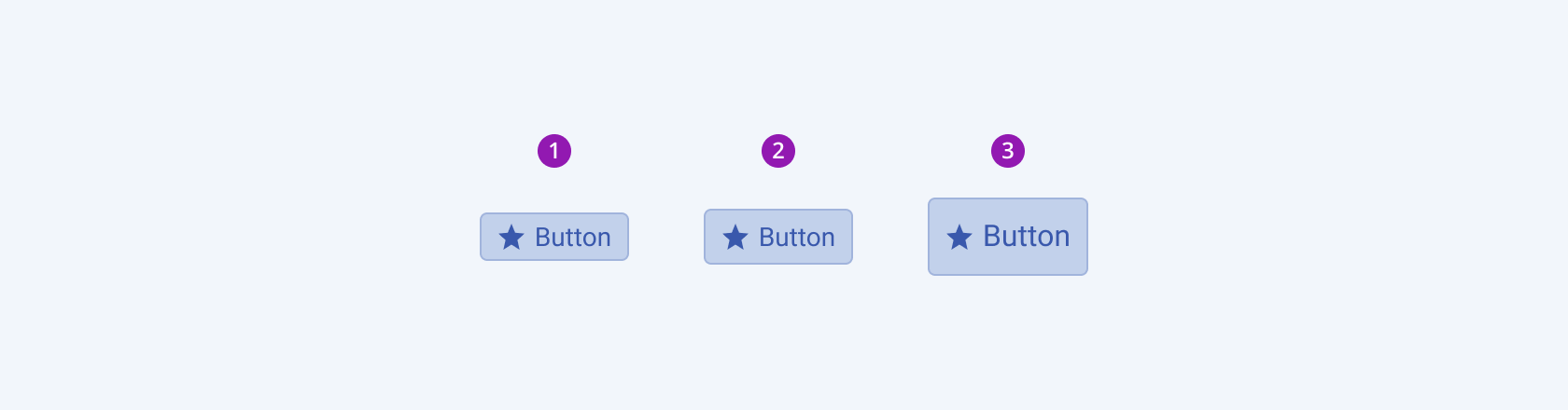
- Small
- Medium (default)
- Large
Color
The Button provides the theme-color configuration option that enables you to choose among the available, built-in colors that will be applied to it. Buttons also provide options for color customization.
themeColor provides the following available options:
base(default)primary—Primary buttons visualize the most important action on the page and immediately draw the undivided attention of users by acquiring specific styling, for example, solid color. To avoid visual clutter, primary buttons must be used just once on a page.secondary—Secondary buttons indicate actions of secondary importance. They are used usually in conjunction with a primary button, but can also be used independently in the context of button groups, for example.tertiary—Tertiary buttons are used less frequently than primary and secondary buttons. They indicate independent, less pronounced, common actions throughout a page, for example, sub-tasks on a page with a primary button.info—Info buttons are most suitably used for notification alerts, conveying to users that new information is available.success—Success buttons imply successful or positive actions.warning—Warning buttons typically appear in confirmation dialogs to indicate actions causing significant changes, which must be regarded with caution.error—Error buttons typically appear in dialogs to indicate that the user is about to make a destructive and irreversible action such as deleting or removing a file.none—Does not set athemeColorand allows you to add your own, custom value.
Fill Mode
Fill modes create a certain look-and-feel of the UI and also signify hierarchy between components of the same type. Combining different fill modes is recommended in very few cases with the button being the perfect exception.
The Button provides the fillMode configuration option that enables you to control the way in which color is applied to the rendered button. Buttons also provide options for fill-mode customization.
fillMode provides the following available options:
solid(default)—On a page, a solid button puts the strongest emphasis on the action it indicates and draws the attention of users to the single issue of primary importance.outline—Often used as secondary buttons, outline buttons have a medium emphasis, indicate complementary actions, and reduce the visual noise when the page displays many actions of equal importance.flat—Flat buttons place the lowest emphasis on the actions they indicate as they have neither a background, nor a border. Their main purpose is to avoid distracting users from the main content and, therefore, are often used in dialogs, toolbars, or inline.link—Link buttons are navigational elements and redirect to internal or external resources.none—Does not set afillModeand allows you to add your own, custom value.
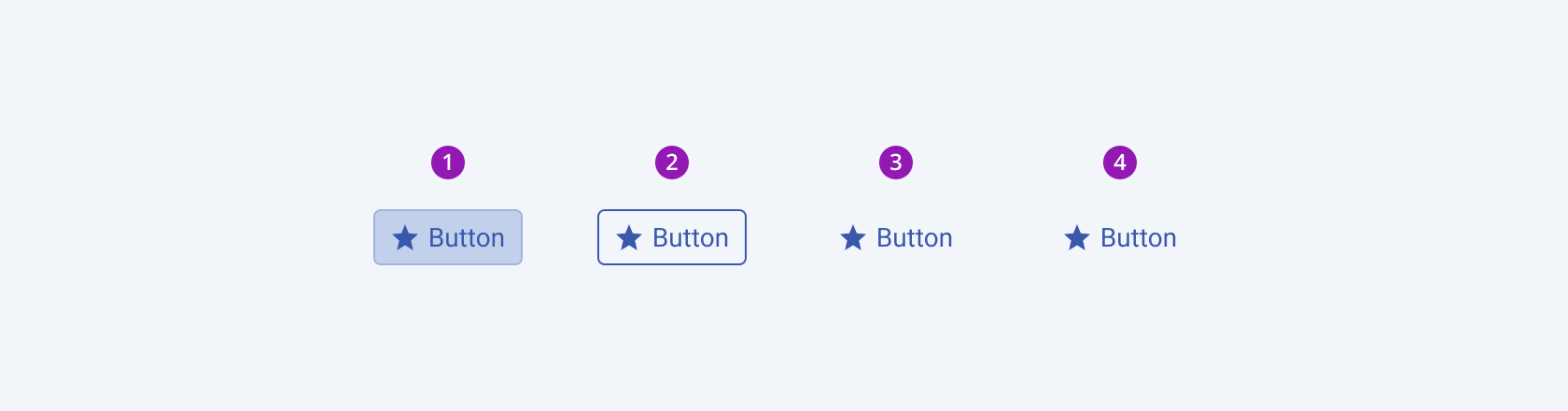
- Solid (default)
- Outline
- Flat
- Link
Border Radius
The Button provides the rounded option that enables you to control the border radius of the rendered button. The defined value for the border radius significantly affects the look-and-feel of the UI. Buttons also provide options for border-radius customization.
rounded provides the following available options:
small—Renders a border radius of 2 px.medium(default)—Renders a border radius of 4 px.large—Renders a border radius of 6 px.full—Renders a border radius of 9999 px.none—Does not set aroundedvalue and allows you to customize the configuration.
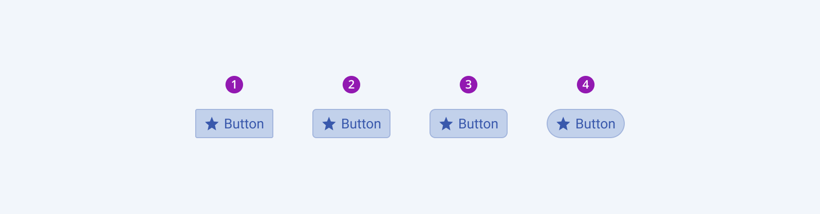
- Small
- Medium (default)
- Large
- Full
Framework-Specific Documentation
For specific information about the component, refer to its official product documentation:


