Overview
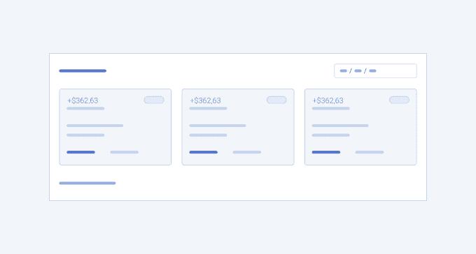
A Dashboard Card has an exclusive use in dashboard interfaces, especially on the overview page which serves as a hub page and provides insightful data. As it is a highly customizable element, it could include different parts (header, footer, body) and components (charts, tables, images, links, etc.), depending on their purpose.
Dashboard cards are often used to represent statistics, tasks, status updates, schedules and calendars, company policies, and useful links. They serve as a navigation to other pages that the user might like to reach and informational overview of the application’s content.
Well-designed Dashboard cards represent the relevant information in the most suitable way with the help of data visualization components, tables, date components, etc.) in a concise and understandable manner.
Key Principles
- Diverse formats – different types of content require different card’s layout and size;
- Relevance – dashboard cards must represent only the most relevant and valuable information to avoid overflooding the interface;
- Clear naming – each card must include a label within it to indicate what does it stands for.
Dashboard Card Variants
The Telerik and Kendo UI Dashboard Card offers design variants showcased in our demos, each tailored to enhance your application development by covering different usage scenarios.
Dashboard Card 1
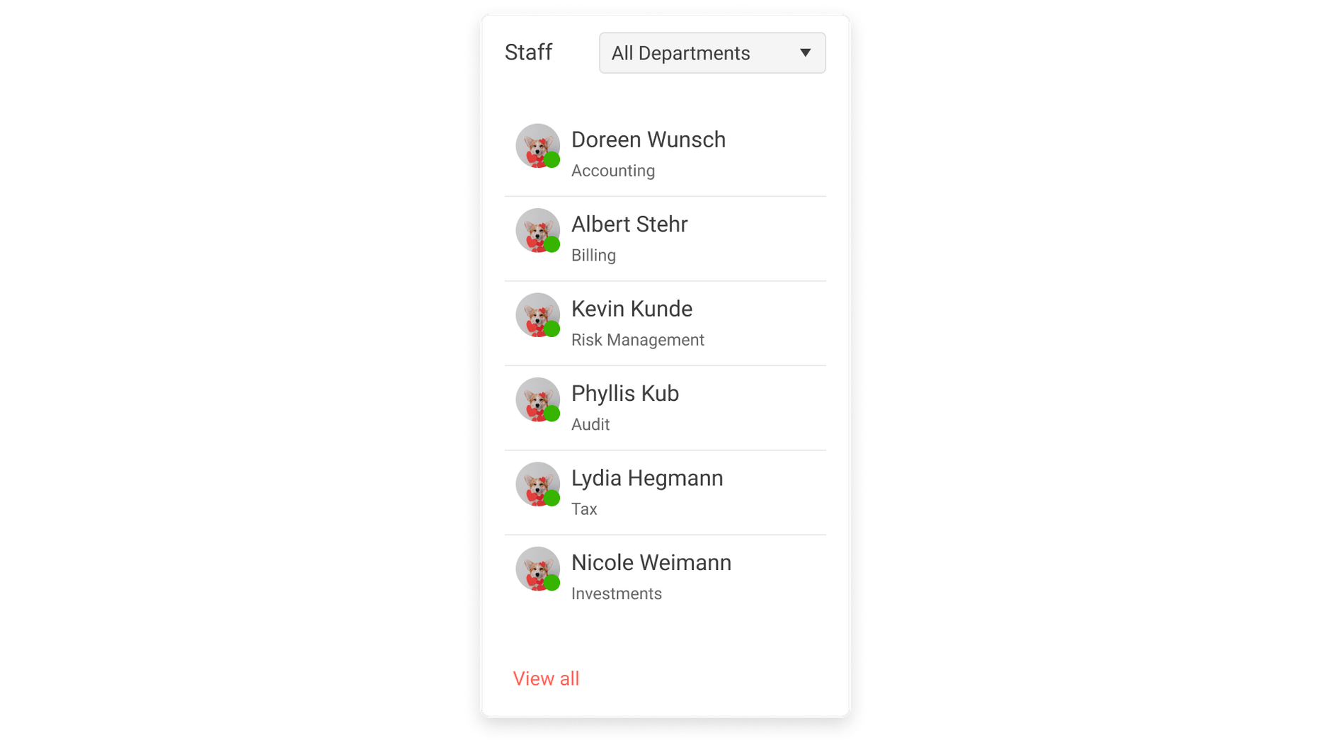
Dashboard Card 2
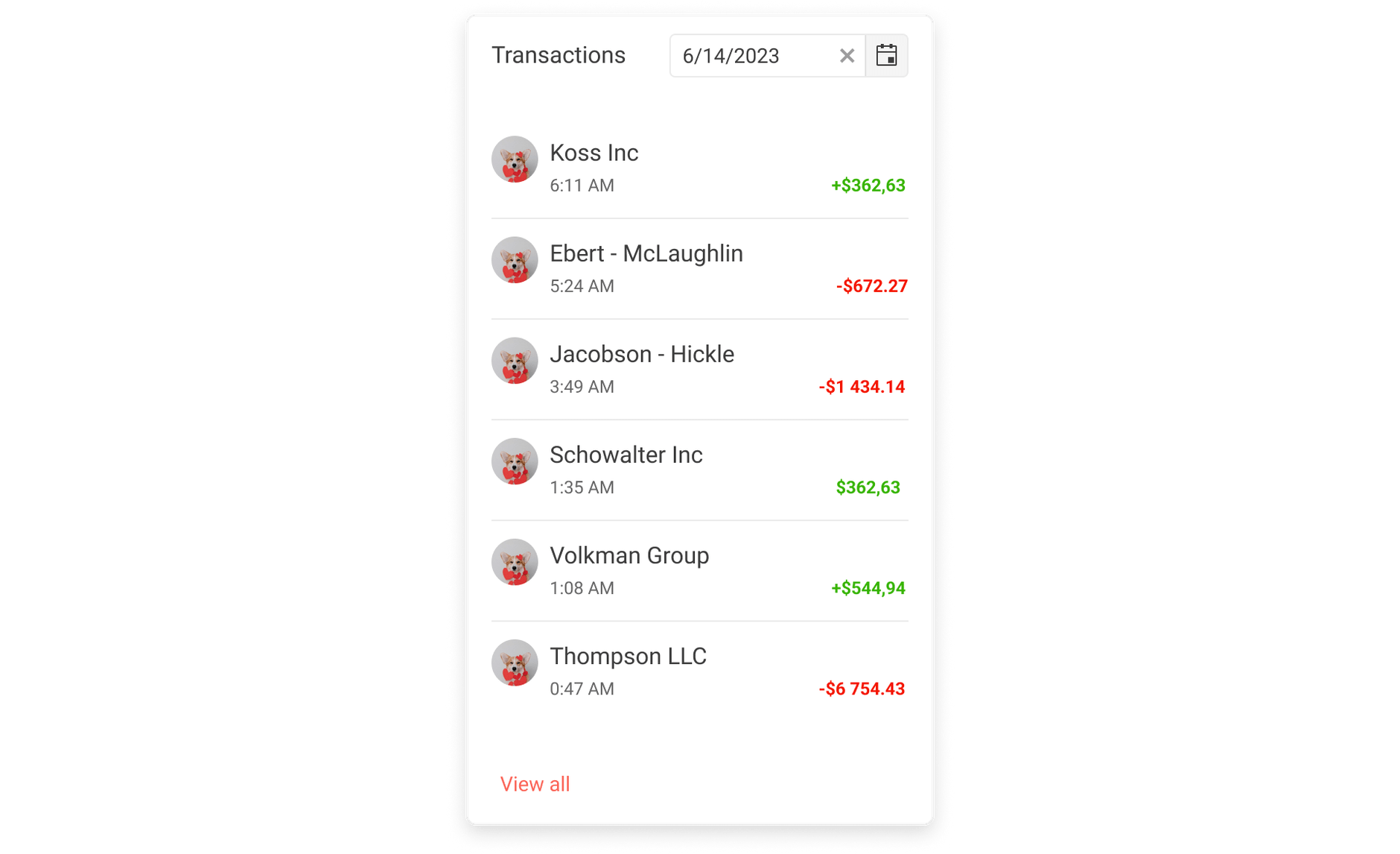
Dashboard Card 3
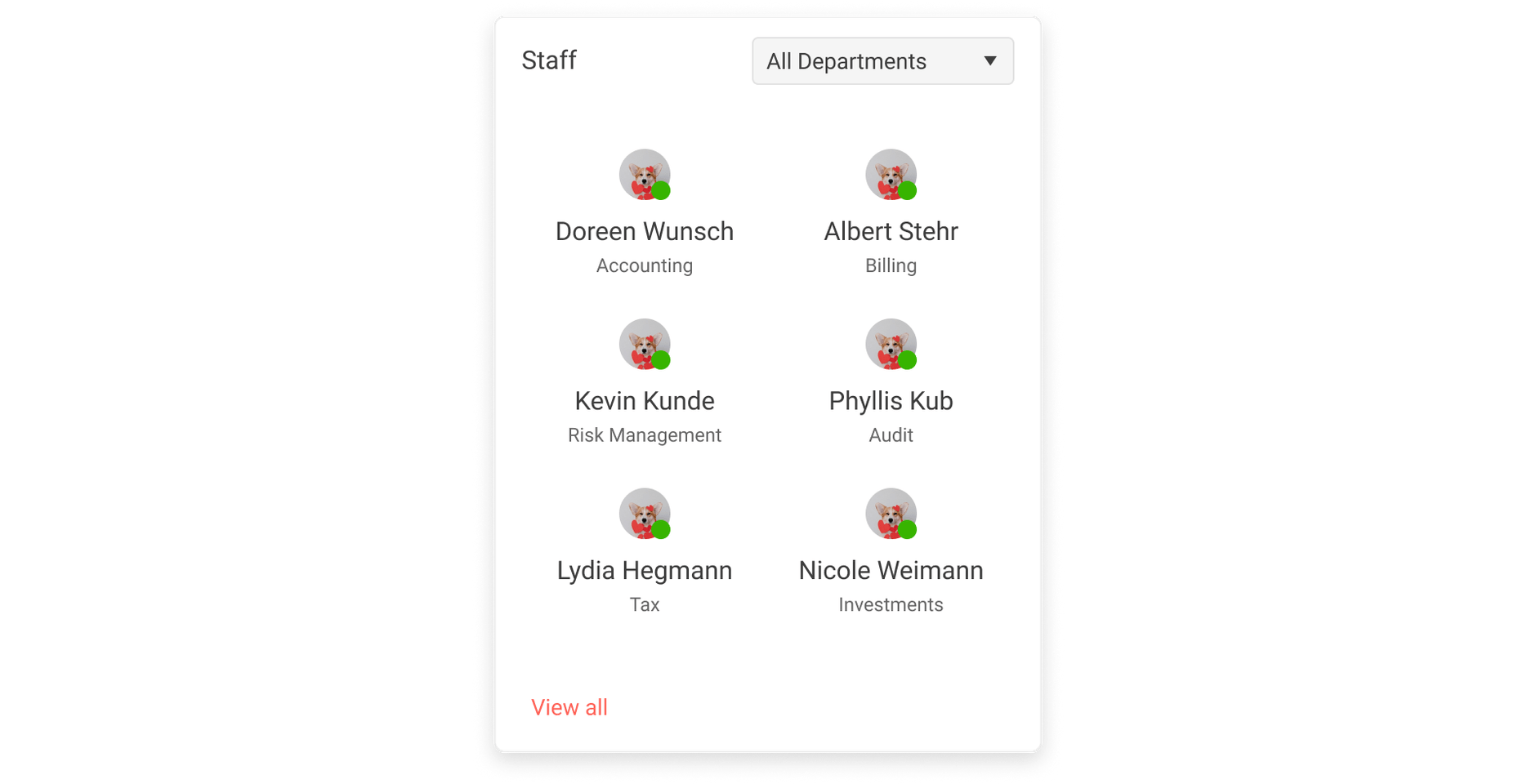
Dashboard Card 4
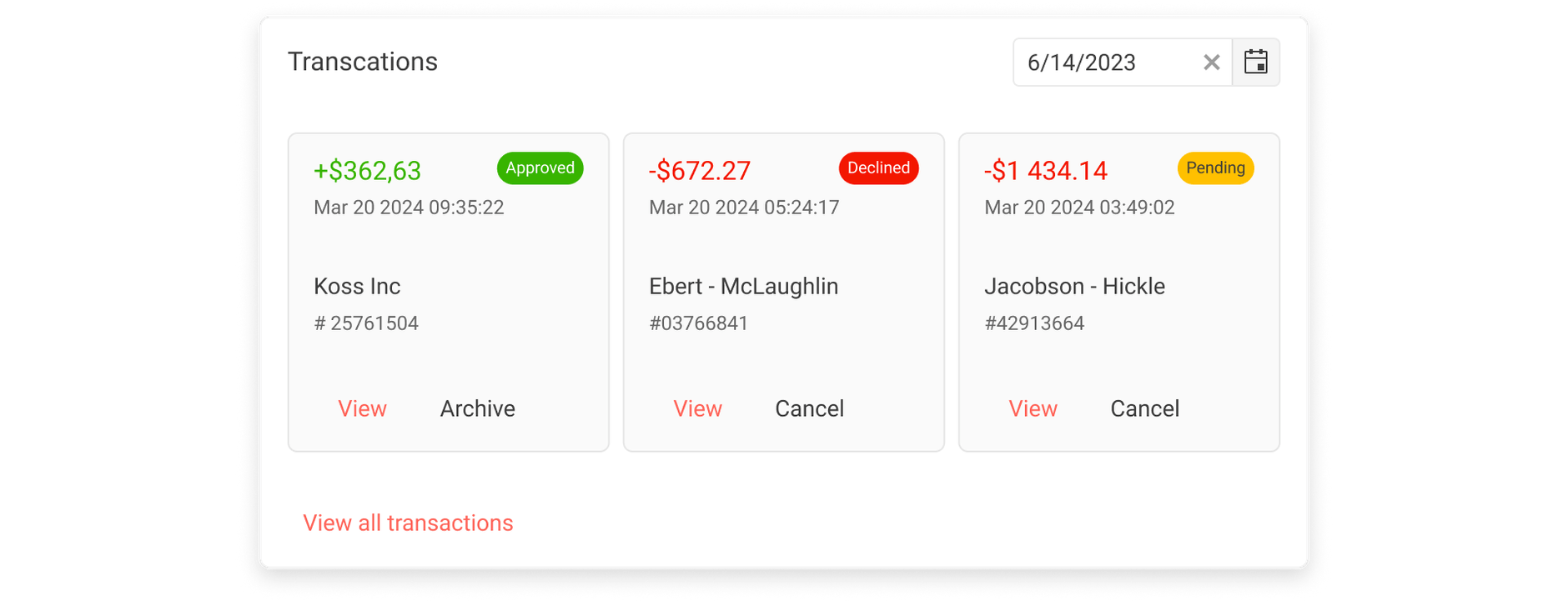
Dashboard Card 5
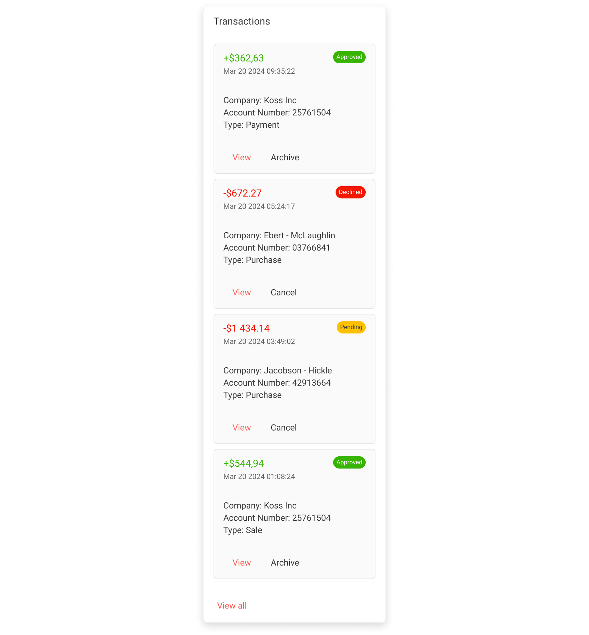
Dashboard Card 6
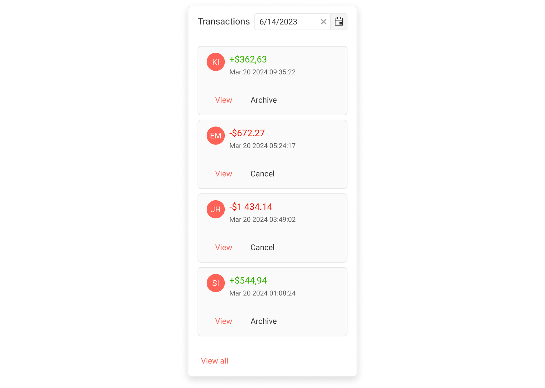
Dashboard Card 7
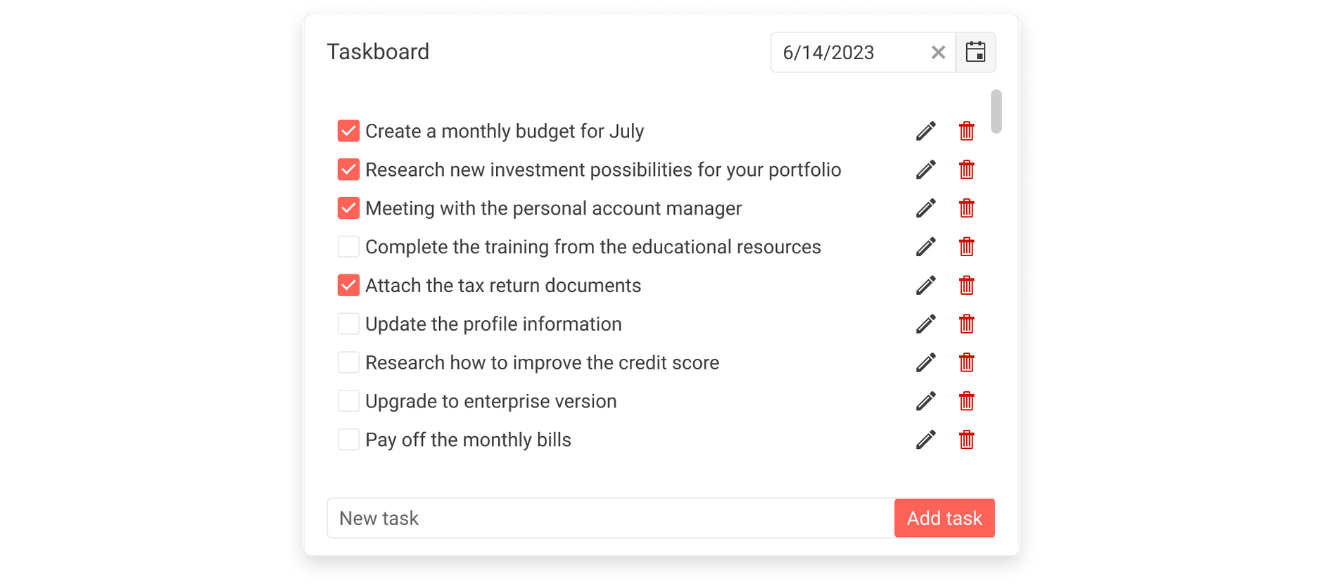
Dashboard Card 8
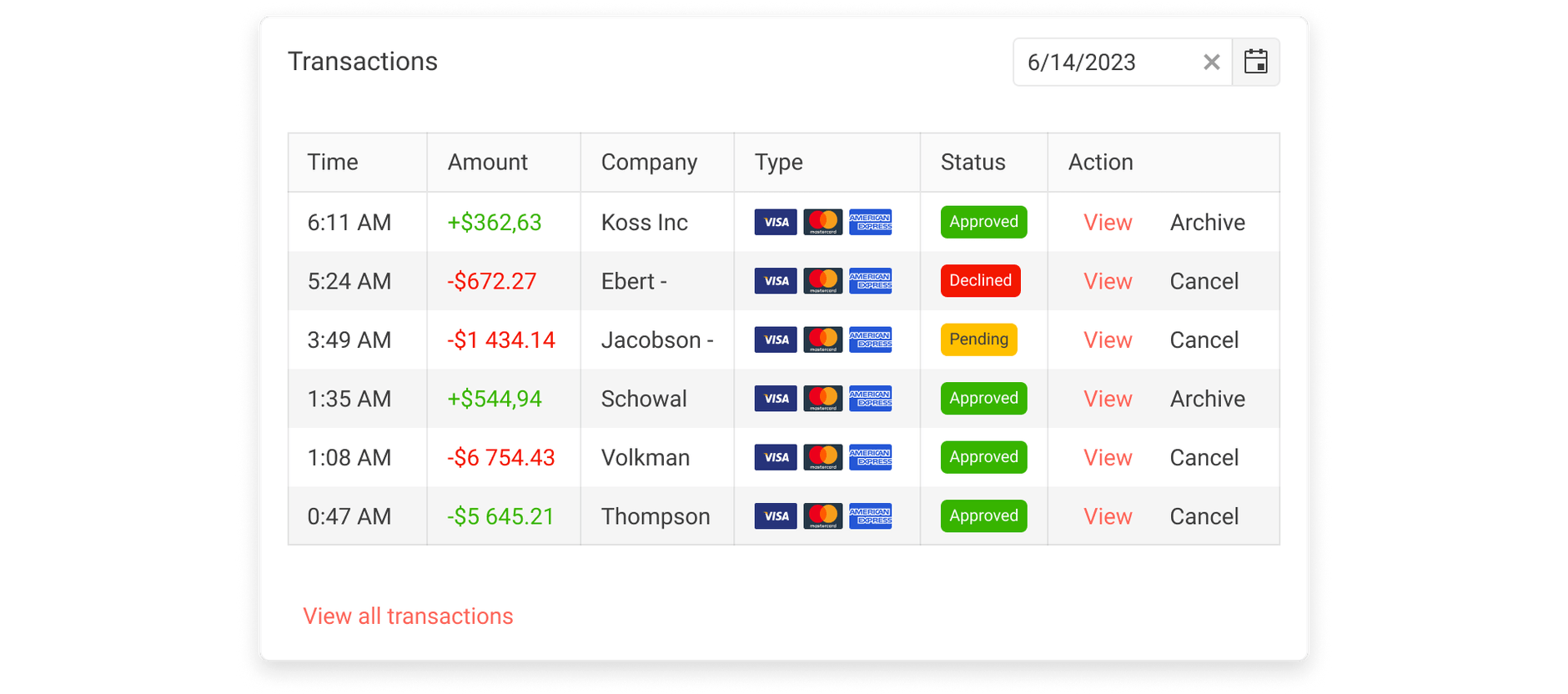
Dashboard Card 10
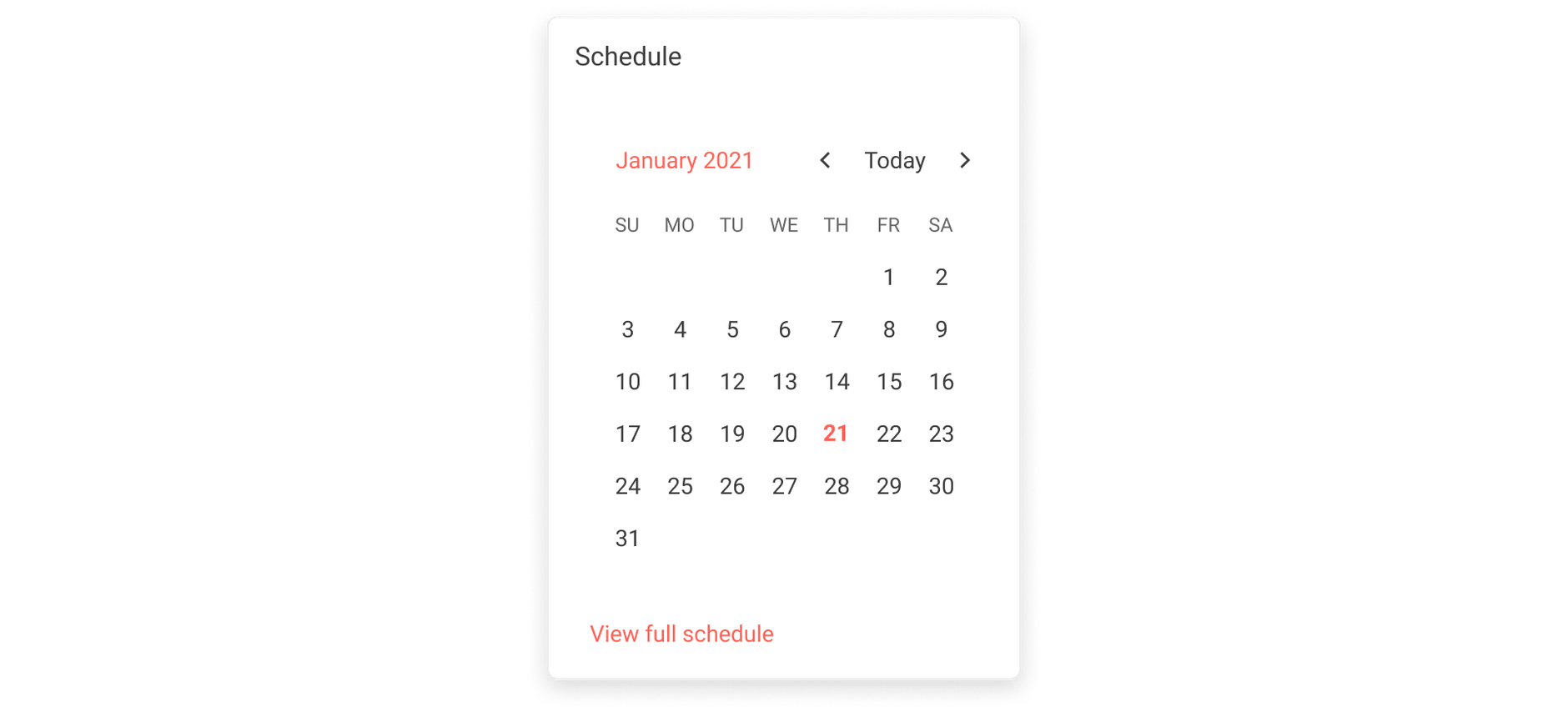
Dashboard Card 11
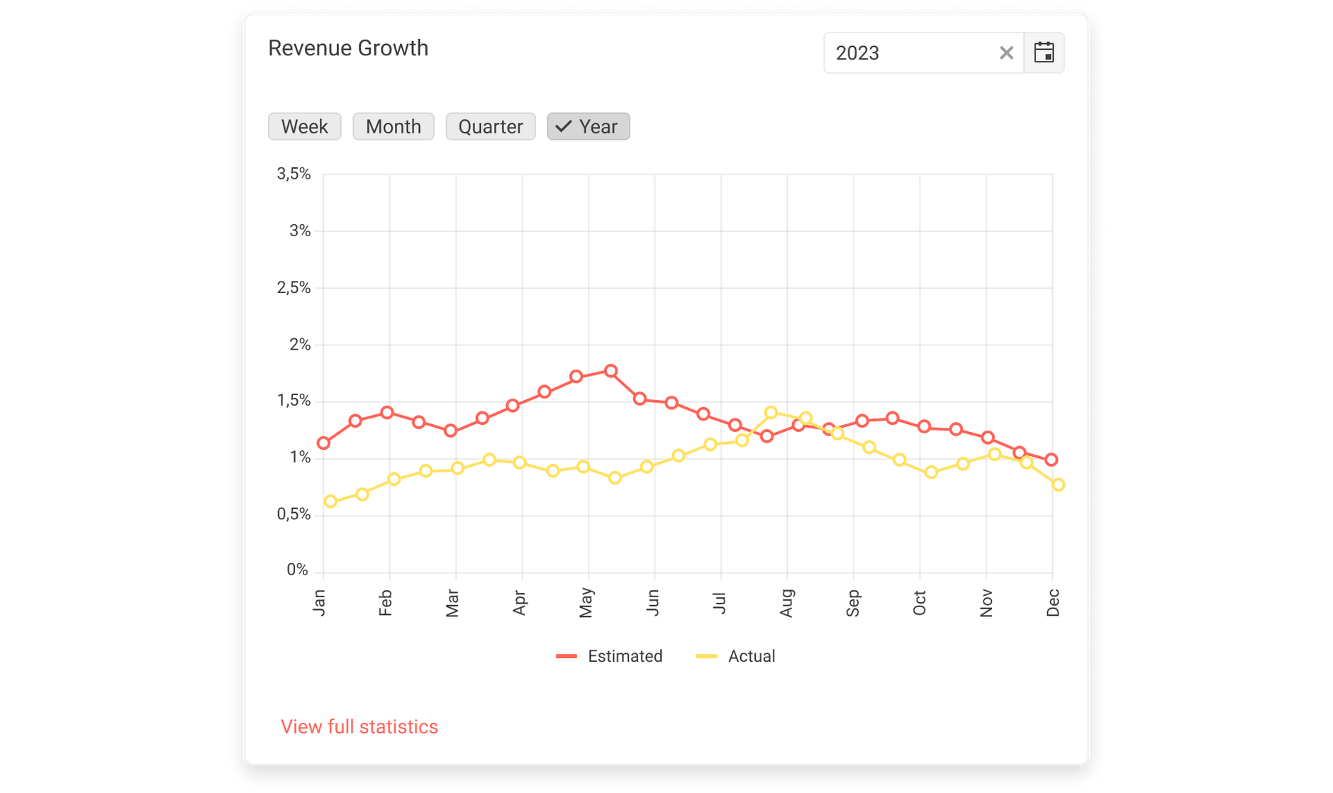
Dashboard Card 12
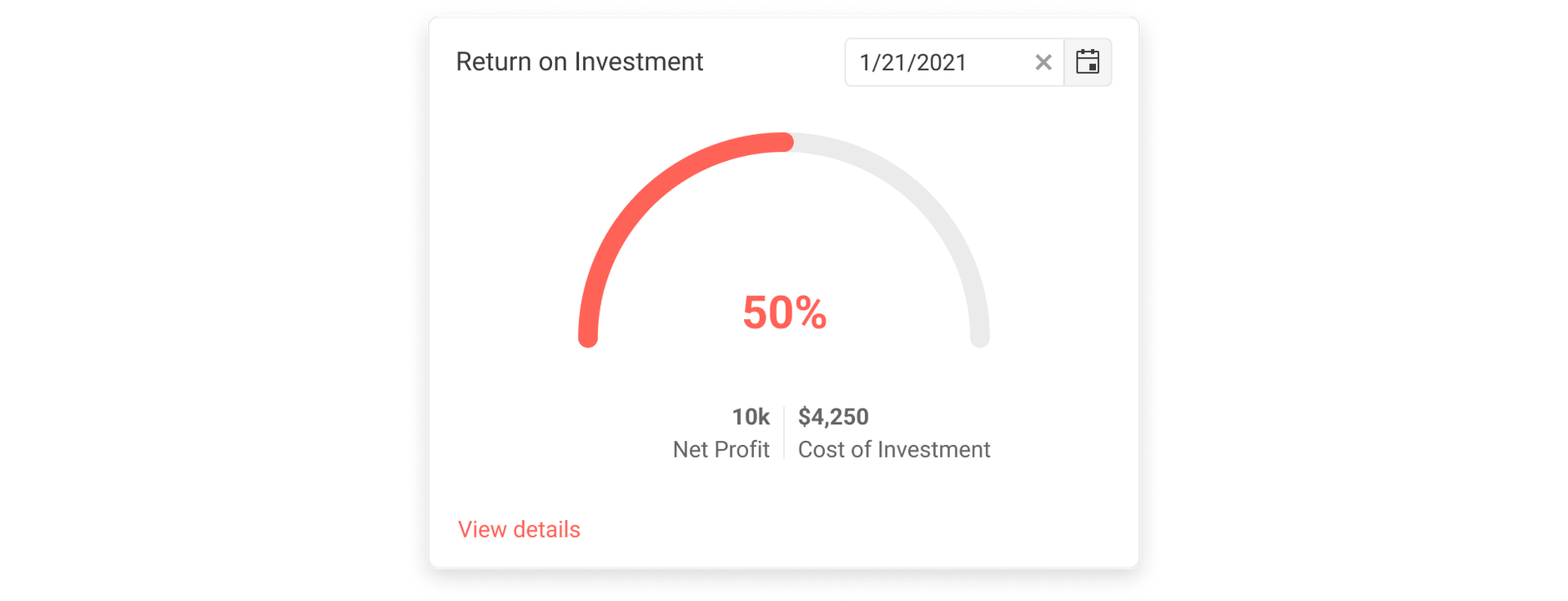
Dashboard Card 13
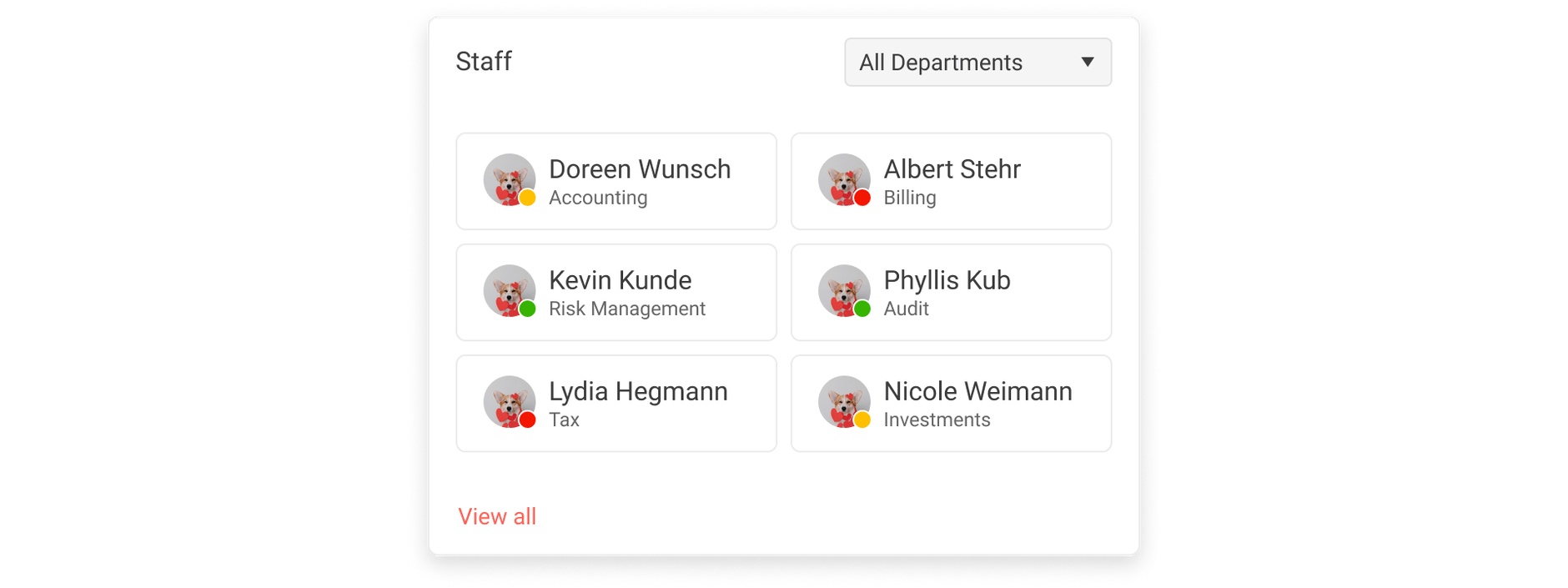
Dashboard Card 14
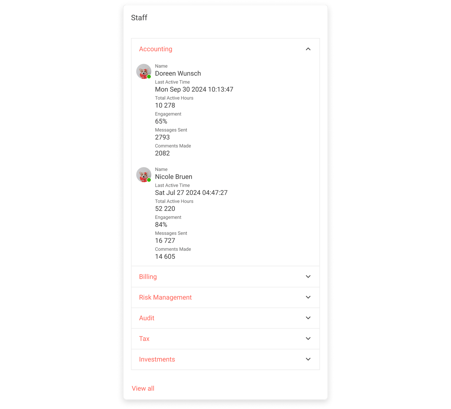
Framework-Specific Documentation
For framework specific information, refer to its official product documentation:
