Overview
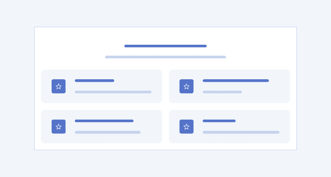
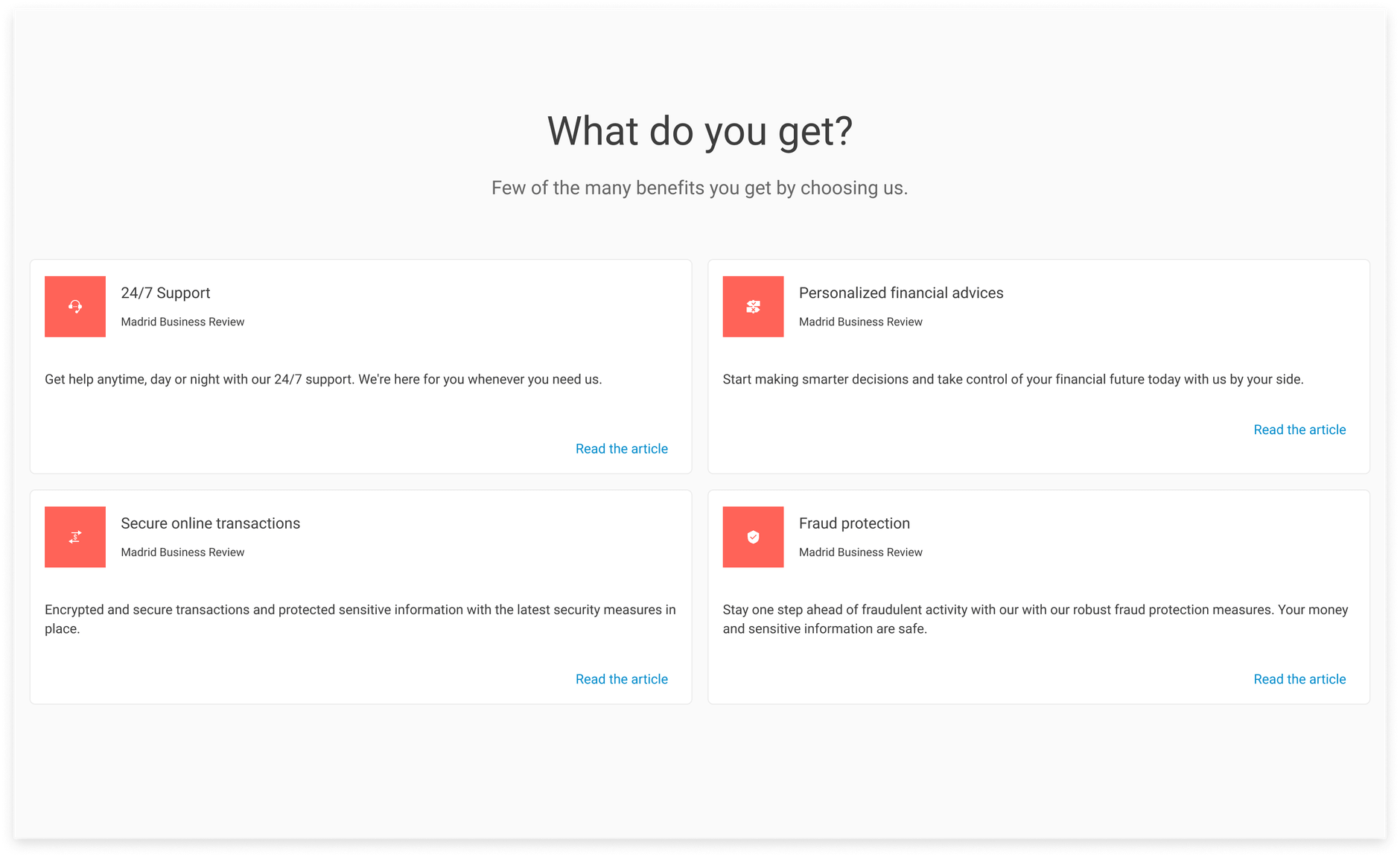
The Features UI section is commonly used in marketing and e-commerce websites where customers compare products and services and each advantage matters. It usually lists cards or simple containers with compact information that outlines the main strengths of a product or service. The features UI section could also be used to present skills and achievements as part of a person’s portfolio. The text within is typically paired with relevant icons, images, and buttons that serve as ‘learn more’ links.
The main goal of the Features UI section is to enhance the positive first impression of the product, service, or company and establish trust.
Key Principles
- Layout—the content must be of equal size and distributed in consistent columns or rows to ensure that no single chunk of text dominates the others.
- Messaging—the text must be concise, yet informative and persuasive enough to make the user choose the product or service.
- Emphasis—use different icons, font sizes, font weights, and colors to emphasize the most important parts of the features.
Features Variants
The Telerik and Kendo UI Features offer design variants showcased in our demos, each tailored to enhance your application development by covering different usage scenarios.
Features 1
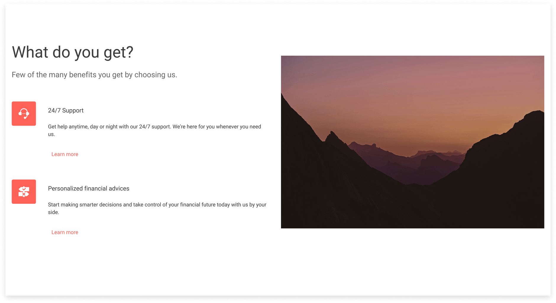
Features 2
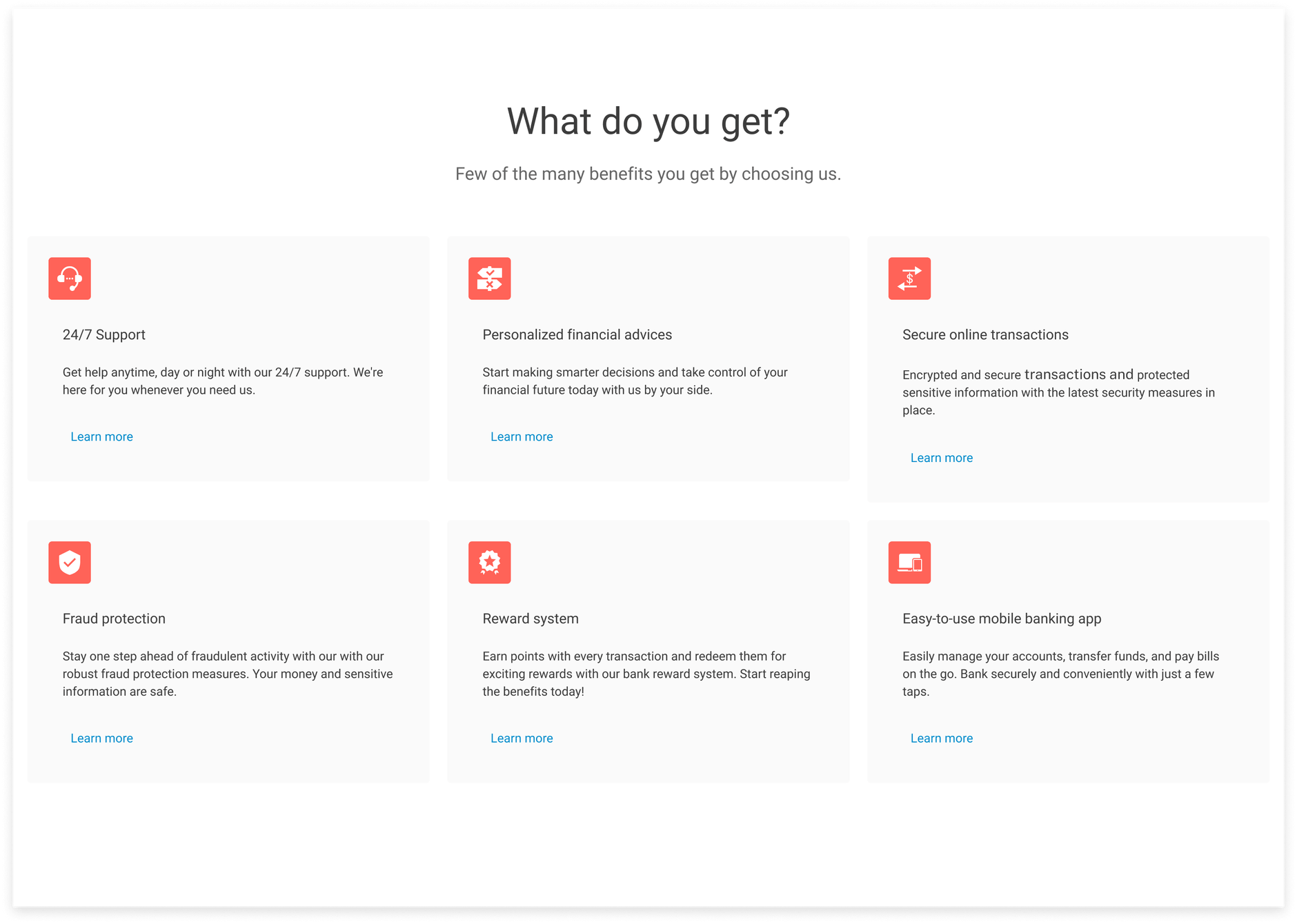
Features 3
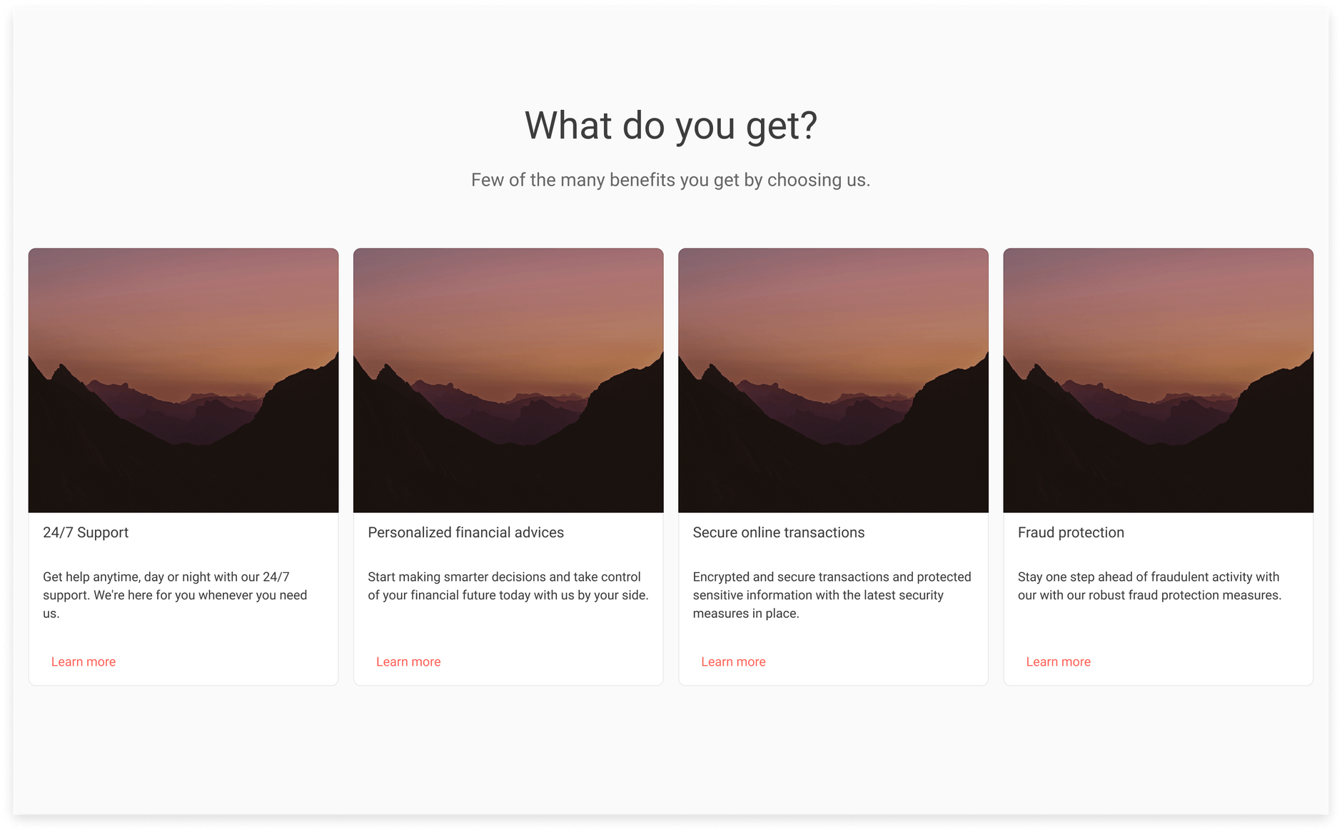
Features 10
UI Components Documentation
For product-specific information, refer to the corresponding Telerik and Kendo UI documentation:
