ColorGradient Overview
The ColorGradient component is a versatile UI component for selecting colors in a gradual and visually intuitive manner. It allows users to pick and adjust colors or input specific HEX or RGBA values. ColorGradients are ideal for scenarios where precise color blending and customization are essential, such as graphic design or creative applications.
Live Demo
Appearance
ColorGradients provide built-in styling options that grant visually appealing and flexible rendering experience.
Apart from the default vision of the Telerik and Kendo UI ColorGradient, the component supports alternative styling options that enable you to configure the individual aspects of its appearance.
States
Depending on the action you want to imply through its appearance, the Telerik and Kendo UI ColorGradient can acquire the following states which you can set by using the following classes:
- A ColorGradient in its normal state appears usable and clickable.
k-focus—The focus state is triggered after the ColorGradient has been spotlighted with the mouse or the keyboard, meaning that the ColorGradient is active and the user is interacting with it.k-disabled—The disabled state of the ColorGradient indicates that the user cannot interact with the component. When disabled, the component has no interactive behavior, it is faded out and slightly out of focus, which helps the user to distinguish it from the active elements on the page.
Anatomy
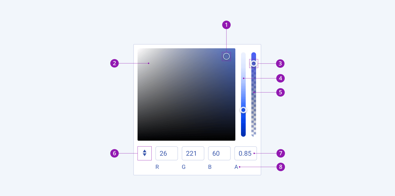
The anatomy of the ColorGradient summarizes the elements of the component and includes:

- Canvas handle
- Canvas
- Slider handle
- Hue slider
- Alpha slider
- Color mode button
- Color mode inputs
- Color mode hint text
Variants
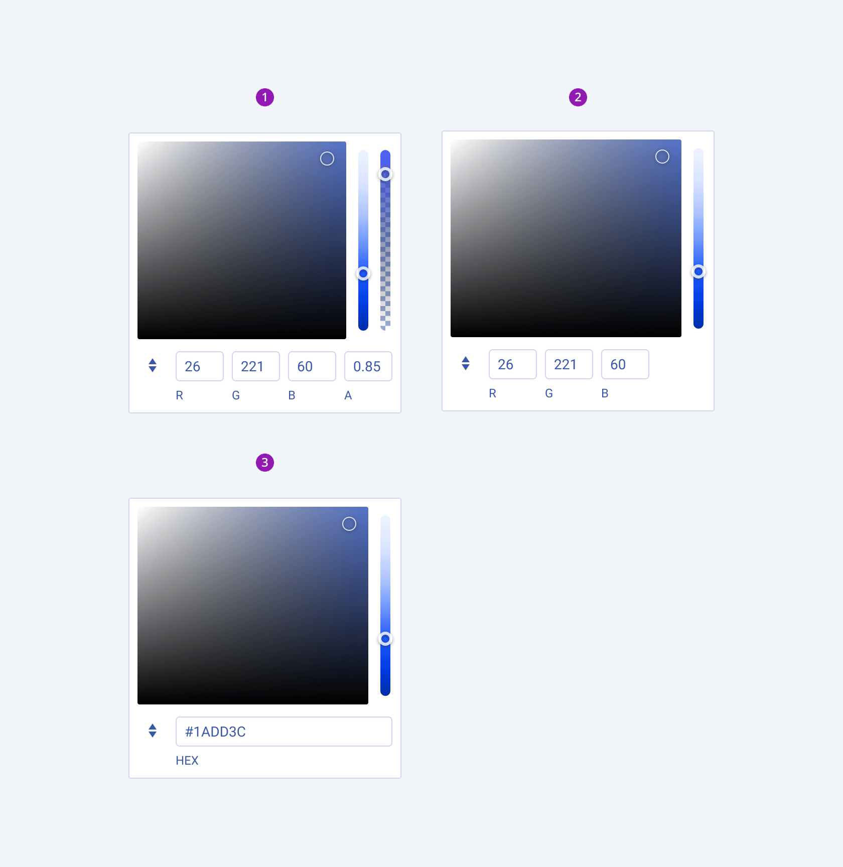
Depending on the elements they display, the Telerik and Kendo UI ColorGradient can be any of the following types:
- ColorGradient with an RGBA color mode (default)
- ColorGradient with an RGB color mode
- ColorGradient with a HEX color mode

- ColorGradient with an RGBA color mode (default)
- ColorGradient with an RGB color mode
- ColorGradient with a HEX color mode
Framework-Specific Documentation
For specific information about the component, refer to its official product documentation:


