

Overview of the Default Theme
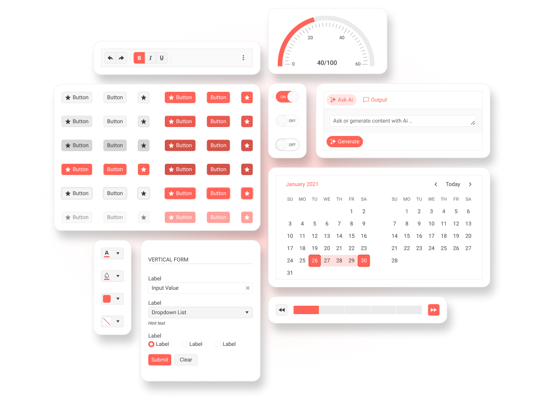
The Telerik and Kendo UI Default theme is a fully-customizable SCSS-based theme for the Telerik and Kendo UI components.
The theme implements the Telerik and Kendo UI Design System guidelines and offers a neutral styling that fits most use cases. To get the theme, you can use the available npm package, CDN link, or GitHub repository.
The Default theme provides a color variation (swatch) with enhanced accessibility—Ocean Blue Accessibility Swatch (also known as Ocean Blue A11y).
Getting Started
The fastest way to apply the out-of-the-box Telerik and Kendo UI Default theme is to reference the theme stylesheets that are located on a CDN. Alternatively, you can install the theme as an npm package—this approach allows you to customize the theme.
Using the CDN Link
To use the Telerik and Kendo UI Default theme without customizing it, reference the precompiled CSS file URL for the required theme version and swatch in the head section of your application, for example:
<link
  rel="stylesheet"
  href="https://www.unpkg.com/@progress/kendo-theme-default@14.3.0/dist/default-main.css"
/>
In the above URL, @x.x.x specifies the theme version and main is the swatch name. To preview the appearance of the available built-in theme swatches, visit the online demos for the Telerik or Kendo UI product that you are using.
To obtain the CDN URL for a specific theme version and swatch:
- Visit @progress/kendo-theme-default on UNPKG.
- Select a version at the top-right.
- Open the
distfolder. - Open the required CSS file, for example, default-main.css.
- Click the View Raw button, for example, here is the CDN URL for
default-main.css.
It is possible to reference a swatch URL without a version, which will load the latest one automatically. This is strictly not recommended in production applications.
While using the precompiled CSS file is faster than compiling the theme from the source code, the approach has two drawbacks:
- The precompiled CSS file contains the CSS code for all components—even for components that you do not use in your application.
- The precompiled CSS file does not support customizations through SCSS variables because they are no longer present in the theme. To customize the theme, you must rebuild it by using the provided source code.
Installing the NPM Package
To install the Telerik and Kendo UI Default theme in your project, use the provided npm package. After installing it, you can customize the stylesheets.
npm install --save @progress/kendo-theme-defaultTo use the theme in your application, import it into your project styles:
// Import the entire theme
@use "@progress/kendo-theme-default/scss/all.scss" as *;
Using the Figma Kit
The Telerik and Kendo UI Default theme comes with a free UI kit for Figma that includes all Telerik and Kendo UI components. To learn more about the available UI kits and how to use them, see the Design Kits for Figma article.
Framework-Specific Documentation
For specific information about how to implement the Default theme in the context of the Telerik and Kendo UI libraries, refer to the official product documentation:


