Overview
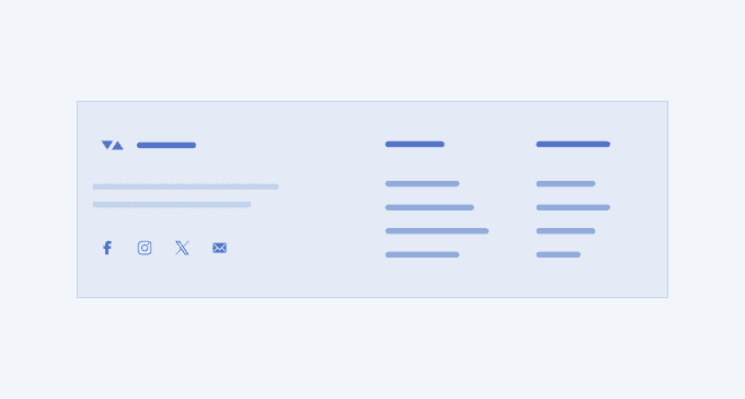
Despite not being а mandatory element, you can rarely see a website or application without a Footer UI section. It frames the content on a page, provides consistency, and helps the user navigate without scrolling back to the top. The Footer UI section usually includes a sitemap, privacy policy links, and a copyright notice. The logo, contacts, social media buttons, and a subscription form reinforce the business’ identity, improve the search optimization, and encourage further user interaction. Any other elements such as CTAs, images, and testimonials are optional and depend on the business case.
A well-designed Footer UI section provides all necessary information in a compact way, marks the end of a page in a visually appealing manner, and provides links under different forms with balance.
Key Principles
- Full width—similar to the Hero, the Footer usually takes the full width of the page.
- Simplicity—the Footer must provide simplified navigation and improve the user experience.
Footer Variants
The Telerik and Kendo UI Footer offers design variants showcased in our demos, each tailored to enhance your application development by covering different usage scenarios.
Footer 1

Footer 2

Footer 3

Footer 7

UI Components Documentation
For product-specific information, refer to the corresponding Telerik and Kendo UI documentation:


