RangeSlider Overview
Range sliders encourage exploration rather than precision, therefore it is advisable to use them when the user intends to set an approximate range among multiple options or see the selection outcome in real-time, such as a price range.
The RangeSlider allows the user to select the minimum and maximum values on a slider track with predefined value steps. To choose the desired range, the user moves the slider handles along the track or clicks (taps) the desired value.
Live Demo
Appearance
The RangeSlider provides built-in styling options that grant visually appealing and flexible rendering experience.
States
Depending on the action you want to imply through its appearance, the Telerik and Kendo UI RangeSlider can acquire the following states which you can set by using the following classes:
- A RangeSlider in its normal state appears active, and is usable and clickable.
k-disabled—The disabled state indicates that a RangeSlider is temporarily unclickable because, for example, the page requires additional user input or something important is missing before the user continues to the next step. To indicate that they are unavailable, RangeSliders in their disabled state are faded.
The RangeSlider's handle has its own states that are independent from the states of the RangeSlider component itself:
k-hover—The hover state of the RangeSlider handle is applied when the user hovers over it but does not click it.k-focus—The focus state of the RangeSlider handle is triggered when the user navigates to it by keyboard, voice, or mouse click.
Anatomy
The anatomy of the Slider summarizes the elements of the component:

- Label (optional)
- Selection
- Track
- Slider handle
- Tick (optional)
Layout
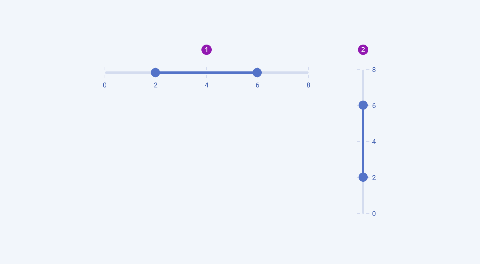
The Telerik and Kendo UI RangeSlider component provides both horizontal and vertical alignment for flexible integration into various user interface layouts:

- Horizontal
- Vertical
Predefined Steps
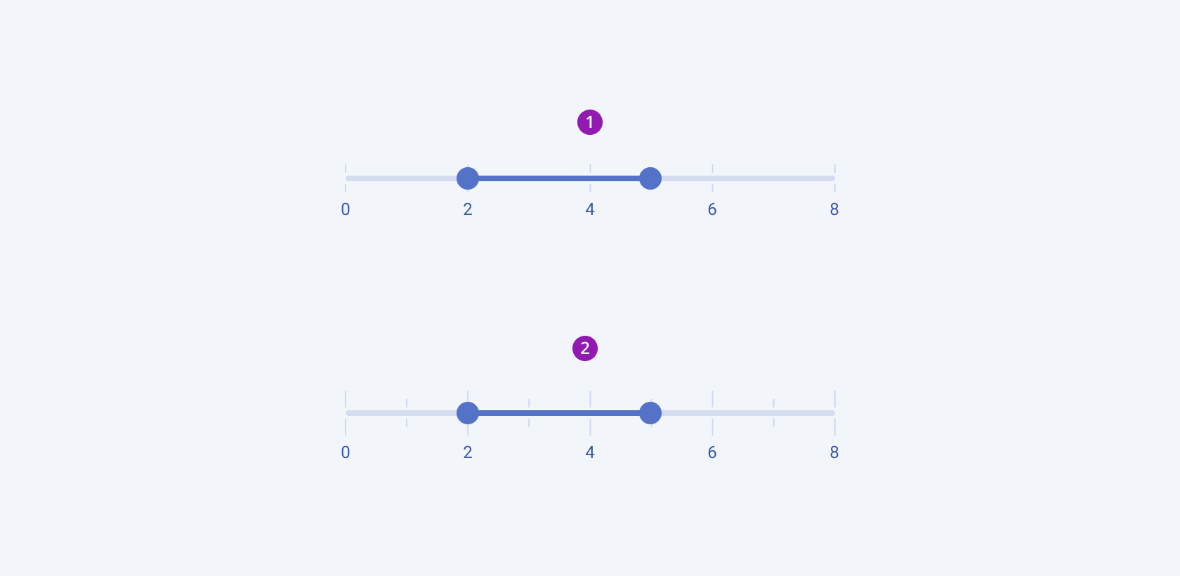
You can configure the way the Telerik and Kendo UI RangeSlider divides its range and updates the value by using the step options:
- Small steps—Based on the
minandmaxvalues, the RangeSlider splits the track into equal ticks. - Large steps—The property specifies the interval after which the step will render a large tick and a label (if any).

- Small steps
- Large steps
Ticks
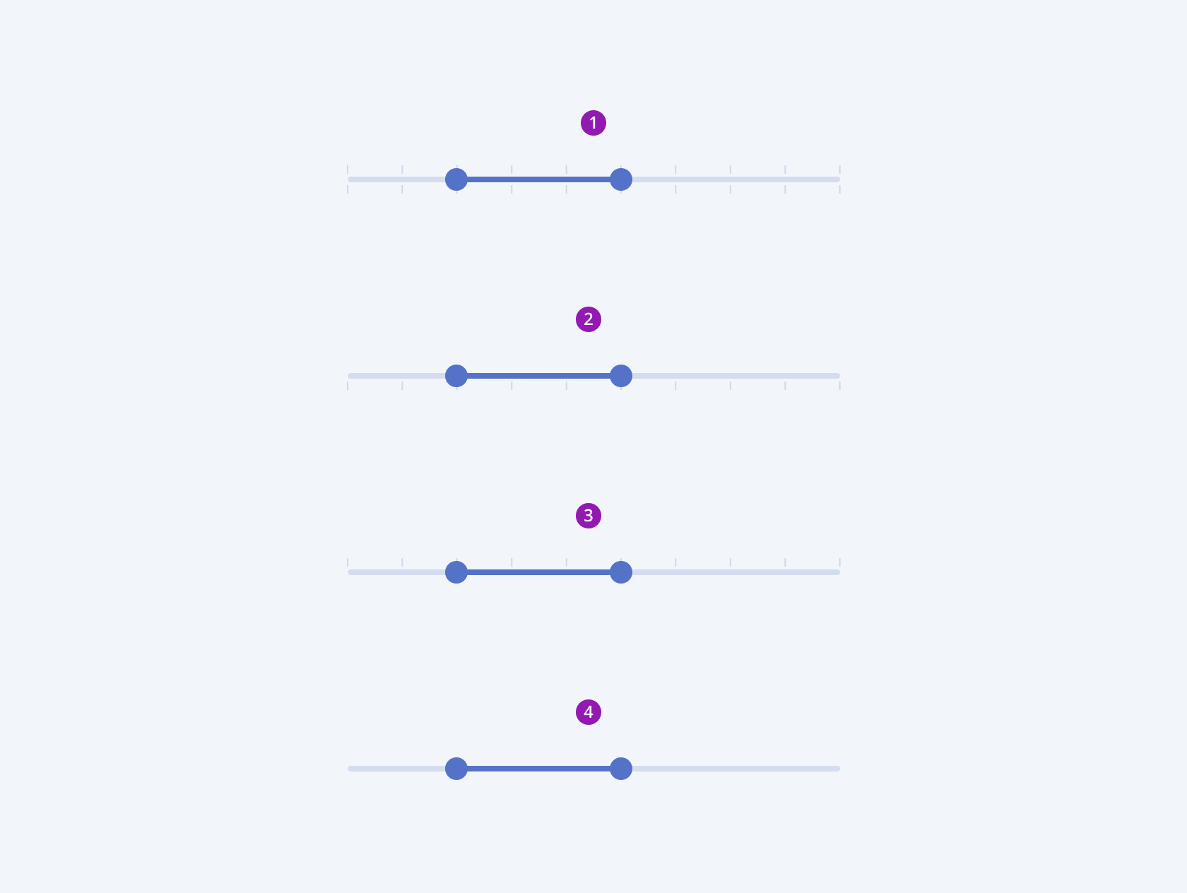
The Telerik and Kendo UI RangeSlider lets users configure the placement and rendering of the track ticks.

- Top and bottom
- Bottom only
- Top only
- None
Framework-Specific Documentation
For specific information about the component, refer to its official product documentation:


