StackLayout Overview
The StackLayout component enables you to easily align multiple elements in a stack, either vertically or horizontally. It provides various customization options, allowing you to set up different orientations, alignments, and spacing between elements. You can stack and adjust the alignment of inner elements, and even nest multiple StackLayout components within each other. This flexibility makes it simple to create organized layouts that enhance the user interface and improve the overall design of your application.
Live Demo
Appearance
The StackLayout provides built-in arranging options that grant visually appealing and flexible rendering experience.
Apart from the default vision of the Telerik and Kendo UI StackLayout, the component supports alternative styling options that enable you to configure the individual aspects of its appearance.
Anatomy
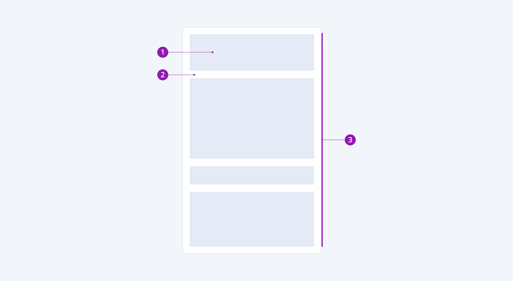
The anatomy of the StackLayout summarizes the elements of the component:

- Inner element
- Gap
- StackLayout container
Orientation
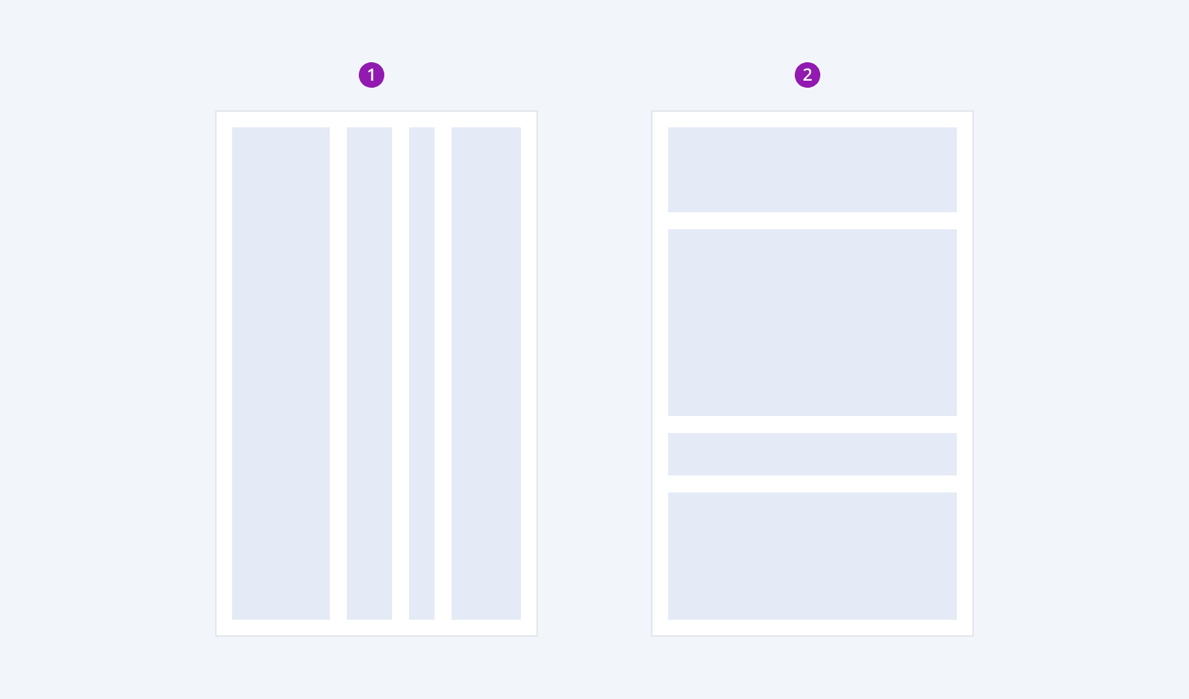
Depending on the orientation of the inner elements, the Telerik and Kendo UI StackLayout can be any of the following types:
- Horizontal
- Vertical

- Horizontal
- Vertical
Horizontal Alignment
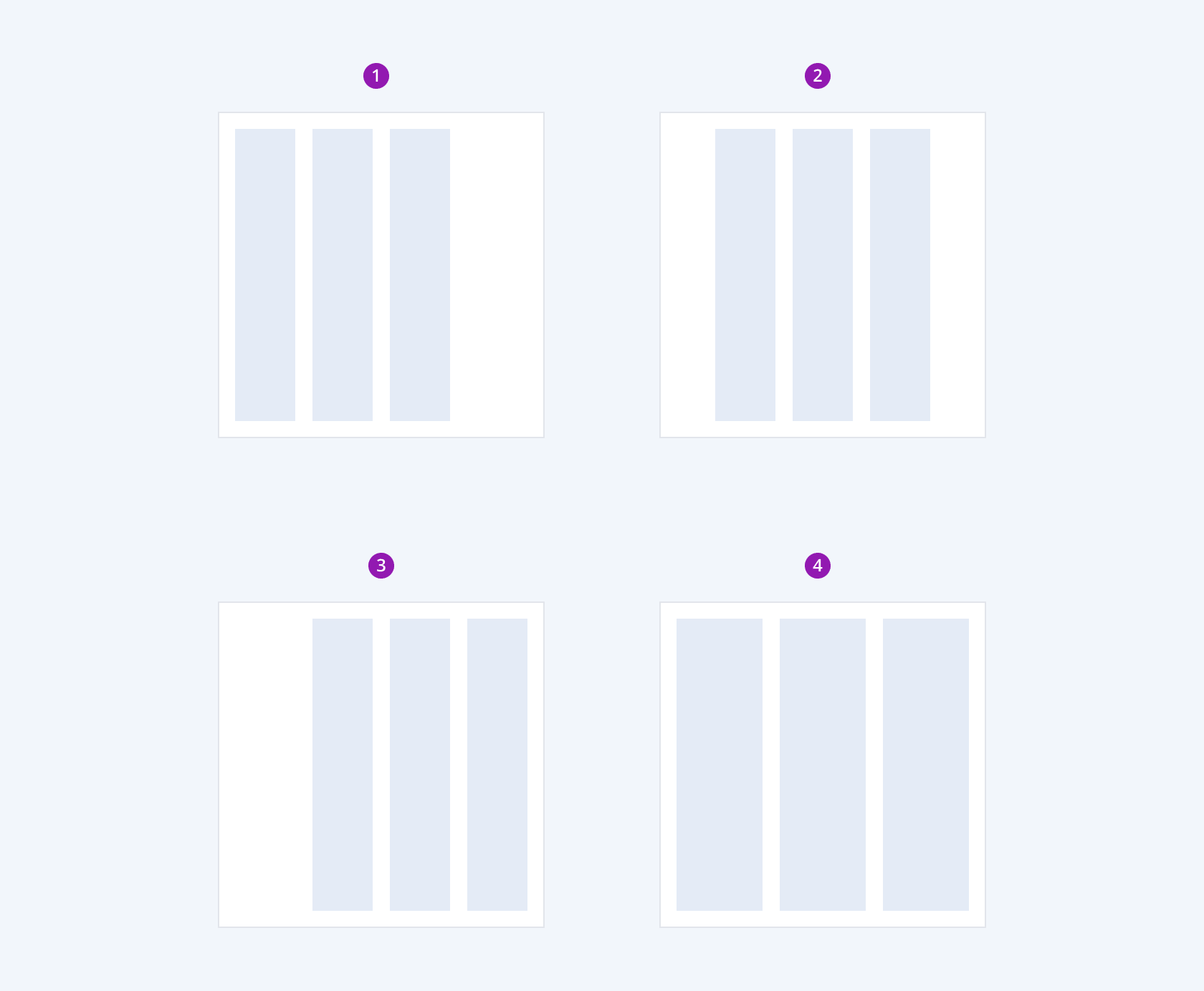
Depending on the horizontal alignment of the inner elements, the Telerik and Kendo UI StackLayout provides the following arrangement configurations:
- Left
- Center
- Right
- Stretch

- Left
- Center
- Right
- Stretch
Vertical Alignment
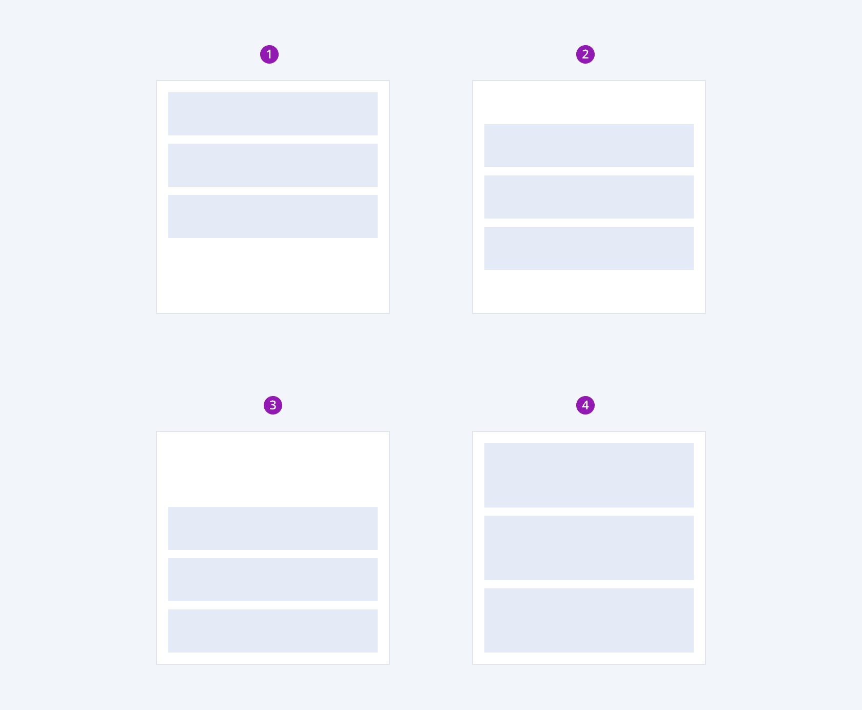
Depending on the vertical alignment of the inner elements, the Telerik and Kendo UI StackLayout provides the following arrangement configurations:
- Top
- Center
- Bottom
- Stretch

- Top
- Center
- Bottom
- Stretch
Nested StackLayout
The Telerik and Kendo UI StackLayout allows you to create more complex layouts by nesting multiple StackLayout components within each other, enabling both horizontal and vertical alignment of inner elements.

Framework-Specific Documentation
For specific information about the component, refer to its official product documentation:


