Stepper Overview
The primary purpose of the Stepper UI component is to guide users through a multi-step process or workflow. It breaks down a larger task into smaller, manageable steps, allowing users to navigate through them sequentially.
It enables setting up validation and error logic to ensure that the user is provided with clear feedback on their actions.
Live Demo
Appearance
The Stepper component provides built-in styling options that grant visually appealing and flexible rendering experience.
Apart from the default vision of the Telerik and Kendo UI Stepper, the component supports alternative styling options which enable you to configure the individual aspects of its appearance.
States
Depending on the action you want to imply through its appearance, the Telerik and Kendo UI Stepper can acquire the following states which you can set by using the following classes:
k-step-current—In the current state, the step appears selected and focused, allowing the user to interact with it.k-step-done—The completed steps appear in the done state and the user can still interact with them.- The steps that follow the current one are in the normal state and appear active, clickable, and usable.
k-hover—Тhe hover state of a step is applied after the user hovers over the step indicator.k-focus—The focus state is triggered after the Stepper has been spotlighted with the mouse or the keyboard.k-step-success—The success state is triggered after a step has been completed successfully. This optional state is determined by the validation logic set by the developer.k-step-error—The error state indicates that the step has not been completed due to incorrect or incomplete data entered by the user.k-disabled—Тhe disabled state of the Stepper component indicates that the user cannot interact with the component. When disabled, the component has no interactive behavior, it is faded out and slightly out of focus, which helps the user to distinguish it from the active elements on the page.
The anatomy of the Stepper summarizes the elements of the component and includes:

- Step
- Indicator
- Label
- Progress bar
Variants
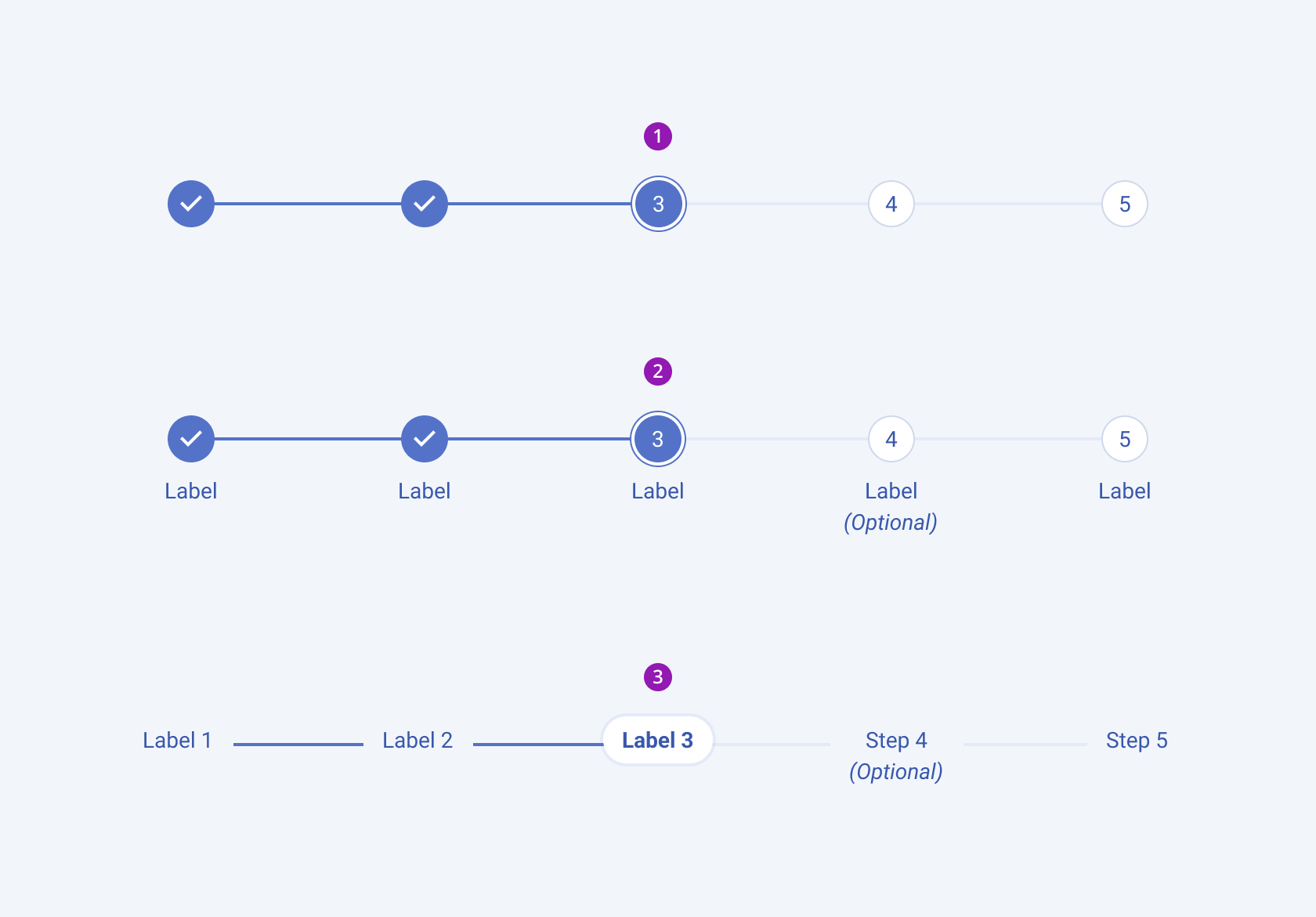
Depending on the elements they display, the Telerik and Kendo UI Stepper can be any of the following types:
- Indicator only
- Indicator and label
- Label only

- Indicator only
- Indicator and label
- Label only
Layout
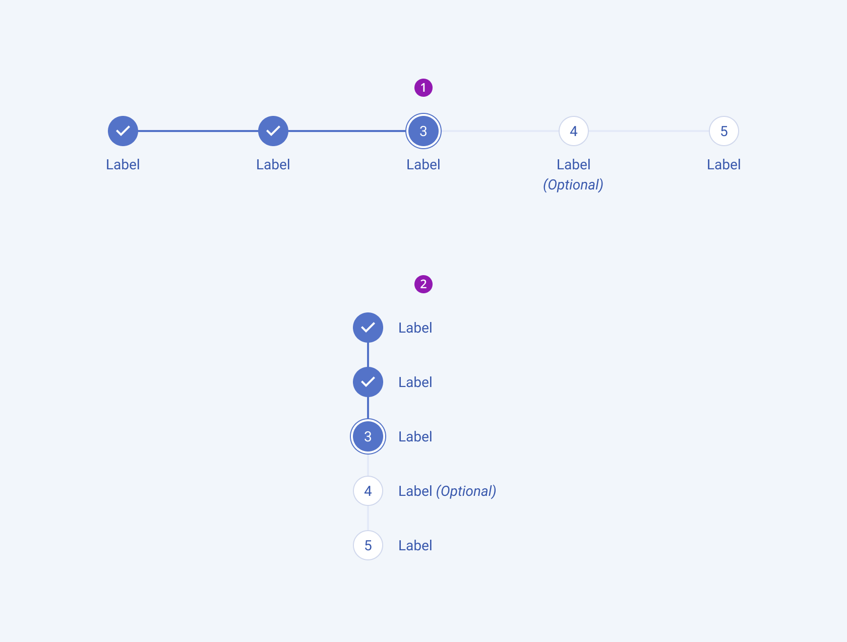
The Telerik and Kendo UI Stepper can appear both in horizontal and vertical orientations.

- Horizontal
- Vertical
Framework-Specific Documentation
For specific information about the component, refer to its official product documentation:


