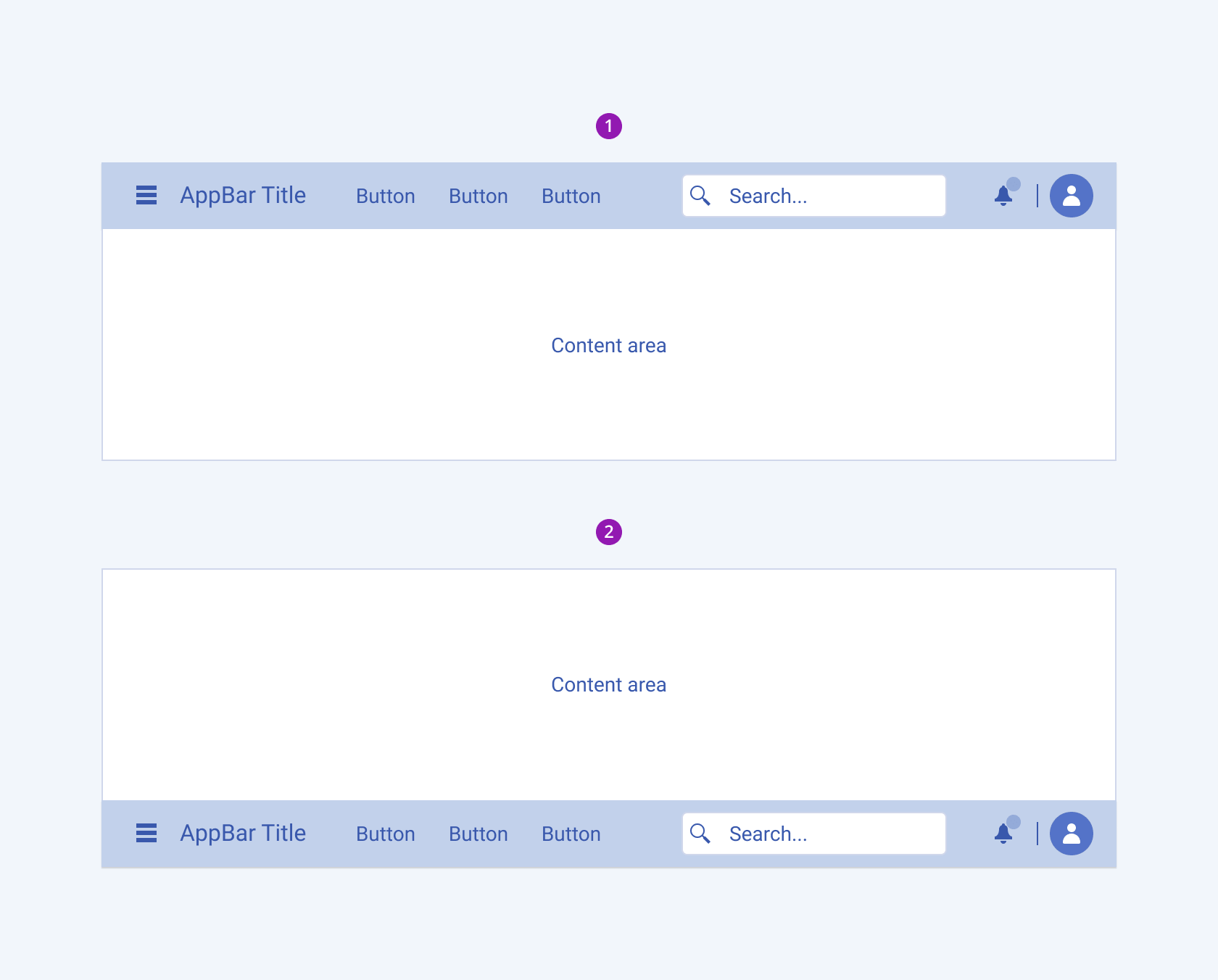
AppBar Overview
The AppBar, short for Application Bar, is a user interface component typically positioned at the top of a software application or web page. It serves as a navigational element, providing easy access to various functions, menus, or tools within the application. AppBars often contain icons, buttons, or menus that allow users to perform actions such as opening settings, searching, or navigating to different sections of the application. The AppBar component helps improve the user experience by providing quick and convenient access to key features, making it an essential part of the website design. It also serves as a versatile platform for conveying the application's brand identity such as title, logo, color palette, and so on.
Live Demo
Appearance
AppBars provide built-in styling options that grant visually appealing and flexible rendering experience.
Apart from the default vision of the Telerik and Kendo UI AppBar, the component supports alternative styling options that enable you to configure the individual aspects of its appearance.
Anatomy
The anatomy of the AppBar summarizes the elements of the component:

- Menu icon button
- Container
- Search input
- Icon button with badge
- Icon avatar
- Title
- Menu buttons
- Separator
Position
The Telerik and Kendo UI AppBars can be positioned in two ways:
- Top (default)—The AppBar will appear the the top of the page, before any other content.
- Bottom—The AppBar will appear at the bottom of the page after the rest of the content.

- Top (default)
- Bottom
Color
The AppBar provides the theme-color configuration option that enables you to choose among the available, built-in colors that will be applied to it. AppBars also provide options for color customization.
themeColor provides the following available options:
light(default)—Applies the light theme color to the AppBar and makes it particularly suitable for user interfaces with a light color scheme.dark—Applies the dark theme color to the AppBar and makes it particularly suitable for user interfaces with a dark color scheme.inherit—Applies an inherited color value.
Framework-Specific Documentation
For specific information about the component, refer to its official product documentation:


