ToolBar Overview
A ToolBar is a user interface (UI) element that represents a container, wrapping groups of related actions or commands of equal importance in the form of buttons, menus, checkboxes, search bars, and more.
The ToolBar displays items horizontally, usually in a single line or column. However, when too many items cannot fit within the available space, an overflow button appears.
Live Demo
Appearance
The Telerik and Kendo UI ToolBar component supports alternative styling options which enable you to configure the individual aspects of its appearance.
Anatomy
The anatomy of the ToolBar summarizes the elements of the component.
Depending on the elements they display, the Telerik and Kendo UI ToolBars can be any of the following types:
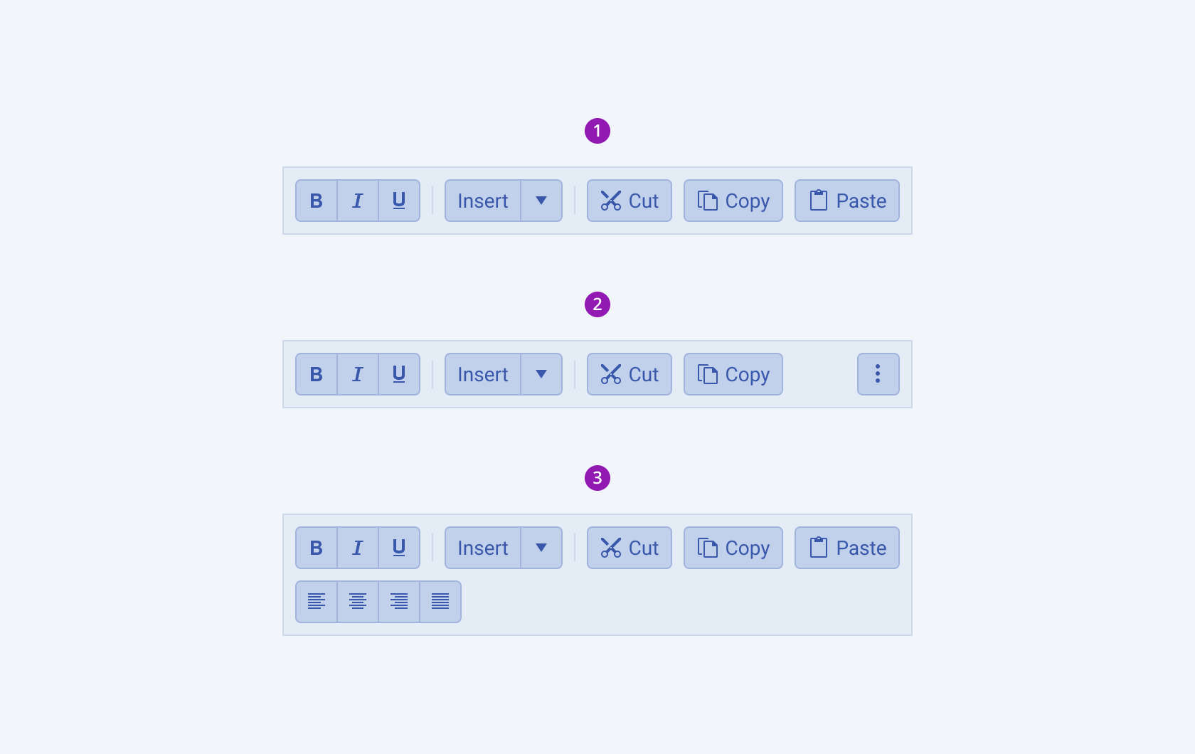
- ToolBar—The ToolBar displays items that fit its width.
- Responsive ToolBar—The ToolBar renders a dropdown button that hides the items that do not fit its width in an overflow popup.
- Wrapped ToolBar—The ToolBar distributes the items vertically according to its width.

- A Toolbar with items that fit its width
- A responsive ToolBar
- A wrapped ToolBar
The next image shows the anatomy of a ToolBar and includes the following elements:

- Container
- Item
- Separator (optional)
- Overflow button (optional)
Size
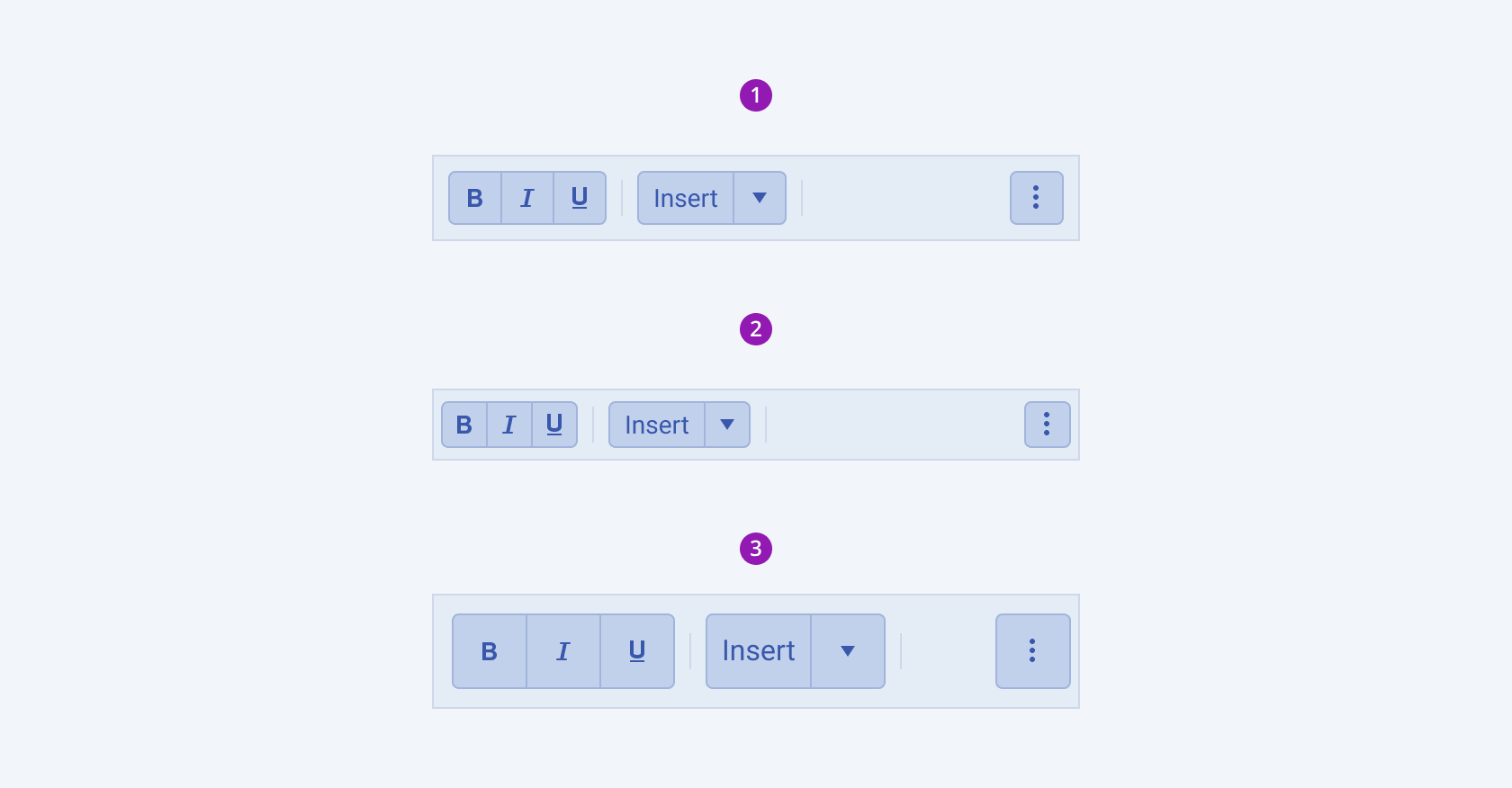
The ToolBar provides the size configuration option that enables you to control how big or small the rendered toolbar will be. ToolBars also provide options for size customization.
size provides the following available options:
-
small—Renders a small ToolBar, which contains small components as its items. Small ToolBars are suitable when the available space is limited.The small Telerik and Kendo UI ToolBar achieve the desired height by applying a
$kendo-spacing, 1spacing value for their paddings. -
medium(default)—Renders a medium ToolBar.The
mediumsize configuration is the base according to which thesmallandlargeoptions are specified. The medium Telerik and Kendo UI ToolBar contains components in their default medium size and applies a$kendo-spacing, 2spacing value for their paddings. -
large—Renders a large ToolBar, which is suitable for adaptive components and mobile devices.The large Telerik and Kendo UI ToolBar achieves the recommended touch area dimensions both by wrapping components in large sizes and applying a
$kendo-spacing, 2.5value for their paddings. -
null—Removes the styling related to thesizeoption. Not setting asizeallows you to add your own, custom value.

- Medium (default)
- Small
- Large
Framework-Specific Documentation
For specific information about the component, refer to its official product documentation:


