Toolbar

ToolBars are UI elements wrapping groups of related actions or commands of equal importance.

Usage Guidelines

The Telerik and Kendo UI ToolBar requires you to follow some basic principles when using the component.

Grouping

Grouping of the items within the ToolBar helps the users quickly identify the related actions and make their choice. Grouping also helps screen reader users as it controls the number of stops.
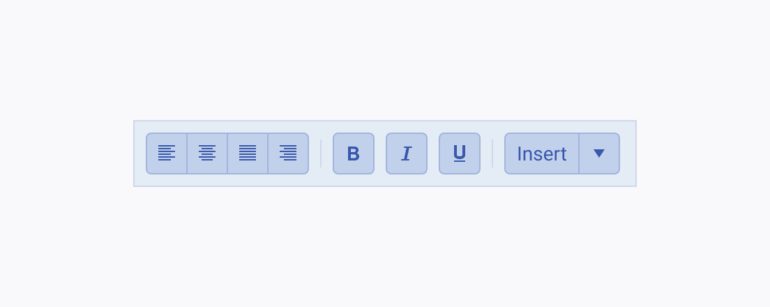
A Telerik and Kendo UI ToolBar demonstrating grouping of its items with separators between the semantic groups.
Use separators to distinguish the semantic groups of ToolBar items.
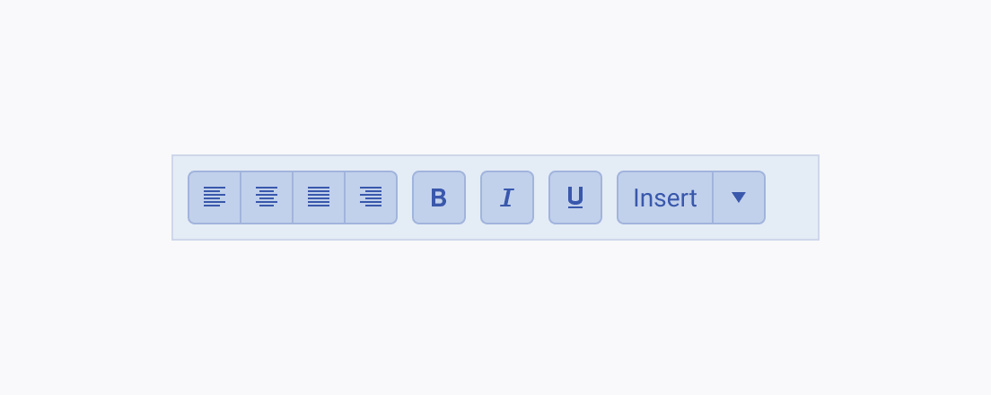
A Telerik and Kendo UI ToolBar without any grouping of the items.
Avoid displaying all ToolBar items without grouping them as it may seem chaotic and confusing.

Overflow

In some cases where the space is limited both horizontally and vertically and the items within the ToolBar are numerous and cannot fit its width, an overflow button appears and accommodates the excess items.
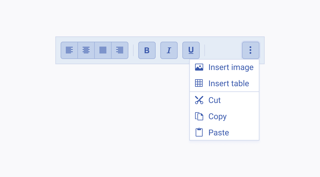
A Telerik and Kendo UI ToolBar displaying the hidden items in an overflow popup.
Use the overflow button in the adaptive ToolBar to display the content that does not fit its width when the space is limited.
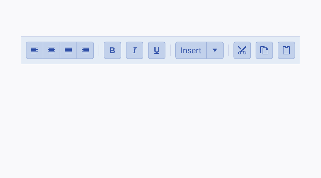
A Telerik and Kendo UI ToolBar with numerous items that increase its width.
Avoid hiding ToolBar items or stretching the ToolBar just to fit them.

Wrapped

The Telerik and Kendo UI ToolBar usually distributes its items in one line. In some cases, however, the numerous items cannot fit into an overflow popup and displaying them in multiple lines is preferred.
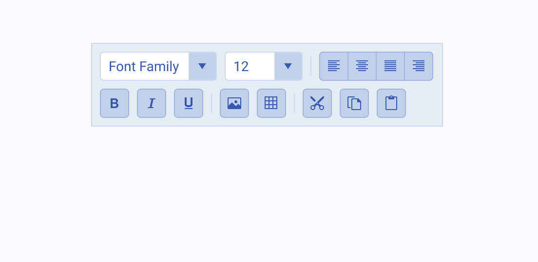
A Telerik and Kendo UI ToolBar that demonstrates wrapping its items in two lines.
Distribute the numerous ToolBar items vertically if they cannot fit within the width of the ToolBar.
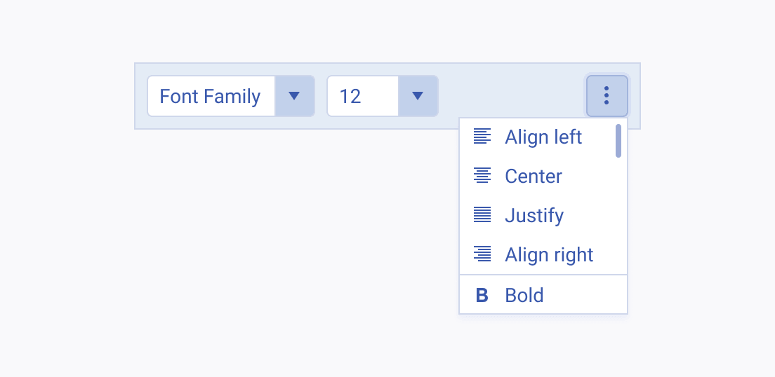
A Telerik and Kendo UI ToolBar showing an overflow popup with a long list of ToolBar items and requiring scrolling.
Avoid displaying multiple ToolBar items in an overflow popup that requires scrolling.
Feedback