OrgChart Overview
The OrgChart component is a visual representation tool used to display hierarchical structures and organizational relationships within an application. It provides a tree-like structure, where users can edit individual nodes, change their parent, or group them in the tree. This control helps you visualize hierarchical data in a sophisticated way and allows multiple nodes to expand and collapse, providing a comprehensive overview of the organizational structure units, such as employees, teams, or departments.
Live Demo
Appearance
The OrgChart component provides built-in styling options that grant visually appealing and flexible rendering experience.
Anatomy
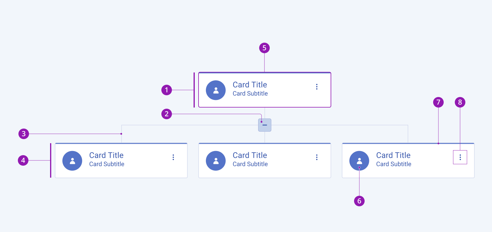
The anatomy of the OrgChart summarizes the visual and functional elements of the component. The main elements include parent and child nodes, expand-collapse button, and OrgChart cards.
The next image shows the anatomy of the OrgChart and includes the following elements:

- OrgChart parent node
- Expand/collapse icon button
- OrgChart line
- OrgChart child node
- OrgChart card
- Avatar
- Color indicator
- “More Options” icon button
Variants
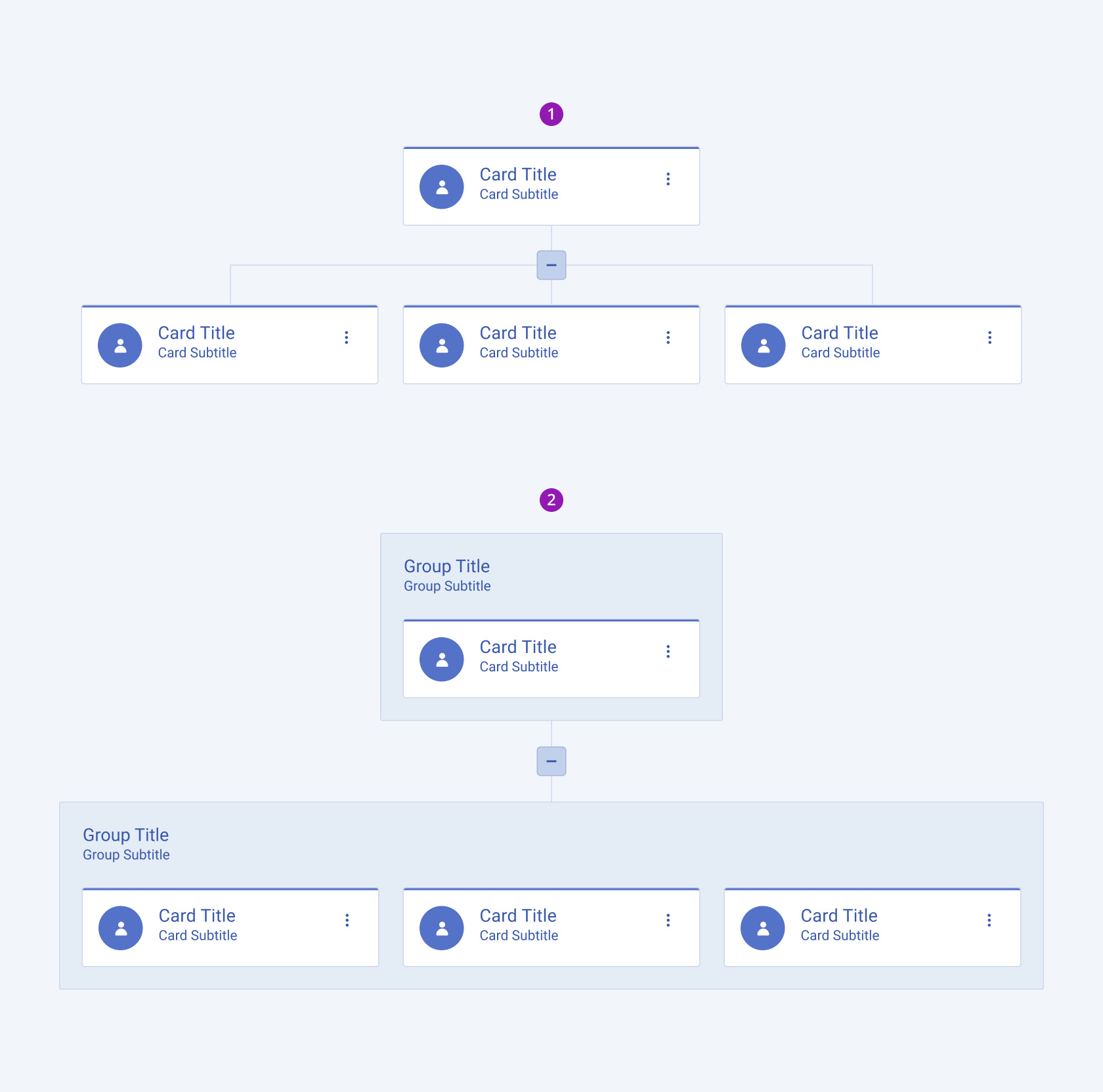
Depending on the elements they display, the Telerik and Kendo UI OrgChart components can be any of the following types:
- OrgChart
- OrgChart with a group field

- OrgChart
- OrgChart with group field
Layout
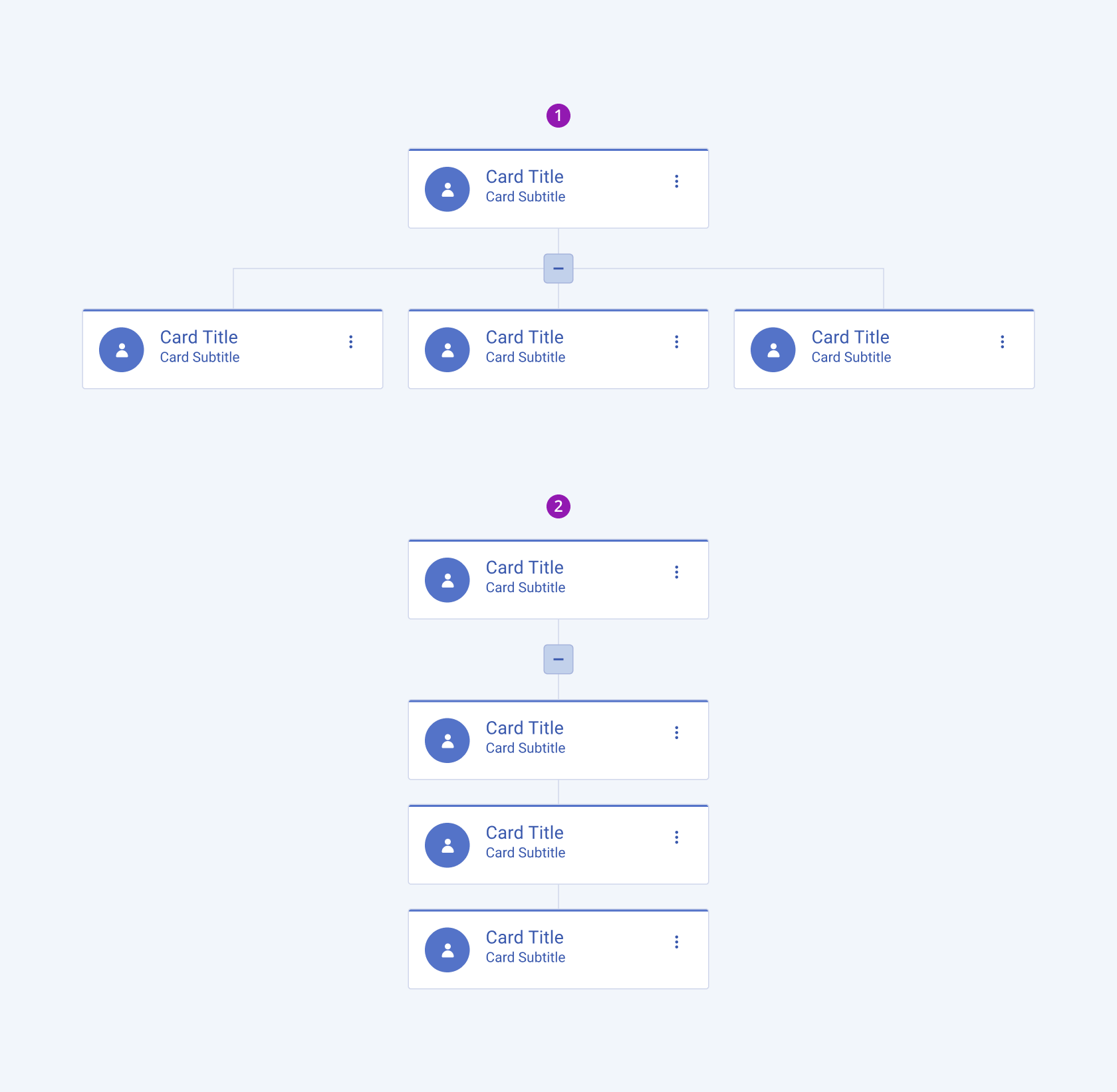
Depending on the layout, the Telerik and Kendo UI OrgChart components can be any of the following types:
- Horizontal
- Vertical

- Horizontal
- Vertical
Framework-Specific Documentation
For specific information about the component, refer to its official product documentation:


