ListView Overview
The ListView component is a versatile tool that enables users to view and interact with lists of items in a structured and user-friendly manner. It displays the information stored in each data item in a custom layout by using templates, making it suitable for a wide range of applications.
Live Demo
Appearance
The ListView provides a visually appealing and flexible rendering experience.
States
Depending on the action you want to imply through its appearance, the Telerik and Kendo UI ListView can acquire the following states which you can set by using the following classes:
- A ListView in its normal state appears active, and is usable and clickable.
k-disabled—The disabled state indicates that a ListView is temporarily unclickable and users cannot interact with it. To indicate that they are unavailable, ListViews in their disabled state are usually faded and slightly out of focus.
Anatomy
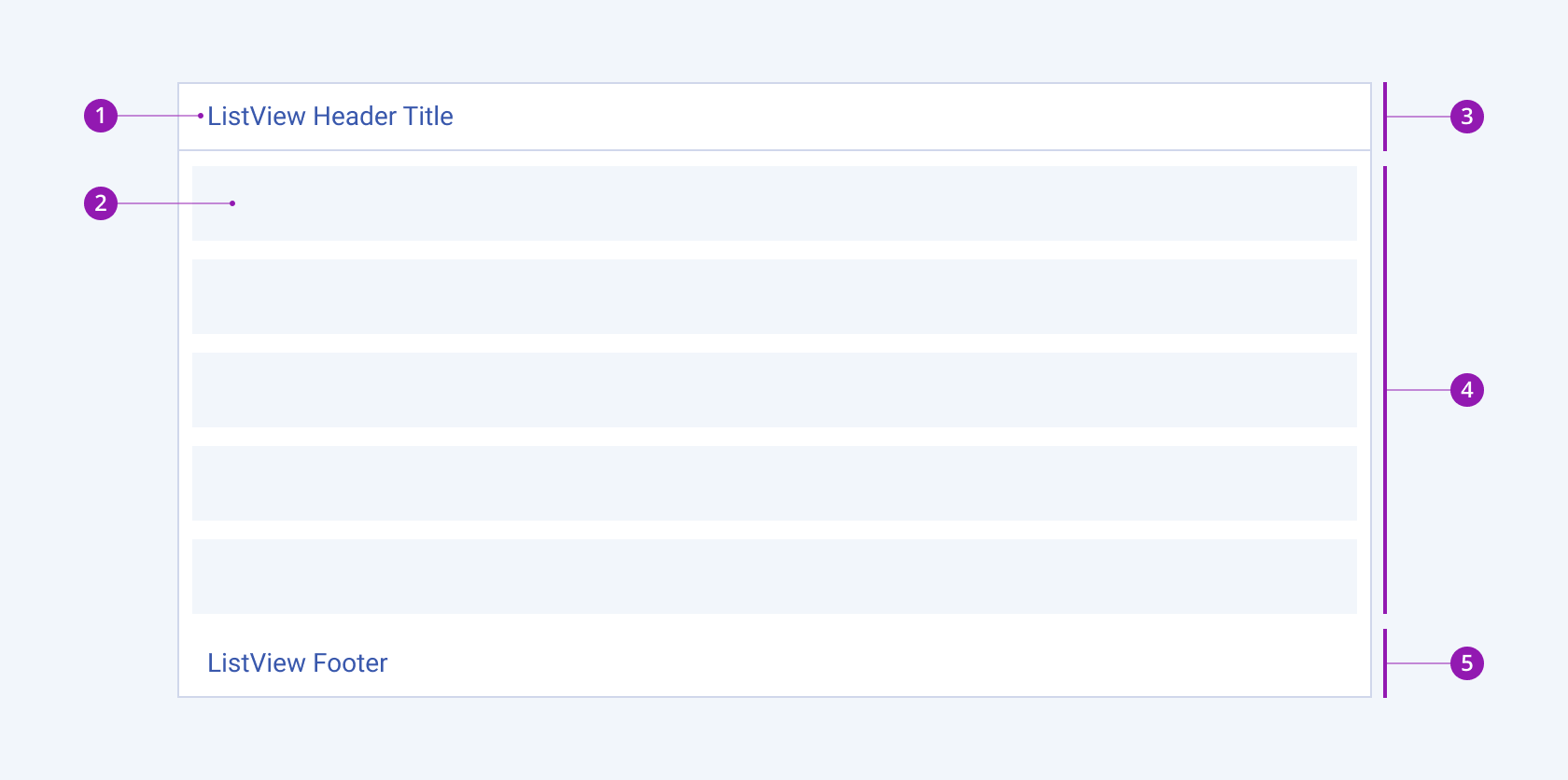
The anatomy of the ListView summarizes the elements of the component:

- ListView header title (optional)
- ListView item
- ListView header
- ListView content
- ListView footer (optional)
Framework-Specific Documentation
For specific information about the component, refer to its official product documentation:


