Form Overview
Forms provide a structured layout for organizing various form elements, such as text fields, buttons, checkboxes, range controls, dropdowns, color pickers, and more that enable the collection and validation of user input. With its interactive features, including data validation and submission handling, the Form component ensures a seamless and efficient user experience in capturing and processing user data. Its flexibility allows customization to match specific design requirements and business needs.
LiveDemo
Appearance
The Form provides built-in styling options that grant a visually appealing and flexible rendering experience.
Apart from the default vision of the Telerik and Kendo UI Form, the component supports alternative styling options which enable you to configure the individual aspects of its appearance.
Anatomy
The anatomy of the Form summarizes the elements of the component:
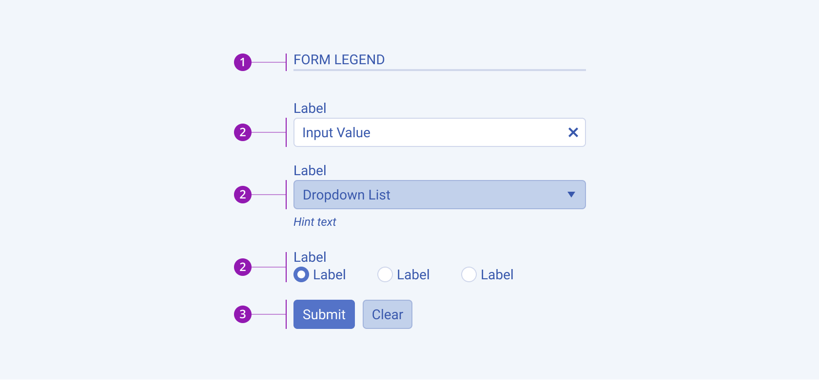
- Form legend
- Form components (inputs, dropdowns, radiobuttons, checkboxes, etc.)
- Form action buttons
Size
The Form provides the size configuration option that enables you to control how large or small the rendered form elements will be and the spacing between them. Forms also provide options for size customization.
size provides the following available options:
small—Renders small form elements and applies a$kendo-spacing, 2.5value for the vertical space between them.medium(default)—Renders medium form elements and applies a$kendo-spacing, 3.5value for the vertical space between them.large—Renders large form elements and applies a$kendo-spacing, 4.5value for the vertical space between them.none—Does not set asizeand allows you to add your own, custom value.
Form Layouts
Form layouts play a crucial role in organizing and presenting form elements to users. The choice of layout can greatly impact the user experience, readability, and efficiency of form interactions. Different layouts, such as grid, horizontal, and vertical, offer varying approaches to arranging form fields.
Horizontal Layout
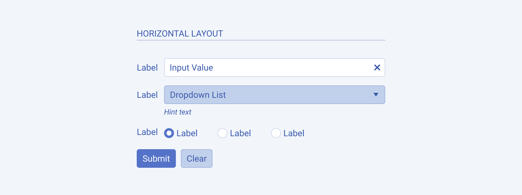
In a horizontal layout, form elements are arranged horizontally, with labels placed alongside their corresponding input fields. This layout is useful when the form has a limited number of fields or when there is a need to conserve vertical space.
The next image shows a horizontal form layout:
Vertical Layout
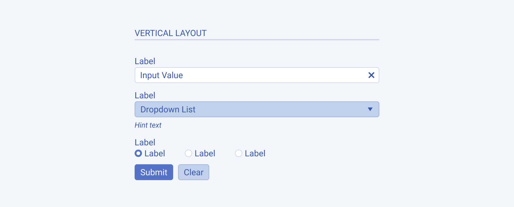
In a vertical layout, the form elements are stacked vertically, with each element taking up its own line or row. This layout is well-suited for longer forms or when readability and clarity are a priority as it provides a clear separation between form fields and their labels.
The next image shows a vertical form layout:
Grid Layout
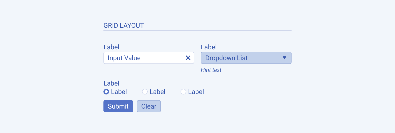
This layout organizes form elements in a grid structure where each element occupies a defined cell or area within the grid. Grid layouts offer flexibility in the aligning and positioning of form fields, allowing for a more visually structured and organized form.
The next image shows a grid form layout:
Form Grouping
Form grouping is a technique used to organize related form fields into logical sections or categories. By grouping form fields together, you help users better understand the purpose and context of the inputs they are providing. This improves the overall organization and structure of the form, making it easier for users to navigate and complete the required information. Form grouping utilizes separators to visually delineate the hierarchy and logical groups within the form, providing clear visual cues for users.
The next image shows form grouping elements:
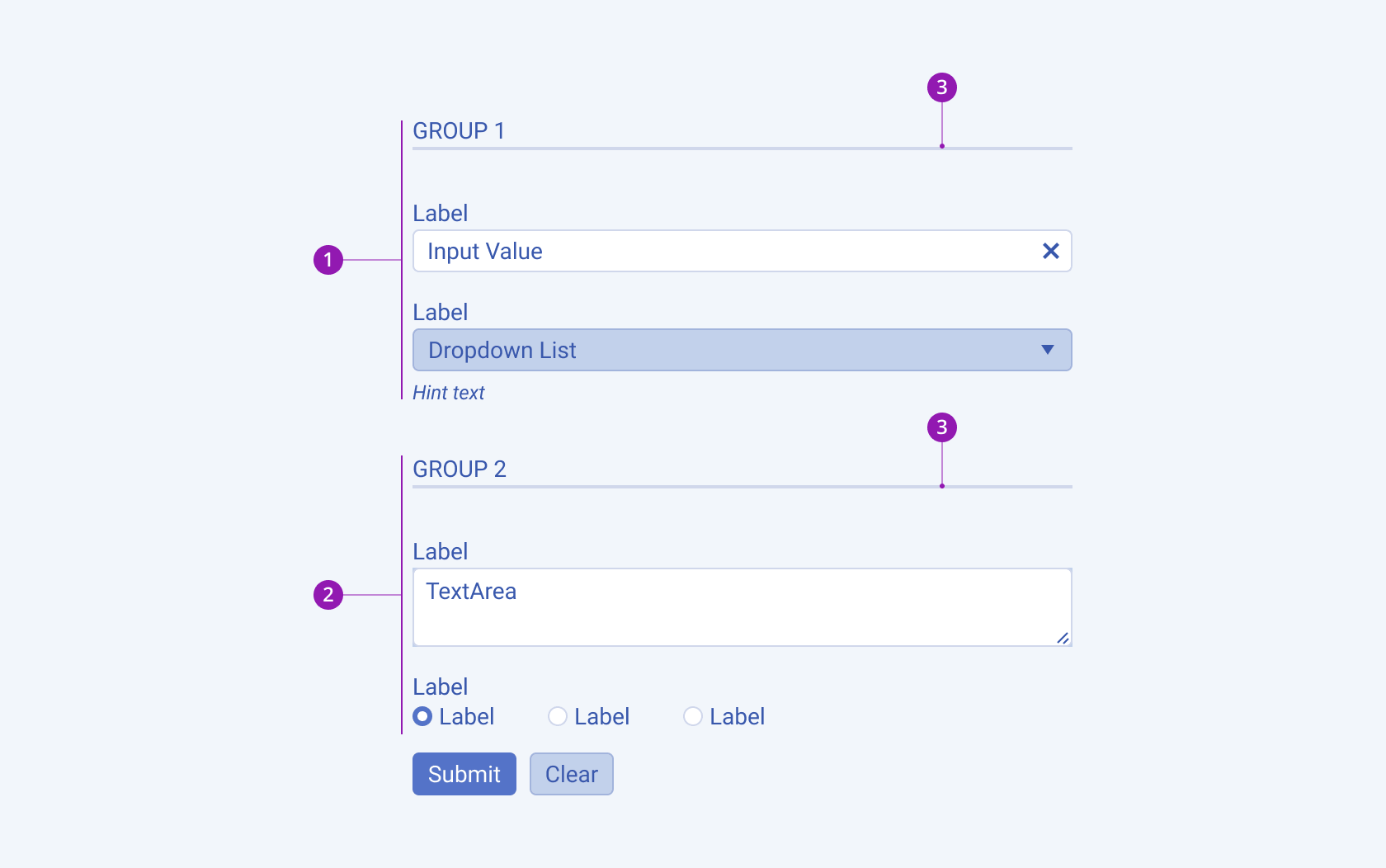
- Form Group 1
- Form Group 2
- Separator
Form Labeling
Labeling in a Form component is an essential aspect of providing clear instructions and context to users regarding the purpose and expected input of each form field. There are different types of labeling techniques.
The next image shows the form labeling elements:
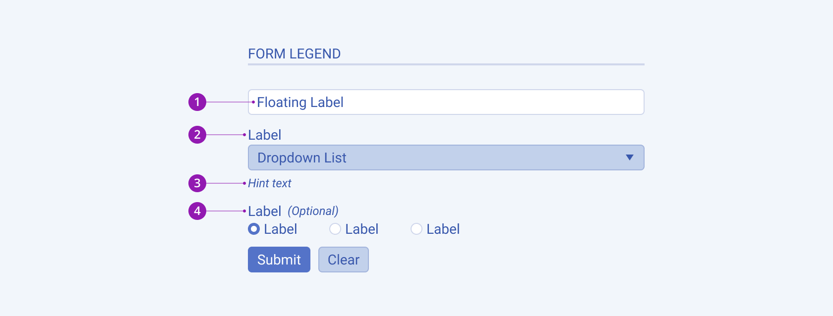
- Floating Label
- Label
- Hint
- Optional Label
Labels
Labels are static text elements placed adjacent to form fields, providing a clear description of what the field represents. Labels are typically positioned above or alongside the corresponding input field and remain visible at all times, ensuring users understand the purpose of each field.
For more information, refer to the Label component.
Floating Labels
Floating labels are an interactive labeling technique where the label transitions to a floating position above the input field when the user interacts with it or enters text. This approach conserves screen space while still providing context and guidance to users as they fill out the form.
For more information, refer to the FloatingLabel component.
Optional Labels
Optional labels are used to indicate that a particular form field is optional and not required for submission. They are denoted by italic text and brackets. Optional labels help users understand which fields are mandatory and which ones they can skip if desired.
Hint Messages
Hint messages are additional text snippets or tooltips that provide supplementary information or examples related to a form field. They are usually displayed in a lighter or smaller font below or beside the input field. Hint messages offer guidance, clarification, or format suggestions to assist users in providing the correct input.
For more information, refer to the Hint component page.
Form Validation
The validation in a Form component is crucial for ensuring that the data entered by users meets the required criteria and follows any specified rules. When the validation rules are not met, error messages are used to communicate the issues to the user.
The next image shows the form validation elements:
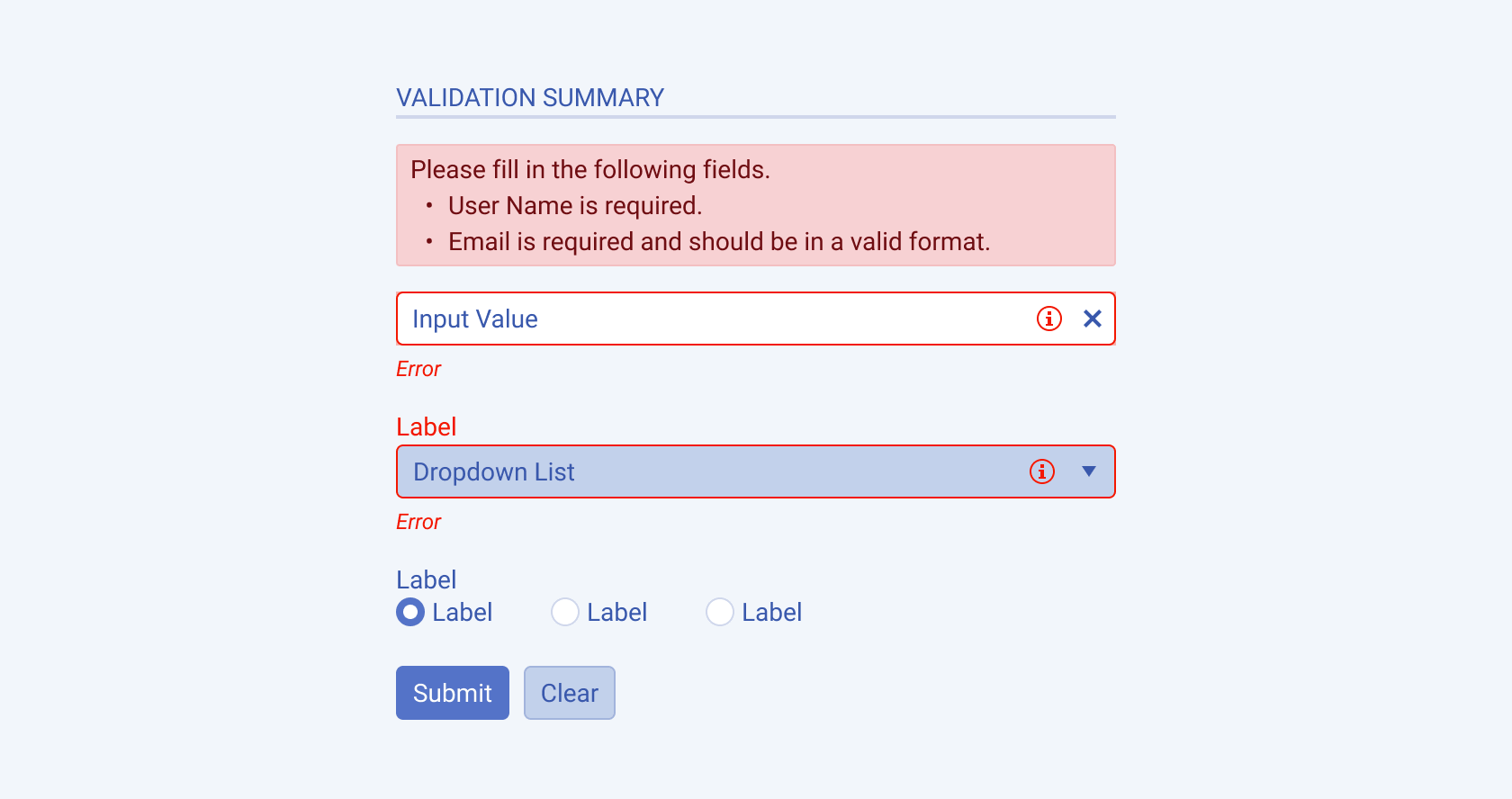
- Validation Summary
- Form Component in Invalid state
- Error
- Form Action Button in Disabled state
Error
Errors messages present a single field validation. If the validation rules are not satisfied, they are displayed below the corresponding form field. Error messages should be concise, clear and describe the error in a user-friendly language and provide guidance on how to correct it.
For more information, refer to the Error component.
Validation summary
Validation summaries present a form-level validation. If the validation rules are not satisfied, they display a list of all errors in a single message box. Validation summaries are useful when dealing with large forms with complex constraints between several fields.
Framework-Specific Documentation
For specific information about the component, refer to its official product documentation:


