Wizard Overview
The Wizard component is a user interface (UI) element that divides complex processes into sequential, manageable steps. It provides a guided experience, leading users through tasks with clear instructions and progress indicators. This makes the Wizard ideal for tasks like registrations, settings configuration, or data entry.
By structuring information into distinct stages, the Wizard minimizes user overwhelm and enhances focus. This component not only improves the user experience by simplifying complicated tasks but also ensures accuracy and efficiency in data collection and process completion.
Live Demo
Appearance
Wizards provide built-in styling options that grant visually appealing and flexible rendering experience.
Anatomy
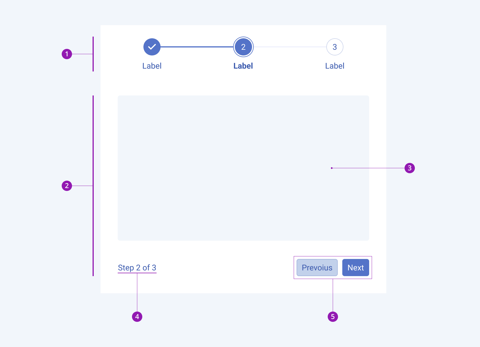
The anatomy of the Wizard summarizes the visual and functional elements of the component. The main elements include a stepper and wizard step that consists of a content area, pager and action buttons.
The next image shows the anatomy of a Wizard and includes the following elements:

- Stepper
- Wizard step
- Content area
- Wizard pager
- Wizard buttons
Content Position
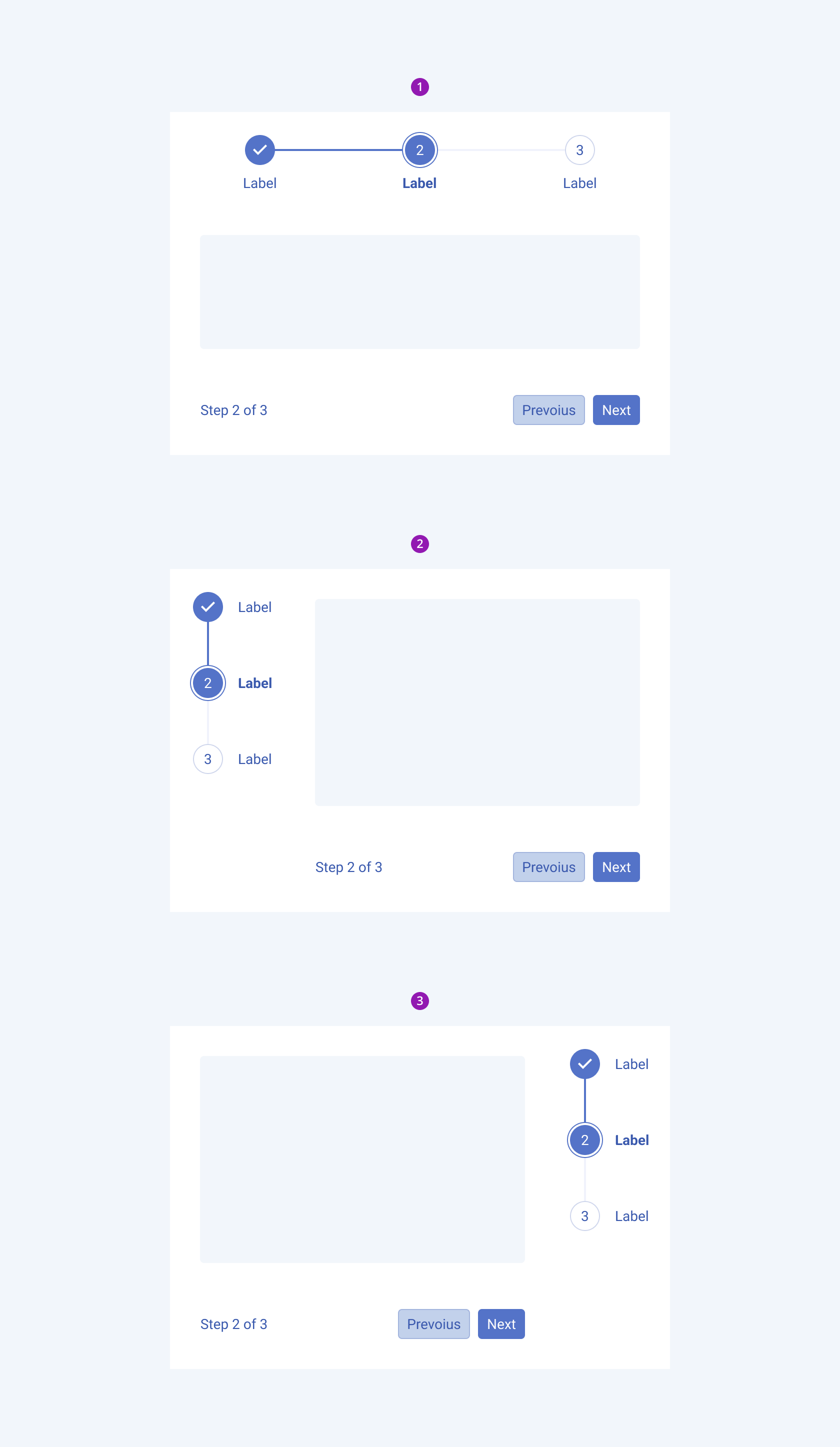
Depending on the content position, the Telerik and Kendo UI Wizard can be any of the following types:
- Bottom with horizontal stepper
- Right with vertical stepper
- Left with vertical stepper

- Bottom with horizontal stepper
- Right with vertical stepper
- Left with vertical stepper
Framework-Specific Documentation
For specific information about the component, refer to its official product documentation:


