Popover Overview
The popover component is a UI element that displays additional content or options when the anchor element is hovered, clicked, or focused. It represents a popup that provides contextually relevant information, menus, or controls without navigating to a new page or interrupting the user's current workflow. Popovers are often used to enhance user interaction and provide quick access to additional details or actions within an application or website.
Live Demo
Appearance
Popovers provide built-in styling options that grant visually appealing and flexible rendering experience.
Apart from the default vision of the Telerik and Kendo UI Popover, the component supports alternative styling options that enable you to configure the individual aspects of its appearance.
Anatomy
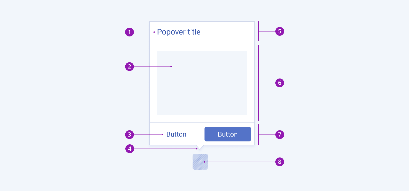
The anatomy of the Popover summarizes the elements of the component:

- Title
- Content area
- Action button
- Callout
- Popover header
- Popover body
- Popover actions
- Anchor element
Position
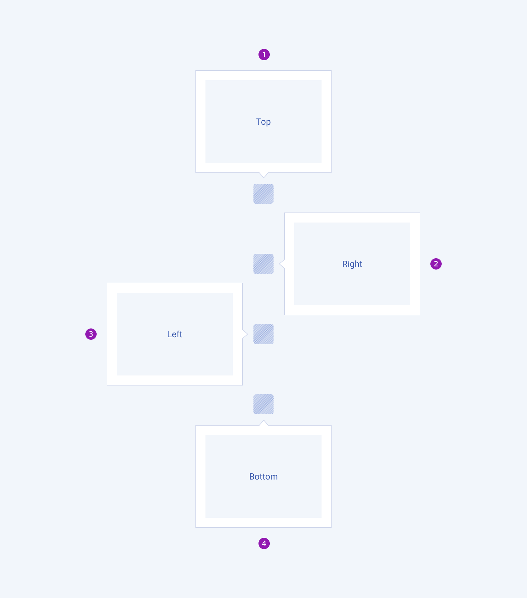
Depending on the position according to its anchor element, the Telerik and Kendo UI Popovers can be any of the following types:
- Top—The Popover will appear above the anchor element.
- Right—The Popover will appear to the right of the anchor element.
- Left—The Popover will appear to the left of the anchor element.
- Bottom—The Popover will appear below the anchor element.

- Top
- Right
- Left
- Bottom
Framework-Specific Documentation
For specific information about the component, refer to its official product documentation:


