TabStrip Overview
A TabStrip component is a UI element that organizes content into multiple tabs, allowing users to switch between different views or sections of content within a single container. This component is useful for creating clean, navigable interfaces where space is limited, by consolidating related information into tabbed sections that are easily accessible. Each tab acts as a clickable header, with the content area below updating to show the corresponding information when a tab is selected. TabStrip components are widely used in applications ranging from web browsers to complex business dashboards to enhance usability and the organization of information.
Live Demo
Appearance
TabStrips provide built-in styling options that grant visually appealing and flexible rendering experience.
Apart from the default vision of the Telerik and Kendo UI TabStrip, the component supports alternative styling options that enable you to configure the individual aspects of its appearance.
Anatomy
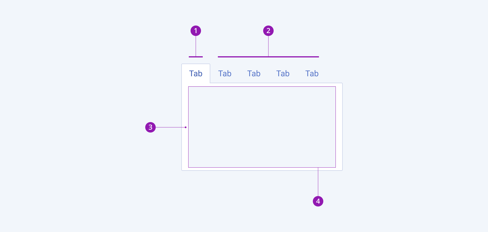
The anatomy of the TabStrip summarizes the visual and functional elements of the component. The main elements include tabs and a content panel.
The next image shows the anatomy of a TabStrip and includes the following elements:

- Active tab
- Inactive tabs
- Content panel
- Content
Variants
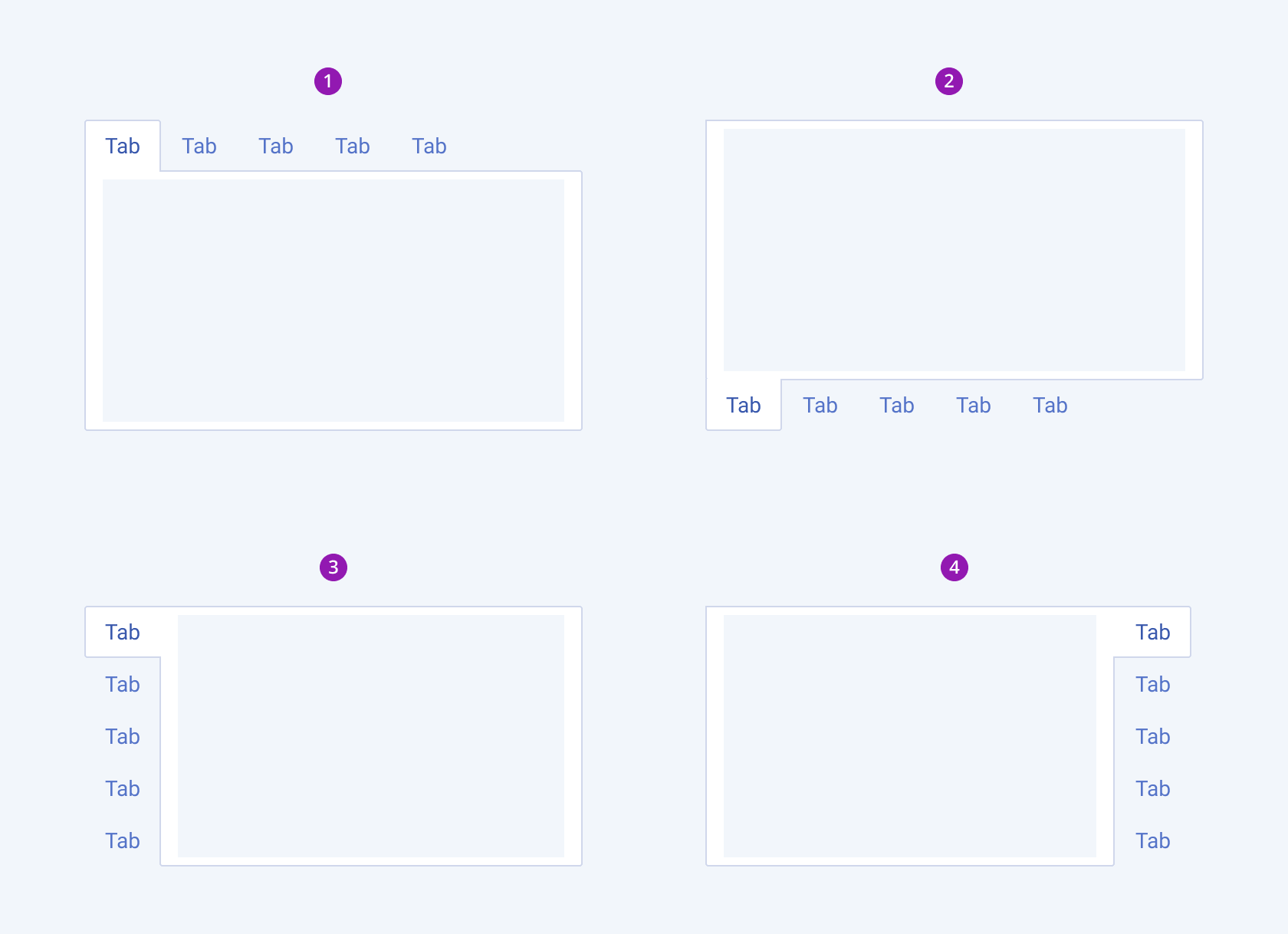
Depending on the tabs position, the Telerik and Kendo UI TabStrip can be any of the following types:
- Top (default)
- Bottom
- Left
- Right

- Top (default)
- Bottom
- Left
- Right
Framework-Specific Documentation
For specific information about the component, refer to its official product documentation:


