Overview
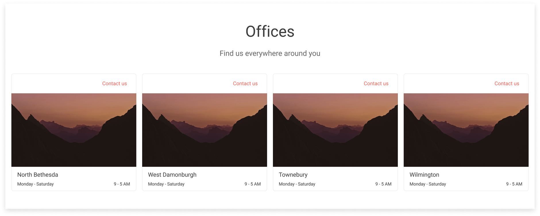
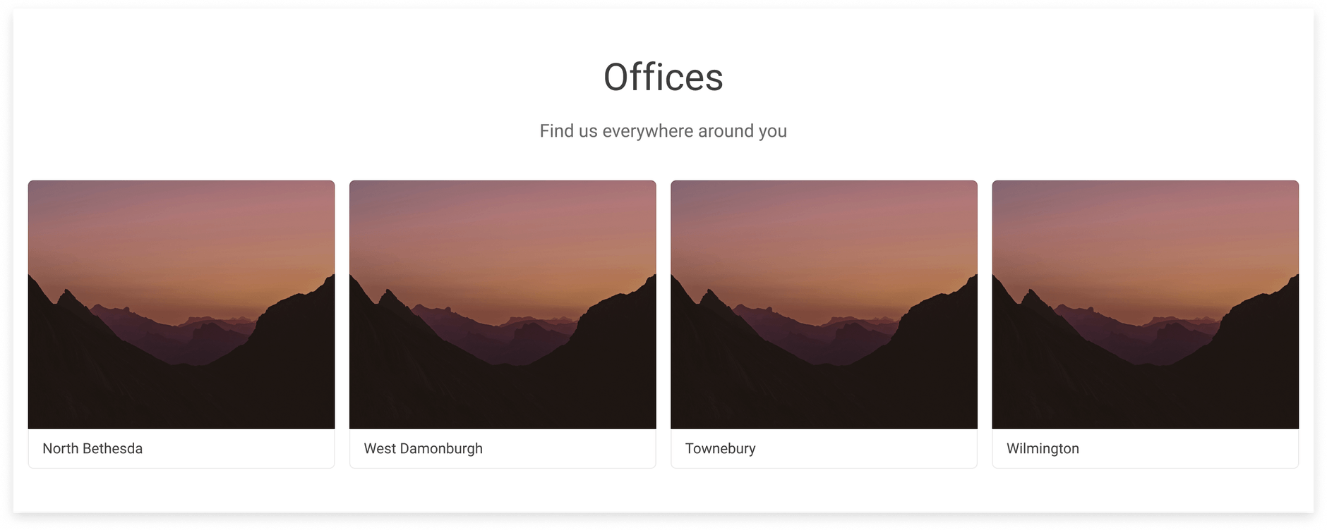
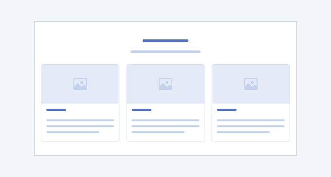
The Cards UI section has universal usage on various websites home pages and applications where you need to present multiple items of equal weight. Like any card, they have representative and navigational functions, but unlike the Product card, which contains mandatory elements such as image, price, color, size, and so on, the cards within the Cards UI section do not require any particular type of content. They can represent items, places, people, or whatever the use case requires. The number of cards and their layout also depend on the use case.
Key Principles
- Consistency—the content within the cards must be of equal importance.
- Impeccable image, video, or graphics quality—the visuals within any card must be of equally good quality, load fast enough and at the same time.
- Messaging—the text must be concise, clear, and captivating by giving sufficient information so that the users click them to learn more.
Cards Variants
The Telerik and Kendo UI Cards offer design variants showcased in our demos, each tailored to enhance your application development by covering different usage scenarios.
Cards 1

Cards 4

UI Components Documentation
For product-specific information, refer to the corresponding Telerik and Kendo UI documentation:


