ExpansionPanel Overview
The ExpansionPanel is a versatile UI component commonly used in web and application design. It facilitates the display of content in expandable panels that the user can expand or collapse to show or hide additional information, options, or details. These panels consist of a header that includes a title, a subtitle, and an expansion indicator icon that shows the state of the panel. They are also accompanied by a content area that becomes visible or hidden depending on whether the area is expanded or collapsed.
Live Demo
States
Depending on the action you want to imply through its appearance, the Telerik and Kendo UI ExpansionPanel can acquire the following states which you can set by using the following classes:
- An ExpansionPanel in its normal state appears usable and clickable.
k-hover—The hover state of an ExpansionPanel is applied when the user hovers over the component but does not click it.k-focus—The focus state of the ExpansionPanel is triggered when the user navigates to the component by keyboard, voice, or mouse click.k-disabled—The disabled state indicates that an ExpansionPanel is temporarily unclickable and users cannot interact with it. To indicate that they are unavailable, ExpansionPanels in their disabled state appear faded and slightly out of focus.
Anatomy
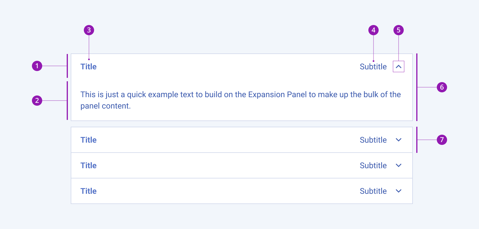
The anatomy of the ExpansionPanel summarizes the elements of the component:

- ExpansionPanel header
- ExpansionPanel content
- Title
- Subtitle
- Expansion indicator icon
- Expanded ExpansionPanel
- Collapsed ExpansionPanel
Framework-Specific Documentation
For specific information about the component, refer to its official product documentation:


