GridLayout Overview
The GridLayout component provides a flexible framework for arranging UI elements into rows and columns within a grid structure. Based on the CSS grid layout system, it enables developers to define the number of items per row or column, as well as span content across them for a more dynamic arrangement. The GridLayout allows you to achieve a consistent and cohesive UI design across your app by applying uniform structural rules to multiple pages. This component works with content ranging from basic text to full components such as cards, charts, and more.
Live Demo
Appearance
GridLayout provides built-in arranging options that grant visually appealing and flexible rendering experience.
Apart from the default vision of the Telerik and Kendo UI GridLayout, the component supports alternative styling options that enable you to configure the individual aspects of its appearance.
Anatomy
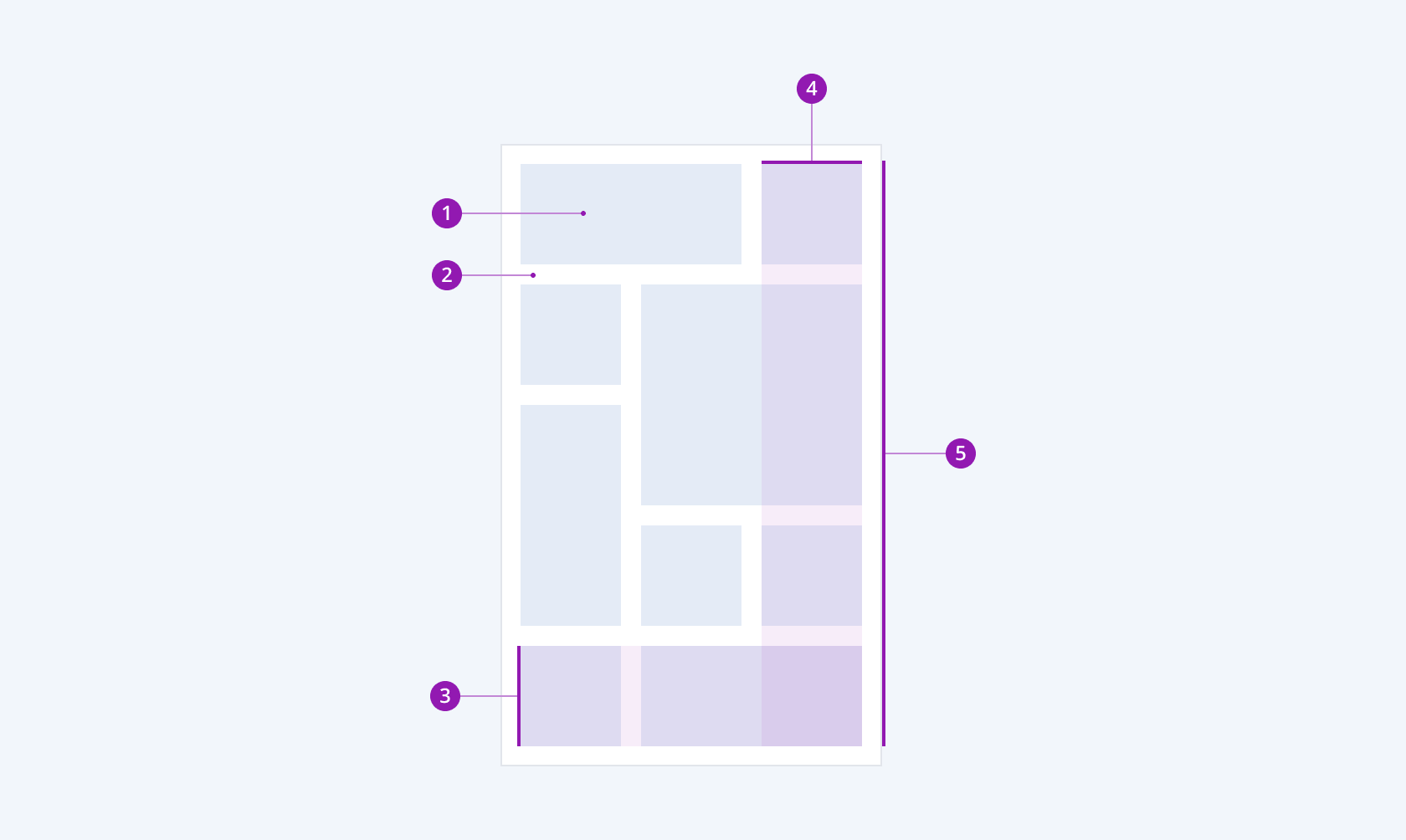
The anatomy of the GridLayout summarizes the elements of the component:

- Inner element
- Gap
- Row
- Column
- GridLayout container
Horizontal Alignment
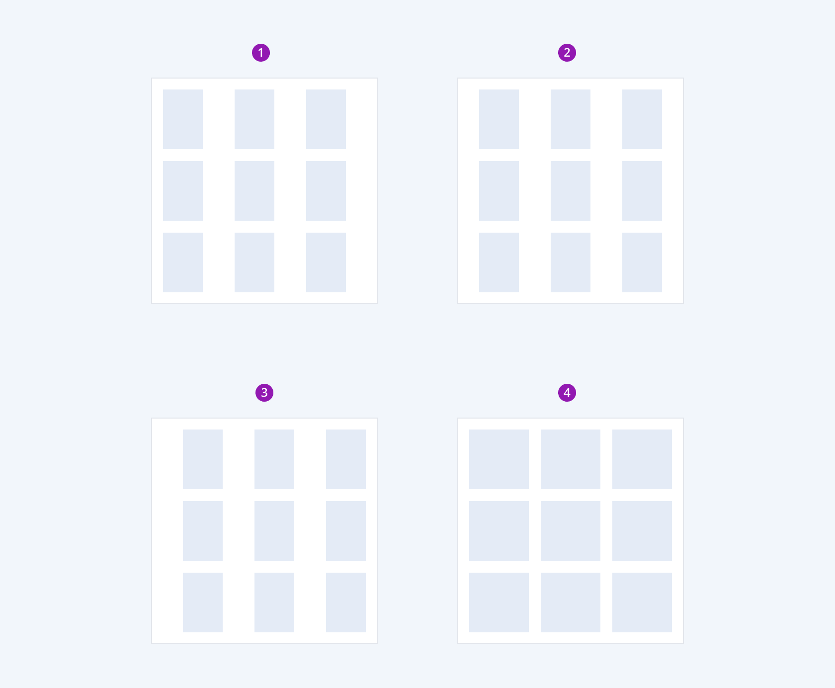
Depending on the horizontal alignment of the inner elements, the Telerik and Kendo UI GridLayout provides the following arranging configurations:
- Left
- Center
- Right
- Stretch

- Left
- Center
- Right
- Stretch
Vertical Alignment
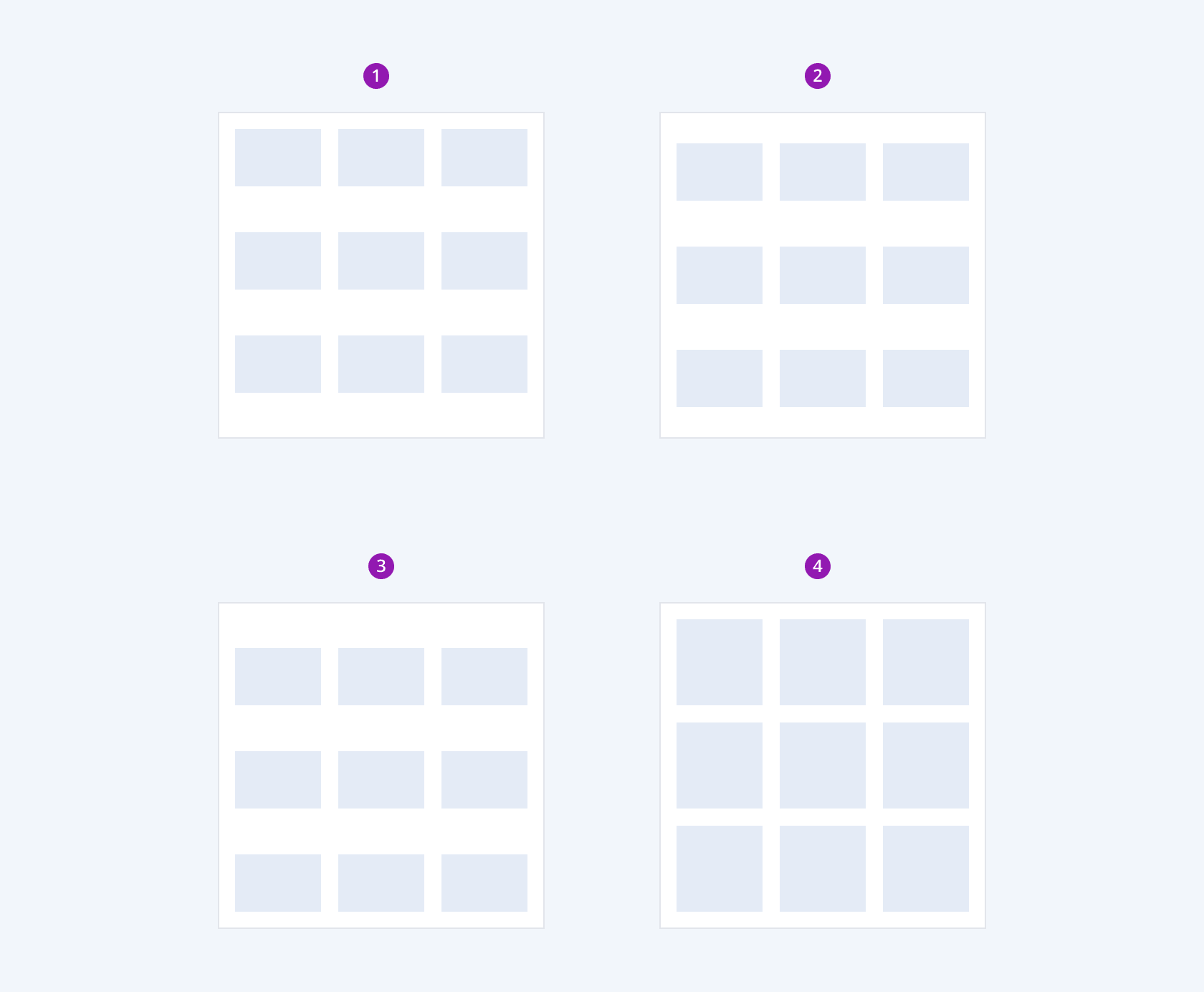
Depending on the vertical alignment of the inner elements, the Telerik and Kendo UI GridLayout provides the following arranging configurations:
- Top
- Center
- Bottom
- Stretch

- Top
- Center
- Bottom
- Stretch
Framework-Specific Documentation
For specific information about the component, refer to its official product documentation:


