Charts Overview
Charts are essential tools for data visualization, allowing users to interpret large amounts of information quickly. They convert raw data into visual formats like bars, lines, and pies, which can highlight trends, patterns, and correlations. By making data more accessible, charts facilitate better decision-making and communication of insights. To better represent various data sets and serve specific analytical purposes, charts can be categorized into different types: categorical, circular, freeform, scatter, sparkline, financial, and flow.
Live Demo
Below is a live demo of the Telerik and Kendo UI Area Chart:
Categorical Charts
Categorical Charts are used to compare different categories or groups of data, often with the goal of highlighting differences and similarities among them.
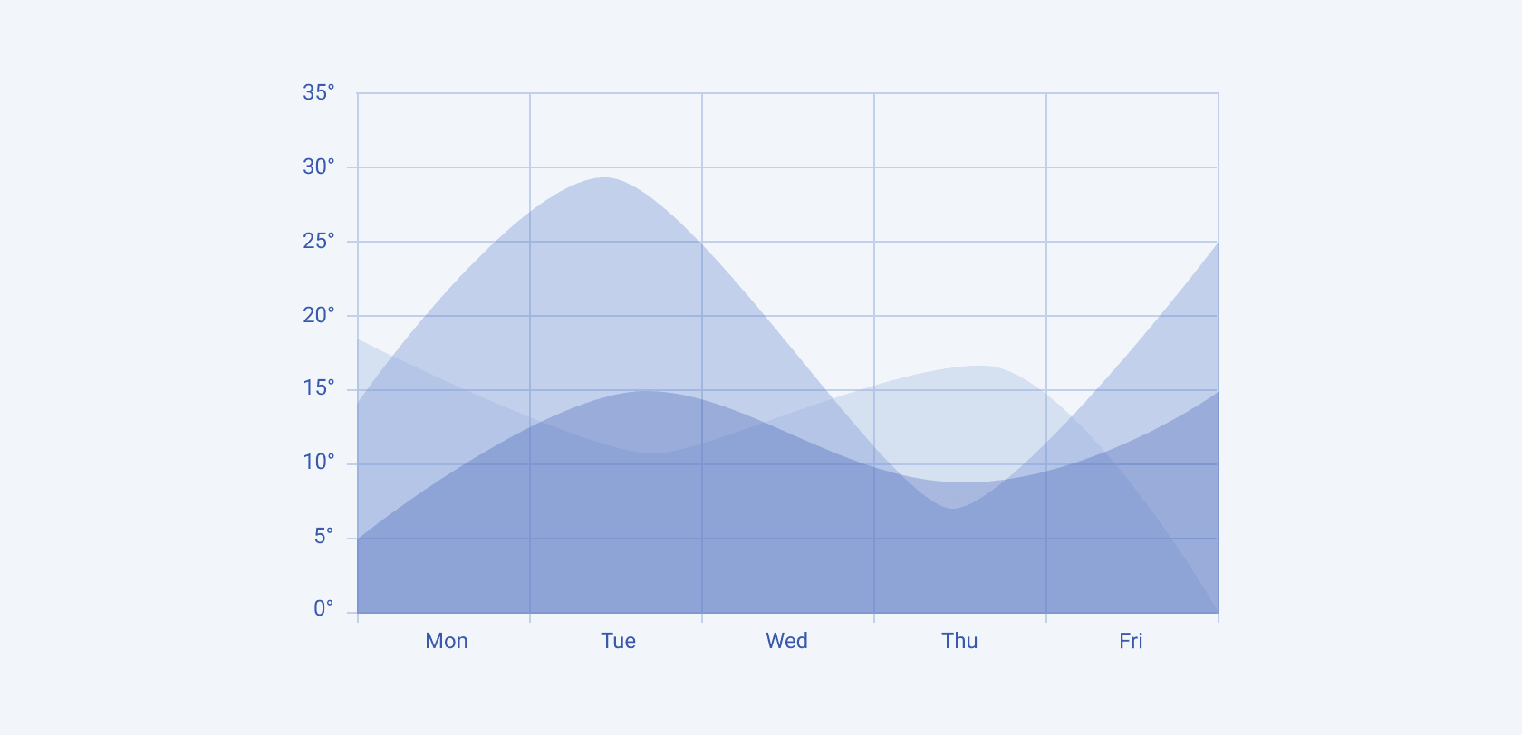
Area
The Area Chart displays quantitative data over time, emphasizing the magnitude of change by filling the area below the line.
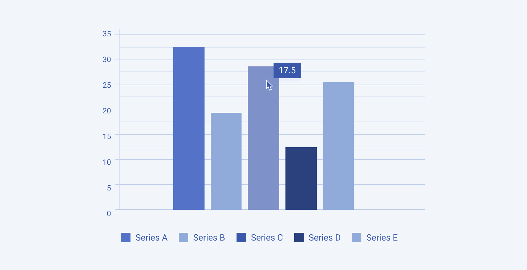
Bar
The Bar Chart represents data with rectangular bars, where the length of each bar is proportional to the value it represents.
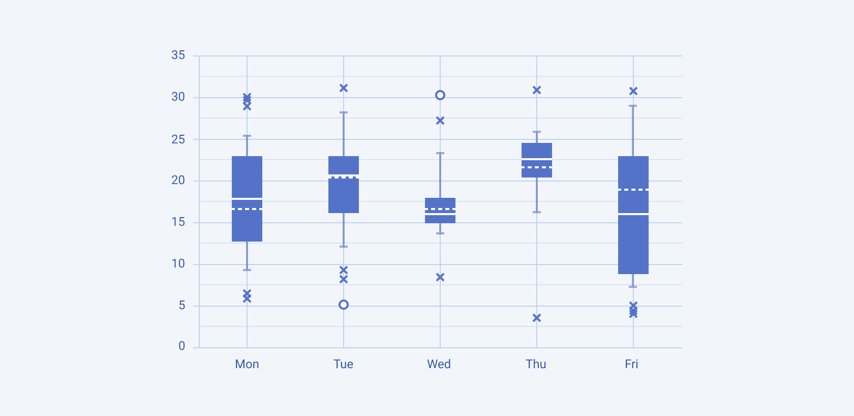
Box Plot
The Box Plot Chart summarizes a data set's distribution, highlighting the median, quartiles, and potential outliers.
Bullet
The Bullet Chart is used to compare a single measure against a goal, displaying progress and context in a compact format.

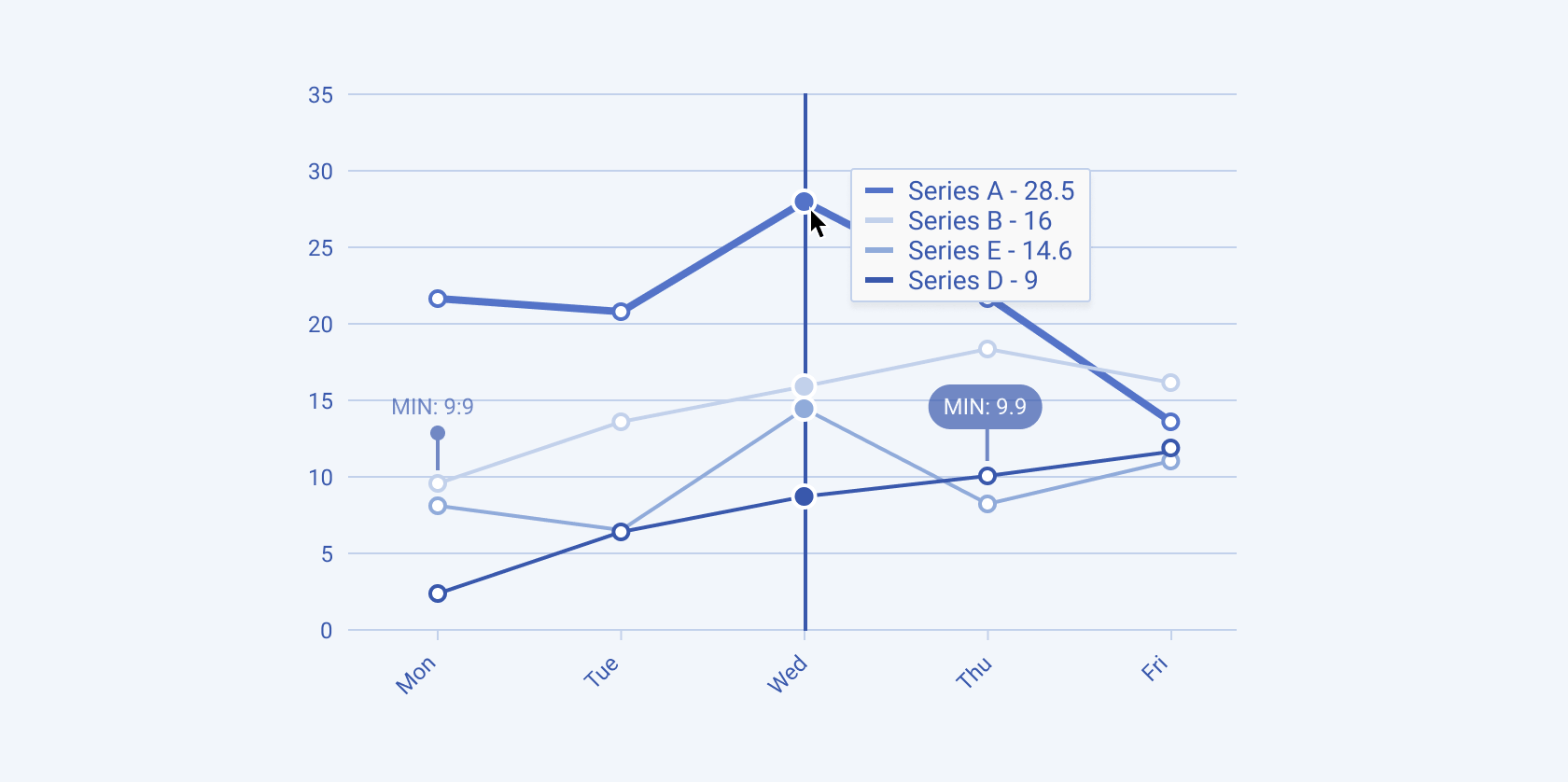
Line
The Line Chart connects data points with a continuous line, effectively showing trends over time.
RangeArea
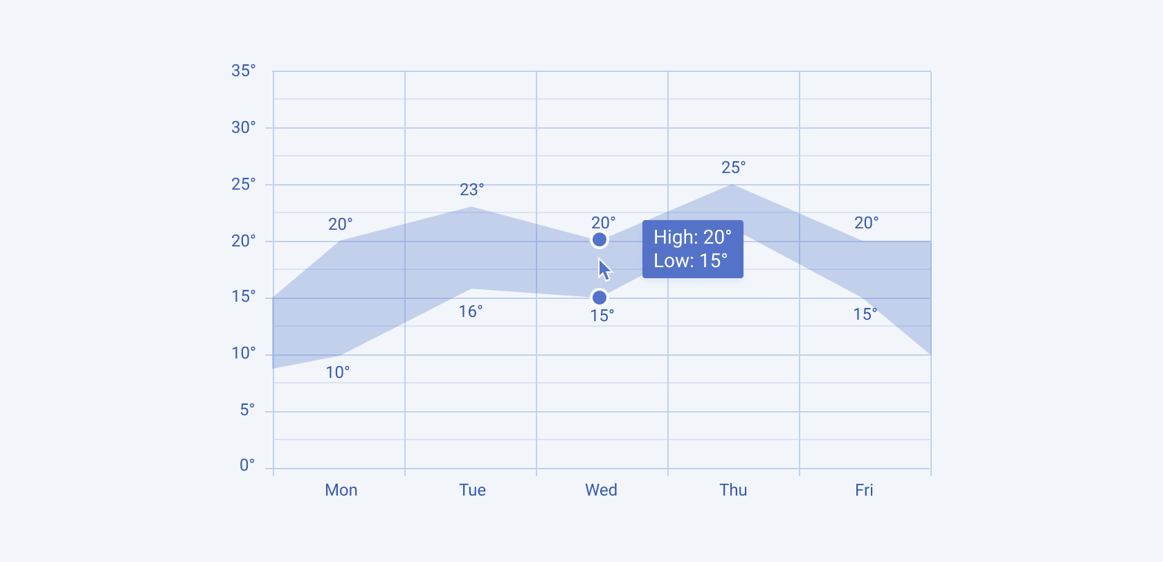
The Range Area Chart displays the range of values over time by shading the area between two lines representing upper and lower bounds.
RangeBar
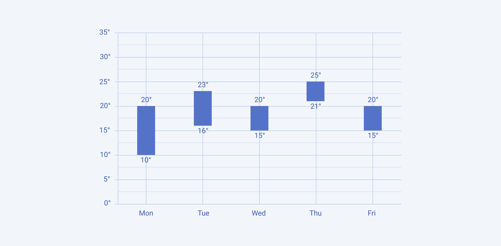
The Range Bar Chart shows the variation in values between a minimum and maximum range for different categories.
Radar
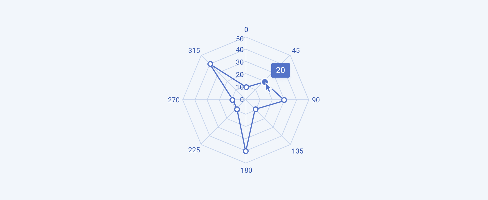
The Radar Chart displays multivariate data in a circular format, with each variable represented by a different axis starting from the same point.
Treemap
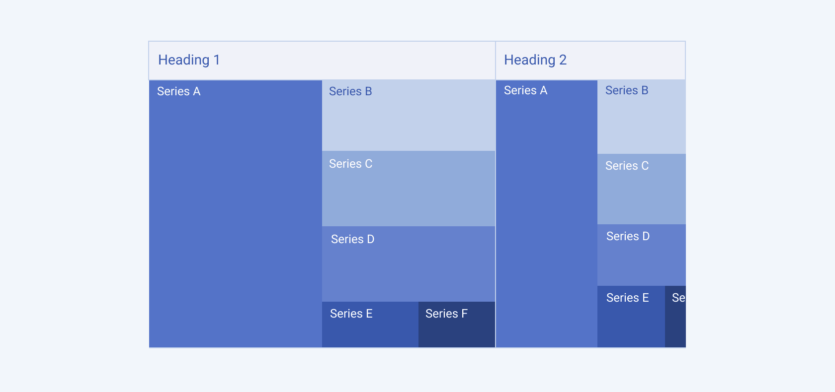
The Treemap Chart uses nested rectangles to represent hierarchical data, with the size of each rectangle proportional to its value.
Waterfall
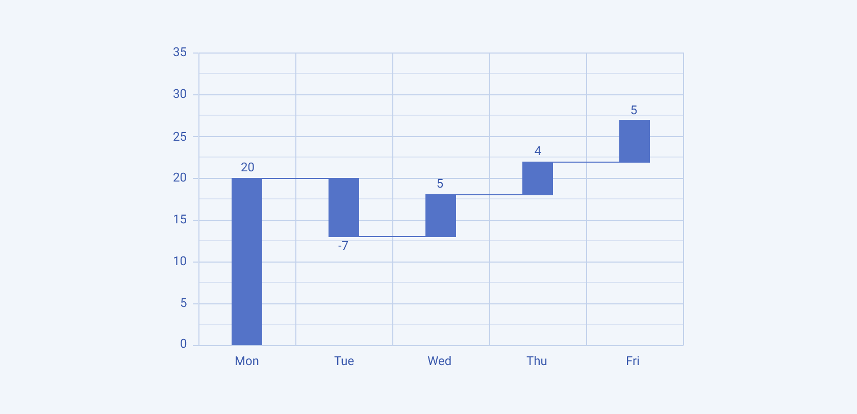
The Waterfall Chart shows the cumulative effect of sequentially introduced positive or negative values, typically used to visualize financial data.
Circular Charts
Circular charts are used to represent data in a circular layout, making it easy to show proportions and relationships between parts of a whole.
Pie
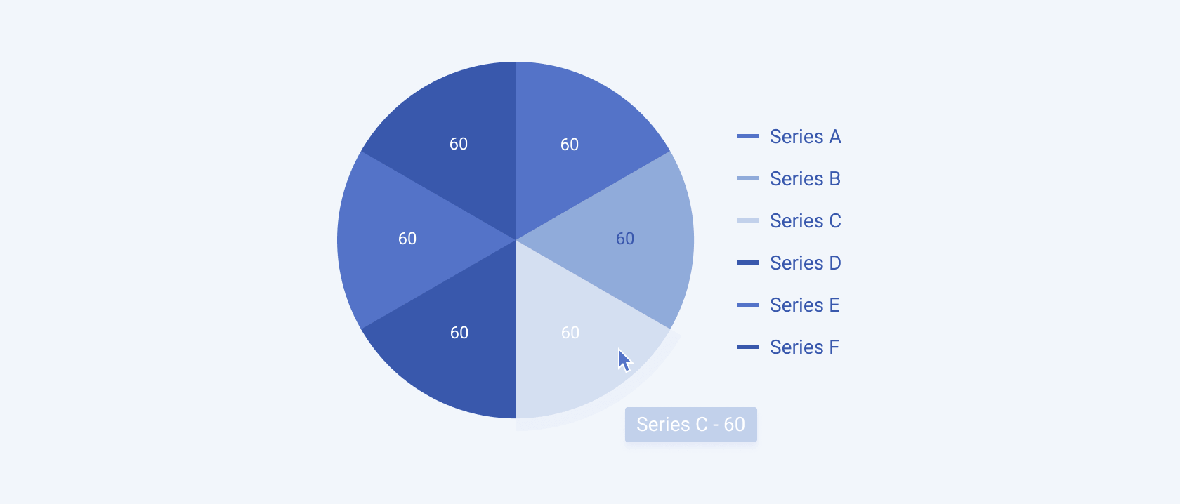
The Pie Chart divides a circle into slices to illustrate numerical proportions, with each slice representing a category's contribution to the whole.
Donut
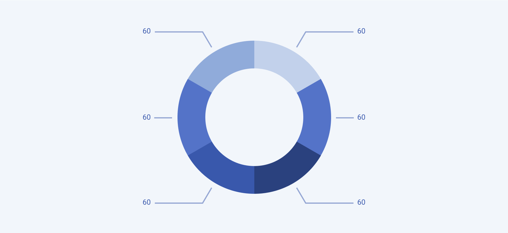
The Donut Chart is similar to a Pie Chart but with a central hole, allowing for additional data representation or aesthetic design.
Heatmap
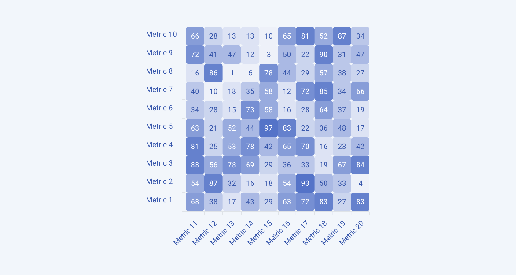
The Heatmap Chart uses color to represent data values in a matrix, highlighting variations in data intensity.
Freeform Charts
Freeform charts offer flexible visualization options that are not confined to standard Chart types, allowing for more creative and tailored data presentations.
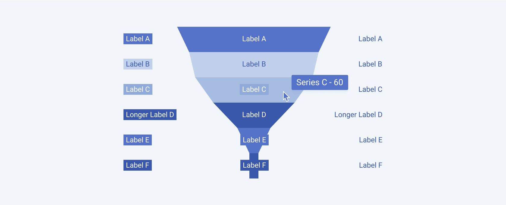
Funnel
The Funnel Chart shows the progressive reduction of data as it passes through stages in a process, often used in sales and marketing.
Scatter Charts
Scatter charts are used to display the relationship between two variables, showing how one variable affects or correlates with another.
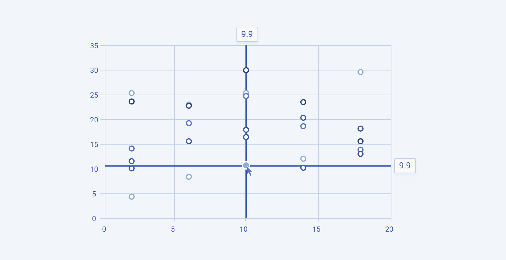
Scatter
The Scatter Chart plots individual data points on a two-dimensional plane, highlighting correlations or patterns between two variables.
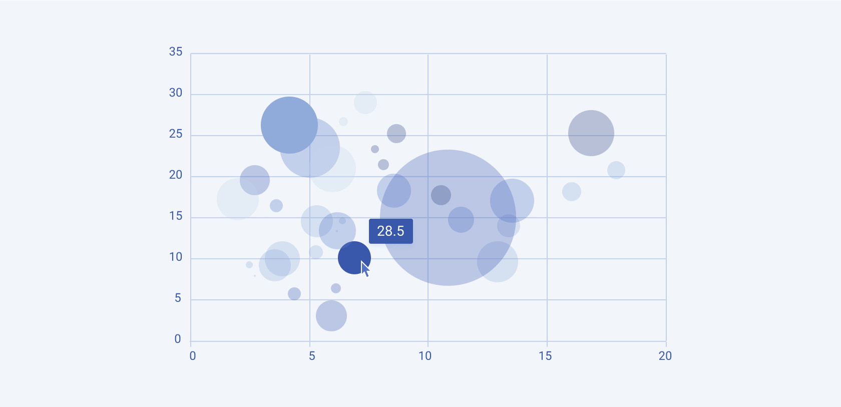
Bubble
The Bubble Chart is a type of Scatter Chart where each point is represented by a bubble, with the size of the bubble indicating an additional data dimension.
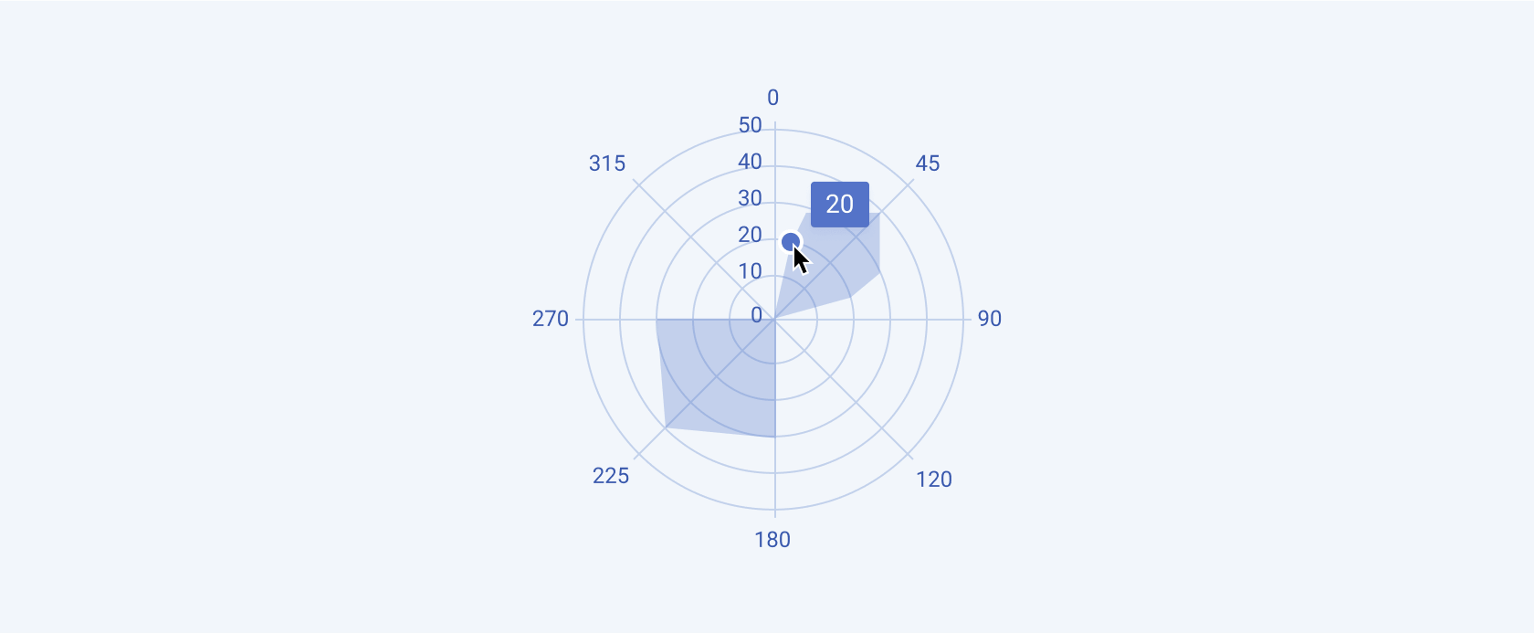
Polar
The Polar Chart plots data on a circular grid, where each point's angle and distance from the center represent two different variables.
Sparkline Charts
Sparkline charts are small, simple charts that are embedded within text or tables to provide a compact visual representation of data trends over time or across categories.
Sparkline
The Sparkline Chart is a minimalist Line Chart that shows the trend of data in a very compact space, often without axes or labels.

Financial Charts
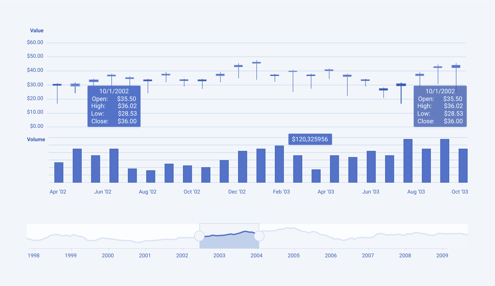
Financial charts are specialized visual tools used to represent and analyze financial data, such as stock prices, trading volumes, and market trends.
StockChart
The Stock Chart displays the price movements of financial securities over time, often including information like opening, closing, high, and low prices.
Flow Charts
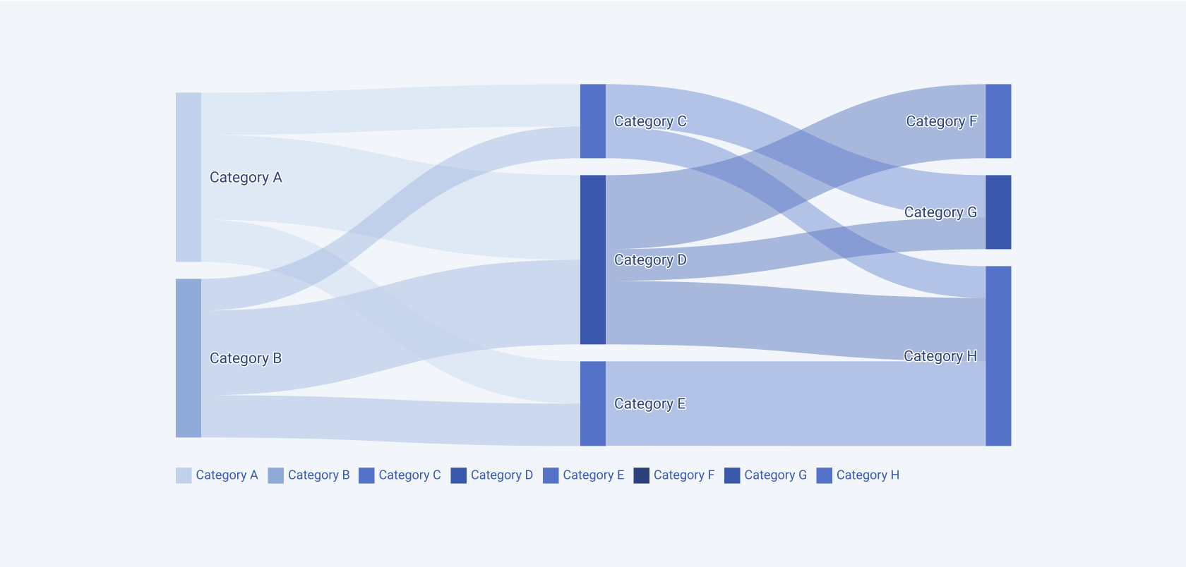
Flow charts illustrate the movement or flow of information, resources, or processes between different nodes, highlighting how elements interact within a system.
Sankey
The Sankey diagram visualizes the flow of quantities between different nodes, with the width of the arrows proportional to the flow rate.
Framework-Specific Documentation
For specific information about the component, refer to its official product documentation:


