Card Overview
The Card is a user interface (UI) element that resembles a virtual card. Its modular nature allows for easy grouping and organization on a page. It can hold together diverse content such as text, media (images, video), action buttons, and other composite elements.
Cards serve to create a clean and user-friendly design for dashboards, article pages, media feeds, profile overviews and product listings.
Live Demo
Appearance
Cards provide built-in styling options that grant visually appealing and flexible rendering experience.
Apart from the default vision of the Telerik and Kendo UI Card, the component supports alternative styling options that enable you to configure the individual aspects of its appearance.
Anatomy
The anatomy of the Card summarizes the elements of the component:
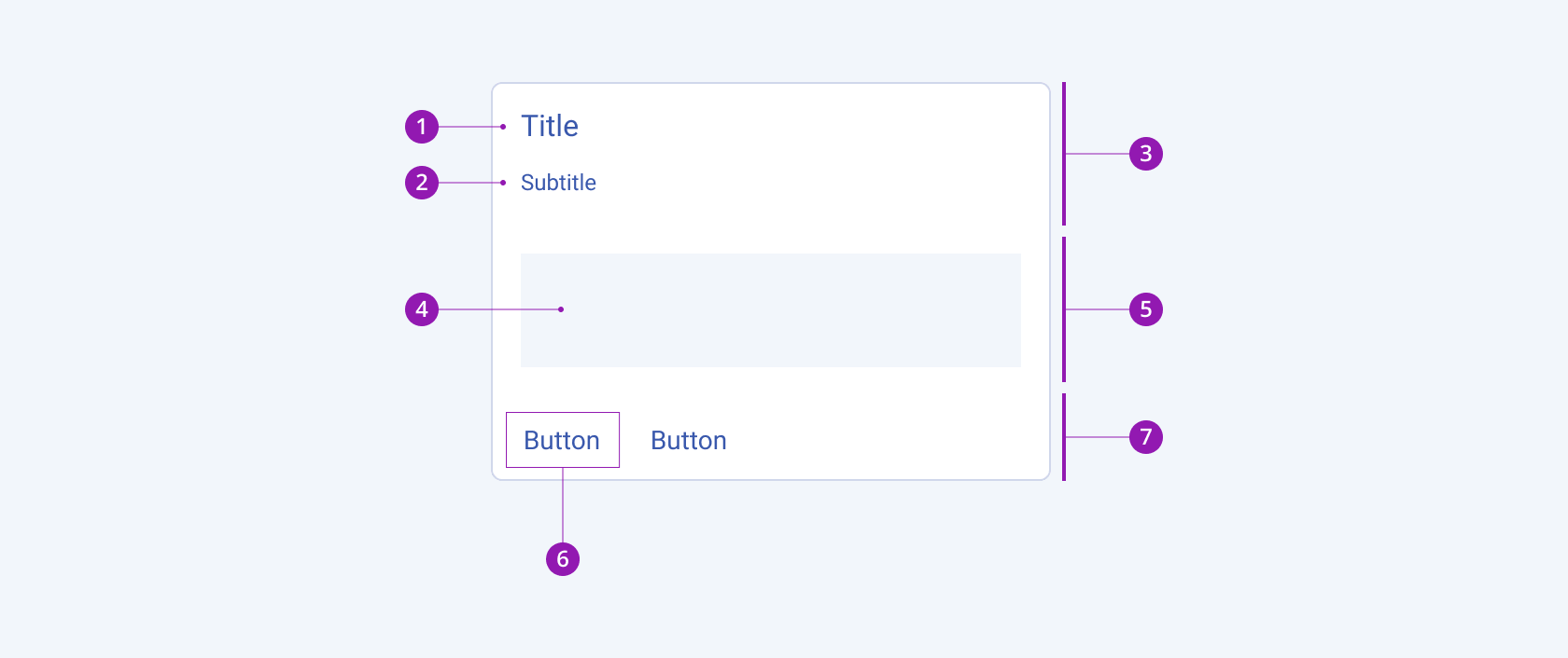
- Title
- Subtitle
- Card header
- Content area
- Card body
- Action button
- Card actions
Layout
The Telerik and Kendo UI Card can appear both in horizontal and vertical orientations.
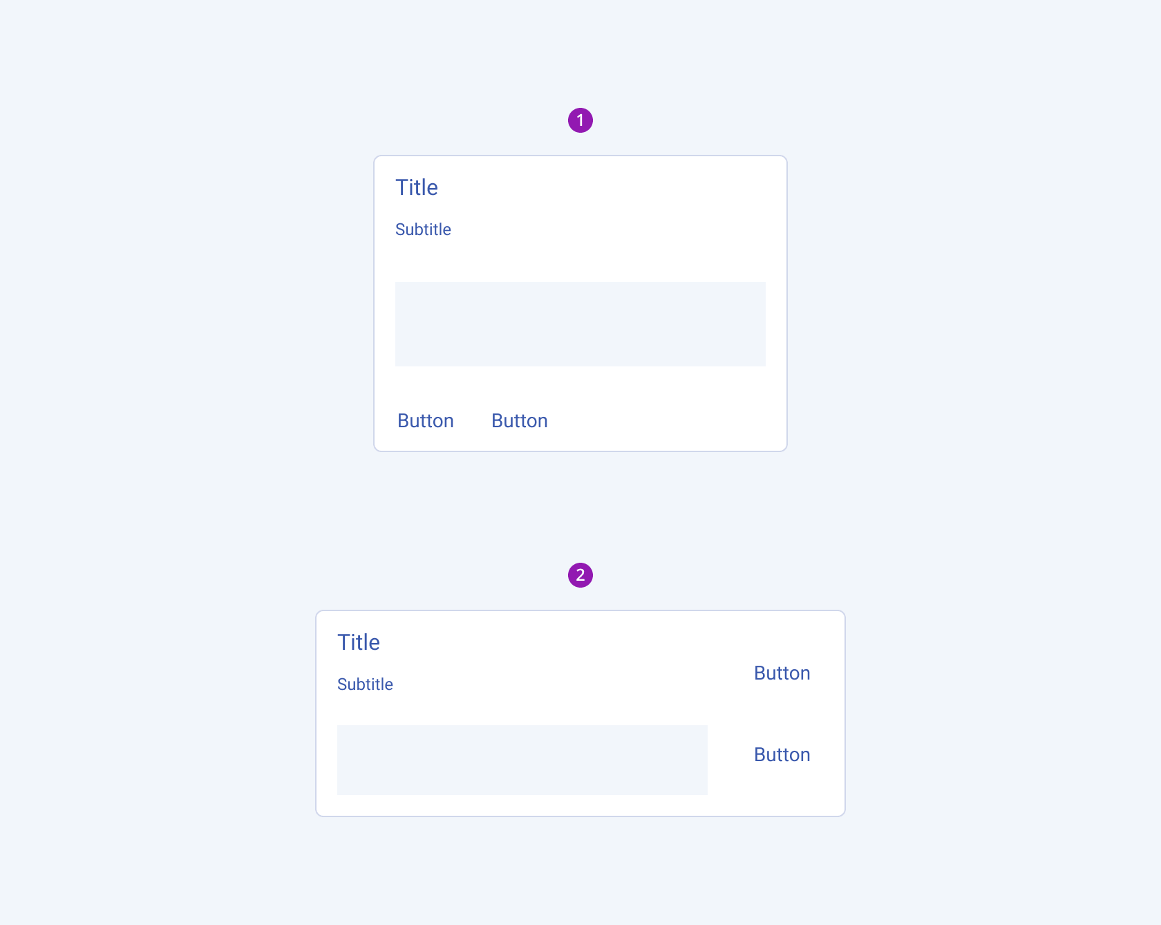
- A Card with a vertical layout
- A Card with a horizontal layout
Card with Media
The Media module can contain different media formats, such as image and video. The layout of the Card can be set both to vertical and horizontal.
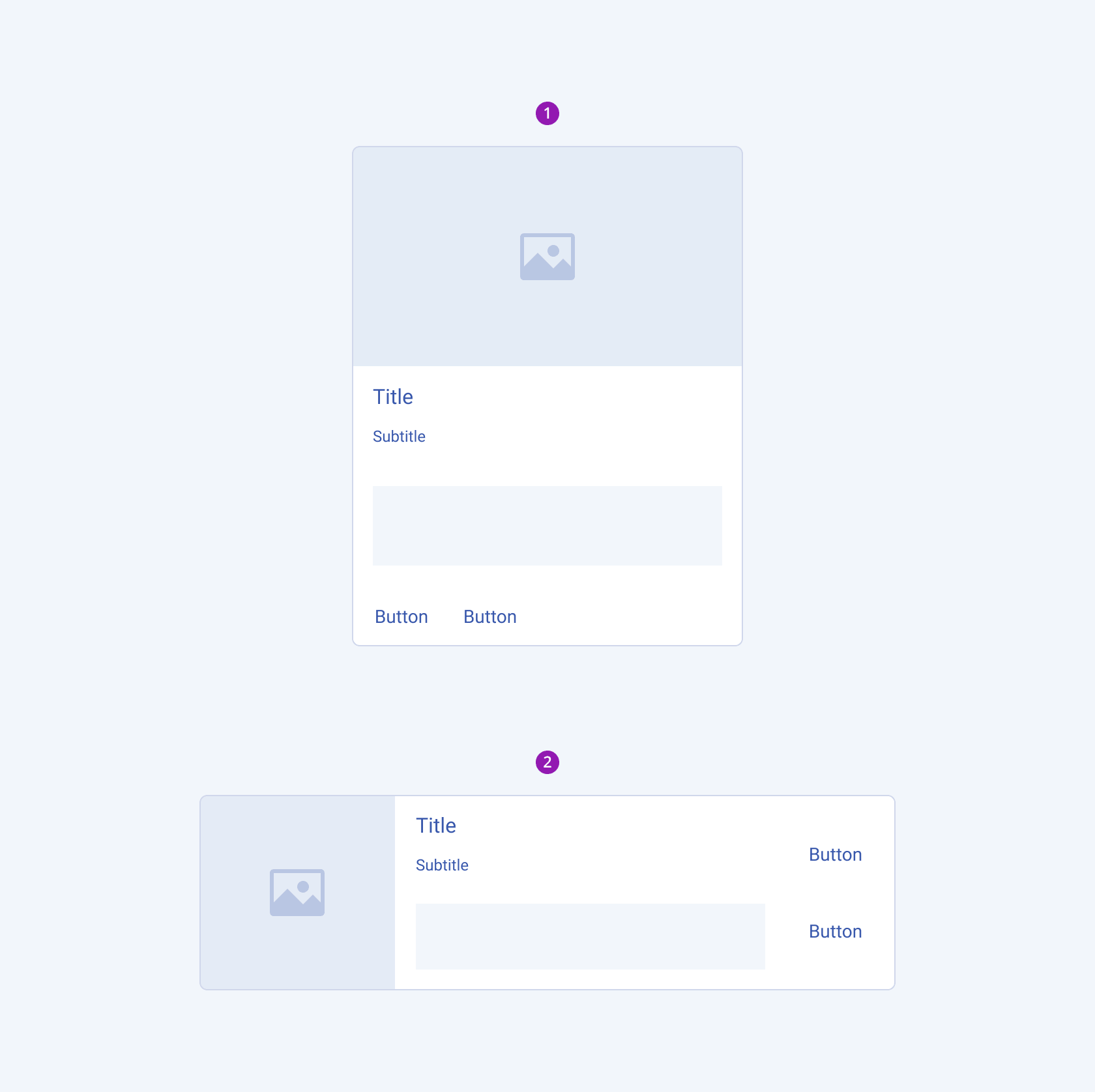
- Vertically oriented Card with media
- Horizontally oriented Card with media
Card with Footer
The Footer module can contain different kinds of supporting content, such as links and icons. The layout of the Card can be set both to vertical and horizontal.
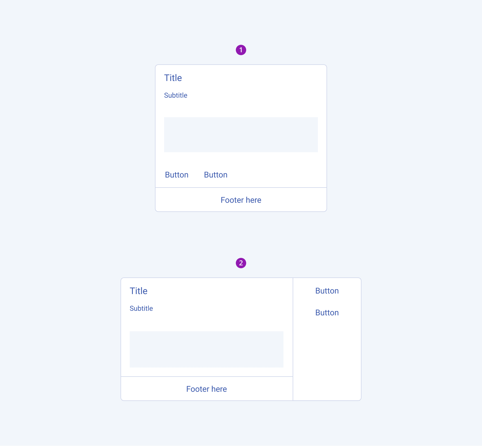
- Vertically oriented Card with footer
- Horizontally oriented card with footer
Action Buttons Alignment
Based on the layout of the Card (vertical or horizontal), you can choose how to position the action buttons within the actions area.
Vertical Card
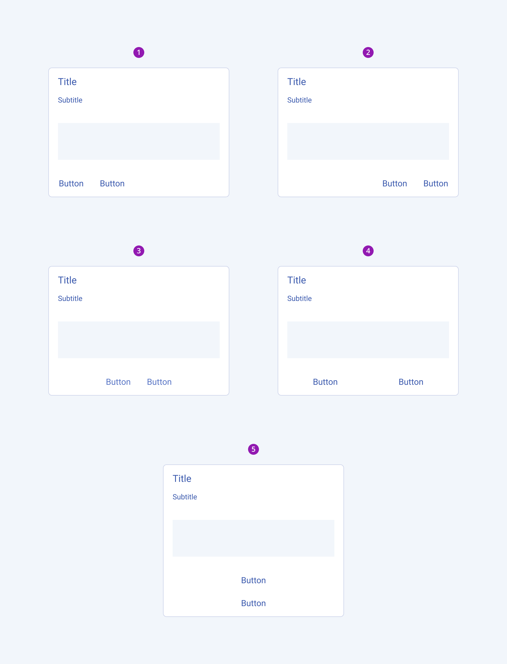
- Left-aligned action buttons
- Right-aligned action buttons
- Centered action buttons
- Stretched action buttons
- Centered vertically stacked action buttons
Horizontal Card
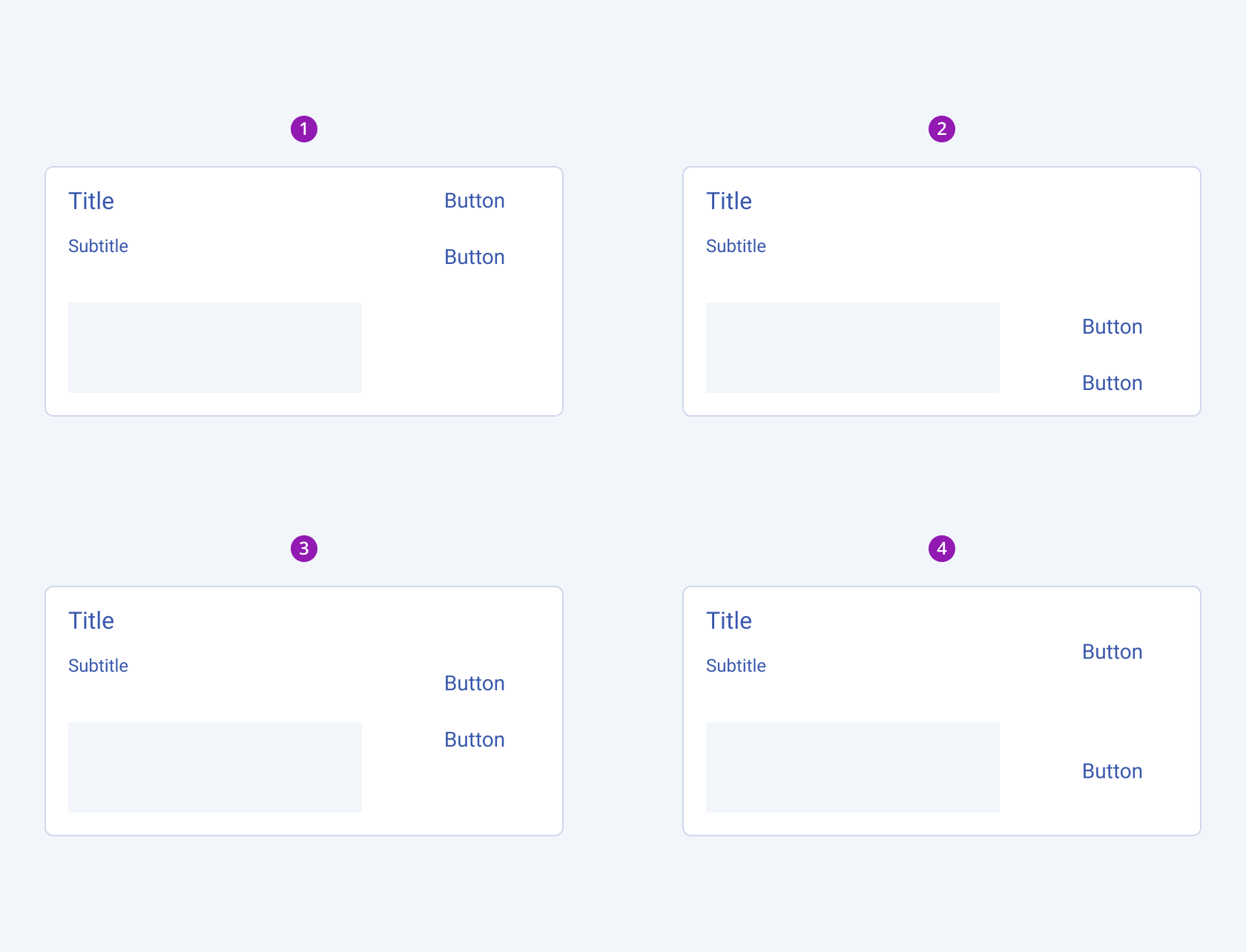
- Top-aligned action buttons
- Bottom-aligned action buttons
- Centered action buttons
- Stretched action buttons
Framework-Specific Documentation
For specific information about the component, refer to its official product documentation:


