Card

Cards are flexible UI elements that present information in a structured and visually appealing way.

Usage Guidelines

The Telerik and Kendo UI Card requires you to follow some basic principles when using the component.

Card Body

The Card Body is this section of the component where the main text goes. The information is presented in plain language, making it easy for users to scan and navigate through content.
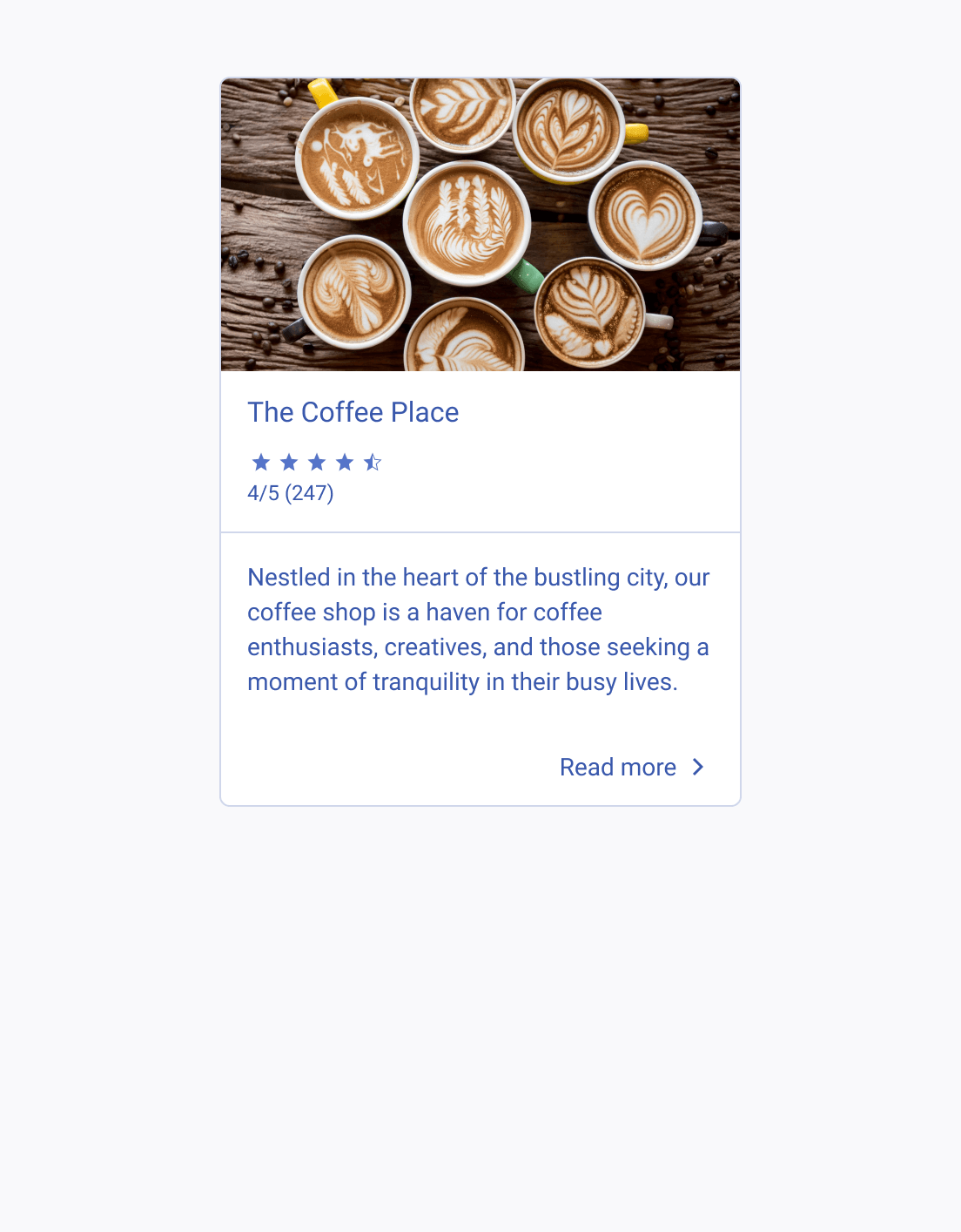
A Telerik and Kendo UI Card component providing essential, easy-to-grasp information
Include essential information and keep the text volume easily digestible.
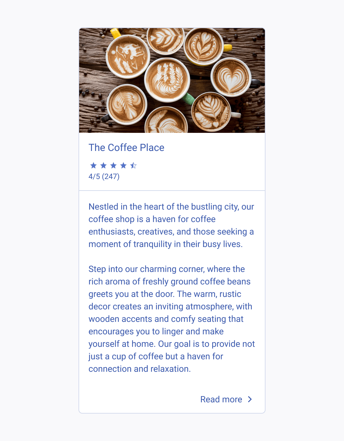
A Telerik and Kendo UI Card component with an overwhelming amount of text in the body area
Avoid overwhelming users with heavy loads of text.

Composite Elements

The Card component allows various arrangements of its composite elements. Its flexibility makes it a suitable choice for various contexts where information needs to be presented in a structured and visually pleasing way - for example, in dashboards, media feeds, profile previews, product listings and many more.
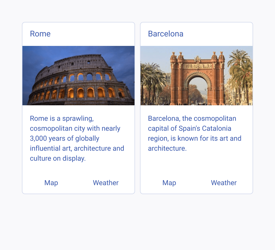
Two Telerik and Kendo UI Cards within a group, both using the same style and composite elements
Apply the same style and include the same composite elements when arranging multiple cards into groups.
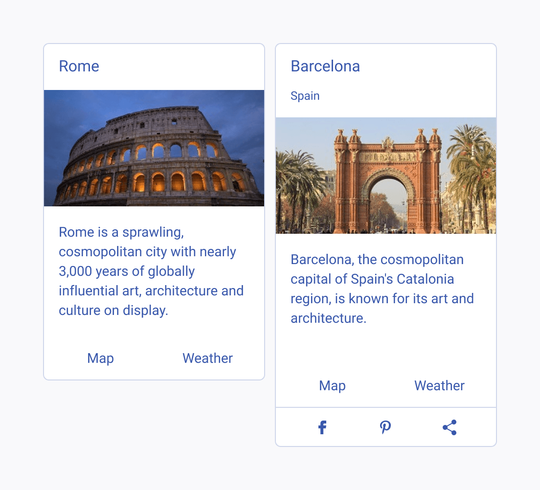
Two Telerik and Kendo UI Cards within a group, each displaying different composite modules
Do not mix together different card variants within card groups.
Feedback