BottomNavigation Overview
The BottomNavigation component is a UI element, typically located at the bottom of an application or web page, that provides navigation items for easy access to various sections or functions of the application. Each item consists of an icon and an optional text label. BottomNavigation enhances the user experience by simplifying navigation and improving accessibility. It is primarily intended for use on mobile devices.
Live Demo
Appearance
BottomNavigations provide built-in styling options that grant visually appealing and flexible rendering experience.
Apart from the default vision of the Telerik and Kendo UI BottomNavigation, the component supports alternative styling options that enable you to configure the individual aspects of its appearance.
Anatomy
The anatomy of the BottomNavigation summarizes the elements of the component:

- Container
- BottomNavigation item
- Icon
- Label
Icon and Label Position
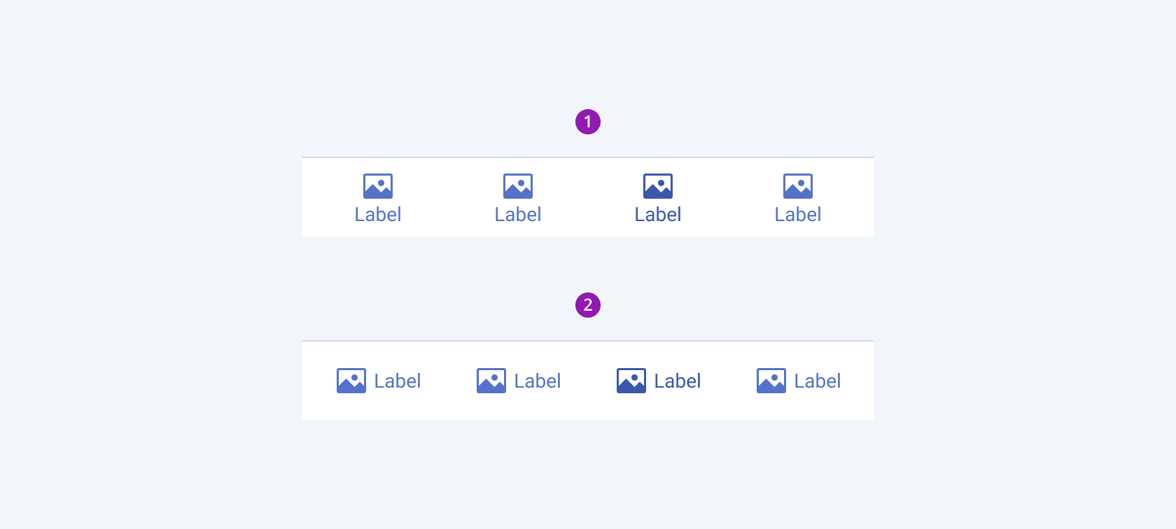
Depending on the icon and label position, the Telerik and Kendo UI BottomNavigation can be any of the following types:
- Vertical (default)—Renders BottomNavigation item with text label below the icon.
- Horizontal—Renders the BottomNavigation item with text label and icon on the same line.

- Vertical (default)
- Horizontal
Fill Mode
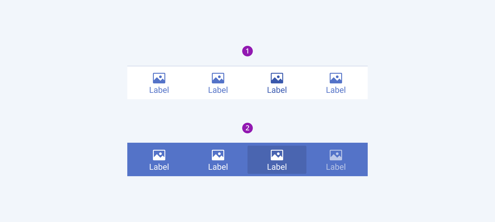
The BottomNavigation provides the fillMode configuration option that enables you to control the way in which color is applied to the rendered bottom navigation. BottomNavigations also provide options for fill-mode customization. By default, the BottomNavigations are rendered in flat fill mode.
fillMode provides the following available options:
flat(default)—The flat BottomNavigation seamlessly integrates into the UI environment, minimizing visual distractions to keep the focus on the content.solid—The solid BottomNavigation draws users' attention through the use of colors, creating a visually striking effect.

- Flat (default)
- Solid
Color
The BottomNavigation provides the theme-color configuration option that enables you to choose among the available, built-in colors that will be applied to it. BottomNavigations also provide options for color customization. By default, the BottomNavigations are rendered in the primary theme color.
themeColor provides the following available options:
primary(default)—A BottomNavigation component in the primary theme color immediately draws the user's attention.secondary—Applies the secondary theme color to the BottomNavigation component.tertiary—Applies the tertiary theme color to the BottomNavigation component.info—The info color of the BottomNavigation indicates the different status of the component.success—The success color of the BottomNavigation indicates that an action has been successful.warning—The warning color of the BottomNavigation indicates a warning status of the component.error—The error color of the BottomNavigation indicates an error status of the component.dark—Applies the dark color theme to the BottomNavigation component, which is particularly suitable for user interfaces with a dark color scheme.light—Applies the light color theme to the BottomNavigation component, which is particularly suitable for user interfaces with a light color scheme.inverse—Applies the inverse color to the BottomNavigation component.
Framework-Specific Documentation
For specific information about the component, refer to its official product documentation:


