BottomNavigation

The BottomNavigation component allows for easy access to primary app destinations.

Usage Guidelines

The Telerik and Kendo UI BottomNavigation requires you to follow some basic principles when using the component.

Label and Icon

The BottomNavigation is effective when used to present content that can be appropriately conveyed through icons accompanied by concise and meaningful text labels. This approach improves usability, clarity, and accessibility and caters to a positive user experience.
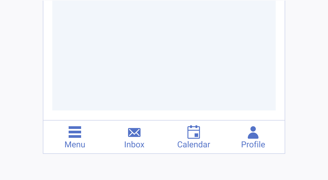
A Telerik and Kendo UI BottomNavigation with clear icons and meaningful labels
Use the BottomNavigation for content that you can communicate through icons, and ensure that the text labels provide concise and meaningful definitions.
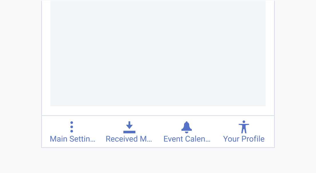
A Telerik and Kendo UI BottomNavigation used incorrectly with misleading icons and long labels
Avoid hiding functionality behind icons that are difficult to recognize and labeled with long and vague text.

Color

A harmonious and visually appealing bottom bar in your app or website provides users with intuitive navigation. To achieve this, it's crucial to maintain consistency in the color schemes and configurations of your BottomNavigation items.
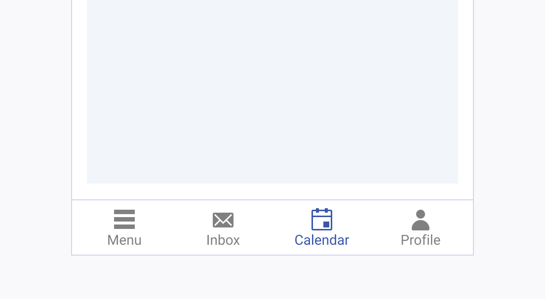
A Telerik and Kendo UI BottomNavigation with consistent colors
Use the predefined theme-color configurations of the BottomNavigation item to maintain design consistency.
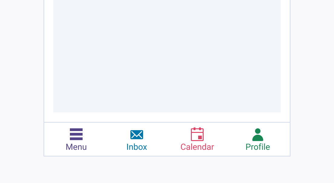
A Telerik and Kendo UI BottomNavigation with inconsistent colors
Avoid creating custom color configurations for BottomNavigation items, as it may lead to inconsistency in the overall design.
Feedback