Window Overview
The Window component is a user interface element that provides a container for displaying content in a separate, movable, and resizable window on the screen. It keeps the contents of the window isolated from the main application interface while still allowing the user to interact with it.
Live Demo
Appearance
The Window provides built-in styling options that grant visually appealing and flexible rendering experience.
Apart from the default vision of the Telerik and Kendo UI Window, the component supports alternative styling options that enable you to configure the individual aspects of its appearance.
States
Depending on the action you want to imply through its appearance, the Telerik and Kendo UI Window can acquire the following states which you can set by using the following classes:
- A Window in its normal state appears usable and clickable.
k-focus—The focus state is triggered after the Window has been spotlighted with the mouse or the keyboard, meaning that the Window is active and the user is interacting with it.
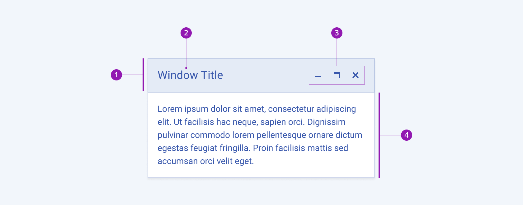
The next image shows the anatomy of the Window component and includes the following elements:

- Title Bar
- Title
- Window buttons
- Content area
Color
The Window provides the theme-color configuration option that enables you to choose among the available, built-in colors that will be applied to it. The Window also provides options for color customization.
themeColor provides the following available options:
base(default)primary—Primary windows visualize an important action that draws the attention of the user.light—Light windows are used to present actions of lower importance, providing a seamless appearance, and are particularly suitable for user interfaces with a light color scheme.dark—Dark windows are used to present actions of lower importance, providing a seamless appearance, and are particularly suitable for user interfaces with a dark color scheme.none—Does not set athemeColorand allows you to add your own, custom value.
Framework-Specific Documentation
For specific information about the component, refer to its official product documentation:


