Calendar Overview
The Calendar component is a UI element that allows users to manage appointments and events. It provides a visual representation of the Gregorian calendar, displaying days, weeks, months, and years. The calendar component supports the selection of dates and date ranges, facilitates the planning of appointments, and enables users to interact seamlessly with temporal data.
Live Demo
Appearance
Calendars provide built-in styling options that grant visually appealing and flexible rendering experience.
Apart from the default vision of the Telerik and Kendo UI Calendar, the component supports alternative styling options that enable you to configure the individual aspects of its appearance.
Anatomy
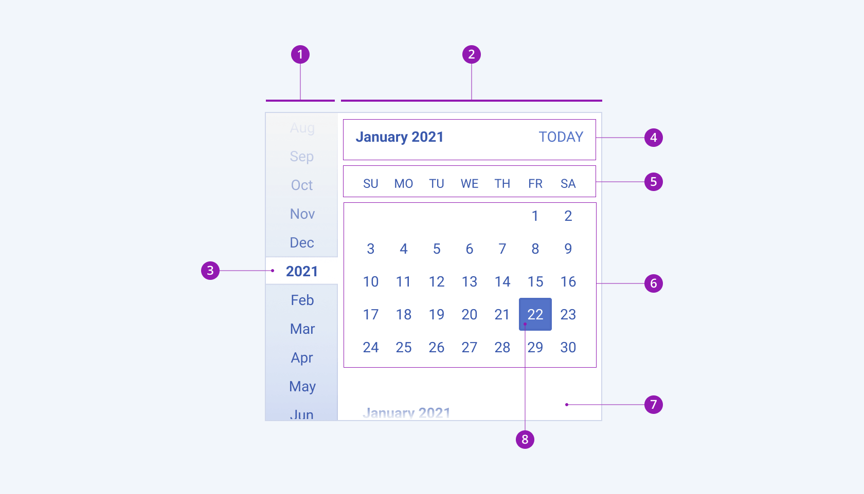
The anatomy of the Calendar summarizes the visual and functional elements of the component. The main elements include a header, where the main buttons are displayed, and a calendar table.
The next image shows the anatomy of an infinite calendar and includes the following elements:

- Side navigation
- Month view
- Navigation highlight
- Header with flat buttons
- Weekdays table head
- Calendar table
- Scroll shadow
- Calendar table cell
Views
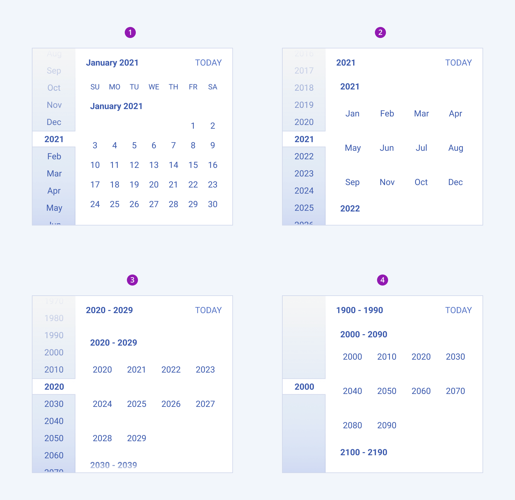
Depending on the user selection, the Telerik and Kendo UI Calendar can display the following views:
- Month view
- Year view
- Decade view
- Century view

- Month view
- Year view
- Decade view
- Century view
Variants
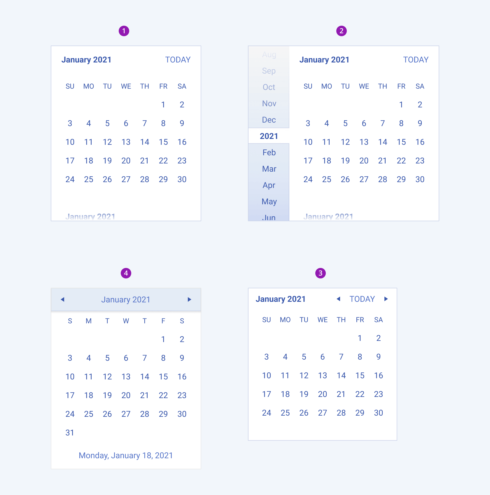
Depending on the displayed elements, the Telerik and Kendo UI Calendar can be any of the following types:
- Infinite calendar with fast navigation
- Infinite calendar with side navigation
- Modern calendar
- Classic calendar

- Infinite calendar with fast navigation
- Infinite calendar with side navigation
- Modern calendar
- Classic calendar
Framework-Specific Documentation
For specific information about the component, refer to its official product documentation:


