MediaPlayer Overview
The MediaPlayer is a great tool to increase audience engagement with a product or a page, as video content tends to capture and retain user interest. For a better user experience and device compatibility, video content should be rendered in standard desktop or mobile formats, such as 16:9 (or 9:16 for vertical orientation) aspect ratio.
Key features of the MediaPlayer include controls for playing and pausing video, adjusting volume, and switching to fullscreen mode.
Live Demo
Appearance
The MediaPlayer component provides built-in styling options that grant visually appealing and flexible rendering experience.
Anatomy
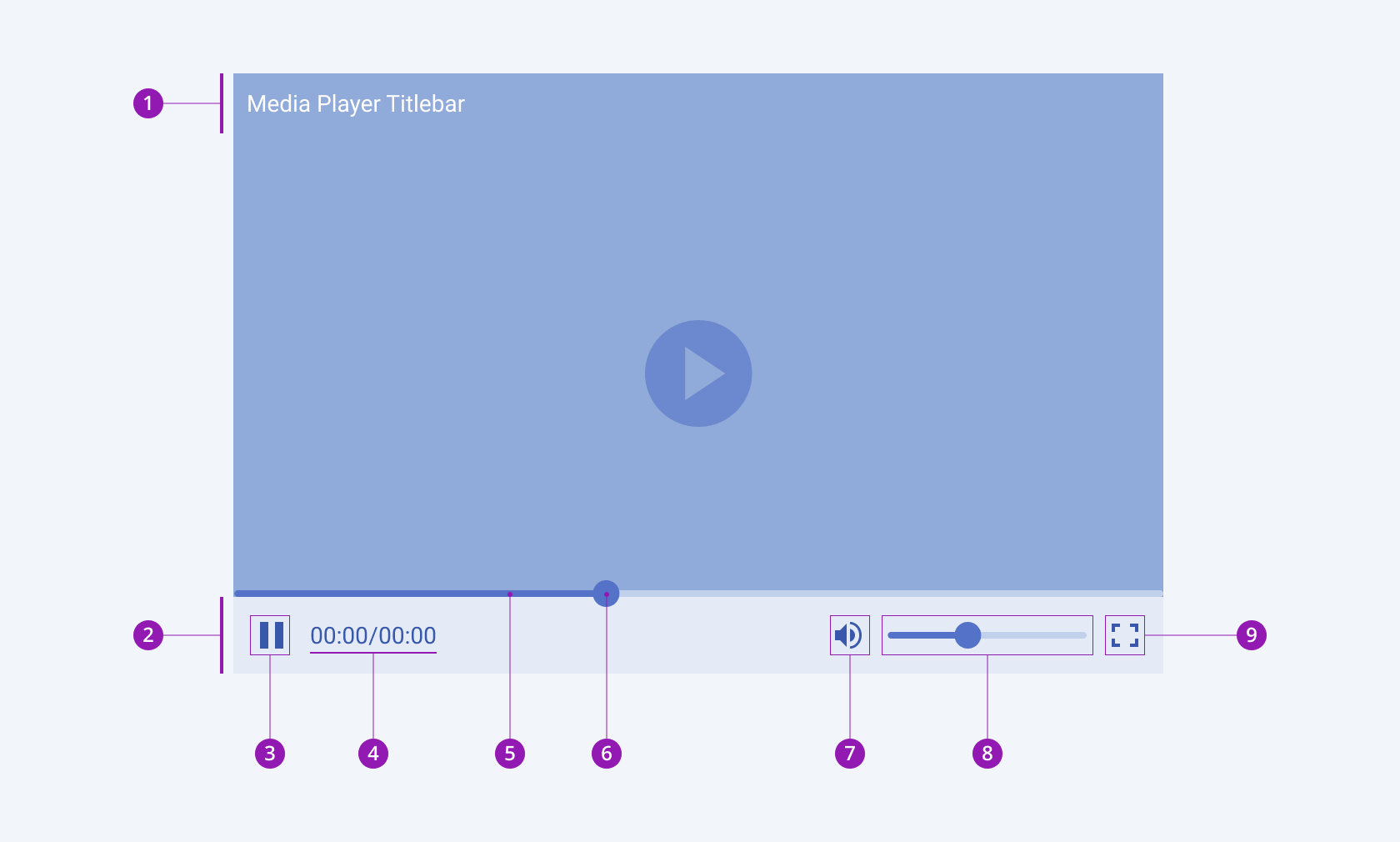
The anatomy of the MediaPlayer summarizes the elements of the component.

- Titlebar
- MediaPlayer toolbar
- Play/Pause button
- Label
- Slider
- Slider handle
- Volume button
- Volume slider
- Fullscreen button
Playlist
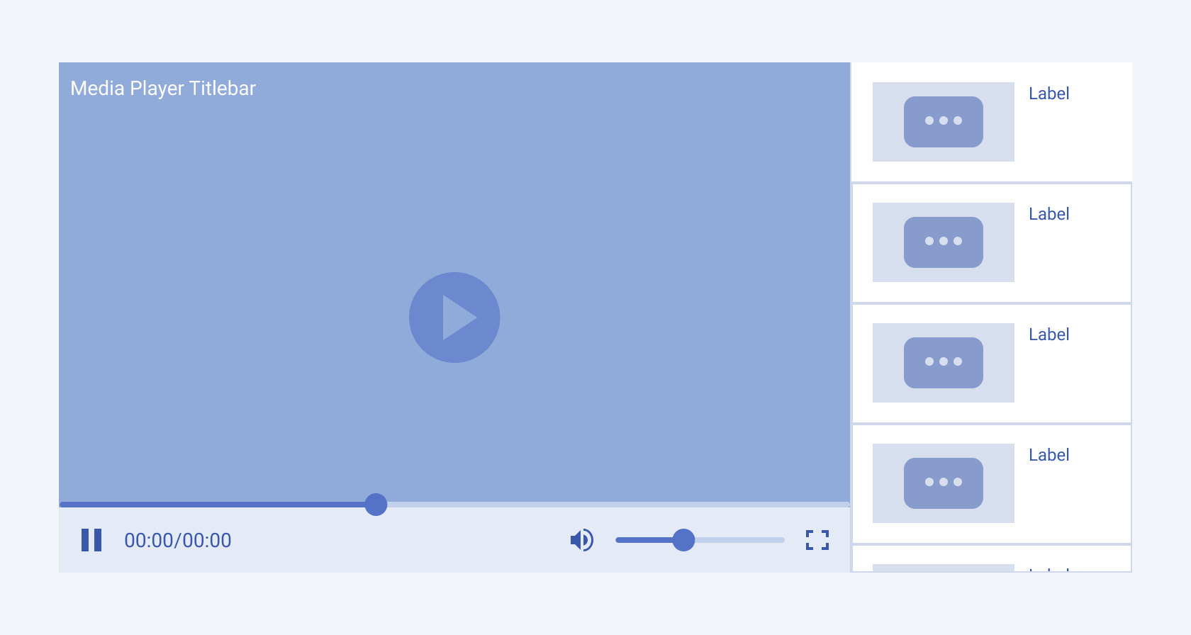
The MediaPlayer allows users to create their own playlists and display them right next to the video container.

Pause Overlay
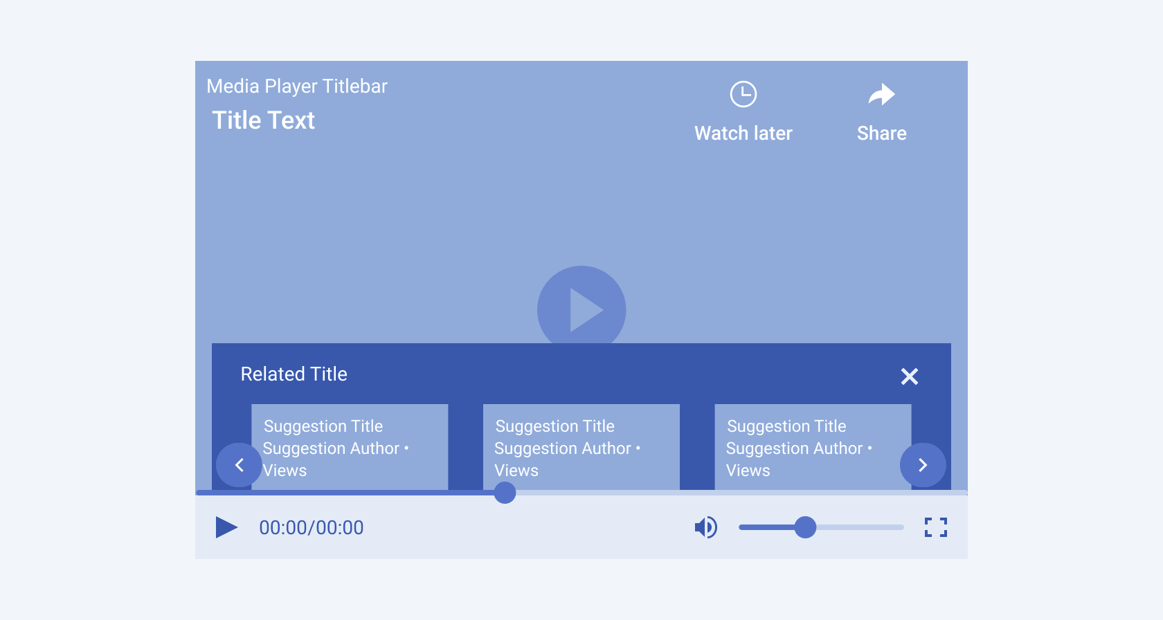
When paused, the Telerik and Kendo UI MediaPlayer displays additional elements like the Suggested Links section, as well as the Watch Later and Share options.


