Tooltip Overview
The Tooltip component is a discreet yet informative user interface (UI) element designed to enhance user understanding and interaction. It displays as a small, floating box containing explanatory text or information, typically triggered when a user hovers over, focuses on, or taps a specific interface element. Tooltips are ideal for providing additional context or brief instructions without cluttering the interface. Their temporary, on-demand nature ensures that users receive just the right amount of information at the right time, improving the overall usability and accessibility of the application or website.
Live Demo
Appearance
Tooltips provide built-in styling options that grant visually appealing and flexible rendering experience.
Apart from the default vision of the Telerik and Kendo UI Tooltip, the component supports alternative styling options that enable you to configure the individual aspects of its appearance.
Anatomy
The anatomy of the Tooltip summarizes the elements of the component:

- Content area
- Remove icon (optional)
- Callout (optional)
- Anchor component
Variants
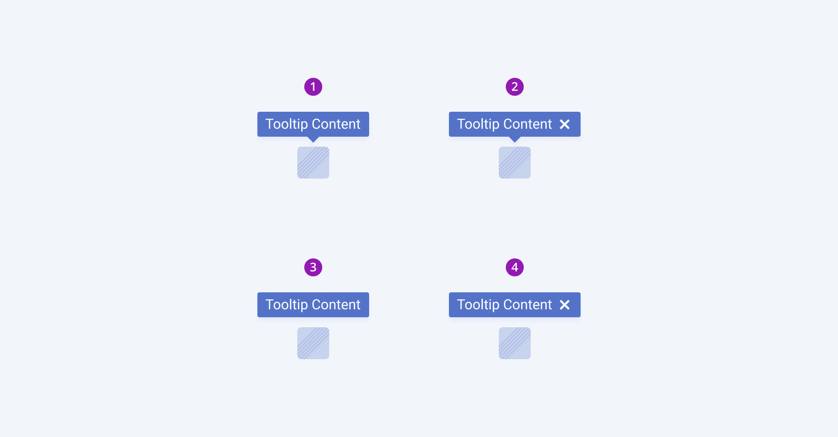
Depending on the elements they display, the Telerik and Kendo UI Tooltip can be any of the following types:
- Non-closable Tooltip with callout
- Closable Tooltip with callout
- Non-closable Tooltip
- Closable Tooltip

- Non-closable Tooltip with callout
- Closable Tooltip with callout
- Non-closable Tooltip
- Closable Tooltip
Position
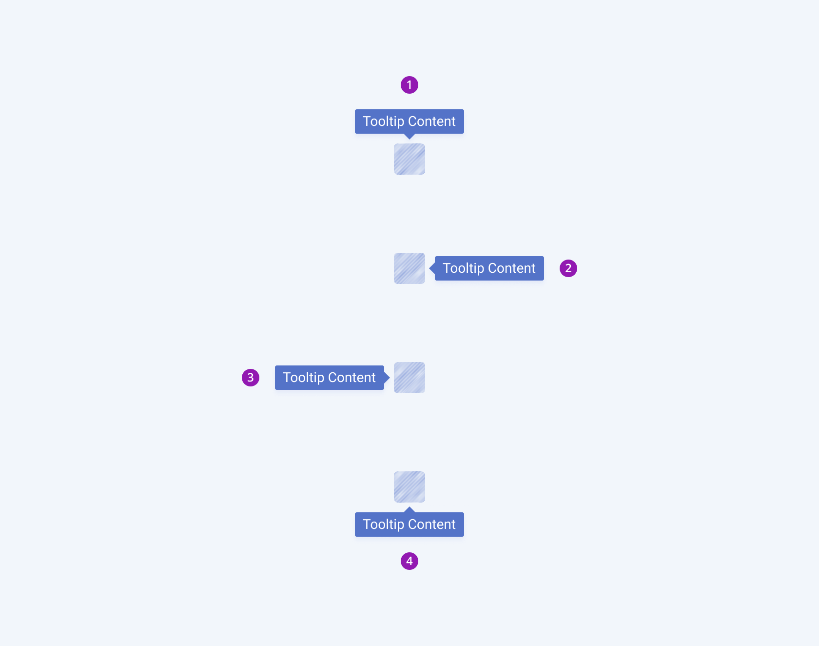
Depending on the position according to its anchor element, the Telerik and Kendo UI Tooltips can be any of the following types:
- Top—The Tooltip shows above the anchor element.
- Right—The Tooltip shows to the right of the anchor element.
- Left—The Tooltip shows to the left of the anchor element.
- Bottom—The Tooltip shows below the anchor element.

- Top
- Right
- Left
- Bottom
Color
The Tooltip provides the theme-color configuration option that enables you to choose among the available, built-in colors that will be applied to it. Tooltips also provide options for color customization.
themeColor provides the following available options:
base(default)primary—Applies the primary theme color to the Tooltip component.secondary—Applies the secondary theme color to the Tooltip component.tertiary—Applies the tertiary theme color to the Tooltip component.info—Applies the info theme color to the Tooltip component.success—Applies the success theme color to the Tooltip component.warning—Applies the warning theme color to the Tooltip component.error—Applies the error theme color to the Tooltip component.none—Does not set athemeColorand allows you to add your own, custom value.
Framework-Specific Documentation
For specific information about the component, refer to its official product documentation:


