Slider Overview
The Slider component is a versatile UI element that allows users to select values within a specified range by dragging a handle along a track. It lets you enhance the user experience in web and application interfaces by tackling various use cases like adjusting settings, filtering data, or selecting numerical values.
Live Demo
Appearance
Sliders provide built-in styling options that grant visually appealing and flexible rendering experience.
States
Depending on the action you want to imply through its appearance, the Telerik and Kendo UI Slider can acquire the following states which you can set by using the following classes:
- A Slider in its normal state appears active, and is usable and clickable.
k-disabled—The disabled state indicates that a Slider is temporarily unclickable because, for example, the page requires additional user input or something important is missing before the user continues to the next step. To indicate that they are unavailable, Sliders in their disabled state are faded.
The Slider's handle has its own states that are independent from the states of the Slider component itself:
k-hover—The hover state of the Slider handle is applied when the user hovers over it but does not click it.k-focus—The focus state of the Slider handle is triggered when the user navigates to it by keyboard, voice, or mouse click.
Anatomy
The anatomy of the Slider summarizes the elements of the component:

- Side buttons (optional)
- Tick (optional)
- Handle
- Label (optional)
- Selection
- Track
Layout
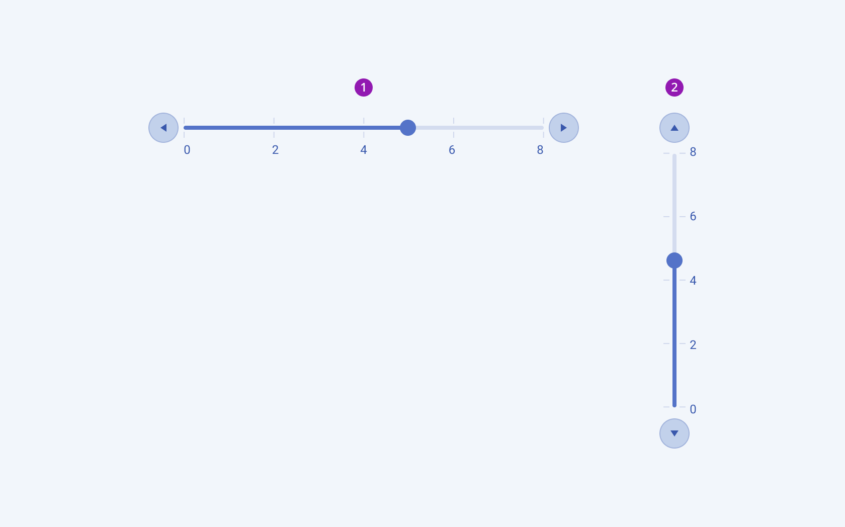
The Telerik and Kendo UI Slider component provides both horizontal and vertical alignment for flexible integration into various user interface layouts:

- Horizontal
- Vertical
Framework-Specific Documentation
For specific information about the component, refer to its official product documentation:


