Usage Guidelines
The Telerik and Kendo UI Slider requires you to follow some basic principles when using the component.
Number of Predefined Steps
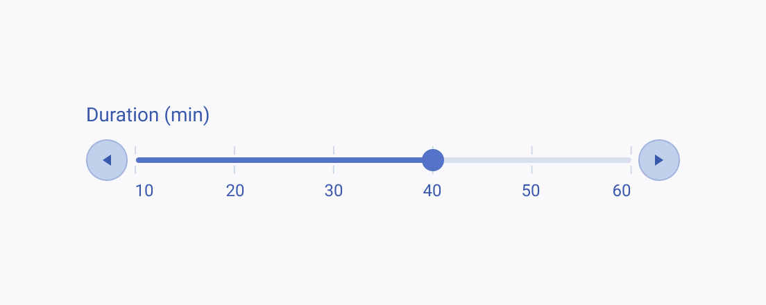
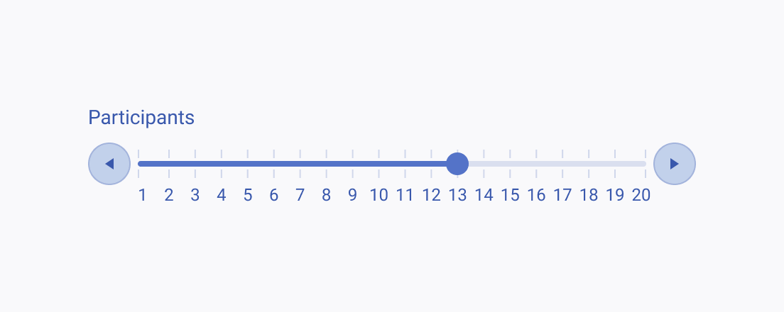
Ensure an optimal user experience by carefully selecting the number of predefined steps in the Slider. Aim for a balance between the component's good fit within the interface and providing enough spacing between the predefined steps—don't try to fit too many steps when you don't have enough space between them. This approach helps you to enhance the usability of the component and keeps the user interactions fluent.


Precision
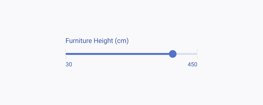
Sliders without predefined steps are a great way to interact with values when simplicity is more important than precision. However, in situations where precision is crucial and every input matters, Sliders may not be the best choice. In such scenarios, it's better to use an Input component that allows accurate data entry and ensures that all inputs are correct.


